Trending
Opinion: How will Project 2025 impact game developers?
The Heritage Foundation's manifesto for the possible next administration could do great harm to many, including large portions of the game development community.
"We noticed that we regularly were too exhausted to play the kind of games we used to like. So, we started working on a game that we could play even when we didn't have energy for anything else."

According to its Steam page description, Here Comes Niko! offers "cozy 3D platforming for tired people", lovingly crafted by a team of self-proclaimed "tired people" themselves. It’s a game about exploring colorful places, making friends (professionally), and helping people with their problems, all while trying to be as relaxing as possible for players who find themselves stressed, worn out, and exhausted from their daily lives.
In order to explore what interested them in creating games for people who are feeling out of sorts, Gamasutra sat down with Here Comes Niko! creators Team FrogVibes to dig into how they used visuals to capture a calming mood and how something as simple as ‘frolicking’ became a key theme that brought the work together.
What inspired the concept of Here Comes Niko!? What drew you to create a game around professional friend-making?
We were coming out of a stressful period in our lives. We noticed that we regularly were too exhausted to play the kind of games we used to like. So, we started working on a game that we could play even when we didn't have energy for anything else. Walking around different islands and being nice to its inhabitants turned out to be a good structure for that kind of experience.
What thoughts went into creating a game around helping people? How did this idea inform its mechanics? Its visual design?
‘Frolicking’ was a keyword that kept coming up. To run and jump around in a joyful way. We felt that to achieve that feeling, it would be best to give the player enough freedom to go whichever way they felt like.
Filling the island with cute, funny characters who need help would allow for that sort of gameplay, while also giving players enough of an objective not to feel lost.
Of course, personality plays a big role as well. We wanted the game to not only be a playground to frolic around in, we also wanted it to be a sort of caring friend. We try to cheer the player up with kind words and lots of jokes. It's very much us trying to tell the player "It's OK, we're here to cheer you up, buddy". It often felt like we were trying to speak directly to the player while sometimes using indirect wording. The many characters you befriend in the game are a way for us to get this message across.

What drew you to the adorable visual design you used in the game? What did you want it to evoke in the player?
With visuals, there are a few factors that played a role.
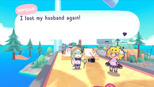
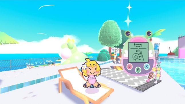
We agreed early on that we wanted the game to look soft and cute. The cute, expressive characters are a great way to communicate ideas and moods to the players. This is also one of the reasons we decided on going for a "2D characters in a 3D world" look. It was much easier for us to make the characters cuter and more expressive in 2D.
Another thing, which became more and more apparent throughout development, was that a lot of the time, our visuals were guided by a simple question: "Would seeing this make us happy?". If the answer was yes, we put it in the game. Things like: a little baby frog, tasty desserts, potted plants, funny posters, a giraffe whose neck is so long it pokes through the roof of the kiosk he works at. We never felt like we had to justify any of these things. Even potentially making a player happy is reason enough.
A side note on dispatcher the giraffe. The kiosk needed to be easily seen from a distance, so the long neck helped in that sense too. As with any game, readability and communication also played a big role in the designs of certain visuals.
The 2D characters also help a bit with readability. Since the characters are 2D and facing the camera, we have full control over the shape. This allowed us to work more easily on creating readable silhouettes and the aforementioned expressions. Both of which work to tell the player what is going on.
How did you inspire players to want to help in-game characters through the narrative of Here Comes Niko!?
We tried to give all the characters unique personalities which we try to show as clearly as possible. Knowing "what their deal is" helps to illustrate what you have to do to help them.
Of course, they also explain the mechanics of their quest directly, but we always try to match up mechanics with a clear problem to then match that problem with a fitting personality.
Likewise, how do you instill a desire to explore into your game's design? How did you create curiosity in the player through your design decisions in the game?
This was one of our biggest design challenges. There are the collectibles:
Cassette tapes are hidden to encourage players to search the islands. To examine every nook and cranny.
Apples are placed to guide players onto certain paths, as well as encouraging detours.
Bugs fly around in many places. They are meant to be chased by the player. They help make going from A to B a bit more interesting.
NPCs (not necessarily a collectible) have players go through the level in a more systematic way. A "Say hi to everyone" sort of process.
With these together, all at once, we see players rapidly switch between different types of exploration. It should make for a varied and enticing experience.
Another thing on the topic, which made a big difference, was pacing the quests. At first, every island had so many quests that most players didn't know where to go and what to do first. There was something to do at every corner, and it was really overwhelming.
We decided to fix this by adding a system where the majority of the quest don't appear on their islands until later on in the game. There are two islands where you can find a "list of phone numbers" which opens up a portion of the quests in the islands preceding it. This helped a lot with pacing. It also allowed us to more slowly reveal the different kinds of quests. In the future, we want to try and tackle this issue right from the start.

The game offers so many activities for players to take part in. How did you choose the activities you wanted to include in the game?
We wanted the game mostly action/platforming focused, since we don't often see it combined with relaxation. We wanted the game to be void of tension, so taking damage and dying were off the table.
Finally, we looked at activities most gamers associate with slow-paced, relaxing gameplay. Those we tried to flip into a platformer version of themselves. For example, the way players fish in Here Comes Niko! is by getting attached to the fishing rod and jumping into the water in order to catch the fish.
What challenges came up from designing so many activities? What good things came out of creating such a variety?
Combat, damage, and dying have been a big part of platformers since the very start. Removing those left us with a big void to fill. That was quite a challenge. Then, there was also trying to avoid tension while still keeping the activities engaging. One thing which helped here was minimizing risk as much as possible. The amount of different activities also made it hard to flesh them out and it made polishing a huge undertaking.
The good things include variety itself and players being able to choose their favorite activities to focus on.
The game also features many varied places for players to explore. What ideas went into creating these varied places? What did you want these places to inspire in the player?
The places in Here Comes Niko! are based on the familiar, like a city or public pool, as well as on the relaxing, like a snowy bathhouse or a forest surrounding a mountain. We want the world to feel familiar, like a real place you might have visited, but calmer and less hostile. The addition of lots of plants, nature, and cute props helped with this. Overall, we tried to keep a modern, urban theme, but cuter, greener and more inviting.
What drew you to calling it "cozy 3D platforming for tired people" on its store page? What interested you in shooting for a game with this kind of mood?
The professional friend storyline helps guide players through that experience. The word "professional friend" actually came up quite late in development. It's quite intriguing, so we're happy to have thought of it.
The game is quite literally meant for people to play when tired. We always knew that there are many people who are at least as tired and stressed as us. We didn't expect it to hit as close to home as it does. It turns out that, especially nowadays, we are all tired people [laughs]!
You May Also Like