Trending
Opinion: How will Project 2025 impact game developers?
The Heritage Foundation's manifesto for the possible next administration could do great harm to many, including large portions of the game development community.

Featured Blog | This community-written post highlights the best of what the game industry has to offer. Read more like it on the Game Developer Blogs or learn how to Submit Your Own Blog Post
A step-by-step breakdown of my final scene composition iteration process for environmental lighting, effects, clouds, atmospherics, and volumetrics in Steel Hunters (in Unreal Engine 4).

This article was originally posted on the Joy Machine blog; maybe check it out too! <3
I tend to do a major iteration on the overall scene composition in Steel Hunters every month or two and since the public trailer is now approaching, I decided to just did one six-seven hour block fo sitting at my computer until I was happy with the results. It should be obvious that this iteration started like most: “just a few quick tweaks.”
I wanted heavier atmospheric haze/fog. The reasoning for which is two-fold:
The general feel of this area is a barren “post-apocalyptic” wasteland. And I don’t mean that in the traditional post-apocalyptic Mad Max sort of way; the world of Steel Hunters wasn’t ever decimated by nuclear war but, rather, the slow depletion of natural resources (unrelated) and the onset of, basically, the worst possible nightmare version of climate change that could be imagined (and is almost certainly scientifically… non-scientific). In short: every environment has a unique feel/setting and the goal of each of these sandboxes is to fully embrace a worst-case scenario of what that environment in the game’s world.
More practically, it’s way easier to handle the blend for the unbelievably intense sand storms (literally, they can not be believed because it’s not also, likely, scientifically non-scientific) that can crop up mid-mission — requiring players to adjust their approach entirely.
Along that same line of thinking, there is entirely too much blue sky if you catch a glimpse of the sky through the clouds — and just adding more cloud-cover would obscure the actual sun vector all the time (instead of 75–85% now).
To adjust this, I have to modify the rayleigh calculation coefficients just enough to reduce the blue of the end result without blowing out the scene’s lighting and composition in the other direction (trump-orange).
There is a lovely issue with the volumetrics rendering light blue light shafts if you happen to end up in an along the edge of an occluded area (this is unrelated to the sky color, as I discovered).
This gets worse if the directional light is completely obscured, at which point the resulting composition ends up with a light blue screen area where the light would normally be (not super obvious/ugly, but it annoyed me. A lot).
I don’t tend to update time-of-day during gameplay, but I still ran into an issue with the volumetrics and sky/cloud/light settings getting out of sync at night (meaning the moon ended up with red/brown-ish volumetrics despite a component white light color) — and time of day can make for a nice demo sometimes (and I may eventually have a very, very subtle progression of time in a mission at some point).
The eye adaptation has issues maintaining a consistent exposure level as you go through the map.
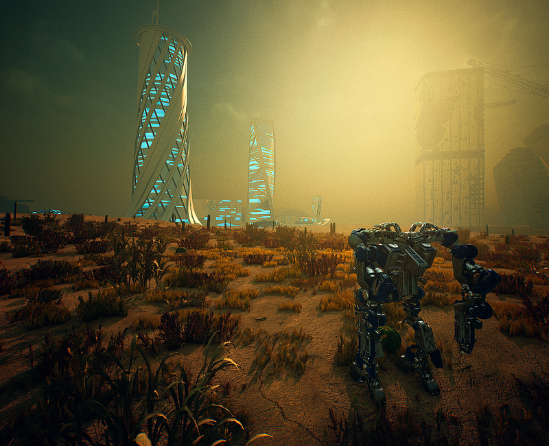
I’ve done iterations on all of these various systems/components in the past, but generally I’ve focused on one or two aspects of the composition at a time. I wanted this iteration to focus on the entire gamut of influencing factors.
Ideally, I’d tackle each problem in that list one at a time. And, for the most part, that’s what I did. The issue is how all of these various systems exist in relation to each other. Which brings me to:
The entire world state is managed by my “world simulation” — anything that related to or occurs within the environment is in some way or another related to this system. In the case of lighting, volumetrics, atmospherics, and relevantpost-processing data, the relation to the world simulation is direct: the simulation manages each of these explicitly.
The Plus Side of This: I don’t have to jump back and forth between all sorts of entities to tweak properties.
The Down Side of This: The world simulation is a simulation in every sense of the word. Simply changing one value can have a ripple effect that affects any number of other data that influences the final scene composition.
I make this sound bad, but it’s actually a great thing. This design and implementation ensures internal environment consistency and, for lack of a better word, “synergy” between what could be setup as disparate entities. This will also be helpful for ensuring future environments are bound to the same rules.
The process, basically, goes like this: start a problem (almost in the order described above, except the sky simulation and resulting coloring was the first problem I took on), work towards an acceptable result, and move on to the next problem.
By the time I started on the second problem, that process was pretty much gone. Changing the sky simulation data resulted in some dramatic composition changes that affected the overall scene exposure, the lighting intensity/colors, and the look and intensity of the haze. Really, the only thing that wasn’t affected by this was my volumetrics solution (based heavily on NVIDIA’s Volumetric Lighting research/implementation advice) as I was previously manually managing the volumetric light color/intensity.
So, obviously, I updated the world simulation’s code to ensure that the volumetric light color/intensity to also be managed by the world simulation in respect to its various light entities (a directional light and sky light). THERE. Now a single change affects ALL THE THINGS. I sure showed that what’s what. Admittedly: this also addressed the problem I was having with the volumetrics being out of sync with a dynamic time-of-day (especially at night), so that’s neat at least.
Note: Unfortunately, I didn’t properly create screenshots of each specific step along the way, but I do have a few iterations that I used to compare each tweak round. So those will appear shortly.
With the exception of the odd issue with the “sun” showing as a large blue halo when obscured (and the volumetrics coloring when in an obscured location relative to the sun), I ended up with this first-pass result:
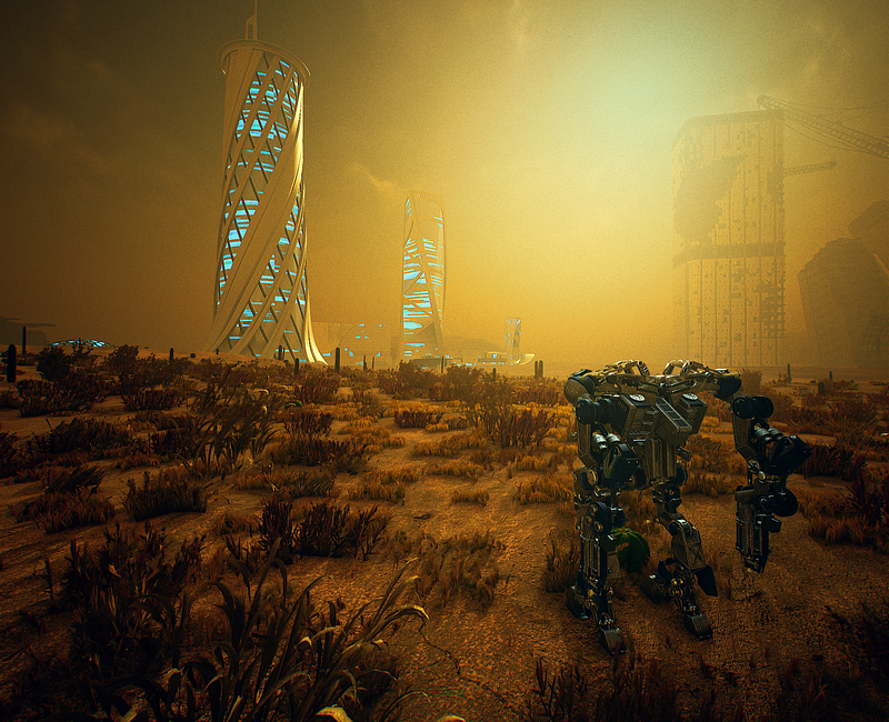
This is definitely a step in the right direction compared to the starting point. And I remember this first iteration being worse than it actually is (in retrospect), but looking at it now, I remember my issues with it:
The lighting and shading is fairly flat and trends far closer to orangey-orange than I want (even the mech shading was fairly flat).
The “sun” (which I use in quotations constantly because it’s just a directional light that is treated as an atmospheric body) is somewhat non-existent. There is a somewhat brighter spot in its place, but it’s far more understated than I want.
The haze is over-saturated and really drowns out the shading of distant buildings more than I’d like.
Finally, though it’s not obvious here, but if any view other than the composition I’m using throughout this post, the eye adaptation was… Not happy. The histogram for the composition shot is fairly even, but anywhere else the overall exposure trends lower (which, since the composition I’m showing is potentially in the brightest areas in the environment).
I really should have written this post yesterday after doing all this work because, looking at this pass’s screen shot looks, basically, like “… why did I just make everything worse?”
This pass’s goal:
Start addressing the auto exposure so if I turned around I wasn’t blinded by the adjusted exposure for darker areas.
This entailed lighting color/intensity (and volumetrics color/intenstiy which has its own modifiers based on the light color/intensity it gets from the directional light) adjustments. This succeeded in evening out the overall composition exposure throughout the environment, but it also made the lighting even more flat (and the composition somewhat darker).
An attempt to change the haze distribution so it wouldn’t affect ground-level areas as intensely as it did in the first pass (also attempted, and failed, to fix the coloring).
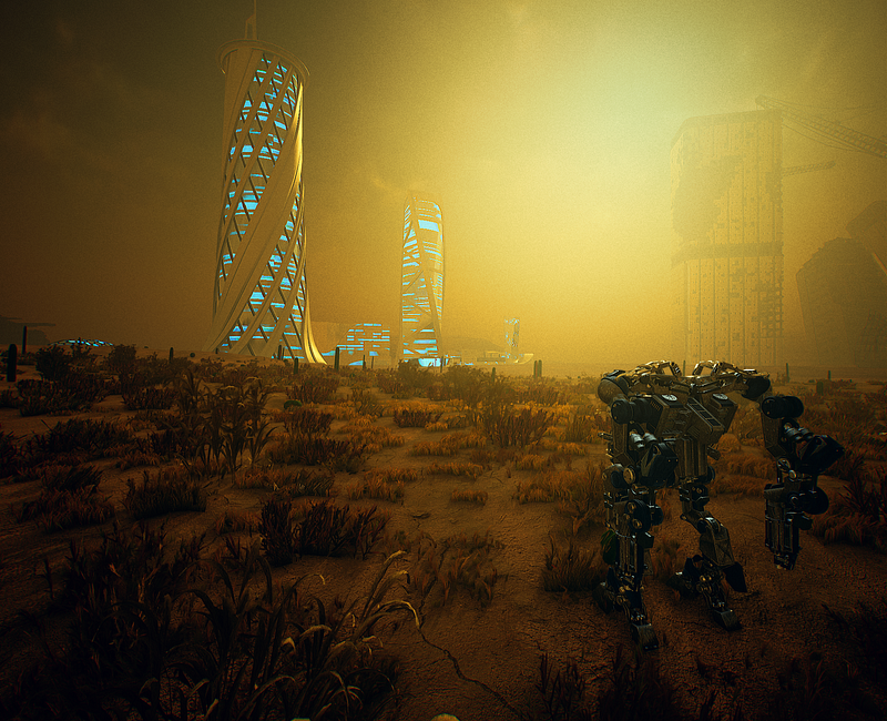
I call this pass “lighting, volumetrics, and composition exposure adjustments that made everything worse”.
Which is mostly true; I can’t remember the specifics of what I did in this pass, but I was focused primarily on getting the lighting in the final composition to be more complex (not flat).
AND I SUCCEEDED. If you ignore the fact that the entire scene is now grim-dark and the mech details are basically completely lost.
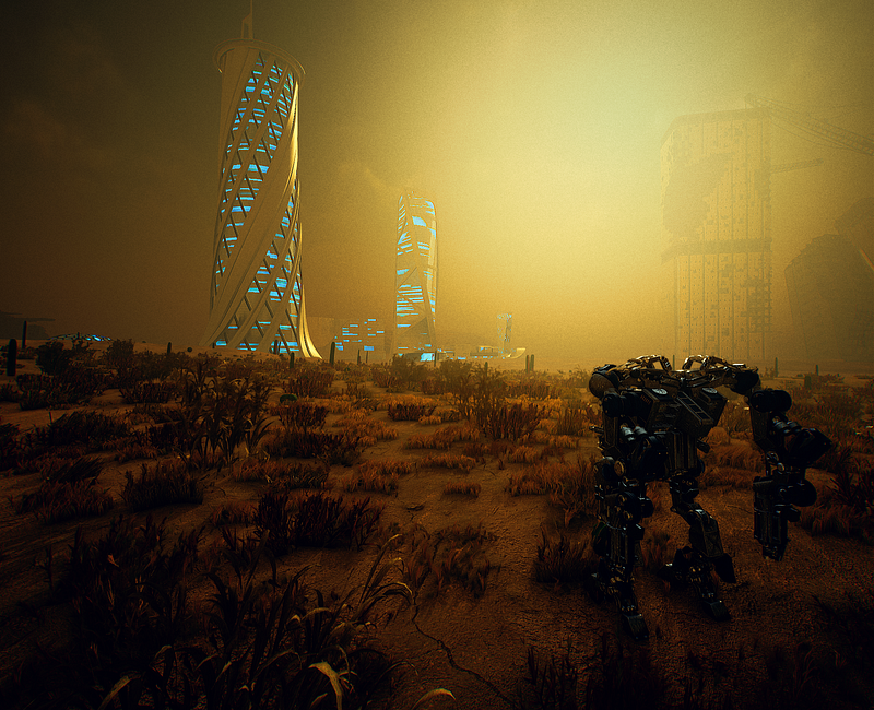
I focused primarily on light intensity values, the brightness of the trueSKYbrightness levels (which were pushing the composition’s exposure histogram far outside the range of the rest of the scene), and getting the haze to cooperate.
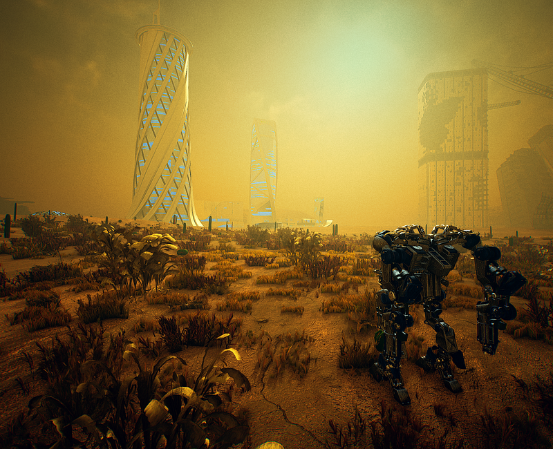
Problems now:
The composition’s contrast was way too heavy — even for me (and that’s saying something. I knew this wasn’t an issue with the post-processing stack, so I blamed the auto exposure. And turning off auto-exposure confirmed that… To some extent.
The lighting intensity adjustments worked for most of the scene, but the smaller-scale details of the mech (which, by the way, is why I like this composition; it has foliage, large-scale meshes, and detailed smaller-scale meshes) weren’t benefitting from any changes to the intensity. Meaning that while most of the scene benefitted, shadowed areas were still suffering a bit.
The haze was getting even more exaggerated from adjustments to the auto exposure. Which is neat.
The “sun” still had an underwhelming compositional presence (and you can see the out-of-place blue halo here more clearly than in other images, despite not being occluded).
I did another round of light intensity modifications in conjunction with the trueSKY light wavelengths and yet-again-more haze tweaks. AND THIS TIME: THEY WORKED.
Oh, and I changed the entire volumetrics simulation settings from being Mie-based scattering to using a Henyey-Greenstein phase function for scattering. This iteration, in particular, took the most time to really get right-ish because it so dramatically impacted the entire composition
Note: I’ll show some debug shots of what the volumetrics themselves look like in the final composition later.
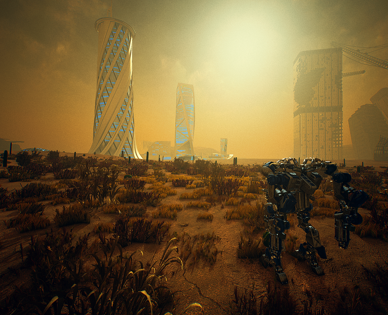
The overall composition still hasn’t quite hit the overall exposure level I’d like and the “sun” still had no strong presence in the composition. And so I decided: unacceptable. The “sun” must bend to my will.
After more volumetrics, eye adaptation, color grading, and light intensity passes, I ended up at a result that I’m pretty happy with. It’s still leaning a bit too close to orangey-orangyness-orannnnge, but at the moment I’m not entirely convinced that’s a bit thing for this environment (especially since, once I started adding VFX to the scene, that will have a pretty dramatic effect on color variation).
AND THE SUN BENT TO MY WILL.
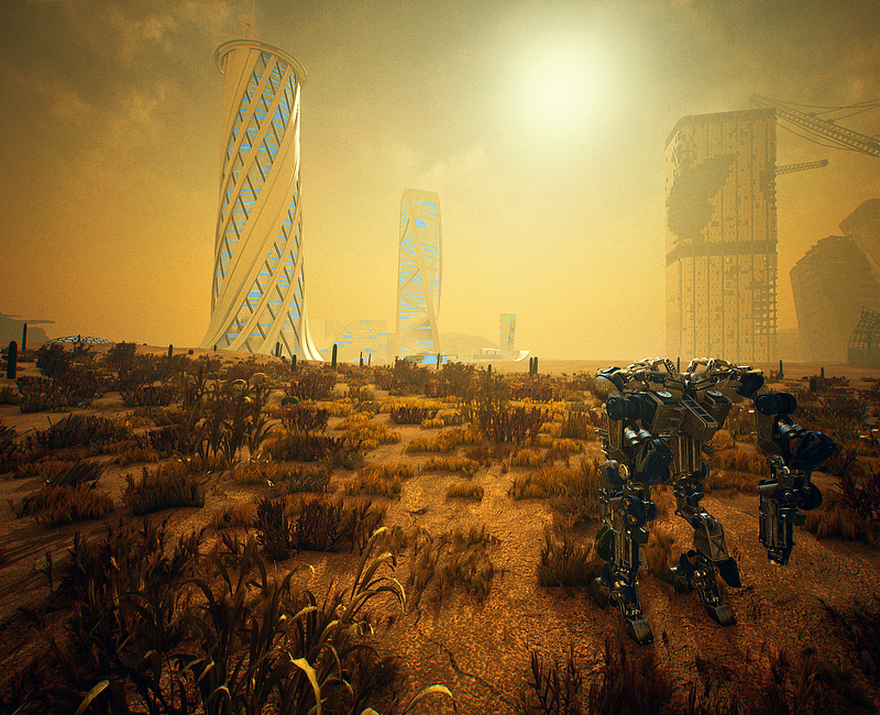
And since I promised some debug screen shots, here is the resulting composition exposure:
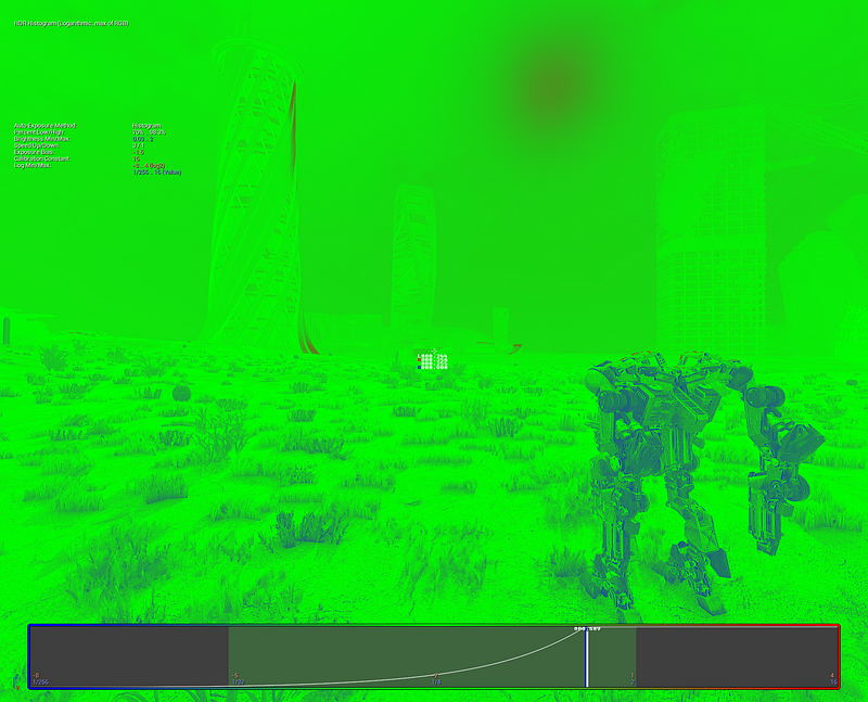
And a debug visualization of what the volumetrics look like on their own (you can probably tell where I went to give the “sun” a bit of help in the prominence department):
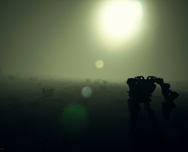
I really enjoy doing iterations like this. And this was fun enough to help me maintain sanity in the twelve hours of camera system work that followed.
Fun Fact: The Steel Hunters “announce” trailer release date is not too far away.
By reader demand, here’s a quick-and-dirty slideshow GIF of the progress (it loops so the beginning/end are, uh, hopefully recognizable):

Read more about:
Featured BlogsYou May Also Like