Trending
Opinion: How will Project 2025 impact game developers?
The Heritage Foundation's manifesto for the possible next administration could do great harm to many, including large portions of the game development community.
Pokemon designs have changed a lot over the last 23 years. In this series I look at how they have evolved based on design trends, developer interviews, and technical limitations. This first entry looks at the games that started it all - generation 1.


The following is a reproduction, and has been modified for this site. The original article, and many more, can be found at RemptonGames.com
What’s up designers, and welcome back to Rempton Games. On this channel, and on my blog, I have touched on a lot of different areas of game design, but one area that I haven’t talked much about is character design. Character design may seem separate from other areas of game design like rules, systems and mechanics, but it is still an incredibly important part of designing a game. And few games live or die based on the quality of their characters quite so much as Pokemon.
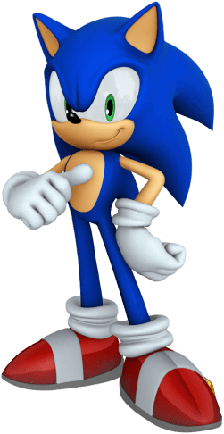
And maybe Sonic the Hedgehog
The newest games in the Pokemon series, Pokemon Sword and Shield, were released recently and with new Pokemon games come new Pokemon designs. As always, new Pokemon designs are a bit of a mixed bag – with some really amazing designs such as Dragapult, the Applin line and the Snom family, and some that are less impressive such as Greedent or Chewtle, with most falling somewhere in between. As always happens with a new generation, these new designs have sparked much discussion in the Pokemon community regarding which designs are good or bad, and whether the new designs are better or worse than previous designs.
Along with these discussions about the quality of the designs have come a lot of discussion about how these designs have changed over time. It seems that fans have a lot of thoughts on how Pokemon designs are different from how they used to be, and will loudly exclaim these opinions on any platform that they can. I, of course, cannot relate to this, as I am only planning on making a multiple part video series on the topic.
For this video, I want to begin an in-depth look at Pokemon designs from generation to generation to truly see how they have changed over the past 23 years. To do so I have not only analyzed the designs of these Pokemon, but also looked at interviews regarding the inspirations of various Pokemon and the design process behind them, as well as how technical limitations have affected these designs.
Of course, before we can really discuss how Pokemon designs have changed over time we need a baseline to compare to. This baseline is, of course, generation 1. Love ‘em or hate ‘em, the original 151 Pokemon helped form the foundation for the entire Pokemon series, and for many players their idea of “what a Pokemon is supposed to look like” is shaped by this first generation.
Before I dive into the details, I want to quickly mention that Pokemon has never really had a strongly defined art style. Even from the very beginning there have been a wide variety of different monsters of different styles, so I am mostly going to be focusing on general trends. Not every trend is going to affect every single Pokemon in a generation, and there will always be counterexamples, but I do believe that these trends can be quite informative when discussing how Pokemon designs change from generation to generation.
That being said, there are a number of factors that separate the original 151 from future Pokemon generations. I believe that the three biggest factor that influenced the designs of the original 151 Pokemon were the mindsets of the developers at the time, the technical limitations of the Game Boy, and the smaller size of the design team.
The first thing to remember when talking about the designs of the Gen 1 Pokemon is that the designers were not intending to design “Pokemon” as we know them today. The term “Pokemon” itself has certain connotations that have been gathered from over 20 years of Pokemon games, anime, merchandise, and other media. However, none of this would have existed when the original Pokemon were being designed. Instead of trying to design Pokemon, they were simply trying to design monsters, similar to those you would find in any classic JRPG from that period.
For a great example of this, you can look at the Pokemon Ratata and Zubat. Rats and Bats, or Skeevers and Keese, were and still are incredibly common early game enemies in a lot of RPGs, so it is only natural that when designing enemy monsters for your RPG games you would want to design a Rat and Bat enemy that you would encounter relatively early on.
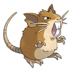
This thing will eat you alive
This mindset also guided the broader designs of the early Pokemon which, unlike later generations, were designed primarily to look “tough” (due to the focus on creature combat). Gen 1 certainly has a higher proportion of “tough looking” Pokemon, with even smaller, weaker creatures like Pidgey and Nidoran designed to look intimidating.
This isn’t to say that Gen 1 doesn’t have any cute looking Pokemon, because it certainly does. However, based on interviews it seems like the cute Pokemon were more secondary, and were mostly added later in the development cycle. According to Ken Sugimori, the original games were focused on the concept of fighting, collecting and trading. While aggressive, tough looking Pokemon might be good at fighting, it was decided that collecting and trading would be more interesting if there was a wider variety of designs, including cute ones.
Regarding the general designs themselves, early Pokemon took inspiration from a wide variety of sources, from real-world animals and plants to mythology, to inanimate objects or concepts and even specific people. With so many sources to draw from it can be hard to spot the similarities, but there are a number of common trends.
The first thing is their color palettes. Pokemon come in a wide variety of colors, but early Pokemon themselves were not very colorful. If you look at early Pokemon as a whole, most of them have very simple color schemes – they usually have a single main color, with either a lighter or darker color as accents.
This is because of the technical limitations of the original Game Boy, which was not a color console. Because Pokemon sprites initially could only be shown in a handful of shades of grey, it wasn’t practical to have too many colors on the same Pokemon.
 This influenced the colors of the Pokemon, but it also affected their designs in other ways. Because of the lack of color, these original Pokemon designs relied on contrast to help make the designs interesting and recognizable. For this reason, a number of Pokemon were given additional design details in a contrasting color to help add variety to their designs, and to differentiate them from one another. An example of this is the dark stripes on Pikachu’s back, but it also applies to nearly 40 Pokemon who were given light tummies that contrast with the rest of their color scheme.
Technical limitations also limited how complex early designs could be, because they would have to be represented as low resolution sprites. The designers had to walk a fine line between providing enough detail to make the Pokemon distinctive, while still making the overall design understandable in sprite form. However, even with their best efforts a lot of early Pokemon sprites ended up requiring unusual poses or strange proportions to actually show the whole Pokemon.

That just looks uncomfortable…
One final thing to note about the general designs of Gen 1 Pokemon, is that it seemed that the Pokemon’s most important aspect was its appearance. What I mean by this was that Gen 1 was made with the goal of having a group of diverse, interesting monsters to battle and trade, and it really seems like the concept of “competitive balance” was not taken into consideration. Generation 1 was notoriously unbalanced, and later generations would put much more focus on balancing the competitive abilities of their Pokemon.
The same can be said for the type system. It seems that Pokemon were simply given whatever types made the most sense based on their designs, with little regard to balancing the various types. This led to a lot of “low handing fruit” typing, such as an overabundance of Poison, water and normal types, as well as oddities such as having no pure rock type Pokemon or Tangela being the only pure grass type.
In addition to these general design trends, these early Pokemon also share a number of very specific traits that are repeated over and over in their designs. This is probably due to the fact that Generation 1 Pokemon were designed by a very small team, which allowed their individual art styles to shine through and led to this abundance of repeated traits.
For an example of what I’m talking about, let’s take a look at the eyes of a Gen 1 Pokemon. While Pokemon has always used a variety of different eye designs, generation 1 Pokemon by and large use only a handful of different repeating eye shapes.
There are what I like to refer to as the “angry anime eyes”, which can be seen on Pokemon such as Charizard, Blastoise, Arcanine and Mewtwo. These eyes are immediately recognizable – the are generally made up of the lines that are slanted towards one another, with a white Sclera and usually dark pupils. This style of eyes was very common in anime in the 80s and 90s, and wouldn’t look out of place in something like a Dragon Ball Z.
It’s about to go Super Saiyan!
These eyes are incredibly common among the original 151, making up by my quick count around 1/3 of all Pokemon in this generation. From Gyarodos to Tauros to Nidoking, the list just goes on and on. However, aside from the original 151 this style of eye is not very common in future generations. It’s use drops off pretty exponentially after this generation, being used sparingly in gens 2 and 3 and barely at all after that point. Because of this, the “angry anime eyes” are one of those features that really defines the looks of a Gen 1 Pokemon
However, not all Pokemon used this eye style. There are a handful of other repeated eye motifs that can be found among Gen 1 Pokemon. The first is what I’ll call “cute anime eyes”, which can be seen on Pokemon like Charmander and Mew, perfectly round circle eyes (often with dot pupils) which can be seen on Pokemon like Psyduck, Magneton and Shellder, and what I’ll call “mystical eyes” on Pokemon like Dragonair, Vulpix and the Eeveelutions.
I know I’m spending a lot of time just talking about eyes, but that’s only because eyes are one of the most important parts of any character’s design, and that definitely holds true for Pokemon as well. To quote the cliché, the “eyes are the windows to the soul”, and what a character’s eyes look like can quickly tell you a little bit about that character’s personality.
Angry anime eyes show you immediately that this is a monster you don’t want to mess with that will be quite powerful in battle, whereas cute anime eyes mean that this is a harmless creature that you can be friends with. Mystical eyes, which are some of my favorites, show that this creature is somewhat mysterious and otherworldly, whereas the big wide eyes….just kinda make the Pokemon look dumb, I guess?
These eyes not only show the personality of the Pokemon, but having a limited range of possible eye designs helps the whole generation look cohesive.
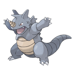
However, the eyes are far from the only repeated design trait that can be found in a large number of Gen 1 Pokemon. This can easily be seen by looking at these Pokemon’s hands and feet. There is an extremely common motif of Gen 1 Pokemon either having very similar looking clawed hands and feet. For hands, for example, you can look at Blastoise, Nidoking, Golem, Rhydon or Kangaskan. They all have three claws on their hands arranged in a very similar way.
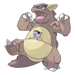
I don’t blame them, though – drawing hands is hard!
Many of the examples I gave also show this phenomenon on their feet. While the hand claws are almost always 3 claws, the feet have a little more variety, with 2 or 4 clawed variations. Hitmonlee has 3 claws on his feet, Slowbro has 2, and some Pokemon, like Lickitung, only have 1 – although the single clawed variation will become more popular later on.
In addition, with the apparent exception of Duck-looking Pokemon, all Bird Pokemon in Generation 1 have the exact same feet.
Another very trait that is widely repeated among Generation 1 Pokemon is their ears. Basically, their ears are triangles. Sandshrew? Triangle ears. Jigglypuff? Triangle ears. Hypno? You can bet that boy’s got himself a big, heaping helping of Triangle ears. They even pop up in places where they don’t make sense. Blastoise is a turtle…with triangle ears. Why is it so confusing to figure out what Venusaur is supposed to be? Probably because he is a frog ….with triangle ears, which frogs tend not to have.
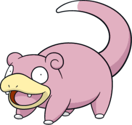
Hey, who are you calling dumb?!
Even this is far from an exhaustive list, and there are a number of features that appear on a smaller number of creatures such as swirls, these head crest thingies, and even Pokemon with lips, which is one trend that I don’t think anybody really misses. I’m not going to dig into every repeated trait, but I think you get the idea.
Gen 1 designs remain some of the most iconic Pokemon designs of all time, from Pikachu and Jigglypuff to Charizard, Gengar and Mewtwo. With it’s mix of cute and tough looking designs, it certainly made a strong impression on millions of Pokemon fans. However, now that there are 8 generations of Pokemon games we have only just begun to scratch the surface of these designs, and there is a lot to look forward to in future episodes.
If you liked this video, please leave a like and subscribe so that you don’t miss future videos where I will explore how these designs have changed from the second generation and beyond. If you want to see more, check out my other videos, and I also have over 100 articles on the Rempton Games blog which you can check out in the description down below. And join me next time, where I take a lookat designing movement mechanics in games. Until then, thank you so much for watching and I’ll see you all next time.
Read more about:
BlogsYou May Also Like