Trending
Opinion: How will Project 2025 impact game developers?
The Heritage Foundation's manifesto for the possible next administration could do great harm to many, including large portions of the game development community.

Featured Blog | This community-written post highlights the best of what the game industry has to offer. Read more like it on the Game Developer Blogs or learn how to Submit Your Own Blog Post
Today's post looks at the use of gating and how it provides structure to your game's design.

Recently, I found myself frustrated with Path of Exile and a poor design decision the developers made. A common mistake I see a lot of indie developers make is not understanding how to gate their game design. Gating refers to the order in which content and mechanics are shown, and is a crucial philosophy to understand.

game design
The more complicated a game is, the more important it is to understand gating mechanics. Hitting the player with everything at once is a sure way to turn them off of a game. More importantly, it becomes impossible to teach someone how a game works when the game just pushes everything on them.
Great game designers understand the importance of properly gating systems and mechanics regardless of the genre. You may think that it just has to do with tutorial design, but there is more to it than that. The design of your UI can have an impact on gating systems, which we'll talk about in this post.
We've talked about this several times in the past, and how you want to show the player mechanics in order of importance. An earlier post I made talked about the "what, how and the why" of game mechanics. It's the old adage of: Learning how to walk before you run.
In action-based games, this is easy to understand. In fact, every action game will usually passively teach the player via the level design. Abstracted-based games are where things become difficult, because they're not easy to show the player how things work. In my previous post on game mechanics, we talked about the order in which you showed systems to the player.

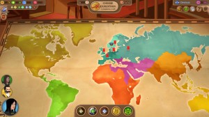
Offworld Trading Company
In Offworld Trading Company, the tutorial breaks down the game's flow into different lessonsThe more vital and immediate use of a mechanic, the earlier you should show the player. In Offworld Trading Company, the developers break down the tutorial into multiple sections.
The tutorial goes over every system in the order that someone would use them in-game. In this way, the player not only sees how the game works, but understands the flow of how a match goes.
That information we talked about already, but there's more to it than just tutorials; we need to talk about game structure.
While tutorials and opening segments in a game are good places to start, you also need to keep that understanding throughout the title and design. Remember, players are going to assume that when something becomes available, that it's meant to be used now.
A common mistake I see from Indie developers is the "menu sprawl," where everything is lit up on the opening menu with no explanation given. It's not bad design to lock things away from the player, especially if they have no purpose at the moment. If a game system is not meant to be used at a certain point, then it should not be usable, period.

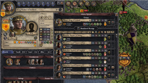
Crusaders King 2, originally posted on Kotaku
Many strategy games hit the player with everything at once during the tutorial; making it very hard to learnThis is where a lot of strategy game designers mess up with their tutorial designs. Building the tutorial as an overlay in the main game means that all the other buttons and functionality still work.
What that means is that every button, prompt and blinking icon is still being shown to the player and confusing them about where to focus on. As an added tip, if there are pre-game choices that impact play, the tutorial should start there.
Another point that should be a given: Do not switch between game systems when trying to teach someone a game. If trying to learn one system through is confusing enough, two or more is just torturing the player.
With that said, let's talk about in-game and where Path of Exile threw me off.
When the player is given something new or shown something, they assume that they're supposed to use it, because why else would the designer show it? In-game gating refers to presenting information to the player when it's relevant.
In Path of Exile, the game has added in a new end-game super dungeon. The end-game requires you to complete six special dungeons over the course of act 1-3, when it will then unlock. The developers don't tell the player any of this in-game, and this presents a problem.
First, you don't know as a new player that this is meant for the end-game, because it's available in act three of four. Since this is unlocked before you're ready, going into it is essentially suicide. Even if the player misses the dungeons, the actual quest shows up in act three; giving the impression that they're supposed to do it now.
Right here, we have the perfect example of poor gating in a title. Another example is when the developer gives the player a new tool or power, but there are no areas nearby to use it. As a contrast, one of the strengths of Zelda's level design is the fact that items and their usage occur in proximity of each other.

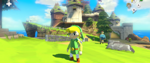
Windwaker HD, originally posted on VG247
The Zelda series does a good job of gating new content and rules through the use of dungeonsEvery dungeon in a Zelda game will have paths that use the common knowledge of the game, and paths that require the special item.
What ends up happening is that by the end of a dungeon, the player will find a new item, learn its use, and get tested on how to use it properly.
You do not want to give the player a new item, and then have nothing related to it. The reason is that if the player is not given a reason to use it, how are they going to know the item's purpose? Another great example is the level design of Portal 1 and 2, and how advanced maneuvers are gated by the design.
Going back to Path of Exile, they should have put the dungeon unlock in act 4, and have one of the requirements take the player to the end of the game. This would reinforce to the player that the dungeon is meant for the end of the game.
One last example that I see a lot from indie developers that I want to touch on. If your game is built around meta-game design or unlocking new content, don't give new players any options. This may seem wrong, but a new player is not going to understand these choices when they're still trying to learn a game. Far too often, the player will get confused by the choices or make the game harder for themselves.
Despite being one of my favorite games, Renowned Explorers is very guilty of this. The crew you choose will determine whether or not you have a chance at winning, and new players will have to do this before they've even played once. To be fair they give you suggestions, but there is still a lot to digest.
If you want to have that hook of new content, then make the first options really easy to unlock. That way the progression model is there and you're not overloading new players.
Figuring out the order in which you show mechanics, UI and systems in your game is vital. Remember, the player is going to be someone seeing things for the first time, and will learn in the order you designed. Playtesting will only get you so far; this is a concept that you need to learn as a game designer.

Renowned Explorers
Renowned Explorers' despite being set up with a good flow, does run into the problem of overloading new playersUnderstanding how you gate your mechanics in order of importance and utility will help you with accessibility. The easier it is for your game to learn, the more likely that someone will be able to figure out and then play your game.
One good thing about gating is that it doesn't impact expert players if you do it right.
Experts will know the order of mechanics and get through any gates quickly. If your game has tutorials on startup, give experts the option to skip it if they already know it.
Gating is a concept that isn't really talked about due to its abstract nature, but it's still vital to learn. Anything you can do to make your game easier to process will ultimately help it on the market.
(For posts and podcasts on game design and the industry, check out Game-Wisdom, along with my Youtube channel for daily videos. You can follow me on Twitter @GWBycer, and my Patreon campaign to help keep Game-Wisdom ad free, while continuing to put out great content.)
Read more about:
Featured BlogsYou May Also Like