Trending
Opinion: How will Project 2025 impact game developers?
The Heritage Foundation's manifesto for the possible next administration could do great harm to many, including large portions of the game development community.
Solo developer Airdorf walks us through the visual and audio effects that helped the series make its mark.

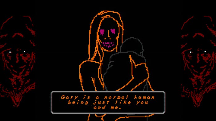
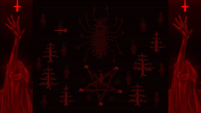
FAITH: The Unholy Trinity sees the aftermath of a botched exorcism lead down some terrifying paths filled with disturbing creatures. The limited ZX Spectrum visuals might incline some to think the game’s monsters aren’t all that scary, but through clever use of mood, voice, color, and rotoscoped animations, the game draws up feelings of looking upon things beyond human comprehension.
Game Developer sat down with Airdorf, the collection’s creator, to talk about how Spongebob Squarepants would inspire some of the game’s frightful encounters with its monsters, creating a sense of impossibility through mixing visual styles and dredging up fears of the unholy through the game’s disturbing use of text-to-speech voice.
The limited visuals of FAITH: The Unholy Trinity creates a compelling atmosphere and style for the games. What drew you to use this visual style, initially?
I've always loved those old chunky pixels from the era of classic 8-bit gaming. There's something about their use of color and abstraction—the challenge of representing something with so much technical restriction—that appeals to me. I think a lot of the charm of that era of games is lost now. The original design challenge I gave myself with FAITH was creating a compelling horror experience using just basic graphics (with a few surprises like the rotoscoped cutscenes). So, the Atari/ZX Spectrum/Apple II aesthetic was what I went for.

You create a great deal of disturbing imagery from this limited visual style. How do you make this style work so well to create unsettling things? Do you feel there's a natural strength to this style in creating horrific creatures and visions?
I think in the end it was good for creating "fear of the unknown" since representing the horrors of FAITH was a matter of only a few pixels. Throughout the development of FAITH, my goal was to get an "omg wtf is that" reaction from the player, which was inspired by a certain scene in The Blair Witch Project (1999).
As for making the style "work", it took a surprising amount of effort to not "over-produce" the sprites for monsters, environments, props, etc. I often found myself re-doing a sprite to make it less detailed and more ambiguous. As the player descends further into Chapter III, they'll notice that I started to get a little more crazy with the sprite work, just because the "madness" aspect of the game was escalating.
What thoughts go into creating some of your monsters? Can you walk us through the design process behind one of your creatures, from initial imaginings to finished monstrosity?
Honestly, it's usually a matter of just creating blobs of pixels in Photoshop and picking out the ones that look the coolest/most disturbing. I did like 50 of those when I first started work on Chapter II. A lot of them didn't make the cut, but some found their way into Chapters II and III. I try to stick to two colors maximum. Dark red usually means some sort of fleshy creature and dark grey is more of a "phantom"-type enemy. Once I find a design I think will work for a certain demon, I'll work on some simple animation frames and start the integration process in Game Maker.
The rotoscoped animations create a jarring sensation when combined with the normally-limited visuals of general exploration and play (I'll never forget the creature rushing towards me in the first moments of the original FAITH). Why did you choose to have these extremely smooth, realistic rotoscoped movements for creatures and cutscenes? What do you feel they added to the atmosphere and feel of the game?
The idea for the rotoscoped cutscenes came later on in the development of Chapter I. I was originally using highly-detailed still images like you see in the early seasons of Spongebob. I think when I was implementing the cutscene where Amy peaks out at you from under the bed, the original cutscene wasn't scary enough for me so I started experimenting with rotoscoping.
I think if FAITH didn't have the rotoscoped cutscenes or the text-to-speech audio, it wouldn't be so well-known! I think they add an "uncanny valley" effect. There's a critic's accolade in the trailer for The VVitch (2015) that says "It feels like watching something that shouldn't be possible" that I thought was really interesting and it sort of became my guiding principle when creating those cutscenes. They shouldn't be possible on that old hardware, yet here it is. Without straying into "breaking the 4th wall" territory, I think it adds kind of a "cursed media" vibe too.
We spoke with you a while back about Hatching and some of your other works. Did your work on Hatching and Earl's Day Off have any effect on how you created the visuals for FAITH III?
By the time I was working on Hatching, the visual style for Chapter III had already been established, so it didn't have any effect. With Earl's Day Off, I enjoyed breaking away from the pixelated style to focus on another game art style I love: the Nintendo 64 blurry upscaling/low poly aesthetic.

There is a very particular sensation that comes from your use of color in these games. What thoughts go into the color choices of characters, places, and scenes? How do you work with color to further unsettle the player?
I wanted FAITH to feel authentic to the era it was trying to mimic, so I used the original color palettes for the Apple II, ZX Spectrum, and Commodore 64 as guides for the color design of the series, especially in Chapter III. I made the decision not to shy away from bright, vibrant colors (which seem to be tragically absent from a lot of "modern" games). So, it sort of created an irony between the bright retro colors and the disturbing story, sound design, etc.
I also adhered to some color "codes"; the use of deep red, purple, and dark grey has certain meanings in the series. I also didn't worry too much about trying to be "accurate" with my colors; John has a blue house because he's blue.
The other element that adds to the game's atmosphere is your use of voice, from the eerie machine voices of the priest to the disturbing shouts of your monsters. What drew you to these particular sounds for the voices of the characters and creatures? Why do you feel these voices create a sense of dread in the player?
I think I first heard about those old text-to-speech programs from Peasant's Quest on Homestarrunner. I was originally using remixed Pokemon cries from the old games for the demon sounds. Using the text-to-speech voices just made the whole experience all the more disturbing. I think they're just "human"-sounding enough to be eerie.
Occasionally, players ask for subtitles for the demon noises but I like to keep them mysterious. It can be disturbing thinking you heard the demon say something, like hearing a cryptic message in static and garbled 8-bit noises.
You mention that you worked with "abandonware speech synthesizers". What challenges come from working with old speech synthesizers and incorporating them into a modern game? What good or interesting things came out of using them?
Not too many challenges. The emulated versions of the synthesizers I used make it easy to export to the file format I want. Those old programs are surprisingly deep, too. You can make the voices simulate different throat/mouth shapes, pitches, speeds, etc. You can even make them "sing", which is how I created the singing in the FAITH trailers.
Do you have any unsettling memories of playing ZX Spectrum games or other older 8-bit era games that inspired the look and sound of the FAITH titles? If so, can you share some with us?
Not really; I have fond memories of playing those old games. When I started on FAITH I was in completely new territory and had no idea if trying to make a scary 8-bit-styled game would even work. I saw some of Scott Cawthon's 8-bit style interludes in the Five Nights At Freddy's series and thought they were pretty cool and creepy. But, with very few exceptions, I don't think a full horror game in that style had been attempted. I appear to have been successful, and I'm very humbled by the positive reaction FAITH has gotten in these first couple of weeks since it launched!
Read more about:
Horror GamesYou May Also Like