Trending
Opinion: How will Project 2025 impact game developers?
The Heritage Foundation's manifesto for the possible next administration could do great harm to many, including large portions of the game development community.
As one of the best-known Korean developers in the West, Hyung-Tae Kim's art has drawn fans worldwide even before his games -- including Magna Carta and Blade & Soul were released outside of Korea. Here, he talks form, influence, and moving from 2D to 3D.

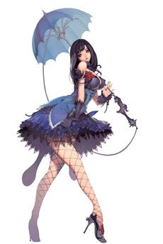
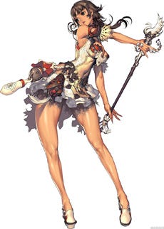
Hyung-Tae Kim is perhaps the best-known Korean game developer -- even if his name isn't known by all, his art is very recognizable, as seen in the later entries to the War of Genesis series, and Magna Carta for PC and PlayStation 2 and its sequel on the Xbox 360. His style exaggerates the female, while also promoting the masculine. His characters straddle the line between Japanese minimal lines and Western emphasis on musculature and detail.
I've long been impressed with his work, especially his willingness to go outside the constraints of human physicality to make appealing characters. All of his characters, male or female, are soft and curved in ways that make sense, even if they are not tied to real anatomy.
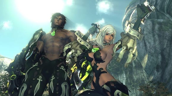
For Kim, it's all about flow, and in the past most of his actual art was relegated to 2D. Now that he's working on Blade & Soul, NCSoft's next big MMORPG after Aion, he has the chance to completely control his work in 3D as an art and technical director on the game.
In this interview, conducted in his native Seoul, we discuss his process, his thoughts on anatomy and character, and his influences.
Can you tell me, step by step, your process for character design? When you're designing one character, how do you go from envisioning that character to the actual process of making them into full illustrations?
Hyung-Tae Kim: First of all, you have to decide the direction of the character, in concert with the design teams. You have to know where the character will be used, and in what manner. And then I have to actually begin the sketch, which is the most difficult part of the process.
What I take into greatest consideration when doing my sketches is first, whether this style reveals the personality of the character, and then if it will be attractive in three dimensions. It didn't really matter when I was working on War of Genesis though, because it was 2D.
Then after the sketch is finished, we start the color planning, deciding which colors we want to use. If the process goes well, it can end in two days. Sometimes it can take as along as three weeks. Then for a final illustration, we would polish by zooming in and fleshing out all the details.
 Do you have assistants drawing in your style, or are all illustrations in your games by you?
HTK: Until recently, all illustrations were completely done by me. But for Blade & Soul, which is an MMORPG, it's a game that requires a lot of characters and a lot of design. So now there's a team doing our drawings. Besides me, we have eight artists working on the images you see.
And are they drawing your style, or adding elements of their own?
HTK: When we hire people, I try to recruit artists who naturally can understand and draw the kind of image I need. It's not that I need them to draw exactly in my style, it's more important that when it transitions into 3D it'll be up to my standards and fit my direction.
So at first the artist's style could be different, but since the beginning of the Blade & Soul project I've had everyone practice drawing these characters and images in a certain style. Everyone's pushing for the same end result with the 3D models. That's actually what I did from the beginning. I provided a 3D polygon model so that everyone had a specific goal to move toward, and the direction to get there. It's all basically an attempt to maintain a consistent style.
I've noticed with 2D illustrations in Korea that there's a more frequent use of vibrant color. I'm wondering if you have any theory why that is, why color is so well used?
HTK: One of the characteristics of Korean digital art is that it's pretty energetic. I guess that's something to do with the cultural background of Korea. Of course I can't speak for others, but in my case, I'm not really comfortable with a stable kind of picture, with something balanced, because what is average is so well-represented in reality. You see it anywhere you go. I want to express through my artwork something that's not possible in reality, something that cannot exist.
One thing that's very distinctive about your style is how you draw women. How do you approach this?
HTK: I'll preface this by saying that when you're drawing something that's related to culture or region, it's incredibly difficult, because trends change so often. This is the hardest thing to depict with character, for me.
For example, there are people who like strong characters, weak characters, innocent characters, feeble characters, on a region-by-region basis. But that sort of thing changes very often. It becomes very complicated. So I try to simplify everything by erasing all the cultural elements, and try to make it more internal or instinctive.
In other words, it's the natural identification of what we really like since birth, before cultural context. I try to exaggerate all those aspects and then tie it to some of the more complex or deeper emotions, and then just draw something that people will really like innately.
Is that "back to basics" approach why the women that you draw tend to have an emphasis on chest and hips? Kind of an Earth Mother element?
HTK: To put it simply, you have to first look at how the body is actually connected. Of course, the chest and hips sort of stand out a lot because they're, you know, the biggest parts I guess. But the most important part of the character is actually fat. Any character we create is composed of bones, muscles, and of course fat.
Despite the beauty of bones and muscles, those aspects tend to not be particularly feminine, and lend themselves to something more male. But if you focus more on the fat of a character, and then you sort of create a flow into the chest and the hips and form the body around it, how force and physics can change a body, including fat, it becomes more beautiful for people who can appreciate that innate nature. In books that explain the body, there aren't that many explanations of fat, so it's really hard to find this kind of information actually.
 I was wondering how much you pay attention to anatomy. Sometimes, it feels like you may stretch people a little bit, altering their actual skeletal structure.
HTK: I do try to exaggerate my characters, but only to the point of still being able to perceive them as human. But then I try to exaggerate those parts that people will find most attractive, like when a man looks at a woman, or a woman looks at a man. Especially, for example, as you mention, the pelvis or the hips in women. I do accentuate the bones and the fat around the body, which makes it a lot more attractive.
One problem that I have through this process is that when I exaggerate this to the maximum, the character starts to become inhuman. And then there's a clash between the two thoughts of what I'm trying to draw. I'm constantly having this tug-of-war between these two ideas when I'm making new characters.
I noticed that in Magna Carta, you also drew the main male character with feminine hips. Does your approach change for male characters as well?
HTK: That was just in the case of Magna Carta, because the main character was supposed to kind of make the audience feel a little awkward. That is why the clothing and also the anatomy of that character was more feminine than usual. I think that's not the most attractive element of male characters. I wouldn't draw a normal male the way I drew him.
What is the kind of essence that you try to bring out for male characters usually?
HTK: Of course, everybody knows that the attractive aspects of male characters are different when seen from the perspective of a man or a woman. One thing that people tend to miss is the importance of the waist. People say that the shorter the waist, the better it looks. But the actual thing is the more detail you add to the muscles, how the waist or stomach moves and how it changes when the muscles move, that's one thing that's really attractive when looking at a male character.
How did you wind up developing your style?
HTK: Well, I really took a lot of things from Japan, not only comic books and games. In my early days I really liked a lot of things from Japan. When I started studying art though, I actually preferred Western styles of painting. I tried to combine both that Western painting style with Japanese style content, and that's pretty much how I got here.
How do your goals change, if they do change, from 2D illustration to 3D model?
HTK: To be straightforward, it's not exactly that 3D is our goal. To be more precise, in 3D I'm trying to express the attractiveness of the 2D paintings that I made. By moving my art from 2D to 3D, I open up the audience for my work. In the past, my true artwork was only on the cover of the game-inside it wasn't necessarily my work. Now, I have larger audiences through actually representing my characters in my own way in 3D.
With 2D, it's obviously easier to direct the eye of the viewer because you're completely controlling what they see. With 3D, how do you make sure they see what you want in a character... Or can you even do that?
HTK: Once it becomes 3D, it is true that there are limits to the kind of structural exaggeration I like to insert in my characters.
It's especially hard to visually express what I want when it's put into gameplay, because it's not so much about looking cool, it's about how people can enjoy the game, how they play it. So what we try to do is simply input camera technology and light technology that can make the structure of the image as beautiful as possible.
What do you feel is the ideal background scenario for your characters? Is the background meant to be a main feature, or does it just accent the characters?
HTK: Regarding backgrounds, I provide the direction of the concept art. For the most part it's drawn by our specific background artists. In this case, more than with characters, I try to leave it to them rather than doing it myself. But I do try to set the background in relation to the culture and character of each race in the game, and once I provide the direction and the details of how it should be drawn, then the artists who are in charge of the background tend to work on it.
Would you ever be interested in making a game that's completely in 2D, where you would have complete control over how the characters would look?
HTK: I've been thinking of different ways to express my 2D art. One of them, of course, would be a 2D game. But I'm also thinking of what else I can do. I can't mention anything in detail though. Right now, the first objective for me is to shape Blade & Soul in my own style.

You have said that these characters are fantasy oriented. Sometimes these exaggerated, really attractive characters can create an unrealistic expectation for a player when they view reality.
HTK: Exaggeration of certain points is really important, but overall the character must be understandable. In other words, it must be human. The person who looks at it must be able to understand it. In some ways, this is the case with the art style of Japan, where the attractiveness of characters are sometimes symbolized.
Yes, it can often be idealized.
HTK: Yeah. When people see something, it looks really attractive, but they're not sure why. This is because the symbol of attractiveness is hidden within the character. I don't want to make that attractiveness as impenetrable as in the Japanese style.
When a person sees a character and thinks it's attractive, he'll know why it's attractive. It will be right there on the surface. I think it's alright as long as it's feasible. It doesn't really have to be able to exist in reality. But there does need to be a balance in between.
Do you have certain character archetypes that you rely on?
HTK: I try not to do that because the character becomes symbolized, which is something I'd rather avoid. But it would certainly make things easier. I think the reason is that I'm not just creating a character when I create these people. I'm creating a painting, a piece of digital art. There are times when we need a lot of flashy characters. So I can't just work from a template. You need these characters to have, well, character! This is really important to the quality of the game overall.
What artists do you personally admire?
HTK: Too many of them actually. For example, among painters, Jeffrey Jones, Range Murata, Masamune Shirow... but actually, the artist who influenced me the most was the illustrator of Lineage 2, Juno Jeong. I've known him for 20 years, since I was in middle school. His kind of painting and drawing have really influenced me a lot. We actually have painted together over the years.
This interview was originally published in Game Developer magazine.
Read more about:
FeaturesYou May Also Like