Trending
Opinion: How will Project 2025 impact game developers?
The Heritage Foundation's manifesto for the possible next administration could do great harm to many, including large portions of the game development community.
"We analyzed how Viewcones were used in the old games and decided on where we wanted to improve it. This also lead us to re-thinking some aspects of player detection in the genre."

Deep Dive is an ongoing Gamasutra series with the goal of shedding light on specific design, art, or technical features within a video game, in order to show how seemingly simple, fundamental design decisions aren't really that simple at all.
Check out earlier installments, including creating believable crowds in Planet Coaster, the challenge of creating a VR FPS in Space Pirate Trainer, and designing dynamic audio for destructible environments in Rainbow Six: Siege.
I’m Moritz, lead designer at Mimimi Productions. I’ve been working here since the early core of our studio emerged from our Game Design studies at the Media Design Hochschule in Munich. During our third semester we started developing early prototypes of our first big game game The Last Tinker: City of Colors, which we got to make after Mimimi was founded in 2011. Aside from that we have been working on several mobile titles.
Currently we are 16 people and our latest release is Shadow Tactics: Blades of the Shogun, a real time tactical stealth game (RTT) played from an isometric view in the vein of the Commandos and Desperados series.
In Shadow Tactics players control a squad of up to five different specialist characters to sneak and stealth-kill their way through large maps filled with enemy setups. These function as puzzles with multiple solutions.One of the most important tools the player has is the ability to display enemy vision in the form of a cone that we call Viewcones. The Viewcone has different colored areas that determine its behavior (more on that later).
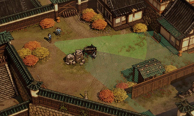
Figure 1: The Viewcone in Shadow Tactics, a thing of beauty.
For those of you who are interested in how this works technically lets me quote the man who built it, Frieder Mielke, our Tech Lead: “The basic principle behind the Viewcone calculations is shadow mapping. We first render a depth texture from the eye position of a selected character. When rendering the main camera we generate a mask that holds information for the various vision areas based in the previously generated depth texture (e.g. "full vision", "fully occluded", "crouch distance", "out of bound"). Using this mask we can color the Viewcone in a final full screen pass, where stencil buffer is used to exclude various objects from being rendered to and to add lightsource information.”
From a design standpoint we analyzed how these Viewcones were used in the old games and decided on where we wanted to improve it. This also lead us to re-thinking some aspects of player detection in the genre.
As many people do we defined a couple of design pillars for Shadow Tactics. Two of them are relevant when talking about Viewcones.
Keep the core loop intact: Commandos gameplay is still as fun today as it was 16 years ago. It is crucial that no matter which decisions we make this strong core stays intact. Shadow Tactics should create the same joy (read: incredible pain followed by satisfaction) these games did.
Improved Usability: While the gameplay is still fun, usability for these old games didn’t age quite that well (surprise!). Controls feel clunky, often there is lacking feedback and important information is not clearly communicated to the player. Shadow Tactics should feel like a modern version of the old RTT games.
Since the Viewcone displays enemy vision it is used to determine the space in a level the player can navigate through and interact in. Enemy setups can consist of up to four different types of space:
No Viewcone: Not hard to guess, in these areas players are mostly free to do as they please. They are typically where guards meet their untimely death. Players can either create them by using distractions, or enemies can be lured into them. Particularly reckless guards just walk through them on their own.
Dark Green Viewcone: Here players need to stay crouched to stay undetected. Any action that would cause their characters to stand up will cause problems. They are easy to traverse but killing guards is usually not possible here without a distraction.
Bright Green Viewcone: These areas are off limits. Depending on the chosen difficulty players can try to sprint through them fast enough without getting detected, but it is almost impossible to perform any actions here without getting into trouble.
Dotted Viewcone: These are used for bushes or high grass. Here player characters are always invisible while crawling unless an enemy actually enters the bushes (which they always announce with a voice line and only do when lured in there or searching for the player). We felt that this sort of “hard cover” was something that wasn’t used to its full potential in the old games and adding it allowed us to create a satisfying pace of feeling save inside bushes and being at risk while operating in the other areas.
The Viewcone is the single most important factor for designing enemy encounters in Shadow Tactics. Some guards move on patrol-paths, which means that usually these spaces change their state depending on timing. This is pretty basic, but I wanted to get it out of the way first.
No gradients or fancy stuff, but sharp edges and clearly defined areas are important when trying to play around the Viewcone in a pixel perfect fashion.
The Viewcone’s size mainly affects immersion, difficulty and level design.
At its core this feature can create immersion breaking situations that often are part of stealth games and thus partially accepted by the audience. Still it was important to not push it too far. While it is clear why an enemy can’t see a player character that’s crouching ten feet away from them when looking at their Viewcone, it still feels unnatural and stupid. We have all been there.
Larger Viewcones made this less of a problem. The closer you can get to your enemies without being seen, the more it feels like a gamey mechanic and can break immersion. Still having too large cones has a big impact on difficulty, level design and map size, so it took some time to find a sweet spot here.
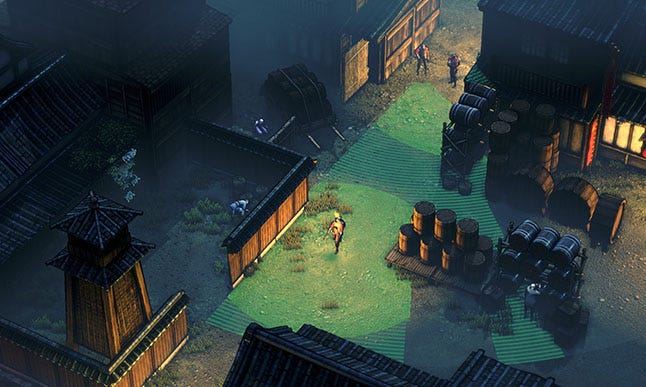
Figure 2: Night-levels use different Viewcone settings. Cones are smaller, the dark green area is very large, but light always creates a bright green area.
Consistency is also an important factor. We decided that all enemy guards should have the same cone size, movement angles and speed. Viewcones are only static in specific situations (like guards talking to each other). This way players can rely on how a cone will behave and can build on that foundation throughout the game without being surprised by a Viewcone suddenly behaving differently. They get better at using the feature to their advantage, which is a satisfying feeling. We also chose to keep this consistent between difficulties, so players who might start out on an easy don’t have to relearn core concepts like this when moving to a higher difficulty.
Now attentive readers might say: “But Moritz, you said there was no fancy stuff in the Viewcones. What about that incredibly fancy pattern in the dark part?” Let me explain! The reason for this is that as soon as the direct contrast with the bright area next to the dark area doesn’t exist, it becomes hard to see which color it actually is. This happens on high ground and if parts of the Viewcone get occluded by large objects or cover.
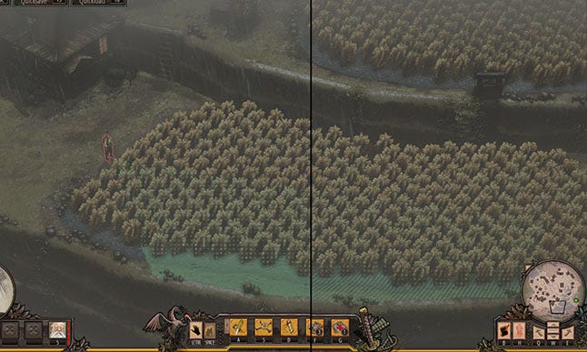
Figure 3: In the left picture I deactivated the pattern. This shows how hard it is to guess if the Viewcone is dark or bright. With the pattern turned on in the right picture it is clear.
Just like in the old RTT games we decided to only allow one Viewcone to be displayed at a time.
From a design standpoint there are two main reasons for this:
Information: Shadow Tactics is a game of almost perfect information. There is no fog of war, enemies don’t randomly spawn and their behavior is always predictable (as long as they aren’t actively searching for the player). Players can analyze a situation completely if they take the time to do so. Only seeing one Viewcone is the single half-hidden information when solving problems. Forcing players to memorize vision of guards beyond the first creates tension and makes the gameplay of working around Viewcones more intriguing.
Readability: A single Viewcone prevents the interface from getting cluttered and hard to read. While a huge amount of information might be okay for some players to handle, it will alienate others and look daunting on screenshots or while watching the game.
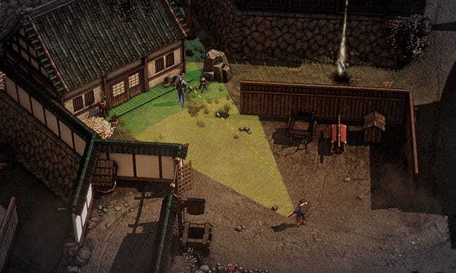
Figure 4: Hayato is being detected by one of the first guards in the first level. Noob.
Polishing the moment when an enemy detects a player character is very important to any stealth game. We iterated on this part a lot and I will go over the process and what we settled on in the end. This part is not only about the Viewcone itself, but also different mechanics and systems that were put into place… and then cut.
First let’s look at what actually happens when a player character enters a Viewcone and is about to be detected:
Sound: A unique sound-cue is played. This tells the player that they have been detected.
Focus: The enemy’s Viewcone focuses on the player character and is turned on automatically, even if another cone was selected. This instantly tells the player who detected them.
Slow Motion: The game enters slow motion to allow players to react better. I will talk more about the evolution of this feature later. Expect pain and failure.
Yellow: If the Viewcone was green it starts to fill with yellow beginning at the guard’s eyes. As soon as the yellow part reaches the player character the enemy actually detects them and will start shooting and sound the alarm. If a player character enters the yellow part guards instantly detect them. This is similar to a feature in Desperados, where Viewcones slowly turned yellow but making the yellow part actually move towards the player allowed for cleaner feedback to when exactly the enemy will recognize the threat. This allows players to better learn how the feature works and use that to their advantage.
Trial and error is an essential part of the genre and supported by allowing players to quicksave and quickload at all times. While it was clear that we wanted to keep this intact we were afraid of how it would resonate with gamers today. Sure, people who played the old games probably won’t have a problem with it, but will the newer generation be turned off by it? Will it be considered too old fashioned by reviewers?
We thought a lot about this topic and came to the conclusion that while we wanted to keep the quicksave and quickload as an integral part of the game we should try to give players more opportunities to avoid detection in the first place. The Yellow part of the Viewcone is also something that is in line with that philosophy and we liked how it worked.
Note: Adding a cool and flashy rewind-time feature was not only a huge challenge from a technical standpoint but also would have changed things we didn’t feel comfortable changing in our first game in the genre. We talked about it, but quickly had to dismiss it. It would have taken too much time and added too much risk for the benefits.
With this premise we started thinking about different features and here begins an odyssey of ideas that all had problems and were ultimately cut after lots of iteration. A painful process, especially for our coder Philipp Wittershagen who had to implement it. I’m sure he still has nightmares about…
This abomination was supposed to use cool ninja powers and prevent detection so players had to quickload less. Here is how it worked: Once a player character was reached by the yellow part of the Viewcone the game would pause and focus on the character. This already had one huge problem: Pausing the game in a moment of stress like this kills flow and feels bad, it always came unexpected and threw people off. Also, if what followed after the pause required players to make an input they would trigger those accidently, since many would just click around hectically to get away. (I mainly blame Diablo and MOBAs for this habit of hectic clicking by the way. Thanks a lot.)
Now to the weirder parts of Freeze Mode. I will go over the main iterations chronologically and quickly talk about what didn’t work for them:
Perform a single action: In this iteration you could perform a single action after the game paused. It was intended that for example you would duck when being in the dark area or be able to just take down a guard with a ranged attack, if he was the only one seeing you.
There were some problems, though. It turned out to be very powerful for some characters (who had great ranged attacks) and almost useless on the others. Plus very often there wouldn’t be a viable option that would save the player. You have been seen in the bright area and there is more than one guard? Well bad luck, now you can perform a single action and will still die afterwards. If a safety-net mechanic like this triggers, people expect it to be useful at all times, if it isn’t the mechanic is flawed. So we cut it and tried something else…
Teleporting inside circles: Here the idea was that your cool ninja characters could teleport away when being detected by using a smoke grenade and appearing somewhere else. This already had some flavor problems: Why would Mugen the samurai use smoke grenades and teleport? And why do all these characters keep their smoke grenades ONLY for being detected and don’t let players use them otherwise?
Of course we decided to ignore those for now and focus on the mechanics:
On detection a circle would appear around the detected character and players could click anywhere in this circle to teleport there. This would either place them into the dark area of the Viewcone and where they could duck down, or even move characters into cover. Of course players would just start using this to teleport into a guards face and stab them.
So we changed it from a circle to a cone that would only allow players to teleport AWAY from the enemy.
Again, there were some problems. It was useless in even more cases than the earlier concept (well, no save spot to teleport to? Boom, headshot.) and players spamming clicks would just randomly teleport their characters somewhere with them wondering what had happened. Displaying the cone also cluttered the interface.
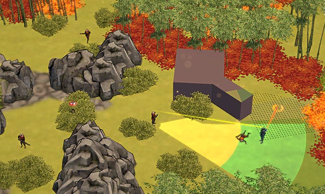
Figure 5: Freeze Mode: Players could teleport anywhere inside the dotted cone upon detection (in case you haven’t noticed, this is pre-alpha footage).
For some reason we still thought that teleporting was a good idea. Since moving anywhere around the character was too weird and complex we wanted to make this part simpler. On detection, a line would appear behind a character, showing where they had been before. Players could make them teleport anywhere on that line and sort of “rewind time” for that character.
Again, there were some problems. Feedback didn’t quite work out and players didn’t know what to do. I think we could have fixed that issue by iterating on it, though. Sadly there was one huge problem: If a player selected a character they hadn’t played with for some time the feature would feel very awkward. They of course wouldn’t remember where they had been before and wonder about how that weird line is generated. Additionally it allowed many abuses on snow maps. Here guards will follow your footsteps… I think you can imagine the rest. Let your footsteps be seen, make a guard follow you and teleport behind them. Sounds fair.
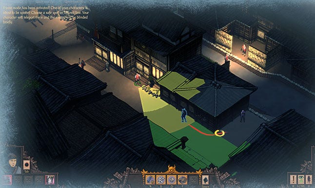
Figure 6: The Fake Rewind: Players could teleport to any spot the character had been at before (this is alpha-footage).
And for all of these iterations I didn’t even mention the weird things we had to put in for it to work when multiple characters get seen and the even more beautiful case of them being on different spots of the map. I still feel dirty thinking about that, it was a dark time.
Finally we realized that this wasn’t going to work. When you spiral down this path it is best to take a step back and look at what you actually wanted to achieve with your feature in the first place. We started out with these cool ideas and just went step by step further down the hole, always building on what we thought we learned from the previous failed attempt, but not looking past that. This did not allow us to tackle the problem with a fresh mind and just do something that is simple and clean. Don’t make the same mistake. Take a step back from time to time. In theory everybody knows this and so did we, but for some reason we just didn’t do it early enough and I think that happens far too often.
After looking at it from a new angle our creative director Dominik Abé suggested a simple Slow Motion that begins when you enter a Viewcone and it starts filling up with yellow.
Again, there were some problems. In the beginning we just slowed down the whole game to test the feature. This gave players more time to react. The problem here was that they felt like this feature punished them and was a disadvantage. They had the impression of being slowed down when trying to escape that yellow line moving towards them, which felt unfair. We tried to fix this by making player characters move faster than the rest of the game, but the problem still occurred. This also caused technical issues with animations and VFX.
Still we decided to stick with Slow Motion, since these problems were definitely something that could be fixed. It also seemed like the most simple and elegant solution we had come up with so far. Plus budget was another factor, at some point you just have to settle for something.
How we fixed those problems was rather easy in the end. It mainly involved fine tuning of how much we slow the game down and rebalancing the speed with which Viewcones filled up with yellow so it felt satisfying when trying to escape them in slow motion. We didn’t even have to make characters move at a different speed for this to work out. Some people still feel disadvantaged by the Slow Mo, though, so it is something we need to look into again at some point.
Since the Viewcone is such a core part of the game there were multiple aspects of it I couldn’t touch on in this article. I chose to focus on the moment of detection since this is one of the areas where we struggled the most and I felt talking about this specific process might maybe help others who are in a similar position with one of the features in their game.
For Shadow Tactics we tried to find one snappy feature that would create a single powerful solution and could instantly be triggered when any player character was detected and miraculously get them out of trouble. What we ended up with instead is a feature that slows down the process of detection and gives players more time to react to maybe solve the situation in a creative way. This perfectly fits what the game is about and it is something that we would like to iterate on in the future.
I’m sure that there is much to improve when talking about Viewcones and the moment of detection.
For future games I would love to try extending the period before detection actually has a consequence (for example the alarm is sounded) instead of only looking at the moment of detection itself. There are many possibilities to do this especially when looking at guard-behavior. This adds a new dimension that allows players to actively stop disaster from happening, which is a very satisfying feeling.
You May Also Like