Trending
Opinion: How will Project 2025 impact game developers?
The Heritage Foundation's manifesto for the possible next administration could do great harm to many, including large portions of the game development community.
"So many of the established smoke and mirrors techniques you use in level design just didn’t work for us. We actually had to put full environments behind the curtain, so to speak."
June 2, 2016

Author: by Maciej Binkowski, Bartosz Kulon, Paul Milewski
Game Design Deep Dive is an ongoing Gamasutra series with the goal of shedding light on specific design features or mechanics within a video game, in order to show how seemingly simple, fundamental design decisions aren't really that simple at all.
Check out earlier installments on the the action-based RPG battles in Undertale, situational awareness and player frustration in GRIP, and the capital ship invasions in Dead Star.
Also, dig into our ever-growing Deep Dive archive for developer-minded features on everything from rocket jumping in Rocket League to the one-hit kills in Titan Souls.
Maciej Binkowski, lead game designer, Dying Light
Bartosz Kulon, lead gameplay programmer, Dying Light
Paul Milewski, PR manager and marketing coordinator, Techland
Techland. Founded in 1991. Company started off selling translation software and distributing Western games to the Polish market. Creators of Call of Juarez, Dead Island, and Dying Light franchises. 300+ employees. (Studio locales: Warsaw, Poland; Wroclaw; Poland; Vancouver, Canada)
Binkowski: So when we sat down to design Dying Light, very early on we decided we wanted to remove those pesky artificial barriers that often frustratingly appear in FPP games. For example, knee-high fences that you need to walk around. A stack of boxes that anyone in real life could lumber up, but apparently not my highly-trained video game character. We wanted none of that.
Our aim was to have a real sense of freedom that along with our world, constantly made the player ask, “Should I fight or should I avoid this?” For us, clever and evasive movement needed to be just as valid as charging in and smashing everyone in your path. So the idea of a character being adept at parkour was a natural fit, and from there we set about actually making it.
"It was a level design nightmare. It was never enough to cover all the possible approaches to an objective, but it was also completely unmanageable."
We had a couple of ideas floating around on how we could potentially build the parkour system, but there was one we gravitated to quite early on. Basically anything that looked climbable will be climbable. The method required our level design team to place interactive hooks on all the various climbable surfaces like ledges, walls, barriers etc. Some of it was streamlined, but a lot of it was manual placement. As you can imagine this design turned into a quite a mess the further we went into it.
Our ambition was to have a game that was open world through and through. We wanted to avoid linearity and add in a grand sense of verticality too. So very soon we had more than 50,000 of these interactive hooks on a map that at the time was about one-fourth the size of what we wanted to ultimately create.
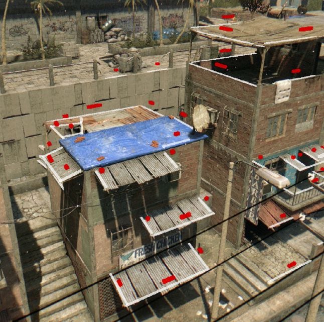
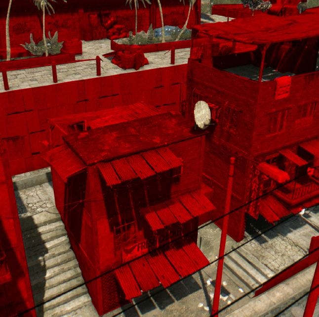
Before and after. The red dots above indicate “hooks” in the initial level designs. The red areas below represent climbable areas after the Natural Movement system was implemented.
It was a level design nightmare. It was never enough to cover all the possible approaches to an objective, but it was also completely unmanageable.
Any changes in geometry or level design meant adjusting the hooks and paths we assumed players would take. On top of that we had to store the location of every single hook on the map. At that time we still considered releasing our game on old-gen consoles. We were constantly running out of memory.
Eventually we realized this was going to be impossible. We’d hit a major roadblock and were struggling to figure out what to do next. Thankfully our lead gameplay programmer Bartosz Kulon came up with a killer idea and prototype to back it up.
Kulon: The idea that eventually became our Natural Movement system was one that scans the environment in real time and decides if the player can climb or interact with the objects based on set of criteria. It considers the whole area around the player to determine what kind of actions can be performed — i.e. climb, jump over, slide under etc. The same system would then analyze the surrounding geometry, player parameters (like speed and position) and decide what potential animation to select as the best possible action on-the-fly.
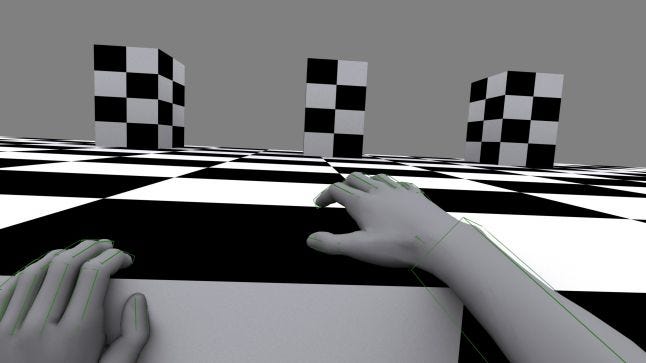
Early prototypes were ugly, but they showed the system had potential. It wasn’t as memory heavy so we freed up a ton of processing power to use in other places. We felt like we’d finally cracked it. All it needed was a bit of fancy polishing work and presto right? Then came the multitude of problems…
Binkowski: To put it into perspective, our Natural Movement system required about a year and half’s worth of work to get it to where it is now. Iteration after iteration. Test after test. It was a lot of work because while the solution was great it created a set of hurdles we never considered prior. We’d created a bit of a Pandora’s Box because pretty soon various teams were pointing out their new challenges thanks to what we’d created.
For example, the new movement system threw quite a curve ball at our level designers because now players could reach places they previously thought would remain unreachable. Rooftops, backyards, courtyards etc. We now had to populate all them with objects that made them both look the part and made them worth exploring.
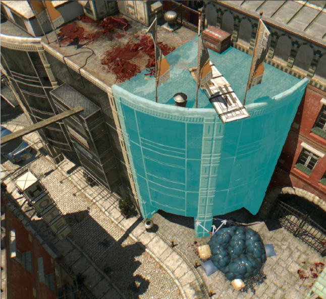
So many of the established smoke and mirrors techniques you use in level design just didn’t work for us. We actually had to put full environments behind the curtain, so to speak. Many of our quests also had to be rewritten from scratch because the path players travelled from point A to B was no longer something we could predict in the slightest. They could approach their objectives from multiple angles and the potential of them deviating along the way skyrocketed. We already had a lot emergent gameplay elements built in, but now that getting there was easier and fun, it was happening way more.
"So many of the established smoke and mirrors techniques you use in level design just didn't work for us. We actually had to put full environments behind the curtain, so to speak."
But don’t get me wrong. The level design team loved the new system. It freed them from being hook caretakers and let them focus on creating much more creative environments, locations and puzzles.
Then the animators came knocking. They found out that without strict control over what the player could grab and climb on, many of their existing animations were prone to clipping through objects. So many of these animations had to either be redone or made from scratch.
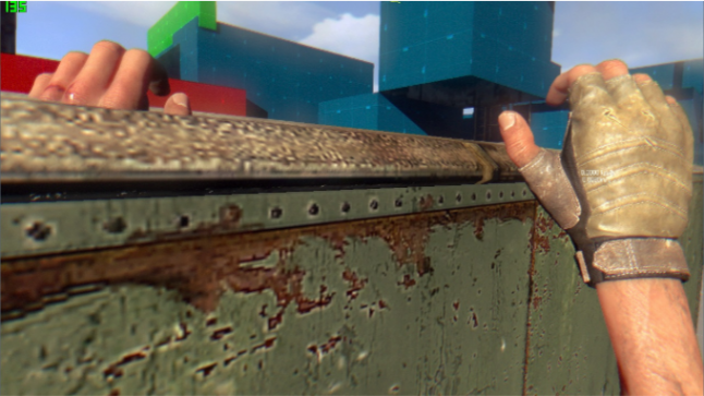
A clipping issue in action
More worryingly though, a round of playtests revealed a major immersion-breaker to them. Movement was now an active task that we were encouraging through our level design, our gameplay and our game mechanics. Players were running, sliding, jumping and climbing a whole lot more. But this ramped up use showed that our movement animations were actually taking away far too much control from the player.
Each animation basically locked the player in until it had played out in full. And since players were now stringing multiple moves together in very rapid use you created this kind of traffic jam feeling. It was this odd disconnect where you didn’t really feel like it was you doing these fancy moves. It was the game doing it for you, and you were just a passenger along for the long ride.
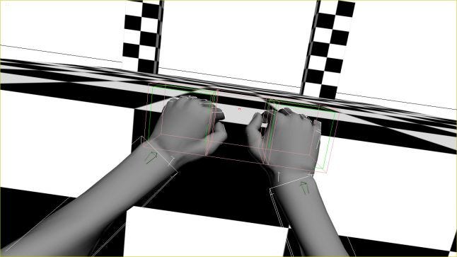
So we shortened the animations as much as we could. It was a lot of back and forth trying to find a sweet spot where the animations still looked good but also finished quickly. While this helped a lot it still felt like you as the player was triggering a sequence he or she had no part in besides pressing the button. Then someone came up with the simple but brilliant idea of letting the player look around during the animations. Just release the camera so it no longer centers and locks during the animations. It seems like a simple trick but the difference was really tangible.
Kulon: I also recall how our AI guys had to rethink quite a few things. Our player was now too agile and enemies had no chance to keep up, let alone be any sort of threat. So we had to program climbing and more advanced chasing behaviors into the various enemy types. The higher the threat level, the more agile they needed to be so it wasn’t just a simple upgrade across the board.
The attacks also had quite a bit of an overhaul. Before, all our enemies were trying to hit the player. That was their primary attack. But for someone as agile as our character, a hit to the back of the head from the basic biters meant you just quickly moved away. So there was never ever really any reluctance to approach the basic enemy types.
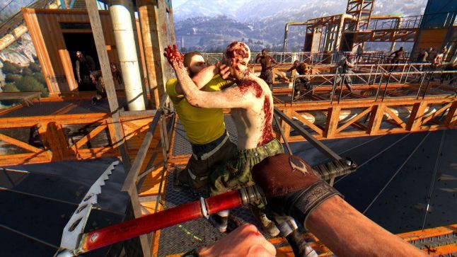
So our game director Adrian Ciszewski came up with a great idea that really added to the threat of basic enemies, curbing this over-inflated feeling of player invincibility we still felt was present. We changed their primary attack from swinging and hitting to grabbing and biting. This now became a direct threat to your greatest weapon – movement. These enemies would pin you down and lock you into a very in-your-face encounter, so you had to really think twice about just charging into crowds of biters since your ability to out-maneuver them had a severe Achilles heel.
Then of course, there were the ways enemies spawned. The player could now basically be anywhere on the level, and our old system often had zombies appearing out of thin air. So we set the system that enemies often spawn behind the player, but not in front. This works great in single player, but not so great in co-op. If you had players looking in multiple directions the system wasn’t able to spawn anything in the vicinity.
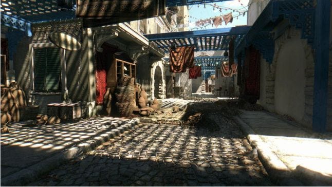
So we created certain environmental spawn “scenarios’’ that made logical sense – enemies would come out from houses, from behind doors, out of vans, out of sewer canals. For the Dying Light: The Following, the expansion that’s set in the countryside, we have fields with high grass, forests and abandoned houses. Our design idea of having fast, viral zombies charge at you from distant locations because you made too much noise also turned out to be quite useful in this case.
Binkowski: Motion sickness was another major hurdle. I recall how after one Gamescom showcase, we had a journalist from Polygon contact us saying that after she played Dying Light, she felt really sick and that she felt that way for the rest of the day. So, not great.
We knew then that we’d have to crack this problem relatively soon before the movement system was built in such a way that we’d be undoing months of hard work. We ran a multitude of tests and commissioned an external study to try pin down the problem. A lot of it came back as “Well it could be this but no guarantee,” so again, multiple iterations and a variety of tricks got us to where are today.
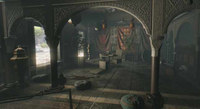
We worked with the motion blur levels, the movement of the camera and the positioning of the aiming reticle. FOV tweaks came into play and using a variety of screen filters were also tested. An odd obstacle with this was that most of us on the dev team didn’t actually get motion sick, so it was hard for us to really understand the problem, let alone immediately see if our efforts were working.
Kulon: Despite all the problems, the effort paid off. The system is touted as one of the key things that really makes Dying Light fun, and works in such a way that feels precise and intuitive. One of the biggest compliments we receive is fans saying that after playing Dying Light, other FPP games feel oddly frustrating with their restricted movement. We created a feature that many people felt ought to become the norm.
Are you a developer interested in contributing to Gamasutra's Game Design Deep Dive series? Email editor-in-chief Kris Graft: [email protected]
You May Also Like