Trending
Opinion: How will Project 2025 impact game developers?
The Heritage Foundation's manifesto for the possible next administration could do great harm to many, including large portions of the game development community.
"Rather than looking back at the past with retro pixel-art styles, I want to apply modern techniques and technology and see what new visuals can be made." - Jesse McGibney, Creative Director at Alientrap

Deep Dive is an ongoing Gamasutra series with the goal of shedding light on specific design, art, or technical features within a video game, in order to show how seemingly simple, fundamental design decisions aren't really that simple at all.
Check out earlier installments, including creating tension in Card Thief, achieving seamless branching in Watch Dogs 2’s Invasion of Privacy missions, and creating the intricate level design of Dishonored 2's Clockwork Mansion.
I’m Jesse McGibney, creative director of Alientrap Games. Founded in 2009, Alientrap has produced 2d platformers Capsized and Apotheon, 3D sandbox games Modbox, Autocraft, and Maximum Overrride, and we just released our latest space-shooter roguelite, Cryptark.
I attended art school at Sheridan College in Oakville ON Canada to get my BAA in Illustration, but making video games was something I always wanted to do. During my final year of classes, I was contacted by my old childhood friend Lee Vermeulen (then attending the University of Saskatchewan) who asked if I was interested in doing some artwork for his final thesis game design project in Computer Science.
Coincidentally, I also needed to do a thesis project to graduate, so we partnered up and began making Capsized, a 2d platformer/shooter featuring a jetpacking space man. After school was finished, we decided to keep developing the game and try to release it on Steam. Capsized ended up succeeding well enough that here we are, almost 8 years later and still making indie games.
As part of a small team, I perform a lot of jobs on the creative side of game development: conceptualizing, production art, writing, game design, and all the little things in between. For Cryptark, the team was expanded to include artist/animator Ariane Laurence and programmer Graeme Collins, and with our skills combined we were able to push the visual design of the game in some very cool directions!
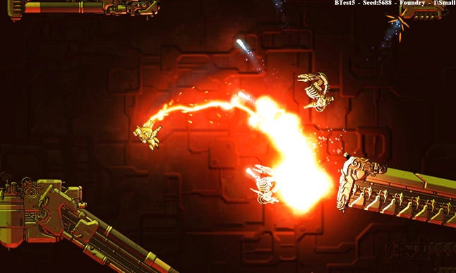
In Cryptark, making money by scrapping spacecraft is the name of the game! You and your motley crew of mercenary privateers will have to blast into heavily defended alien derelicts, survive waves of cyber-skeleton attack drones, and surgically pick apart security systems with strategy and absurdly weaponized mech-suits (all while staying within budget of course)!
My challenge as creative director was to figure out how to bring the world of Cryptark to life, solve a series of new design problems, and make sure it was visually unique amongst the plethora of other fantastic looking indie games. Our previous game Apotheon was wholly based on Greek mythology and black figure pottery art, and so Cryptark would be a massive stylistic change (though it adhered much more closely to my own personal art style).
I’ve always held a strong belief in the advancement of 2D game art. What would 2D games look like now had the shift to 3D not taken place in the 1990s? Rather than looking back at the past with retro pixel-art styles, I want to try to apply modern techniques and technology to the medium and see what new visuals can be made.
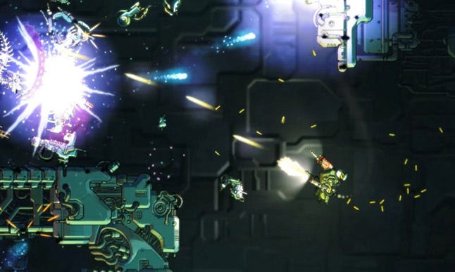
At it’s inception, we knew that Cryptark would be about boarding procedurally generated levels with a heavily armed player character. A small but powerful intruder trying to take down an overwhelmingly dangerous fortress from the inside. There were also a few basic tenets that we knew we wanted to adhere to which informed the art.
The game be set in zero gravity, with full freedom of movement and aiming. This was a reaction to our previous platformer games, where creating enemy AI and pathfinding was problematic when gravity is concerned. Getting enemy characters to navigate a complex environment is hard enough even when they don’t have to worry about jumping, climbing, and falling! Setting Cryptark in space was the obvious answer, but we also toyed with underwater environments.
Even though the game played functionally like a top-down shooter, a side-on view would be preferable. Unless a game is focused on characters with interesting top-down shapes (like spaceships, tanks, or other vehicles), it can be extremely difficult to make them interesting or readable. Looking straight down onto the top of a protagonist’s head and shoulders doesn’t give a lot of design opportunities.
Level assets had to be designed in such a way as to mitigate patterning or noticeable tiling in the procedural generation.
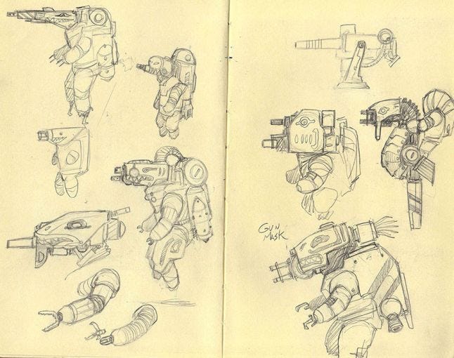
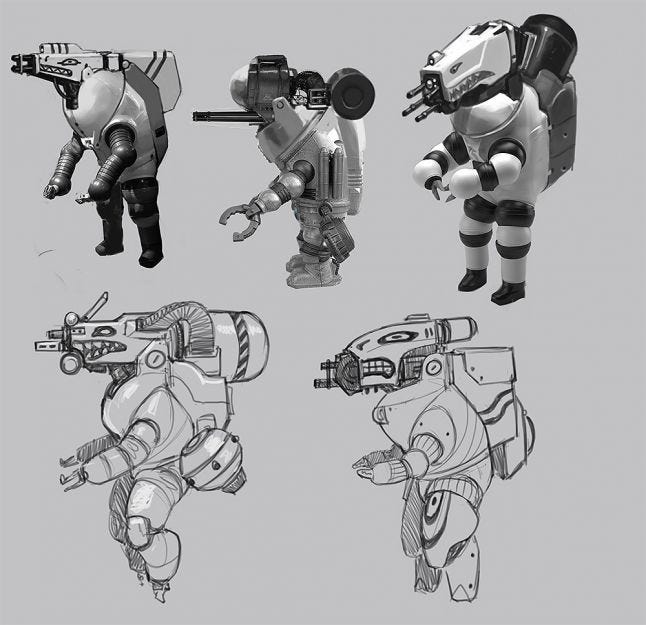
These are some early concept sketches for the player character. I wanted something more relatable than a spaceship or boat, and it had to be something that could reasonably infiltrate inside another spaceship for boarding actions, so a sort of mech-suit made a lot of sense. We wanted the player to be able to fire multiple weapons at a time without having to switch between them, so it was important that all the designs kept this in mind by keeping the weapons all visibly mounted. I drew on a lot of deep sea diving suits for inspiration, combined with more contemporary military vehicles. Anything with shark nose-art is cool in my book.
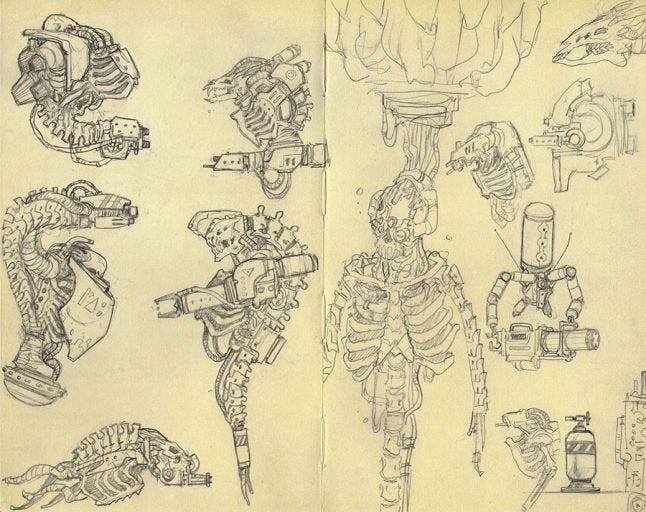
For the enemy designs, I was immediately referencing things like Giger’s Aliens (or more specifically, his Space Jockey), Warhammer 40,000 and Doom for ideas on biomechanical gribblies and overwhelming detail. Just shooting up regular “aliens” is commonplace (and we already did it with our first game Capsized), so I decided on making all the aliens creatures long deceased and puppeted about by their still-functional cybernetics. Doom had cyber-demons, so I opted for cyber-skeletons instead (my all time favorite monster is the Harryhausen Skeleton warrior). Incidentally, this also helped name the game Cryptark.
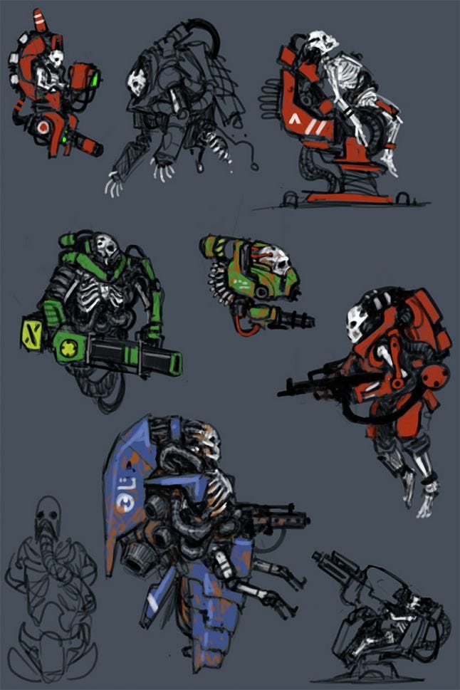
These early sketches had more humanoid operators before we had really committed to the alien themes. Soon I shifted to more bestial skeletons, letting me create a whole host of bizarre combinations of spinal cords and robotic monstrosities.
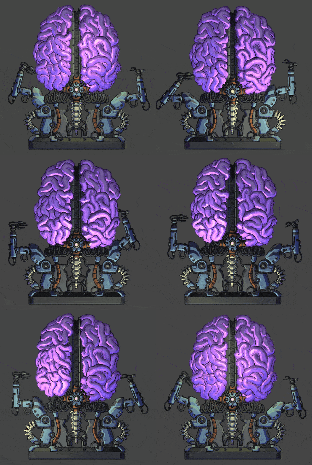
The organic/mechanical themes carried over into the Security System designs as well, becoming the metaphorical (and sometimes literal) “organs” of each space ship.
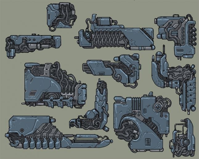
Hyper detail was one thing I wanted to keep consistent for the level aesthetics as well, making the derelicts more like tangled metallic forests or inexplicable computer brains than any sort of identifiable space ship. The complex and asymmetrical level elements were important to help hide any sort of tiling or patterning inherent in any procedural level generation. Each part is modular and can be bolted together in different ways, overlapped, combined, flipped, and rotated to help prevent any of the levels from looking repetitive.
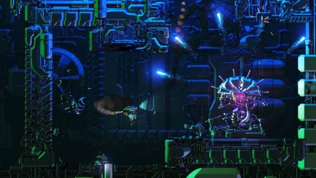
The barrage of visual noise helps to link all the separate modules together without visible seams, while we were still careful to maintain player readability through contrast and light sources.
To push Cryptark’s visuals farther than just 2D sprites (high res though they were), I started trying to think of modern techniques to make the artwork “pop”. In our previous games, we learned that dynamic and coloured lighting did wonders for a 2D game, helping to give a sense of space to the environments. I had seen a few other indie games do interesting things with bump or normal mapping, but they were usually simpler pixel-art or 3d/photogenerated. The idea of making 2D sprites “faux 3D” by using dynamic normal lighting seemed like a novel idea, and we set about trying to make it work for Cryptark.
I discovered a program called Sprite Lamp which generates and previews normal maps. My original tests tried to generate normals based off a single height map, but given the complexity of the artwork it didn’t produce the results I was hoping for. Everything ended up looking too flat and had a “plastic wrap” effect to it, rather than real depth. After a few more failed trials, I came to the conclusion that there was no simple shortcut to creating good looking normal maps, it would take raw elbow grease.
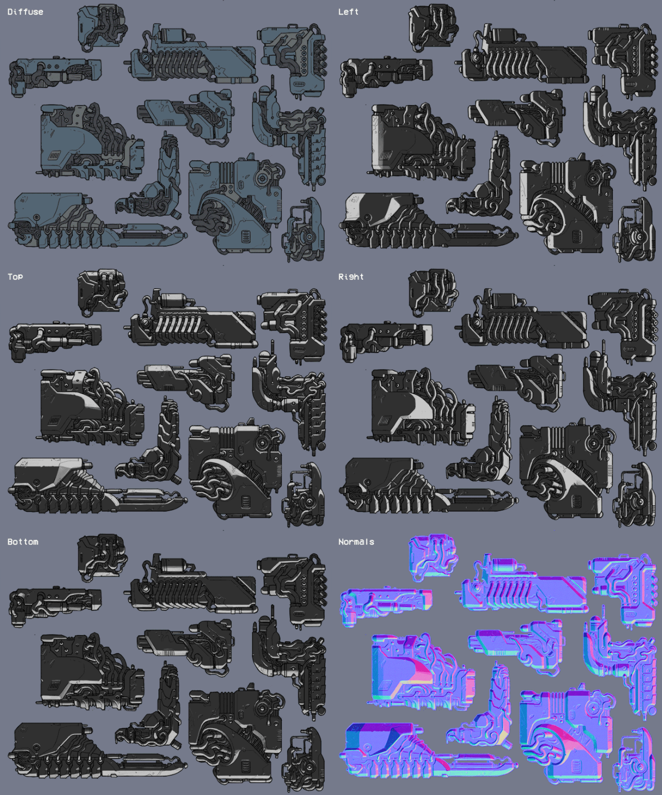
Each and every game asset in Cryptark uses a base diffuse image and three hand painted light channels for up/down/left/right light sources. To preserve our sanity, the lighting is painted in just two tones with no gradients.
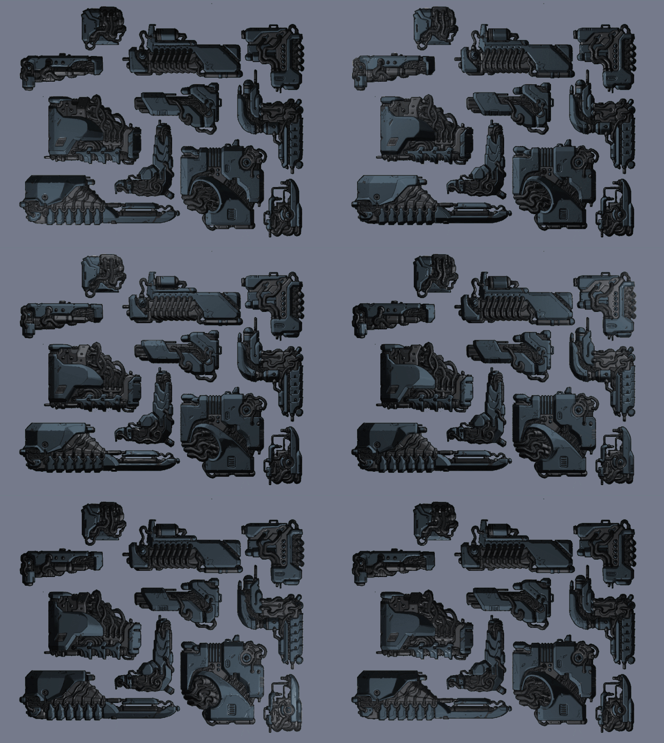
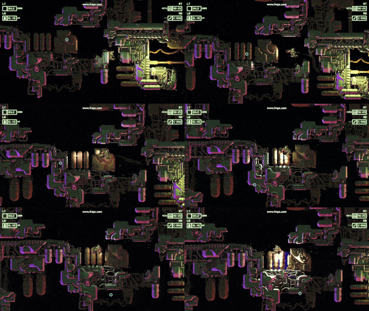
The finished result creates something that has eye catching depth, reacts to dynamic lighting, and has a unique faux 3D look, without losing the hand drawn feel. Additional glow effects were added with specular maps, especially useful for helping enemies pop out from the background.
While the core game visuals were all coming together nicely, we wanted to add a narrative layer to help give the player’s actions context and have a framework to hang story and tutorialization on. To contrast with the grimdarkness of battling undead alien cyborgs, we wanted the narrative elements to be a nice light hearted break between the tense and claustrophobic levels.

To promote the roguelite and economic systems of the game, we decided that the player would be part of a privateer crew; plucky space pirates looking for a big score.
A cast of colourful characters was designed taking inspiration from space-adventure fiction like Star Wars. All the aliens are kooky humanoids, wearing clothes, smoking cigarettes, and wouldn't look out of place as some kind of muppet.
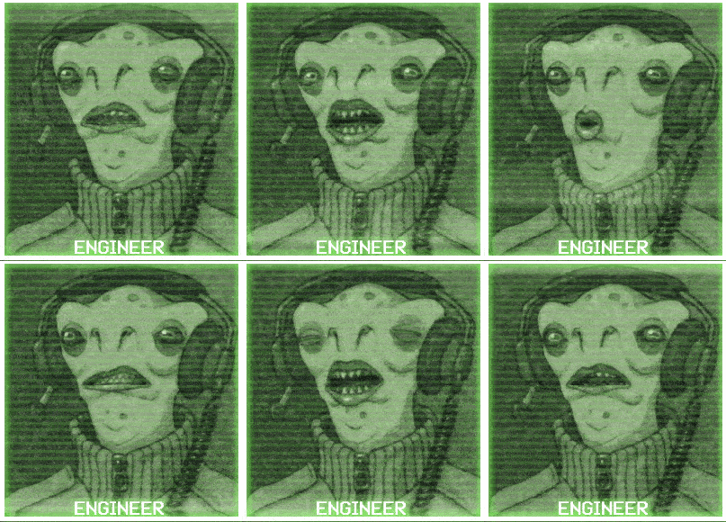
We used fully voiced characters for Apotheon and had a fantastic experience with the process, using Toon Platoon Casting to organize actors and direction. For Cryptark our animator suggested we go one step farther and add full lip syncing to the animated character portraits. Just like with the normal mapping experiments, we found that there were no real shortcuts to take. Trials with automated lip syncing software gave suboptimal results, or required extensive reworks (accents or exaggeration proved especially troublesome). The best results were gained by syncing each voice line by hand using Spriter (an animation program which can import and play audio on the timeline). A time consuming process, but worth it in the end.
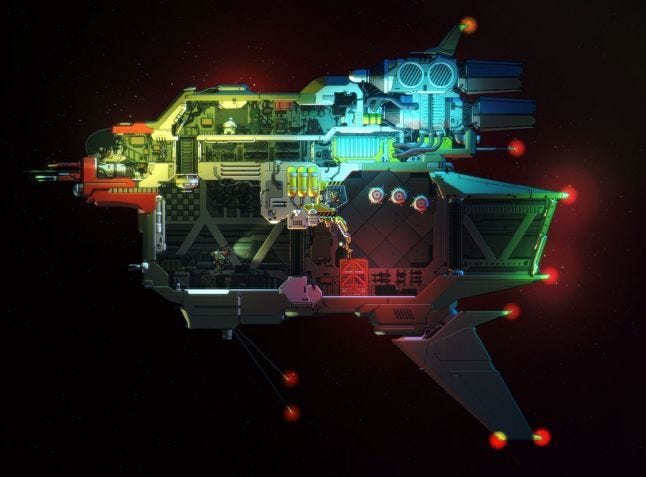
Alongside the talking character portraits, we made sure to establish the player’s place amongst their crew. Each level starts off with the player’s mech suit inside a detailed cross section of their mothership, complete with sleeping areas, armoury hangar, and tiny ingame versions of all the characters. The player isn’t just going from level to level alone, we really wanted give them a sense of a homebase.
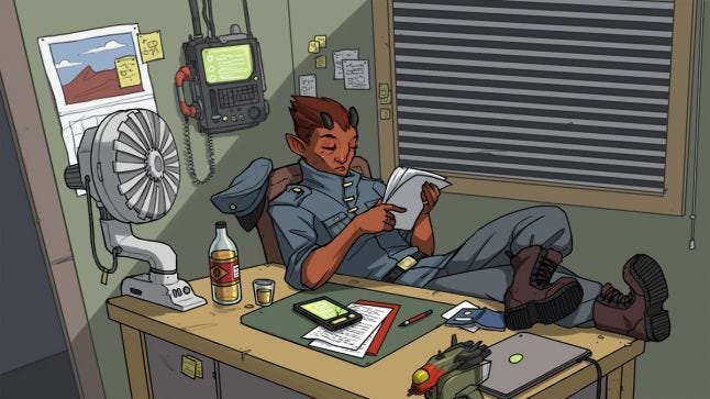
For narrative set up and closure, I created a set of comic-style cutscenes to quickly get the player up to speed with the setting and story. Returning to a more familiar style let me stretch my artistic legs and inject a bit of life into the characters that might not otherwise be shown ingame.
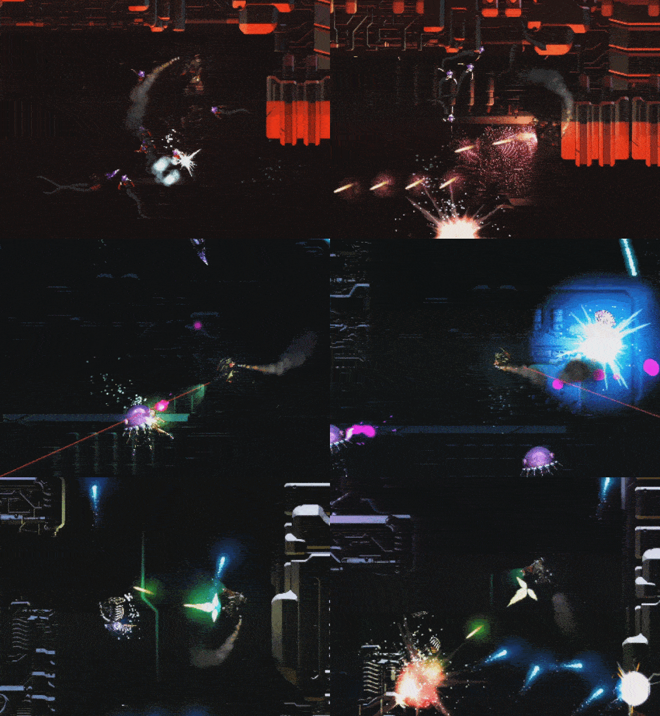
All in all, Cryptark has been a great learning experience to create a strong visual style that both looks unique and compliments the mechanics of the game. We set out to achieve something that we hadn’t done before and break away from the sort of design challenges our previous games had given us. While attempting to apply modern tricks and techniques to 2D sprite art, we quickly found that there was no replacement for hard work, but the end results hopefully speak for themselves!
You May Also Like