Trending
Opinion: How will Project 2025 impact game developers?
The Heritage Foundation's manifesto for the possible next administration could do great harm to many, including large portions of the game development community.
The second in Gamasutra's 'Game Design Essentials' series looks at the roots and design lessons of 'open world games' - titles in which the player "is left to his own devices to explore a large world" - from Adventure through Metroid to Grand Theft Auto.

[The second in Gamasutra's 'Game Design Essentials' series, following '20 Difficult Games', looks at the roots and design lessons of 'open world games' - titles in which the player "is left to his own devices to explore a large world" - from Adventure through Metroid to Grand Theft Auto.]
When we discuss "open world games" in this article, or sometimes "exploration games," we mean those games where generally the player is left to his own devices to explore a large world. What all of these games share is the seeking of new, interesting regions at whatever time the player deems fit. No force forces the player's motion into new areas. There's no auto-scroll, and there are no artificial level barriers.
A couple of games, such as Air Fortress, push this by offering many mazes, but they are more like many individual games than one large map. One of these games, Cadash, is presented for contrast, but technically fills the description. Most of the games take closely after Metroid games, or are one of them. Fully half of the games here contains substantial side-view platformer elements.
At the core of the open world game is consumption. Once a place is seen for the first time, it cannot be unseen and seen again. To an extent, the game is a maze, and once the whole thing is seen the game cannot be played the same way again. Perhaps it can be played for a good score or a good time, but that's a substantially different kind of experience.
Some games attempt to offer replayability through randomization. Roguelikes and strategy games in the mold of Civilization do this. Some allow the player's state to vary, allowing them to reach a given point in the game world in a variety of ways, each with its own implications for the situation found there. However, no game in this list uses randomization in this manner.
Some particular comments on the games that were picked for this list:
1. As with all such lists, some things had to be left out. Morrowind and Oblivion are particular games in which exploration plays a prominent role, and their absence, or that of any other game, should not be taken as a slight against them. There are other reasons they are not mentioned here, one of them being that I think it's best to possibly save them for a later article on RPGs.
Also notably absent are any adventure games, either textual or graphic. This is also not intended to short that genre. Also missing is the notable Commodore 64 game Phantoms of the Asteroid, but it was covered last time. Another Commodore game that could make the list is Spindizzy, but the fact is I don't think I have enough experience with that game to write well about it.
2. As with the previous article, 'Game Design Essentials: 20 Difficult Games', this is not intended to represent the best open world games, or the ones that are most "explore-y," although some of them are pretty nice. The games are chosen for their instructive qualities and general interest, not to compare them using a meaningless yardstick. They're here because I could illustrate something important using them as examples.
3. Some out there in Internet Land snarked, concerning the previous list, that it was biased towards older games. Yes it was, and I make no apologies. Older games tend to have more elemental designs, presenting their mechanics strongly rather than submersing them between a sea of what a game is "supposed to be." This is particularly useful for explaining and highlighting design conventions.
The first action-adventure game.
Published by Atari.
Designed and developed by Warren Robinett
Platform: Atari 2600
Length: Short
Of Note:
From a design standpoint, watch for the fact that, on a system with 128 bytes of RAM and completely on-the-fly, raster-based graphics, each of the objects in Adventure is still more interesting than anything contained within 99% of current games. It is the most scathing indictment of "modern" gaming possible.
Further: Everyone knows, by now, about the famous easter egg. In case you don't: on higher game variations, there is a one-pixel-size dot in a locked-off room that's the same color as the background. Use the bridge to get into that room in order to pick up the dot, then take it to the room that has a black line on its right-hand edge and drop it. Bring enough other objects to that room and the line will flicker. At that time, you can move through the wall by pressing against it to see a graphic of Warren Robinett's name. Consider what percentage of the game's ROM is taken up by that graphic!
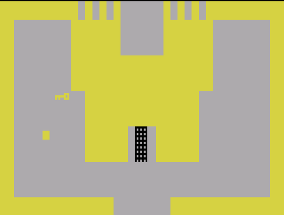
The Game:
That anything other than Pong could be made on the Atari 2600 is rather incredible. By default, the system had four kilobytes of ROM space and 128 bytes of memory. Its graphics capability was more primitive still.
Atari's developers, at the time of the system's heyday, amused themselves with trying to push the system farther and farther. The creator of Adventure also wrote a BASIC interpreter for it. It was just barely useable, but it worked. Someone else wrote a chess player for it. The system is so challenging to write for that in recent years 2600 programming has become something of an extreme sport for geeks.
The 2600 was designed to play Pong-like games, but as is often the case, amazing things are possible if no one tells you what can't be done. So it was that Warren Robinett, despite having been told by his bosses that the project was too difficult to even attempt, decided to condense Crowther and Woods' classic text adventure, Adventure, to the system.
He didn't succeed in porting it, or even really capturing its flavor, but that's okay because the resulting game is probably the Atari 2600 game that stands up the best today. Even Pitfall II isn't quite as fun to play today as it was when first developed, but Adventure is still quite entertaining to run through for a few minutes.
The player is represented by a square, and his abilities can be summed up as being able to:
Move around.
Pick things up by running into them.
Drop things by pressing The Button.
Return to the start location (by pressing reset, useful if eaten).
Get eaten by dragons. (Actually, the player doesn't have to do anything for this to happen. It more or less occurs on its own.)
Yet look at all that can happen:
Castles can be unlocked, by touching their doors with the right key.
He can also re-lock doors the same way.
Mazes can be explored, by moving around them.
Dark corridors can be explored because the area around the player lights up.
Dragons can be killed by touching one with the sword.
Some dragons are also afraid of things. The yellow one is afraid of the yellow key, and it can be used to chase him off.
The bridge item allows the player to pass through any horizontal wall it covers, and is used by dropping it in the right place.
The bat steals items, carried or not.
The bat can also move dragons around, sometimes producing moments of sudden peril.
Since the bat behaves randomly, he might also steal away a dragon that's chasing the player.
The bat might even bring a useful object to him.
The player, tiring of the bat's antics, can pick up the bat himself and carry him into a castle. If the bat or a dragon is inside a castle when its door is locked, it's trapped there!
He can use the magnet to pull objects through walls. Again, the magnet works entirely by proximity.
If the player gets eaten, and the dragon gets picked up by the bat, the player gets carried along, treated to an aerial view of the game world. (It's not too useful, but is interesting.)
Finally, the player can win the game by bringing the chalice to the Yellow Castle.
Making the game's triumph complete is the random adventure mode that scrambles the locations of the objects at the beginning of play. It's been noted that one game in eighteen is unwinnable in this mode, but considering that it's on a freaking Atari 2600, I think that kind of fault can be excused for once.
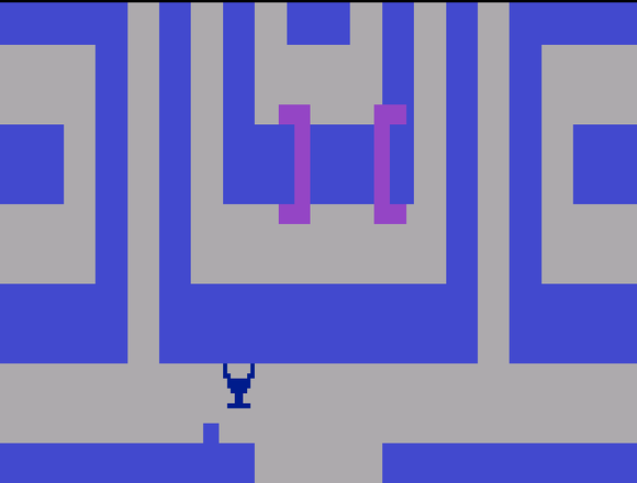
Design Lessons:
For such a small game world (there are only about a couple dozen screens in all) the game shows remarkable ingenuity in making the most of that space. Initial exploration of the world doesn't take long, but it's the varied terrain combined with the effects of the objects (including monsters) that make it interesting.
Adventure's fun comes from the way all of its simple objects interact to produce complex behavior. Carried objects continue to operate, whether it's the bat or player who holds them, so the bat might carry the magnet through a room where the player is using the bridge, moving it out of position and forcing him to find another way back. Or, carrying the sword, the bat might brush it across a dragon on his flight, killing it. This is possible because all of the objects in the game function automatically, which they have to be anyway since The Button is devoted to dropping stuff. A lot of the fun in Adventure comes from the unintended consequences of the player's actions.
Further, while the game contains what can only be described as a tiny game world, it is considerably replayable. Game variation 3 scrambles the locations of the game objects and monsters at the start of play, and the various implications of those objects can sometimes produce special challenges, like the sword being locked inside a castle, or the dragons appearing clustered together.
Links:
Indenture, a freeware DOS recreation of the original game with some extra features
An action-adventure that works its isometric perspective unusually hard.
Published by Sega
Developed by Climax Entertainment (Japan)
Platform: Genesis, Wii (Virtual Console)
Of Note:
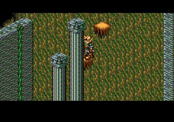
Landstalker is a game that revels in its isometric presentation. Other isometric jumping games (there were more than a few from Europe) worked to keep each screen easy to understand, so the player wouldn't get confused as to how the platforms of each area related spatially to each other. There are places in Landstalker, on the other hand, that seem as if they were created specifically to be optical illusions.
The Game:
While it is indeed its own game, at first glance it looks like an isometric knockoff of Zelda. Your character is an elf, is dressed in green, hangs out with fairies, explores a lush landscape, and frequently collects heart containers, here called "life stocks."
Where it diverges from the mold is in its vibrant characterization. Every character in Landstalker has a distinct, often humorous, personality, including the protagonist Nigel. The characters are memorable to a degree little seen outside the Grandia games, or perhaps the original Shining Force, also developed by Climax. It is truly a game that contains no angst. Nigel and pint-sized assistant Friday aren't even in it to save the world; their aim is to get filthy rich, and while they do good along the way it is fitting that the conclusion of the game results in them getting showered in gold coins. They may be treasure hunters, but they work for their loot.
And oh, how they work! Despite its Japanese production, Landstalker is really a descendent of those European isometric jumping games, dating back to Airball. Every one of them is maddeningly difficult, and not just for reasons dealing with the perspective. Other games of the type include Spindizzy and little-known SNES sequel Spindizzy Worlds, Head Over Heels, Light Crusader (a very atypical game from Treasure), Taito's arcade RPG Dungeon Magic (a.k.a. Light Bringer) and Sony Imagesoft's Solstice and Equinox. Landstalker is nothing less than an isometric platformer, infuriating puzzles intact, expanded and made into the basis of an entire game world.
It turned out pretty well. The joy and humor with which the characters are written and presented serves as a nice counterpoint to the difficult jumping challenges. While the game is one of the more linear examples on this list, it doesn't push the player to make progress. In Zelda style, there are "Life Stocks" hidden everywhere which serve to increase Nigel's life bar, and players will find themselves well-rewarded for poking around. And the game sports a very nice variety in setting. One area is a sequence of devious riddles, and another is a gigantic hedge maze. These places are important for exploration-type games where the vistas are much of the point.
Landstalker is one of those games where you hope, at the end, for another game with the same characters, which of course never happened except for Nigel & Friday's inclusion in Time Stalkers (a.k.a. Climax Landers), a suspiciously indulgent pseudo-roguelike in which Climax took characters from a number of other games they'd made and shoveled them all into a generic setting.
Design Lessons:
Most open world games make the player's character an unknowable cypher, purposely without words in order that the player can project his own thoughts onto him. But Landstalker takes the opposite approach, with effectively two protagonists who each comment during conversations. It is hard to imagine more likeable game protagonists without straying over into Game Arts' territory.
Landstalker also proves that difficulty can make an open world game better. There are traps on Mercator Island that will make any player want to throw down their controller, but the sheer variety of situation, just of seeing what the next area will throw at him, is enough to make him want to continue. The riddle area by itself is intriguing enough to warrant a play-through.
Links:
Possibly the first big-world game.
Published by Activision
Designed and developed by David Crane
Platform: Atari 2600
Length: Short (Medium if played until mastery)
Of Note:
The Atari 800 version has a second quest!
The Game:
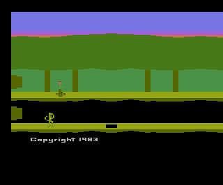
This is the most advanced game on the old 2600. It's certainly so technically: it's got a large mapable, sometimes scrolling world with independently-functioning enemies, special regions, multiple modes of movement (running, jumping, swimming, ballooning). It's even got pretty good background music that changes based on the situation.
But its design is even more advanced than its programming tricks. While the original Pitfall's exploration-based gameplay was tightly limited by its three lives (for novice players) and 20-minute time limit (for advanced players), Pitfall II discards entirely lives, health, and even death. When the player touches a fatal enemy, the music changes for a bit and he's transported back to the last "cross" he touched, and he loses points depending on the distance. Crosses aren't too common, but they aren't too rare either.
The main thing this did for the game was remove the requirement of having to be really good to see it all. The original Pitfall had 255 screens and 32 treasures, of which probably less than 1% of owners had ever seen all of. Pitfall II, while still challenging, could be played continually until finished, with the player's remaining score still providing a substantial measure of skill that could be improved through further play.
The result is, interestingly, not dissimilar to Metroid without weapons or power-ups, but with a score. Pitfall II even has that game's search aspects: instead of looking for missiles and new abilities, players search for treasure. Not bad at all for a 2600 game!
Design Lessons:
Realizing that game-ending conditions other than winning could be discarded entirely was an amazing insight, and possibly marks the origins of the structure seen in 95% of games to this day: play until death, then send the player back to a checkpoint or previous save. While most of these games will boldly declare "Game Over" when the player runs out of health, considering you can always resume from the last checkpoint it's really not over at all. It's arguably an overused design now, but it wasn't back when Pitfall II did it.
Notice that Pitfall II leans even harder on score than Pitfall! did. While the origin of the concept of score goes back to pinball and earlier, is an oft-neglected aspect of gaming these days. Sure, there are "experience points" and "hit points" and "magic points" and a dozen other points, with more introduced every time a Japanese RPG tries out a goofy new system, but most games have shied away lately from providing measures of skill. Exploration games, in particular, tend to focus more on finishing the quest than building up a score, but Pitfall II shows that they are by no means incompatible.
Links:
Not the first open world game, by a long shot, but refined the concept and introduced the Metroid structure that rules action-adventure game design.
Published by Nintendo
Developed by Nintendo R&D 1
Designed by Gunpei Yokoi and Yoshio Sakamoto
Platform: Famicom Disk System, NES, Gamecube (Metroid Prime), GBA (Metroid Zero Mission), Wii (Virtual Console)
Length: Medium
Of Note:
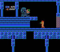
Take a look, the game is composed entirely of horizontal and vertical-scrolling areas. They almost always alternate, that is, horizontal areas always have vertical areas connected to them, and vice versa. There are only two types of places where this trend is bucked: powerup rooms always connect horizontal-to-horizontal, and the final boss room is also connected this way.
Also consider for a moment the Maru Mari, a.k.a. Morph Ball, one of the strangest powerups in gaming history. Mario growing large from eating a mushroom is an obvious nod to Alice in Wonderland, but where the hell did this come from? It has become one of the most identifiable aspects of the Metroid series, enough so that the Prime games had to include it. When game designers sit down with a notebook and start jotting down abilities for their kick-ass warriors to have, turning into a small ball on command is not what one expects to see written down. Even less does one expect to see it survive the editing that brainstorm sessions demand. That it did, and that it became one of the signature elements of the games, says much for the elemental power of creativity in game design.
The Game:
Metroid was not the first open world game, and neither was it the first side-view platformer exploration game, nor was it the first game where players found things in the maze to allow them to reach new sections. But it was likely the first game to take these different elements and rigorously mold them into a game-ruling structure.
Tellingly, the game starts out by immediately forcing players into a wall imposed by its structure. The first room (I'll call a single horizontal-scroll or vertical scroll area a "room") contains a powerup item, the Morph Ball. The third room contains a low ceiling that cannot be passed without it. If the player tries to tackle Metroid like Mario, always going to the right, he'll hit the barrier immediately; the Morph Ball can only be obtained by going left from the start.
In effect, by putting such a barrier in the first two rooms of the game, the designers are telling the player:
1. You can explore in more than one direction.
2. There are cool things in this game that give you permanent new abilities.
3. You'll need them to progress.
4. If you find a place you can't get by, go back and look for new powerups.
Modern games tend to be chatty enough that, were the game made today, all this would probably have been printed on the screen at some point, if not voice-acted. But Metroid is silent. Outside the opening and ending, there are only six words visible in the entire game. (They come near the end....) At the beginning of the game the player's explored area is limited, so there's not a lot the player can do other than go back and find the Maru Mari. Later on the player is more likely to be without a needed power-up, but by putting such a block almost at the start the player comes to learn the rule of powerup progression for himself.
Design Lessons:
The atmosphere is the thing about Metroid that holds up the best today. I'm not the first to remark that Metroid's awesomeness comes, by large part, from the fact that the game doesn't seem designed. It's easy to look at the chaotic arrangement of tunnels, large unimportant sections, frequent dead-ends and random strangenesses (like the "fake" version of boss Kraid that lurks in one tunnel) as signs that the game was created by computer. It's actually intricately planned out, but exploring the planet makes it seem like the level designer was determined to erase any signs of human handiwork. This makes Metroid what one might call a Lovecraftian game. It is easy to believe it the work of inhuman logic, built by beings unknown to us.
It's dangerous to say definite things about whichever game did something first, but the following seems safe enough. Metroid gave us the first large-scale use of granting permanent player abilities as a means of game progression. It gave us major powerups (Long Beam, Hi-Jump Boots, Screw Attack, etc) as both rewards and an advancement system, while also including many minor powerups (Missiles and Energy Tanks) that serve as simple rewards. Yet they too are essential objects; Energy Tanks of course extend the player's maximum health, but large numbers of Missiles are eventually needed to destroy the Zebetite barriers in one of the last rooms of the game. If the player hasn't found enough missiles he's stuck, lending importance to what might otherwise be a trivial collection goal.
Links:
Metroid Cubed, a fan recreation using a voxel engine
One of three games on this list that first saw life in arcades, a market so anathematic to exploration goals that it's notable when any game there features them.
Developed and published by Taito.
Platform: Arcade.
Length: Very short.
Of Note:
Many supposed RPGs pay mere lip-service to the conventions, especially if they're action games. In Capcom's two Dungeons & Dragons brawlers, for example, players advance in level automatically as they finish levels, and experience points are merely for score. Taito's two 90s arcade RPGs Cadash and Dungeon Magic (a.k.a. Lightbringer), on the other hand, attempt as best they can to incorporate all the RPG aspects they can into their reflex-testing, real-time worlds. You can even take the time to talk to townsfolk, although the strict timer would seem to make that a dubious proposition at best.
The Game:
Taito is one of my favorite developers. They don't get the fandom that Nintendo or Sega does, but in their heyday they were just as inventive as any of them. Recent years have seen them fall on hard times, and subject to the ignominy of being bought by Square/Enix, who has just about as little to do with classic arcade games as any game manufacturer.
Cadash is a game that fits my "open world game" definition only with effort. It is true that it is a large-world game, but it is also a fairly traditional action RPG, one made notable in large part for its appearing first in arcades instead of in console ports. (It got two of those.)
Most RPGs don't fit into the exploration game mold because, although generally nothing stops the player from going back to old areas, there is usually so little reason to that it's a waste of time to do so. The basic RPG structure is: fight monsters in an area until the player has strength to beat its boss, beat said boss, then proceed to the next. Each area has stronger opponents than the last, and each provides greater rewards for beating them, so it's always numerically advantageous for the player to bumble around the most advanced area available to him. The monsters may be tougher, but they're worth so much more experience and money than those in previous areas, and the points required to attain the next level are great enough, and the equipment that can be found or purchased in the new towns strong enough, that there's no reason at all to go back unless the story demands it. And if he does have to spend significant time back there, there'll probably be some twist that'll make the monsters worth fighting again.
But that's the thing. The player can go back, but in practice he never does. All the exciting stuff happens in the new area until it has been wrung dry of goodies, and the player's skin has absorbed most of those lovely experience rays. Like a drug addict forever chasing his next fish fix, the player is constantly seeking the next tier of tasty monsters, his evolving tastes pushing him towards greater rewards as entire kingdoms become obsolete. In actuality, this progression is little better than the forced scroll back in Super Mario Bros. Pick whatever RPG series and this will nearly always be true, from Dragon Quest to Paper Mario. Cadash, it must be stated, is no different than this.
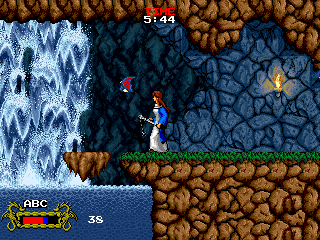
But it's still worth talking about here due to the fact that it plays around interestingly with the strictures forced upon it by its arcade nature. All arcade games, you see, must impose hard limits on the player's game time so the machine isn't hogged. Some games, like Defender, Golden Axe and Smash T.V., do this by sending in "baiters" that will kill his character unless he continues on his way. Others plop a clock on the screen, but usually the clock only comes into play if the player is explicitly dallying. In Metal Slug's case the clock is easy to ignore right up to the moment it's about to expire.
Cadash uses a clock, but integrates it into the play. While the clock serves its function to keep the player moving in order to obtain the large time bonus awarded for entering a new region, he can also purchase time extensions in the in-game shops, using in-game money. One of the characters available, the Cleric, also has a spell that adds time to the clock. In a RPG, it should be noted, time spent fighting monsters directly translates into additional power for the player. Some amount of building-up is expected in Cadash, but the player must carefully judge how much building he can get away with without getting too close to death by the time-over monster.
Design Lessons:
Time spent in exploration, navigation and combat in Cadash is always at the expense of the game timer. The game's balance is between the speed with which players must explore, and the time spent defeating as many monsters as they can. While running out of time doesn't absolutely end the game (it just forces the player to put in another quarter), attempts to carry out a one-credit run will inevitably run into striking a balance between fighting and progress.
Further reading:
The beginning of sophistication for any gamer is the realization that there are lots of good games that didn't do well in the marketplace. Blaster Master's failure is like a zen koan.
Published by Sunsoft
Platform: Famicom, NES
Length: Medium
Of Note:
An infamous article in Nintendo Power once stated, correctly, that the game is awesome but didn't sell as well as Sunsoft hoped. This was probably because it had a generic name vaguely reminiscent of Mad Max Beyond Thunderdome. The article said that what Sunsoft should have done to move cartridges was to have slapped a license on it. Go take a look at the games on the shelves of your local department store and tell me the studios didn't take that advice to heart. Anyway, that's just what Sunsoft did with a quasi-sequel to the game, Uncle Fester's Quest, one of the more notorious examples of mismatched licensing in video game history.
The Game:
For the first time in game journalism history, someone will now discuss this game without mentioning the "save the frog" storyline. You're welcome.
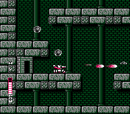
After Metroid, a veritable tsunami of exploration games struck the island nation of Japan, drowning twelve. Blaster Master is among the best by any measure. The game makes the freeform structure of Metroid a bit more rigorous, dividing the world into eight theme areas following the archetypes just then being chiseled into unyielding stone. There's a fire world, an ice world, an ocean world, a techno-world, an organic world, and a forest world. The two standouts are a castle world and a surprisingly large sewer world. The worlds are numbered, akin to Zelda's dungeons, but cannot be traversed out of order. Each world boss leaves behind an upgrade that makes the route to the next world passable.
While the worlds cannot be explored out of order, they are not laid out in an orderly progression. For example, the way to Area 4 is in Area 1. Sometimes the big door that leads to the next level is hidden fairly well, too; that Area 4 door is found in the starting room up at the top of the large wall the player starts in front of. And vast sections of Blaster Master's territory is superfluous. Each multi-section side-view area contains a number of doors around the place that lead to overhead sections the player must explore on foot, but only one of those doors contains the boss and major powerup. Usually it takes a player a couple of lives to explore them all the first time and find the important door, and that itself is a significant limiter.
It's significant because in Blaster Master, unlike most open world games, lives matter. There is a final limit to the number of lives and continues the player gets to progress through the game, and there is no save, or even password feature. Lives are so limited, and the game so large, that even very good players will probably have to start over a few times. Some may find this frustrating, but at least the main play mechanics are pulled off with enough panache that it's still entertaining to play through old areas.
Design Lessons:
A big part of the draw to open world games is how interesting are the areas explored, and one way to make them interesting is with graphics. Blaster Master is among the very best-looking NES games.
It is also an unusually difficult game, in terrain, in exploration, in enemies, and in lives. Yet it is unquestionably one of the NES's highlights. It proves that high difficulty and free-form exploration need not be incompatible.
Links:
Fansite Blaster Master Underground
Takes the ideas introduced by Metroid and refines them to a sharp edge. Arguably more influential than the original game.
Published by Nintendo
Developed by Nintendo R&D 1
Designed by Gunpei Yokoi, Yoshio Sakamoto and Makoto Kanoh
Platform: Super Famicom, SNES
Length: Medium
Of Note:
Super Metroid is widely regarded as the best in the series, and one of the best games ever made. The game is loaded with secrets of both the normal, find-the-powerup variety, and of cleverer types. Even the bosses have secrets: Phantoon is not overwhelmingly difficult to beat if normal missiles are used, but hit it with a powerful super missile and it goes nuts, flailing around the room invincible for some time. Draygon, the boss of the Maridia area, has an amazing secret way to beat it: high up in the room is an open electric relay with a stream of electricity bridging the gap. Jump up and grab it with the Grapple Beam. Samus will take some damage while attached, but when Draygon grabs her he'll take far more, and die very rapidly!
Also of note, the game plays out, in large part, as a labor of love for fans of the original game. One of the first areas the player explores is the opening Brinstar areas of Metroid, which haven't been made over to reflect the more powerful system; while the rest of Zebes has received a tremendous graphical makeover, the areas that are supposed to represent the original game have boxy, low-color tiles similar to those on the NES. The game's final sequences play out a lot like they do on the NES, too....
The Game:
Super Metroid is a game many people rave over, but few do a good job of explaining what it is about it that's cool. It's like they play it, and they know. But what is it that fascinates them? I've yet to see someone convincingly put it into words. Well, here goes.
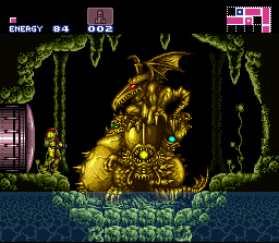
Super Metroid, if not the very first, was among the first open world games to offer a mapping facility to the player. Before this it was mostly a feature used by particular forward-thinking RPGs like Might & Magic. Automaps in exploration games are common now, and every Metroid-inspired Castlevania provides one. Super Metroid's shows the outlines of the rooms, the locations of save rooms and refills, and even provides dots showing the locations of items. But it doesn't show everything. Not coincidentally, the displayed borders of the rooms matches up with the visible walls of that area, often coinciding with scrolling boundries. If a secret passage extends through the wall to a hidden chamber in a corner of the room, the screen often won't scroll into the chamber until the passage has been found, and only once the room has been entered will it appear on the map.
The developers also learned important lessons, concerning frustrating secret areas and stuck players, from the original game. Now there are many types of special block other than just destroyable. There are shot blocks, missile blocks, super missile blocks, bomb blocks, power bomb blocks and speed booster blocks.
In the hands of lesser designers each block type would simply be equivalent to a lock, with its proper means of destruction being its key, but they saw the shallowness of that approach. Instead, "low" level types, like missile blocks and bomb blocks, can also be destroyed by their high-powered counterparts, and many passages (especially speed booster ones) are hidden in ways that make them difficult to be broken with their matching weapon. This idea would be improved upon in Metroid Zero Mission to great effect. Special block types are normally not visible, but using bombs, super bombs or the X-Ray Scope can reveal them.
Finally, there's the matter of graphics. Open world games place special stress on their graphics, since each area must seem unique if the player isn't to get them confused. The sameness of the passages in some areas of the original Metroid is probably one of its greatest flaws, although it is likely an unavoidable one considering the time it was made. And a lot of the fun in any adventure is the mere thrill of seeing new things, especially if they were difficult to reach or feel like they aren't supposed to be there. Urban explorers get the same kick out of abandoned buildings and sewer systems. Super Metroid's graphics are more than adequate for this task.
But the space between bosses and powerups never feels like empty graphics. Lots of ordinary rooms are still quite challenging, many areas contain secrets to find, interesting one-shot enemies are scattered around, sub-bosses like the infamous Crocomire are interesting both to fight and to look at, and the maze itself is an interesting enough puzzle. When people play a game like this and complain about "getting lost," they may consider that a flaw in the design instead of a puzzle intended to challenge them. Is it really good design or bad? The answer lies, perhaps, in the expectations the game sets up in the player's mind.
What does it do well?
Providing a large, varied, interesting world, riddled with secret areas and tricky puzzles: these things are the essence of an exploration game, and while it didn't create the genre, Super Metroid provided necessary refinements that brought it forward. The Metroid Prime games, although taking place in three dimensions instead of two, all arguably take more after Super Metroid, with its purposeful rooms and caverns, boss reward areas, and point-to-point travel, than the far-less-linear Metroid.
Design Lessons:
Exploration games live or die, not by their boss fights or powerups, but by how fun the game makes the mere act of navigating corridors and seeing the sights. If you don't think such things are entertaining then you may not want to develop one.
The design of an automap can make or break these games. If the player can see everything he needs to know without going there and looking, then a large portion of the incentive for exploration is gone, even if the player has to go there to obtain them. Open world games work best, by far, when the world isn't just space between powerups and bosses. I can't emphasize this enough: make exploring the world interesting for its own sake!
But how to do that? Well, I can't tell you everything.
Links:
The beginning of a massive revision of the series, and still possibly the best Castlevania game we've seen.
Developed by Konami
(Find designer and developer)
Platform: Playstation, Xbox 360 (Xbox Live Arcade), PSP (Rondo of Blood)
Length: Medium
Of Note:
Symphony of the Night didn't just introduce the Metroid paradigm to Castlevania games, complete with automap and horizon-expanding powerups, it also introduced the series tradition of having a "fake" ending, found after beating an apparent final boss, and a "true" one, obtained by performing some trick before beating it, which reveals a second portion of the game.
The GBA and DS Castlevanias make varying amounts of hay over this feature, but it was Symphony, way back on the original Playstation, that took it to extremes, offering an entire second castle to explore.
The Game:
Symphony of the Night is still regarded by many as the high-point of the series. Its clever sprite-work, intricate map design, imaginative abilities, and use-once puzzles and tricks are also found in the DS games, and are still excellent, but their impact is less since we've seen their like before by now. And for some reason, Symphony seems to have a super-abundance of these things.
The atmosphere is also unsurpassed in this installment. The games are called Castlevania after all, and ever since the first game, with its progress-plotting map between levels, the series has striven to make the castle itself seem like an actual place instead of just a sequence of rooms. The object of the game is not to defeat Dracula, who is just the head of the beast; it is to defeat the castle. That's why the ending always shows it crumbling! When the series made the transition to free-roaming exploration that essential fact became much more prominent. The castle seems more like a real place when you can travel through its corridors at will instead of being forced through in sequence.
In recent installments the developers seem to have tired of designing gothic corridors and staircases over and over, and have attempted livening it up with, for example, the painting worlds in Portrait of Ruin. This could be seen as a mistake. Exploring an European city, a circus, or a rustic mansion may have been fit into the story by the scenario writer, but they suffer from discarding the game's strong sense of place. The result was that, while the castle still has a few puzzles and secrets to find, it seems like a greatly reduced world with the emphasis placed on the paintings.
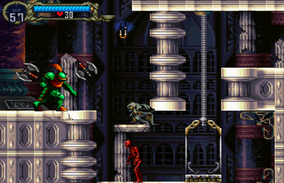
The castle in Symphony of the Night, on the other hand, is among the most interesting of the whole series. It's laid out believably, its crumbling sections hide an interesting array of objects to use, and there's also the interesting sense that the player is returning to it. His character is Alucard, the half-vampire son of Dracula himself, who not only has lived here before but also fought against it in an earlier game. Perhaps that makes it fitting that this is the first game to permit its free travel: Alucard has come home.
What does it do well?
As far as game secrets goes, the game's second castle ranks high up there, fully the size of the whole first part of the game! The decision to make it just like the first but upside-down is a masterstroke. It's economical in that art assets for the second half didn't need to be created, nor does it take up any more CD space as the flipped tiles can be made with a simple hardware effect. Yet it's still interesting to explore because, as with many open world games, the first trip through tends to be cursory. And since "down," the one direction with any special meaning in a side-scroller due to gravity, is flipped, exploring the areas provides interesting new challenges, as do the different monsters in the inverted castle.
Design Lessons:
Action games are about fighting, and the maps are a setting for the fighting to happen. Exploration games are about place, with the fighting being what you do there. Let us meditate on this wisdom now... ommmm....
Links:
Fansite Castlevania Dungeon's page on the game
Considered by some the greatest video game ever made.
Published by Nintendo
Designed by Shigeru Miyamoto and Takashi Tezuka
Platform: N64, Gamecube, Wii (Virtual Console)
Length: Long
Of Note:
Ocarina of Time is a "modern" Zelda in just about every way, for all the good and bad that implies. It's got Heart Pieces, puzzle dungeons, and an overworld with a good number of secrets (but doesn't make them very hard to find). It is also, unlike the original Legend of Zelda or later bits of Link to the Past, depressingly sequential. But an interesting thing about it is that, despite appearances, it isn't completely linear. After getting the bow in the Forest Temple (approximately level four if one's counting), he can actually choose to tackle either the Fire Temple or Water Temple next. The game's clues point to Fire, but nothing at that point prevents the player from either entering or completing Water. In fact, this can be done as soon as the bow is acquired, without having to fight the Forest Temple's boss.
Unfortunately, that's where the break in linearity ends. The temple after cannot be reached until a certain cut scene happens, and it only occurs after all preceding dungeons have been conquered.
The Game:
Ocarina of Time is nearly worshipped these days, and I have no desire to incur the wrath of a legion of fans by telling you that it sucks. Especially since I'm quite fond of it myself. But I'm writing about open world games here....
One thing about Ocarina of Time that harms the feeling of being in a vast, interesting world is that vast plain on which nothing much happens: Hyrule Field. It's a huge open area, even by recent standards, but so very little happens there. In Young Link's time there are only two enemies that appear there, the gigantic, menacing Peahats during the day, which don't even notice the player unless he approaches one, and at night the continuously-appearing Stalchildren, which are easy to beat. In Adult Link's time, after Ganondorf's taken over the land, even these enemies stop showing up. Say what you want about Ganon, at least he did something about the Peahats! In their place are ten Poes that are usually invisible, and it isn't difficult to avoid being hurt by them.
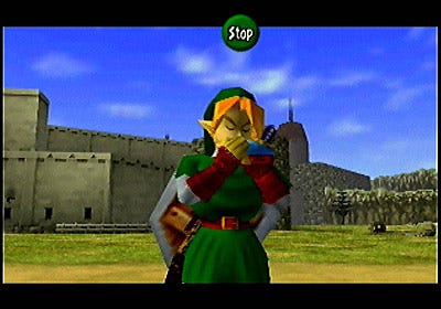
There's also little to do there other than fight enemies. There are exits south to Lake Hylia, North to Hyrule Town, southeast to Kokiri Forest, East to Zora's Domain, Northeast to Kakariko Village and Death Mountain, and West to Gerudo Desert. In the middle is Lon Lon Ranch. These are nice places to go to, but they're all exits, and between them there's not a whole lot to see other than a handful of bomb spots.
Yet an exploration game is ultimately about finding cool things to see and do. If there is a mountain in the background, by jove, I should be able to climb it. If there's a tremendous lake, I should be able to reach the bottom. If there's a waterfall, I should be able to look behind it. And when I get to these places, there should be a reward waiting for me; if there's not I feel cheated, but usually there is.
This has been the essence of the Zelda overworld throughout the series. It is a way to inspire players to go places just because it is cool to do so. It has been a highly influential concept, and yet there are times when it seems like it hasn't been influential enough.
Design Lessons:
The Zelda games proved the elemental coolness of just hiding stuff in out-of-the-way places. Of course, there must first be out-of-the-way places in which the stuff can be hidden.
I think this kind of game is somewhat ruined by the prevalence of strategy guides, either for purchase or on the internet. A well-designed game can be completed without having to find lots of secrets, but players who use guides to hunt them all down end up shortening the experience far short of what was intended. If any players are reading this, then consider my plea: leave the guides on the shelf until you complete your first playthrough! They really aren't all that essential, at least if the game's worth anything.
Links:
Perhaps strangely, perhaps not, but few arcade games feature exploratory elements. How can it be that a driving game should feature them so prominently?
Published by Sega
Developed by Hitmaker
Platform: Arcade, Dreamcast, Playstation 2, Xbox, Gamecube
Length: Arcade
Of Note:
There's a code that can be entered from the driver select screen that puts the game into "Another Day" mode. In it, the layout of the city is exactly the same, but the player begins facing the other direction at the start, the fares are all different, and the flow is generally reversed. There also seem to be fewer fares in this mode, and the player ends up driving routes that never occur in the normal game. The result is that the feel of the play is much different. Each of the sequels offered its own "Another Day" mode as well, with the Dreamcast-only Crazy Taxi 2 even offering "days" that were downloadable from the game's website. I do not know if they're still available.
The Game:
Is this really an open world game? I maintain that it is, and it's not even a huge stretch. But a basic description of play is mandated here.
You drive a cab in a section of a large city. You start out with a quantity of time, 50 seconds by default. Scattered around are customers with dollar signs over their heads. Park near one and he climbs in. When someone is picked up, time is added to be main clock, and a fare clock begins. The color of the dollar sign indicates how far he wants to go, with longer routes granting more time and money. He says where he wants to be dropped off, and an arrow shows the way. Make it there in time and park and you earn money, and a small time bonus if you're fast enough. Find another fare and keep going until the main clock runs out. There, that wasn't so bad.
The exploration comes from the fact that, despite this being an arcade driving game, it's not a race. You can actually drive anywhere you want, and often usefully so. There are also no checkpoints to race to, and no opposition to try to beat out. The game is purely a race against the clock, and there is nothing other than the timer itself to force you along.
In most 3D racing games, finding shortcuts is occasionally a helpful aid, and they're often treacherous enough to make traversing them difficult even if you know the way. In Crazy Taxi, finding the way is part of the game. Finding fares is also important; most people you can pick up cycle, over time, between potential destinations, but knowing where they are can help the player to plan ahead to form a route that extends beyond the current fare.
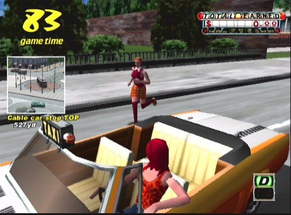
You see, the city is laid out roughly in a circle. The starting location is the University, and there are a number of areas the player passes through on his way. Each area has a few possible destinations, and a number of fares that might want to be dropped off within that neighborhood (red dollar-signs) or in another neighborhood (yellow or green dollar-signs). But there's also another factor: fares that want to be dropped off further counter-clockwise along the cycle tend to be worth a little extra time. In particular, fares towards the end of the cycle who want to be dropped off at, or even beyond, the University are worth a bit of extra time, and customers picked up at the University or the areas right after it are worth much more bonus time than any others in the game. But it's difficult to find fares who want to travel the last leg to the University! As the game continues, time bonuses from picking people up are shaved progressively thinner, and these lucrative trips can be lifesavers.
It's not enough just to pick any customer up. If you drop someone off at a destination, then drive a long way to pick up the next fare, you're going to lose far more time than it's worth. The trick is to find a fare that wants to be dropped off at the beginning of a valuable route. Those routes can only be learned through long experience.
Further, once a customer is picked up he is unavailable to be picked up again for the remainder of that game. It's possible to play a one-credit game of Crazy Taxi for almost an hour, but around halfway through that the player will notice that all the good fares have been taken. That's when the exploration elements come in, for in addition to the fares that are lurking around the drop-off points, there are other fares scattered around the city. Usually those are for longer routes, and a few particular fares, like those on hard-to-reach rooftops or under water at the marina, will ask to be taken clear across town, and score substantial points and time. There are even a couple of little-seen destinations, Sail Street and Fresh Avenue, that many players never see until they start checking out those side roads and hidden nooks for off-the-path fares.
The result is, beginning and intermediate players can do well at Crazy Taxi by just picking people up and taking them where they want to go, but to get really great scores requires knowing the ins and outs of the virtual city as well as a real cabby. And it's exploration, of terrain, of routes, of traffic patterns, and of fares, that makes truly high-scoring games possible.
Design Lessons:
Crazy Taxi's exploratory elements are unique in that they're limited by the need to continually earn extra time. Just driving down side roads randomly will doom the player to an early Game Over. To get a good look around while continuing the game requires finding fares that go where you'd want to go anyway. In a way it's like a board game with a branching path: from KFC, you can either go to the Church, the Heliport, to Tower Records, or to FILA. The way you go depends on your knowledge of who'll want to go where. The high-level player will want to travel to places with good routes, and not be dropped off at a place where no fares remain. When playing past that 40th minute, the strategy involved in finding fares can be surprisingly involved, making Crazy Taxi a game with tremendous hidden depth.
The main way the game increases difficulty is by decreasing the extra time awarded for each pickup down to a minimum value, which is constant for each route. So many things can slow down the player between destinations that the game has what amounts to a substantial random element, something nearly unheard-of in exploration games. Well there is one exploring game that features that, but we'll be talking about that soon enough....
Links:
It still seems amazing that Metroid could have been to made to work in three dimensions. Point for point, everything Super Metroid had is here, and with a Z-axis.
Published by Nintendo
Developed by Retro Studios
Primarily designed by Mark Pacini, Karl Deckard and Mike Wikan
Platform: Gamecube
Length: Medium
Of Note:
Most of the Metroid games have proven to be paradise for sequence breakers (especially Zero Mission, which was designed with sequence-breaking in mind!), and Prime is no exception. Progress through these games is driven by abilities gained due to found powerups, but sometimes this is done in a binary, get-the-boots-to-jump-the-wall fashion. If one can find a way to get over the wall without the boots, then it might be some time before the next wall shows up. Sometimes bypassing the wall nets the player a new powerup that makes some walls obsolete. In the very first room on the planet surface there's a door high up that leads to the Space Jump Boots. Some versions of the game have a subtle bug that allows players to propel themselves onto the high ledge that leads to the boots, opening their vistas tremendously from the start and making the game far less linear.
The Game:
Ultimately, Metroid Prime is Super Metroid in 3D. That itself is reason for amazement.
The biggest thing the series gains from the transition, it seems, is atmosphere. Of course the Metroid games have always been atmospheric, but there's a qualitative difference in seeing these things in three dimensions, and rendered in realistic polygons instead of tiles. Yet there is also a drawback to this; it takes far much more work to produce an equivalent room in a 3D game, to current graphic standards, than a 2D one. Modellers, texturers, and level designers must be employed to create all the assets required, while a 2D room can still conceivably be created by one or two people. This matters because, as mentioned earlier, an exploration game is ultimately about consumption. Terrain is consumed by the player's travels. Once it is seen once it'll never have the same effect on him again.
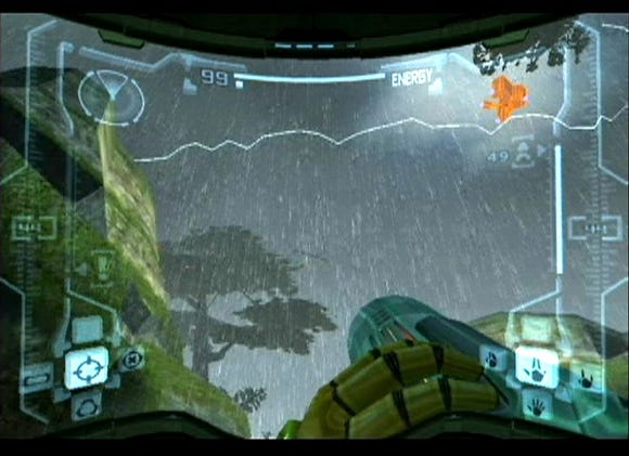
If a designer is smart, he'll try to work around this by trying to get more use out of each place. Sight-seeing need not be the only source of interest from a room. Metroid Prime attempts to get around this in the traditional Metroid ways: by making players backtrack between points, which provides the navigation challenge of getting around, and by hiding important powerups around the landscape to give players a reason to investigate each area. That also makes the scenery more interesting by forcing the player to pay attention to it, instead of treating it like mere wallpaper.
Another way they do it: later on the monsters in some areas changes to the difficult-to-kill Chozo Ghosts enemies. Backtracking through an area long after it was first seen is usually trivial by the time it's seen again, since by that time the player has much more power and health. The Ghosts help to counteract that, yet they don't really replace the normal enemies. They randomly infest certain rooms. If they're killed, the room goes back to the previous enemies for a while, but if the player leaves without killing them, they'll still be there when he returns.
Something must be said about the artifact search late in the game, in particular the reaction of some reviewers to this kind of task. I'm all in favor of it. Engaging the player in a treasure hunt is a substantively different task than the step-by-step objective chasing that forms the rest of the game's structure. It makes the game world seem much more like a real place besides. If the player never had to go back through old areas, or search through them, then why should they be arranged as a complex to be explored at all? Why not just arrange them in a straight line and prevent backtracking, and save the player the effort of navigation?
If a game is truly about exploring then these kinds of tasks should be seen as the main objective, instead of a bothersome distraction. People who complain about wandering around are missing the point. While I would caution against rejecting these players outright, I consider that they should be included by expanding their perspective through entertaining discovery play, rather than by making yet more straight action games.
On a personal note, Metroid Prime remains my favorite of Retro Studios' updates of the classic games. Its story is the least infested by the cliches of game-writing and its loathsome short-hands, with "corruption" and "darkness" lathered liberally over its polygonal surfaces. (The worst game in that regard: Kingdom Hearts.) The second game went and made that the theme, and the third puts it right into the title. There's only so much of that a gamer can take, and at least the first Prime game kept it to a minimum.
Design Lessons:
It seems like the first Prime was mostly R&D, proving the classic Metroid structure could work in a 3D game. The later games expand upon the basic concept, with stuff like Prime 2's parallel world, but there's no real indication that it particularly needed expanding. At least 3 does bring in many new powerups and intra-planet travel.
If you're making a open world game, don't get pulled off-track! I consider exploration to be a primal impulse up there with fighting, eating and sex, and is better suited for games for being more intellectual than those others. But the degree to which players will be enthralled by their discoveries is directly proportional to the imagination you put into your world. There is definitely no shame in including combat portions, but decide early on if it's a shooter or an exploring game, and then don't lessen the one you prefer at the expense of the other.
Links:
After Ocarina of Time's quest approach and Majora's Mask's ruling gimmick, Wind Waker returned Zelda to an emphasis on poking around and finding stuff.
Developed by Nintendo EAD
Main designer: Eiji Aouma
Platform: Gamecube
Length: Long
Of Note:
While host to a much greater exploration aspect than the Zeldas just prior, the game puts off access to the full world for a surprisingly long time. There are effectively seven dungeons in this one, and the player's talking boat prohibits access to places outside the direct route between essential places until three of them have been finished.
Some vocal players reacted with dismay towards the Triforce search quest immediately before the final areas. There are aspects of make-work in it (since essential maps to this part cost lots of rupees to use) but all-in-all, it was a welcome change back to the original Zelda pattern, involving the players using their wit in a search for artifacts, more than straight-up combat and puzzle-solving. When it comes down to it there are not that many kinds of activities available for game developers to put into games, and most devote themselves to narrow subset of those: fighting, talking, and solving abstract puzzles. Hunting for treasures is severely under used, not over.
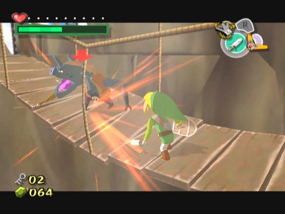
The Game:
Ah, another Nintendo product. This one makes five in all on this list. I apologize for this, but then, Nintendo did a lot to popularize this kind of game, especially in their 3D efforts. Anyway, here I spare no words, other than these, to discuss the developer's bold decision to cel-shade the game. If you are one of the many who dislike Wind Waker for attempting a comic art style, there are plenty of alternatives for you to enjoy.
Wind Waker makes the list for one over-riding reason: the sea. It is an amazing thing. It is the first game to bring back to the series that feeling of stumbling upon awesome things just lying around that the first game had. Even Link to the Past had secrets that felt more like the player was being led to them, or that weren't meant to be secret at all. Wind Waker brings navigation in to become a much larger part of the game, and makes the map facility much more important than before.
In addition to the individual area maps, there are maps that point the location of upgrades, maps that show treasure locations, maps that show triforce pieces, maps that show secrets, and maps that show giant squid. There's even, for the first time in any Zelda game, a map that helps players find Heart Pieces, an aid that was reprised in Twilight Princess' fortune teller.
But I shouldn't neglect why it is the secrets seem harder to find here, or why the maps are important. It's because the game world is freaking huge. Although it's mostly water, it's true, in size it begins to approach vast-scope RPG worlds like that of Oblivion. Both games tend to have less going on per square foot, however, than a simulation sandbox game like a 3D Grand Theft Auto.
Design Lessons:
Plenty of the islands in Wind Waker utilize a technique I like to call the Significant Void. If you see a button on a speck of land in the middle of a vast field of blue, who could bear not to press it? Even if there's no other clue nearby to indicate there's a secret there, the presence of the button itself is a clue.
Many of the islands in the game work like this. One that sticks out in memory is an island with a step button, a hammer button, a flame wall, and a hidden spike wall, among other things. Just pressing one of the three buttons there wasn't enough to reveal any secret; it turned out each had a timer on it that caused it to pop back up. So, the player has to figure out the right order, hit them all in time, and find out how to get between them quickly enough. Not only that, but some of these buttons required using items found elsewhere in the game. By the time I finally got the stuff I needed and figured out the puzzle, I hadn't even realized that there was no other clue that anything was hidden there! The presence of the puzzle elements there was enough to indicate a secret could be found.
Take that a step further: if there's an island in the middle of nowhere with nothing on it, the player would be greatly disappointed if there turned out to be no significance to it. It is the responsibility of level designers to not just produce significance leading to goodies, but to reduce significance when there are no goodies to be found.
Links:
The earlier Dragon Quest games usually had a section where players were left to their own ends. This one had the most substantial example.
Developed by Enix
Designed by Yuuji Horii
Platform: Famicom, NES
Length: Very long
Of Note:
Until this game, and unlike the series inspiration Wizardry, the Dragon Quest games gave the player pre-made characters (DQII), or at least those with randomized stats (DQ). This was the first game to use a Wizardry-like system of letting the player actually create his teammates in a simple creation process, giving them names and classes and even letting him swap them in and out of his party at will. The result was a game with greater longevity than many Japanese console RPGs. Players can play with a party with the basic Soldier, Pilgrim and Wizard, or experiment with other unusual configurations like three Merchants or Jesters.
The Game:
Up until Dragon Quest III, the venerable series did have some non-linear aspects. Most of the original game is not really blocked in any way other than by being infested with monsters that can instantly kill an unprepared player. The second and third games have a substantial portion of them taken up in a search for important items scattered throughout their worlds.
One interesting thing that separates these Dragon Quest games from many others is the role bridges play in them. Bridges tend to signify a major change in the difficulty of monsters the player encounters. If the player is still struggling with the monsters he's fighting and sees a bridge, he'll know not to traipse across it. There are exceptions to this rule, and sometimes monsters improve upon crossing invisible boundaries, but the use of some element of the scenery to indicate to the player that difficulty is going up is an idea that far more RPGs could stand to borrow.
While most games use "hard" barriers to prevent player access to later areas, Dragon Quest is more likely to use "soft" barriers, where the player can go where he wants, maybe after an early section that's more linear, but it might be unwise to do so because of the strength of the monsters. In an action game player skill can make up for undue numeric difficulty, but in a turn-based combat RPG the numbers and flags that define a monster's abilities are the challenge, and there's only so much the player can do to get around them.
If you think about it, this poses unique problems when designing a non-linear RPG. To a player with 40 maximum hit points, going from an area where the monsters do 12 hit points of damage to an area where they do 20 is an almost unbearable increase in danger. If the quest path is mostly straight and one-way, then the monster spawn zones can be placed to match.
But if the game isn't linear, then the designer has no idea where the player will be going next. The player might stray into areas intended for far hardier characters than he's had the chance to build, and could get wiped out quickly, causing frustration. I think some frustration isn't necessarily bad in a game, but no one wants to challenge the gods unprepared. But on the other hand, if all the areas have monsters that are a good challenge for characters from the moment they are able to enter them, then growth will be rapid at first and soon the player will cruse through the rest of the game.
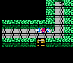
The Dragon Quest games, to my eyes, solve the problem by taking advantage of an interesting aspect of RPG character growth, the fact that the effective rate of character growth actually decelerates over time.
Take 1st and 2nd edition Advanced Dungeons & Dragons level growth as an example. Back in those days, a character's starting hit points were determined by the role of a single die. Upon reaching each additional level, players got to roll another die and add that to their total. The result was, at first level the player's hit points could be as low as one, but with each additional level gained the law of averages caused HP to trend towards average, making them more generally survivable against foes of equal level. However, the amount of hit points gained with each level remains constant, even though the player is accumulating more and more of them. A first level mage in 2nd Edition AD&D had an average of 2.5 hit points. Gaining an additional level approximately doubles that figure. But a tenth level mage has about 25 hit points, and gaining level 11 still adds on just 2.5 more. The gain relative to what he already has becomes less and less as the character grows.
More recent versions of D&D even out the randomness a bit more by giving characters maximum hit points at first level, and JRPGs like Dragon Quest work around this by giving characters some extra HP at the start, by subtly increasing growth rate at higher levels, and sometimes by even starting players at higher levels, but the overall principle still applies. As the player's party gains levels, they may grow linearly, or even in a steadily accelerating rate, but the effective benefit from those levels decreases.
Dragon Quest games never start the player, from first level, in a wholly non-linear part of the game; that bit only kicks in once he's gotten some levels under his belt. The result is, that large area with monsters all of about the same level, if made just a little harder than usual, can suffice to provide good challenge for quite some time. A level 21 player may struggle a bit when facing level 26 monsters, but he won't be wiped out as a level 1 player would be fighting level 6 foes.
Design Lessons:
The non-linear sections of the early Dragon Quest games (IV does not apply!) allow the player some freedom in his exploration, but have to be carefully handled to continue to give the player a sense of danger. But it isn't all that bad if the player's party gets a little strong compared to the opposition during the tail end of these sections. If an RPG couples monster difficulty too closely to PC advancement, then the player never gets the feeling that his wards are really improving. The worst games in this regard are those that multiply by scaling values to directly tie monster difficulty to player level. Final Fantasy Tactics and Final Fantasy VIII are two notable games that do this. Oblivion does it too. If monsters are always slightly stronger than the player, then what on Alefgard/Ivalice/Tamriel are experience levels for?
Links:
It's like Metroid meets Hello Kitty, true, but it's actually rather a cool little game.
Developed by Sunsoft.
Directed by "Chow-Mu-Sow" and Yoshinori Homma
Designed by "Ucchi"
Platform: Famicom, NES (European, Australian)
Length: Short
Of Note:
This is a rather quirky open world game that, despite being the subject of an infamous Nintendo Power spread, never made it to the United States. The reasons are possibly related to Sunsoft's continued disappointment over Blaster Master. It's actually fairly rare in any territory, and is regarded as a collector's item.
By the way, if you decide to hunt this game up and play it, you should probably be made aware of the primary means of attack. Early in the game, before weapon items have been found, the only way to harm enemies is to jump on them with the down direction held on the control pad. If you jump on them Mario style you'll just get hurt, but holding down causes the characters to present their feet in order to give the monster a good stomp. Once killed, the enemy usually leaves behind a weird blue face that can be used as a weapon against other monsters.
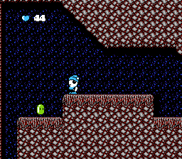
The Game:
The game's map is found early, but is more like the one from Goonies II than Super Metroid, showing the general location of the areas and sometimes it shows the location of objects, but not exits or any detail, and other things only if special detectors are found.
This is another game that starts the player out with only very basic maneuvers and makes him find 90% of the abilities he can eventually have. In this case, some of those abilities come in the form of alternate characters he can control. Unlike Legacy of the Wizard (see below), the player can switch between these guys at any time, which is kind of a weird decision from a design standpoint. Only one character walk on ice and float on water, yet another can sink in water, one can climb walls (once the appropriate item is found), one can destroy bombable walls (again, with the right item)... and another has floaty jumps that let him cover long distances.
There is really no good reason all of these abilities can't be given to one character, especially since they otherwise have similar abilities and share the same damage meter. But on the other hand, a lot of the game's charm comes from its animations, and there'd be a lot less of that to see if the player only had one guy to play.
As far as game structure, there are some rather fiendish secret routes in this one, like doors found on platforms surrounded on all sides by air, and which must be sort of lucked onto from above. There's another place where the ghost character has to jump from cloud to cloud to make it to an important area, but there's a gap between two clouds that looks too far to jump. It is too far, but if the player tries it, a cloud shoots up from below, just as the player passes it.
While the game's character graphics show an undeniable Sanrio influence, the backgrounds seem a lot more detailed than they have to be. Have a look at the water for example, those animated waves look a lot more realistic than they have any right being in a game like this.
Design Lessons:
One thing about Ufouria that could possibly be regarded as a negative in how it takes after Metroid is its health system. Both games start the player with a pitiful amount of health, far less than maximum, and when starting a new life they go back to that minimal energy level. In Ufouria the player can eventually get up to 250 health, but every time a life begins, he's back to 10. At least in Metroid enemies drop health rather frequently! Maybe one in eight kills in Ufouria drop a health ball, and those are only worth 2 energy each!
The only realistic way to refill health is to find Medicine or Water of Life somewhere in the game, which refill 50 and all health respectively, but each can only be found once per life, and neither can the player carry more than one of either at a time.
While I think we can all agree that this is going too far, there is something to be said for the spirit it adds to a game. It means that the player can't ever just bludgeon his way through any areas. Any time he's going somewhere to fight a boss, even if he's going through the areas at the very start of the game, he can't just rush through and take the hits. Whether the damage taken at any point leading up to a boss, or facing the boss himself, it counts the same. The player must pay attention if he's going to survive, and classic gamers tend to appreciate that.
Links:
Speed Demos Archive (I'm as surprised as you are)
Start with Zelda, then add dozens of independent agents hanging around, each doing their own thing. You can affect them, and they can affect you.
Published by Take Two
Developed by Rockstar North
Platform: Playstation 2, Windows, Xbox, Xbox 360
Length: Long
Of Note:
My favorite thing to do when playing these is to forget about the plot, find a hack somewhere, and run fares. So I like Crazy Taxi, so sue me. But there's far more to do here than just that. There's so much to do in a GTA city that the storyline seems uninteresting by comparison.
The Game:
Ocarina of Time was a breakthrough in many ways, and direct sequel Majora's Mask succeeded admirably in making the player feel like a participant in a world in which things were happening whether he was directly involved in them or not. But after that, what? While Wind Waker went towards bigness, secret hunting and navigation challenges, and Twilight Princess went towards being Ocarina of Time DX, it feels like the true evolution of the ideas from the first two 3D Zeldas came not from Japan, but from Scotland.
Basically, the Grand Theft Auto games feel like urban Zelda, with full realization of what that implies. It means a multitude of actors all with their own behavior and movement. It means realistic traffic, as either obstacle to be overcome or opportunity to be taken advantage of. It means traffic patterns they obey even if you don't have to. It means all this going on while you have your own missions to accomplish, with the two intersecting in completely unplanned ways. It means just-for-fun subgames that take advantage of the patterns. It means, in brief, something that looks like applied chaos theory.
Chaos theory. That's the branch of math that describes systems that look random but are in fact built off of many interacting, non-random systems, producing behavior so complex that it looks random to us. Of course GTA does contain random elements so the comparison isn't precisely apt. But it seems quite suggestive of it to these eyes. It's really a tremendous shame much of the media has latched onto the series as an example of all that's depraved in gaming since the series provides so many awesome ideas... but then, it can't be said the developers haven't invited the controversy.
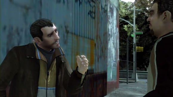
Design Lessons:
The GTA games work as standard open world games, sure, with rooftops, warehouses, side roads and coastline to explore, and in the Zelda style there are rewards scattered around for this kind of searching. But there are other, more profound, types of exploration here too. Exploring the answers to questions like, how much property damage could I do here within a time limit?
To get back to the general theme of the rest of the series, while the games lock off portions of the city until the player has advanced somewhat in the game's story, the games are generally exhilarating in how open they are. There are refreshingly few artificial barriers to the player's wanderlust within the city. None of this collecting of High Jump Boots and Varia Suits here, nossir.
Wikipedia (series)
GameFAQs (GTA III)
Speed Demos Archive (GTA III)
Coming out shortly after Metroid, and containing both side-scrolling "action" scenes and first-person "adventure" scenes that, in fact, play like adventure games. The mixture provides for an odd, yet undeniably unique, game.
Developed by Konami
Platform: Famicom, NES
Length: Medium
Of Note:
Some of the characters in the adventure scenes don't like it when you use the "hit" command on them and refuse to help you any more, but at least one must be hit five times before he gives up his treasure. How would one find this out without a strategy guide? I have no idea. Also noteworthy, the game contains no bosses, but one doesn't generally notice this during play. Combat is thus de-emphasized, making for a game that offers unusually pure exploration.
The Game:
The Goonies II was a semi-popular game from the early days of the NES, but what ever happened to "The Goonies I?" It was released only in Japan and on U.S. Playchoice arcade machines. I've played through all of the original The Goonies and can say it is an unreasonably difficult game. The sequel tones down the difficulty considerably, adds kinda out-of-place "adventure scenes," and is structured as an open world game, instead of as a bunch of levels.
One of the interesting things about it is that the player gets a map right from the start, but it's split into two halves, "front" and "back." I've played through this game several times by now, and while I can understand in principle how the front and back maps are supposed to fit together, I've still yet to ever make use of that information in any real way. It doesn't help that the game contains "warp zones" that can send the player clear across the map regardless of how the rooms might connect spatially. One of the items the player might find, the Detectors, exist only to point out on the map the location of the Goonies the player is trying to save, but the player will probably find them just as well by searching everywhere they can.
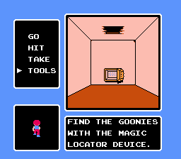
The strangest feature of the game has to be the "adventure scenes," which are like mini adventure games contained within each of the doors. The adventure scenes don't really work that well, they just produce a lot of make-work and arbitrary stuff for the player to do or else get screwed. Sometimes a door only appears if you hit the wall in the center, or the floor or ceiling, so the player ends up hitting the walls in every room. Sometimes a door (or floor or ceiling hole) only appears if the wall is hit with the hammer, so that ends up being done too. Also, doors sometimes are on the back wall of a room, "behind" the player, so the player must also try to move backward from many rooms in case he misses a door that way. The effect is less that of solving a puzzle and more of a list of things to try in each and every adventure room or else risk missing the essential passage needed to move on.
The relation between the Action and Adventure scenes is a little more coupled than they may seem at first. Most of the major powerups, like jumping shoes and slingshots, are found in Adventure scenes, but can only be obtained with keys. Keys are usually found in Action scenes, dropped by defeated enemies. I can't help but think that must make the game torture for speedrunners, being so beholden to keys dropped randomly by random monsters.
There are a number of fairly inventive obstacles in the game, far more inventive generally than other games at the time. The forest region uses background animation to produce gushing torrents of water that can harm the player and knock him off platforms, and the effect is rather striking for a NES game of the time. The suspension bridge is only one small area of the game, but it has unique graphics and even a special enemy that appears there that doesn't do any damage, but eats one of the player's weapons! Midway through the player even finds a wet-suit and is able to swim in underwater areas.
The object of the game is to rescue six Goonies, then go and rescue Annie the Artistic License Mermaid. The door she's hidden behind is awesome: a unique, gigantic steel portal that implies through its very imposingness "open me to win the game."
Design Lessons:
One very strange thing about the game gets back to what I was talking about earlier about significant voids. There are a number of rooms in the game that can only be found by bombing specific places, or pressing "up" in unmarked places to enter a hidden door. Usually they contain Konami Man who offers a health refill, or an extra life. Once contains a helpful optional item. None of them are required to find to win the game.
The thing is, there are no explicit clues to finding any of these rooms, but sometimes there are implicit clues, like an enclosed bit of an area with nothing inside, or a moving platform that leads by a waterfall that doesn't seem to go anywhere. They are probably hidden a little too well, since players who had never played the original Goonies (most people in the U.S.) would never think about finding doors with bombs, and making doors invisible just feels like cheating on the game's behalf.
Still, think about the reaction of the player the unlikely event he does happen upon one randomly. Wouldn't that seem like the most awesome thing in the world? The key to hiding them is to do it in a place where he would ordinarily do the thing that would make it appear anyway, so it appears by accident. Once he's found one, he'll be on the lookout for other significant places later. But if the player is given no clue they exist, then the game basically requires a strategy guide to finish. Which is, in case you must be reminded, a bad thing.
Links:
Another driving game with heavy exploration influences, Dave Theurer's last effort for Atari Games was like nothing seen before, and little seen since.
Developed by Atari Games
Designed by Dave Theurer
Platform: Arcade, PS2, Xbox, Gamecube (last three: emulation through Midway Arcade Treasures 2), assorted ports
Length: Arcade
Of Note:
The Game:
A.P.B. sometimes feels like an extended exercise in rubbing your stomach and patting your head at the same time, what with it having a gas pedal, a siren button, a gun button and a steering wheel, but that could just come through playing it through Midway Arcade Treasures 2.
The player drives a police car through an overhead-view, scrolling world. Each level starts him off in a different place, and asks him to arrest a quota of lawbreakers without acquiring too many demerits. Earlier levels task him with arresting litterbugs, while later levels feature harder-to-arrest perps like honkers, drunks, and eventually murderers. The player has a crosshair that floats in front of his car, and pressing the "siren" button causes it to flash.
The unique properties of this button are a big part of the game. While the siren is pressed, lawbreakers pointed at by the crosshair get hit by what we'll call "arrest damage"; when a certain amount of damage is inflicted, they pull over. You don't have to brake or anything, if they get enough damage you get credit for the arrest. Further, while colliding with other vehicles will ordinarily give you a demerit, if you do so with the siren button held down there is no penalty unless you actually hit the car hard enough to destroy your own vehicle. But the player can't just keep the button held because other cars will never break the law while the siren is on.
Got all this so far? In addition to this, there are shops around where the player can, once per level, pick up an improvement for his vehicle by driving through and pressing the siren button while the crosshair points at what he wants. Starting with level 4, the player can get a gun this way, and can use it to "arrest" people in addition to the siren... but hitting innocent people with the gun is worth a demerit.
There are also doughnut shops and stands scattered throughout the game. Shops are just driven through, but stands must be driven past just as they reach out with a doughnut to collect it. Doughnuts are worth extra time; if the player runs out of time the day ends, and he gets demerits for every quota not yet acquired.
The player's car also has limited gas. If he runs out the day ends, he gets the usual demerits for not making quota, and an extra demerit for getting stranded. Gas can be refilled by stopping at gas stations or by docking with special refueling cars while on the road.
Players also get demerits for running people over, for crashing their vehicle, and for who-knows-what other things. All kinds of things give out demerits in this game, and doing well at it requires that players be incredibly attentive. But there are also secret areas scattered around, off-road sections containing all kinds of hidden bonuses. Of course, it's counter-productive to grab bonuses when the player's behind on making quota. I haven't even mentioned the A.P.B.s themselves yet, who if brought in mean the player doesn't have to worry about quota.
So, with all this stuff to keep track of, does A.P.B. make it work? They make it rather unfriendly to new players, but buried beneath it all is a genuinely interesting game. Once all the various aspects have been mastered it is possible to get quite hooked on it, but it expects far more out of the player than most arcade games.
Design Lessons:
The coolest thing about A.P.B. is how it's a level-based game that also takes place in a huge world. While early levels generally take place along a single stretch of road, nothing prevents the player from ducking down a side road and exploring areas he wouldn't ordinarily see until much later!
At first it seems like there's not much reason to do this, but towards the end the purpose of allowing players to jump the rails and look around becomes apparent. Each level requires that the player collect an increasing number of perps of various types. Most of these will be drivers, who appear generally anywhere he might go, but some are Hitchers and some are "Helps," people seeking roadside assistance.
While drivers appear on most roads, Hitchers and Helps appear only in certain places. They get refreshed every day, but to collect them requires the player knowing where to look, and more and more as the player reaches higher levels he'll have to stray off the main path to find them. Also, the locations of the A.P.B.s is told to the player at the start of the levels, so to find them the player must generally know his way around and where to find landmarks.
Links:
The most unfortunate casualty of the Lynx's failure in the marketplace, a vast game supporting many players and possessing amazing game variety.
Developed by Epyx
Designed by M. Peter Engelbrite
Platform: Atari Lynx, Sega Genesis
Length: Long
Of Note:
The Arcade maze on the Lynx version contains a secret exit! If found, the player is given an address at Epyx to write to, presumably long gone by now.
The Game:
This is one of the greatest games you've never heard of. It is absolutely awesome in every way. It's clever, it's huge, it's strange, it's filled with secret areas, and it comes with no less than seven different ways to play it. That doesn't even get into its multiplayer, which on the Lynx supported up to eight people!
The player is a guy in a jumpsuit with a water gun who's just crashed on the appropriately-named planet of Slime World. Somewhere within the many caverns of the planet is an exit to an escape ship. All the player has to do is find it.
Between him and rescue lie one of the most devious game challenges ever devised. The walls drip, slowly, with slime, and whenever a drop of slime touches the player's guy he gets a tiny bit greener. When he gets fully green he "pops," losing a life. Most modes give the player infinite lives, but he gets sent back to the last checkpoint arrow found. This is almost never a huge problem though, because arrows are all over the place.
Scattered around in great abundance are a variety of useful items. Among the most useful of these is the Slime Shield, which can be saved until needed. When activated it provides a kind of limited invincibility: it cleans off all the player's slime, and protects from anything else that might make him greener until it wears off. Interestingly, there is rarely a shortage of these items.
There are also gems that clean the player off a little, red gems that are worth huge point awards and give him an instant shield, jet packs that allow ascending long vertical shafts, cleansers that let the player turn pools of slime into water for cleaning himself off, bait that draws monsters towards it to their deaths, and the awesome Mega Bomb that utterly destroys the contents of a single room—including the player, if he's still inside when it goes off.
These things help the player combat the great variety of monsters scattered around the world. Of these there are two general types: green ones and red ones. Both cause the player to rapidly get much greener when touched. When green monsters are shot with the water gun they explode into a spray of "boogers," which on contact stick to the player, making him steadily greener by degrees. Shot red monsters spray out in red slime. Red slime is instantly fatal, even if the player is invincible. Red gems, if accidentally shot, also spray into red slime. Sometimes this creates interesting situations like a room full of green monsters hovering over a number of red gems, that force the player to consider his options, and his aim, carefully.
If this were all there was to the game then it'd already be fairly interesting, but the extra features push the coolness clean off the charts. Slime World actually contains seven different game variations within the cart. Three of them, Easy, Exploration and Action, contain worlds of various sizes and monsters of various viciousnesses. These are largely specialized versions of the same game. But there's also Logic, which asks the player to survive without his water gun, and all the game elements are arranged in ways that turn Slime World into a puzzle game!
Then there's Suspense, where there's a two-minute clock that forces the player to explore quickly. Finding a mushroom in Suspense adds another minute onto the clock, but the caverns contain a great many dead-ends, and while death is still a minor problem, the game ends in failure if time runs out. Arcade mode contains a small, but excessively devious maze even by Slime World standards, where none of the checkpoint arrows work. The player must return to start after every death!
The final variation, Combat, deserves special mention. In it, two players in the Genesis version, and up to eight on the Lynx (provided enough systems, copies of the game, and ComLynx cables), roam around Slime World with five lives each, all trying to kill each other. A special power-up here, the Slime Gun, allows player guns to damage the others. All of the other items and enemies can also be found here, and killing an opponent's last life using a Mega Bomb, is an extra special experience. Alas, as we all know by now the Lynx was one of the freshly-sprouted Game Boy dynasty, and sold poorly. Because of this it's possible that, outside the development offices of Epyx, no one has ever gotten together systems, cartridges, cables and batteries enough to play a full game of Combat Slime World.
Design Lessons:
Slime World's seven game variations prove just how flexible the open world game paradigm can be.
Central to the design of the game is the modes of movement the player is allowed. In addition to walking, he can jump up, jump forward, or long jump forward. Each takes the player a predefined distance away; there is no way to control a jump once the player is in the air. He can also grab onto walls and climb up or down along them, or jump off.
Slime World prominently features another aspect of the "significant void" idea I mentioned earlier, but in reverse. The game contains an enemy colloquially called the Snapjaw. It is nothing more than a giant set of teeth laying on the ground. Any player that walks into the gaping mouth dies instantly, regardless of invincibility. Those are easy enough to avoid, but there are also hidden Snapjaws, lurking within certain spots of ground. There is no explicit clue that a Snapjaw lies there, and the only way to kill one is for another player, if one's even in the game, to shoot it while it eats you.
But if the player is observant, there are often other clues that Snapjaws lurk about. In the Easy maze, there is a huge secret area containing dozens of red slime gems, worth tremendous score bonuses. There are also, however, many hidden Snapjaws in these chambers. The key to cleaning the treasure rooms of their wealth is to realize that there are suspicious gaps in the line of red gems laying on the platforms. Sure enough, each spot where there's not a red gem contains a hidden snapper. The result, however, is that the very process of looting the rooms removes the only indication the player has that there's a fatal trap laying there! I hope he has a good memory....
Links:
An overlooked game with shooter sequences, but the meat here is in the sixteen fortress mazes, split between two quests, a unique two-tier health system, and heart-stopping escape sequences.
Developed by HAL Laboratory
Platform: Famicom, NES
Length: Long
Of Note:
Check it out, it's another game with a second quest! Actually, since the game is broken up into sixteen progressively more difficult areas, one could argue that it's got far more quests than that, but I'm getting ahead of myself.
The Game:
This one might at first seem to be breaking my rule concerning the definition of an open world game, that it must consist of a large world the player explores instead of levels. Air Fortress is actually made up of many of these worlds. The only reason it qualifies, to me, as an exploration game is that some of the later levels are large enough to almost qualify as full games in their own right.
Each "level" of Air Fortress begins with a shooter section that defines the player's initial stats for that area. He collects Energy bubbles, which give him more maximum energy, and Bomb bubbles, which give him limited uses of a powerful weapon. He has three attempts in this section before he's dumped back to the title screen. It's to his advantage to be daring and collect as many items as he can (especially energy), because opportunities to acquire these things are scarce in the fortress.
Once inside the overbuilt technobase itself, the primary game begins. Every action the player can perform other than noting uses up energy. He can shoot, but it takes energy. He can fly using a jet-pack, but it takes more energy. Even walking takes energy! Standing and doing nothing causes energy to regenerate at a good rate, but it'll never go above the amount acquired in the shooter phase unless he finds more energy bubbles, and good luck on doing that.
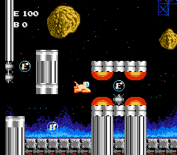
Enemy attacks also sap energy, but the damage done by them is a bit different. They not only take off energy, but they take off maximum energy. There's no readout on screen showing what energy max is, so the only way to know what one's true status is is to rest and find out what energy recharges to. Of course, running out of energy means the end of the game. Fortunately when most enemies are killed they're gone for good, which is welcome news when it comes time to face the finale of each fortress.
There is no time limit for these stages until the end, when the player must destroy the base's core reactor energy ball thing. After that, most of the lights in the fortress go out, everything gets dark, the music stops, and the panic begins. Now the player has a limited amount of time to go back through it, find the escape rocket hidden somewhere within it, and, well, escape. Although there is no clock visible on-screen, there most definitely is a timer in this section. It's made visible only through the increasingly violent shaking the screen goes through, the red warning lights that start to overwhelm the game's color scheme, and the increasing volume of the explosion noises in the background. While it doesn't exactly start out shouting to the player "HURRY UP IDIOT OR YOU'RE GONNA DIE!", eventually the effect is nerve-shattering, especially in the fortresses where the player doesn't have the opportunity to scout ahead, clearing out enemies and finding the right route.
Design Lessons:
Oh, those escape sections. It's almost common knowledge by now that Metroid, Super Metroid and Metroid: Zero Mission each end with timed escape sequences. This game, on the other hand, has sixteen of them, and some are quite lengthy. The game doesn't have an automap, either....
One of the main complaints that can be made over open world games is that they're relatively sedate. Generally there's not a lot forcing the player to be constantly moving ahead. They encourage taking your time in order to uncover secrets. Air Fortress has no secret areas, but its energy-regaining mechanic and need to clear out an escape route ahead of time would seem to agree with that. However, it's more than made up for by the end. What the escape sequences are is a navigation challenge against a time limit. They force the player to not just stumble through to just find the reactor. He must actually comprehend the layout of each maze, so that afterward he can use that knowledge to make it out alive.
The lesson here: mazes are made more interesting if the player has an incentive to optimize his route, and make later trips through it more quickly. Really, it's the reason speedrunners bother playing a game over and over. Air Fortress understood that back in the NES days.
GameFAQs (slim pickings here)
Yet another huge-world game, but this one's split into four sections, each enterable by only one of the game's characters. The intersection between their unique abilities and usable items, and the barriers that make up the game's maze, fits into the Metroid pattern, but with much more difficult puzzles and mazes.
Developed by Nihon Falcom
Platform: MSX, Famicom, NES
Length: Long to Very long
Of Note:
There are four gauges at the top of the screen: health, money, magic and keys. Money lets you stay at inns and buy stuff, magic is ammo, and keys let you open doors (which basically means making door-shaped blocks disappear). Most of these things are acquired by killing enemies, but how does the game decide which to generate? It's simple: the odds of a given thing appearing is determined by how little of it the player has. If the player's almost out of health, then life-restoring items will appear. If the player's low on keys then keys will mostly appear. This is why it's difficult to fill one of the gauges to the very top from just killing stuff: the more full a gauge is, the less likely that kind of item will appear upon defeating an enemy.
The Game:
Legacy of the Wizard actually comes from the Dragon Slayer games, which are almost entirely unknown in the U.S. except for minor cases like Faxanadu (see last month's article). This game is really Dragon Slayer IV. Each of the games takes pains to be its own game and has many differences from the others, but one thing all the games shares is difficulty. Legacy of the Wizard is quite hard.
The player actually takes on the role of a whole family of monster fighters. Using their house as a base, they delve deeper and deeper into the treacherous mazes. Each family member has his own statistics, and can use certain items from the twenty or so that can be obtained. The dungeon is presented in a side-scrolling format, and is designed so that there is one substantial portion of it that is only accessible to each of four of the five family members. Hidden somewhere within that section is a Crown that'll teleport that character to a boss fight. Upon defeating it that Crown is earned for good, and collecting four of those makes the final boss available, who can only be defeated by the last family member, the boy.
The general structure is Metroid-ish in that objects must be acquired from some passages that make others available, which in turn have items that allow entry into yet more of the dungeon. One notable difference is that the family members have such widely varying abilities. Often an object picked up by one family member can only be used by another, and in any case each can only take three items with them into the dungeon at once.
Many of the powers that allow the family to make their way into the maze allow them to do various things with the stone blocks that make up much of the way. One item allows them to be moved (even if standing on one), another allows them to be thrown, still another lets them be destroyed outright. Naturally, each of these abilities is only available to one of the characters. The most interesting of the lot is the family pet, who being a monster himself takes no damage from any foe other than bosses. Enemies are actually fairly useful tools themselves, as they can be stood upon and ridden, and even climbed like a ladder.
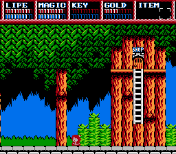
Design Lessons:
Legacy of the Wizard's gameplay works best when it's seen as a series of block manipulation puzzles and similar obstacles. The game engine has a wide array of quirks, such as the monster-riding thing, and the developers make use of them frequently. Many things that the player can do that might seem glitchy at first turn out to be necessary to the solution to some room later on. There is very little distance between the realm of what can be done, and what must be done.
This is generally in opposition to the Miyamoto school of design, which tends to create situations that can be defeated with a very bare set of moves, but which then gives the player additional resources beyond that, to make things easier and give him more leeway in terms of finding solutions. It's a much more demanding way to produce a game, but Legacy of the Wizard gets away with it by giving the player many available avenues at once.
While some items must be obtained in preliminary runs before the Crowns can be seriously sought-after, generally, they don't have to be collected in any special order. If the player cannot find a way through one room, he can go back and try another. Dragon Slayer IV is radically non-linear in this way. The only thing that really prevents access to most Crowns is acquired items, and many of those can be found most any time once the player knows where to look, and has built up enough money (which is a severe limiting factor) to buy them.
Links:
Read more about:
FeaturesYou May Also Like