Trending
Opinion: How will Project 2025 impact game developers?
The Heritage Foundation's manifesto for the possible next administration could do great harm to many, including large portions of the game development community.

Featured Blog | This community-written post highlights the best of what the game industry has to offer. Read more like it on the Game Developer Blogs or learn how to Submit Your Own Blog Post
I give examples on how designers have taken simple elements in games and turned them into masterpieces and showing that they are something we can all learn from.

Hey guys,
Hope everyone is well and enjoying playing/creating games (when this blog was released was when FFXV and Last Guardian released….so I was happy). To cut the pleasantries short, this blog post is going to be about the small details of games, and how smart people have manged to take what most of us would consider “boring” or “ non-game” moments and transformed them into some of the smartest moments in game history.
(This will not apply to all games)
What is “it” I mean when I said “boring”/”non-game” moments. Well what I mean is stuff that we as players don’t think are part of the core game experience eg:
Loading Screens
Opening Menus
Save points
Soundtrack
Control layout/feedback
Camera
Now most people will argue with this blog post right away is that save points, music, controls are already kept in-mind and are well researched etc. So this does not apply to all games (hence me doing this, as we can all always learn) yet a lot of games do not have the time, expertise or may not of even thought of this stuff till after development.
Loading Screens: are something that we as gamers are not a huge fan of. They kill the flow and take away control from the player, and if they are anything like ‘Blood Borne’ loading times then talk about immersion breaking.
A few devs have tried to find a way to keep players entertained and interactive. They have either done this through sound fx, mini games, giving players control over small objects etc. Some are okay and here is a list of some peoples favourite.
Now when I was younger I was blown away by these types of loading screens and couldn’t believe I was making something happen while playing the game. Then I recently revisited “Resident Evil 1” and WOW now Capcom used loading screens and took them to the next level!
Resident Evil is a survival horror game, where you do not get much bullets and you have no idea what is around the corner. Players were trapped inside an old abandoned mansion …… Or so they thought. Now the map for the game was not huge but due to technical limitations, a loading screen would trigger as players entered and exited the rooms of the mansion. Players will back track a lot (some great level design here) so what did Capcom do? They made these loading screens part of their design!
Capcom have masterfully done this as the player is not even aware (first time playing) that the game is loading because they are nervous, unsure of what is behind that door. I remember playing as a kid (despite my dad banning this game from me) watching the camera make its way up the stairs and the door slowly creek open. Scared that a zombie would be waiting for me.
This turned a ‘non-game’ part and used it to build the tension, creating uncertainty. Jump scares are some of the cheaper tricks in horror (not to take away from them as if executed well, man they work) yet this keeps the tension and build upon the horror of the unknown.
Resident Evil shows a great way on how to build on a theme of the game, yet The Last Guardian teaches the players, without them even knowing.
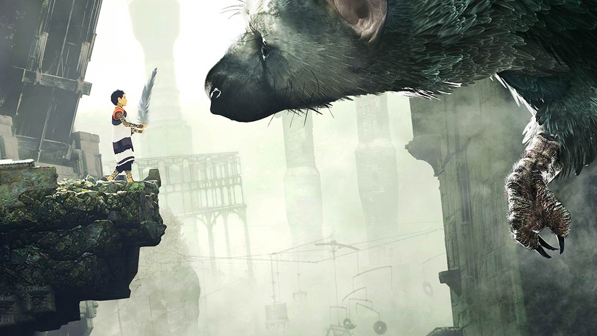
Players must wake ‘the boy’ up and they do that in a loading screen:
You first find these strange icons and learn you have to get rid of them to wake up. This first time means nothing to the player. It is not until you see these symbols again.
Players encounter the symbols once the enemy has a hold of the player. Players have to get rid of these symbols from the screen to escape. Great news players you have already practised this within the loading screen.
These are incredible examples and there are other great examples (Fifa is one). So the next time you are thinking about just having a pretty picture and a loading bar, take a step back and think how can I use this chance to improve my game/communicate with the player.
Opening Menus: I am going to make this brief as I have written an article already on this subject so for more details click here.
Main menus are the first thing that players see, yet most games just use static images and the games logos. But certain games like ‘Dragon Age: Inquisition’ and ‘Infamous’ take this opportunity to set the tone of the game.
That is how you start a game with a bang. First impressions are the most important impression so why wait to the opening cutscene or the first movement made by the player. Use this as a chance to wow the players and show them that your game is so enticing from the get go.
Save Points: are somethings that we as players do not always see, as there are now checkpoint systems, autosaves, or you can just save where ever you want to. So this will not apply to every game yet it may make you stop and think if you want to add a save point system into your game.
There is never much expected of save points other than some feedback to the player that they have saved the game. We as players have grown a custom to them and know that they are very ‘gamey’. The art looks like it belongs, as it has some sort of nice jingle attached to it.
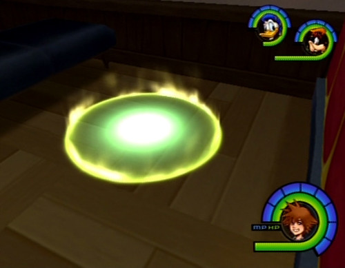

_42.png?width=640&auto=webp&quality=80&disable=upscale)
Yet for other games these are also a chance to enhance the theme, build tension or just become a whole new mechanic within itself.
First example is ICO (if you have not played this then please do, a defining chapter in games IMHO) in ICO players play a boy who is trying to escape this castle and along the way he encounters a girl who also wants to break free of this place.
The girl looks like this:
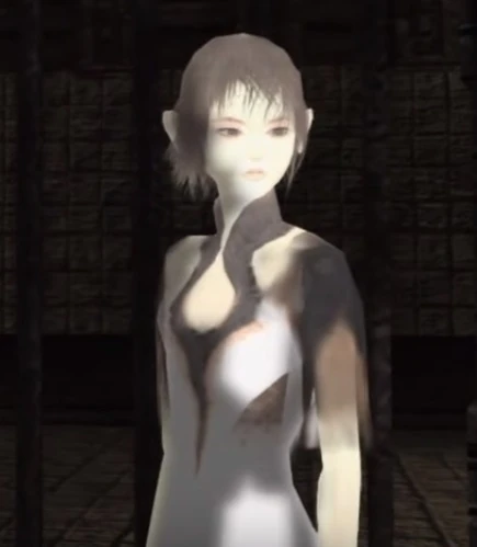
And her outfit is the same colour scheme as the save point.

Now you may be wondering why that is important but it is a subconscious sign to the player. In ICO players cannot save the game without the girl. Which is amazing as the game has not said to the player in some expedition dump that she is important, the game shows you this. “Hey player you can’t get far without her so keep an eye on her” She is not just a damsel in destress who is just cargo with eyes. She has purpose!
This save point helps show to the player that she is more than an AI and because of her gameplay role, players build a connection with her as they know they are unable to save the game. Another great thing about this is the way they sit and the music that plays. As players go through this journey, protecting the girl and solving puzzles I feel that the connection grows stronger and in this position you feel like these two characters have a fondness for one another with hands almost touching. Throughout the game there is no music, yet a beautiful song plays when players save the game, it as if to say that they are safe, and despite the hard times this is a beautiful journey.
Second example is Alien Isolation which is a horror game in which players have to sneak past androids and of course the Alien. Yet this save point is not a safe haven like the previous example …. Oh no.
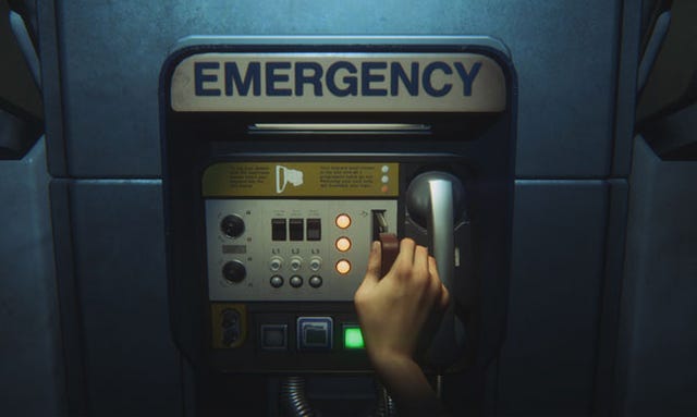
Even the save point adds nail biting tension. It will not save instantly the player has to wait till all three vertical lights are turned off for the game to save.
Now I know there were some issues with this where players saved with the Alien right behind them and it was a never ending death loop. Yet I cannot personally be mad at the devs for this. They creating something that keeps tension and pushes save points to a mechanic. For a deeper look into the system then click here.
I am unsure if they took inspiration from the first Resident Evil with their ink ribbons as inspiration but if you want another good example check out some playthroughs of Resident Evil. Another great example is the Dark Soul series as the trade-off for the save is interesting and intense.
This is the end of Part 1 but I will be bringing some more examples of details that help push games to extraordinary standards. I hope you have enjoyed the first instalment and if you have some more example or have your own thoughts on designing the details of games please leave a comment below or
Twitter: @MaxPears
Instagram:@Max.Pears
Sincerely
Max
Read more about:
Featured BlogsYou May Also Like