Trending
Opinion: How will Project 2025 impact game developers?
The Heritage Foundation's manifesto for the possible next administration could do great harm to many, including large portions of the game development community.
Gareth Harwood, technical art director at Playground Games, offers an in-depth run-down of the shaders used to give buildings realistic rooms in the fast and beautiful Forza Horizon 4.
December 10, 2018

Author: by Gareth Harwood
The Gamasutra Deep Dives are an ongoing series with the goal of shedding light on specific design, art, or technical features within a video game, in order to show how seemingly simple, fundamental design decisions aren't really that simple at all.
Gareth Harwood is technical art director at Playground Games
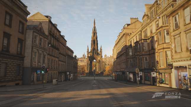
Forza Horizon 4 is set in beautiful Britain, filled with iconic locations and landmarks making areas instantly recognizable – including Playground Games’ representation of the city of Edinburgh.
Most open world games require special consideration for streaming, and being able to drive supercars in Forza Horizon 4 through a detailed and varied city is no exception. The buildings of Edinburgh required new asset construction, rendering, and engine technical features to allow them to load at 300 m.p.h.
The buildings are created from real-world reference. This required many houses to be photographed and constructed, however there is a finite amount of buildings we can create and physically fit on a disk. To help with this limit while retaining variation, we built interchangeable modular set dressing objects which we added to buildings; this includes items like window boxes, porches, aerials and alarms. We also allowed for parts of these objects to be colored or tinted. This was perfect for making a row of terraced houses that all have different color doors.

For Edinburgh, we needed to create a huge number of buildings in a relatively small area. Loading these buildings into a small part of our open world vastly increased the memory required. To combat this, we built our buildings in a modular fashion where a library of basements, ground floors, upper floors and roofs can be stacked and combined in multiple ways to achieve variation and interest with a smaller memory footprint.
It also allowed us to weight complexity easily towards ground level; shopfronts that you can drive right up to had higher rendering budgets than roofs that you could only see at a distance. Bespoke hero buildings like the Scott Monument and the National Gallery, combined with modular buildings, reduced noticeable repetition while maximizing asset reuse and variety.

Creating realistic worlds has always been a strength of Forza Horizon games, and one area we achieve this is by adding interiors to our buildings.
In Forza Horizon 4, we knew Edinburgh would be so dense and detailed that physically modeled interiors would exceed our budgets, so we looked at a different technique called parallax textures. This gave us a huge advantage to create interiors that, as they are baked to a texture, are not constrained by poly counts or material complexity. As rendering these is cheaper than creating geometry, we could have more interiors in game. Previously, budgets might require closed curtains or darkened windows; so we now have a full parallax interior.
.jpg/?width=646&auto=webp&quality=80&disable=upscale)
The parallax interior materials consist of three layers, which were independently selectable by the artists for each window. As each layer has several different options, this provided hundreds of possible visuals for each window – even when only using a small selection of atlas textures.
The first layer was straightforward and contained the window frame and glass. This added nuances like window panes or leading on windows, which are featured prominently in older British architecture. This layer has a diffuse, alpha, roughness, metalness and normal pass. The normal pass contains variation in each glass pane to add realistic variation to the reflection angles on the glass, which is more noticeable in our antique window panes.

The second layer was for the curtains or blinds. These have a diffuse and alpha, but also include a transmissive texture which is used at night to show the thickness of the curtains. We have thick curtains that do not let light bleed through, blinds which are translucent and even ornate curtains which we created with the lace sections allowing some light through.

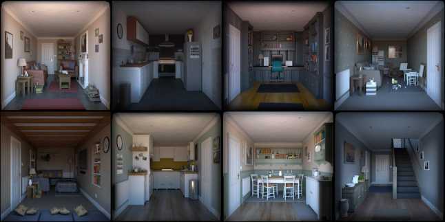
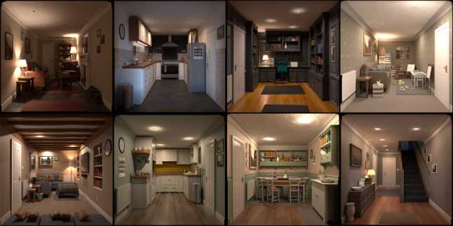
The final layer is where the shader magic happens, as this is a flat texture that simulates the 3D interior. The interiors are first modelled in 3D using a uniform scale, and then rendered to a unique texture format supported by our parallax interior shaders. Like the other layers, we created atlases that for this layer contained up to eight different interiors of the same style to reduce draw calls.
We have several rural atlases which are shared on rural homes, atlases for town houses and some commercial atlases that are on our shops, restaurants and the quintessential British pub. We also have two main interior depths. One is for standard rooms and the other is for shallow windows displays. Artists can select which part of the atlas they want for each window of the building when setting up the materials using properties on each window poly.

The shader calculated the angle that you view into the room and would adjust the UVs so that you can only see the section of the interior that would be visible from your viewing angle. This technique has a few limitations which we addressed.
First, the shader trickery becomes noticeable at very shallow angles. In these edge cases, we increased the natural Fresnel effect of glass to show more of the reflected image than the interior. Second, the details in the center of the room start to warp as the angles increase. We reduced this by pushing interest to the walls and corners, and by darkening the floor. As in real-life, the parallax effect is helped by having converging lines hitting a single focal point. In our images, we played on this by having parallel lines where possible: tiling, book shelves, wood flooring and patterned wall paper.
Each interior texture also has a supporting light texture for night-time, where once again the benefits of baking a texture allowed for as many lights to be used as desired, as they will all finally be consolidated into a texture. We have on and off times for each building to add variation to when the lights turn on.

The artists were free to select any type of window, curtain and interior combination they like, but they followed some simple rules: bedrooms normally appear on the upper floors and we don’t repeat the same room in every window or put rising staircases on the top floor. We also looked at the feasibility of each room. For example, we couldn’t have a small two-bedroom cottage where ten or more windows look into different rooms, so the artists set up windows that look into different parts of the same room.
Finally, for performance reasons; as the player moves away from the building, we needed to not only reduce the complexity of the mesh but also the complexity of our shaders and materials. To do this, we faded off the parallax effect and replaced the window with a flat image that has the window, curtains and interior on one layer. This happens while the window is very small on screen and isn’t noticeable for the player.

Whether you are cruising Edinburgh in your vintage roadster looking in every shop window or racing a million-pound supercar through at near 300 m.p.h., Forza Horizon 4 recreates a beautiful, realistic and interesting environment. Every construction technique, rendering method, shader and piece of artwork works in harmony to create one of the most technically challenging sections of the Forza Horizon 4 map.

You May Also Like