Trending
Opinion: How will Project 2025 impact game developers?
The Heritage Foundation's manifesto for the possible next administration could do great harm to many, including large portions of the game development community.
To help design a party game that made players feel comfortable and whimsical, That's You! developer Wish Studios turned to graphic designer Annie Atkins, best known as a prop maker for film & TV.

If you haven’t played Wish Studios' That’s You!, it might come as a surprise to learn that there’s a strong link between this PS4 party game and the films of Wes Anderson.
If you have, you’ll know it captures some of Anderson’s gentle surrealism, his eye for symmetry, use of color and his eye for graphic detail. Still, what’s unexpected is that it comes as part of a Sony PlayLink game.
In other words, it’s designed to firmly locate the fun between the players in the room and their connected smartphones, where the game delivers the questions to them. The TV simply plays a supporting role, managing the game, collating scores and providing a soundtrack.
And yet That’s You! also happens to feature incredibly lushly realized room settings, through which the camera lovingly pans and dollies while you answer quizzes and draw silly pictures.
But there’s a good reason why: the devs at Wish Studios were anxious to relax players and get them in the mood. The team realized early on in development that the game was at its best when players gave honest answers.
“It became funny when they’re fallible, when you can poke fun at them,” says art director Paul Abbott. “They needed to feel they were in a comfortable, recognizable, friendly environment.”
Scenography was the solution. “We were thinking about places that people understand and feel comfortable in,” Abbott says. And films like Napoleon Dynamite and those of Wes Anderson seemed to capture the familiarity he was after. “The way they dressed their sets, there’s a lot of storytelling going on there, creating deep worlds through them. They feel like stage sets, illustrations of life.”
"There’s a rule I try to work to, that if something was meant to be made by hand, I make it by hand. It’s obvious when things like that are done digitally."
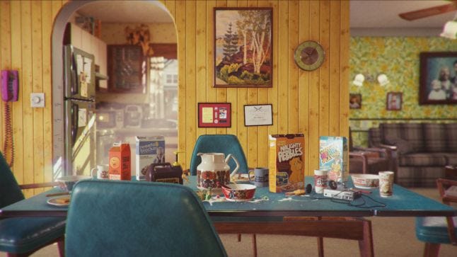
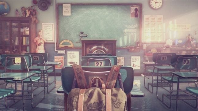
That’s You! features 10 scenarios, including one set in a tent in the wilds of North America, a British seaside amusements pier, and a spooky attic. There’s a South American jail, a scruffy German bar, a 1980s domestic kitchen and a school classroom. Devs may be curious to know that they were concepted by an illustrator rather than a traditional concept artist, because they were meant to be impressions of places rather than recreations, taken from the subjective memories of the character who provides the game’s voiceover.
“For me, an illustrator would tell a story more, I think,” Abbott says. “A concept artist would get across mood and form and lighting and that kind of thing, which the illustrator also did, but that wasn’t the priority. The priority was illustrating a story.”
Intriguingly, realizing them meant hiring a graphic designer who had never worked in games before. Annie Atkins is best known for making props for film and TV, including Wes Anderson’s Grand Budapest Hotel, for which she shared an Art Directors Guild award.
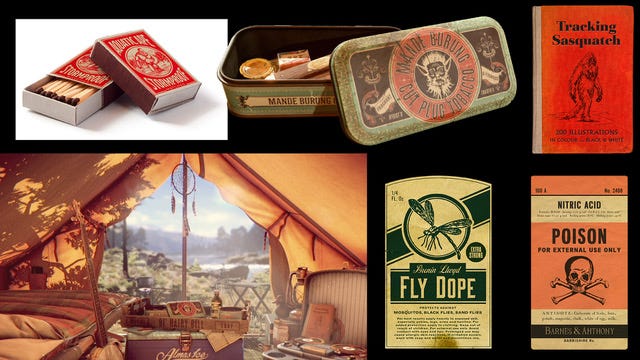
In That’s You! she produced a wide array of props: notebooks, boxes, posters, tins, books, and also the thematically related tokens players use to boost their score. They bring life to spaces which feature very few living things, and no humans.

“It was a whole new world for me, games,” Atkins says, “I’d not considered them before, I guess because I never see references of graphic design in games, really.”
But when Abbott started to send her research for the scenarios Wish was planning, she realized they were designed to be inhabited by strongly drawn characters.
”The fun thing about designing graphic props for film or games is that you’re not really designing as a graphic designer a lot of the time. You have to step into the shoes of the character you’re designing things for," says Atkins. "For example, in this game, if you have a prisoner in a cell in a South American jail, what’s he going to doodle in his notebook? If you’re a child in a horrible 1980s school, what do you carve into your desk? They’re the fun things; they’re really small details but they’re so fun because you see the world through someone’s eyes, and I think that’s why we watch films and play games in the first place."
Atkins’ process for working on That’s You! was quite different to working on a film. She’d start a film project by going to the studio, taking the script and setting up a little office, from where she’d exclusively work. She’d go through the script and use it to identify what graphic props it demanded. And apart from designing them, she’d also schedule their production according to the filming schedule, find and commission managing suppliers, from blacksmiths creating wrought iron gates to printed materials.

For That’s You!, much of the research was already complete, because it tends to happen much earlier in production than in film. Abbott passed to her sketches made by the concept illustrator and images of the research he and the team had done.
“It’s always the way when you start working with an artist that you have to feel where you stop as an art director,” Abbott says. “When it didn’t work it was me giving Annie too much; it was best to let her get on with it with some ideas and reference material, and she comes up with something that surprises you.”
Atkins could therefore simply focus on making, spending more time on it than she’d normally get. “We were able to push things until they were just right rather than go with things that weren’t fully finished, which we do a lot of the time in film. Everything’s always such a rush on a film set; it’s such a high-pressure environment.”
The objects she designed are remarkably credible, fitting right into their environments and helping them, in turn, feel real. And while her work for That’s You! would be realized in a digital medium, she still physically made a lot of it.
“There’s a rule I try to work to, that if something was meant to be made by hand, I make it by hand,” Atkins says. She says that you can spend all day trying to recreate handwriting in Photoshop, but it’s pointless if you can actually write by hand instead. The same goes for hand-lettering and signage, stencilling, or anything else you could do yourself.

”It’s obvious when things like that are done digitally. Rubber stamps – get one made!" Atkins says. "They’re so cheap and it’s actually quicker in the long run than trying to make a rubber stamp look stampy.” She also used the classic prop trick of tea-staining paper to make it look aged before writing on it.
Wish then scanned them in on a normal consumer scanner at a high resolution, and traced over the details in Substance Painter to create the different material properties and a normal map for any of the details that were in relief, such as stitching on the player tokens.
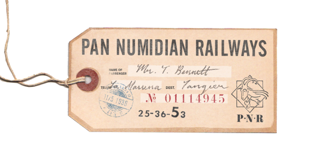
But beyond their making, they’re designed credibly, too. Proportions of text look right, and so do their typefaces for the period they’re meant to be representing. Atkins strongly believes that while Google Image Search is useful, it can’t compare to sitting down with an actual object.
"You have to step into the shoes of the character you’re designing things for...they’re really small details but they’re so fun because you see the world through someone’s eyes, and I think that’s why we watch films and play games in the first place."
“If you search for ’telegram’ you’ll find thousands of examples, but you can’t judge their scale or the paper they’re printed on,” she says. She’s gathered a large collection of what she calls ‘paper ephemera’, including telegrams form the 1940s, love letters from the 17th century, bus tickets, cigarette boxes, business letters. Otherwise worthless, they help her instantly know whether what she’s designing looks authentic.
“I see typewritten documents written in a typewriter font in film and TV shows a lot, which is fine,” she says. “You don’t necessarily have to use a real typewriter all the time. But just make sure that you’re not using 18 point font sizes, otherwise you wonder where they got this massive typewriter from! The audience isn’t necessarily going to know something’s wrong, but lots of little things add up.”
Not that she bounds herself to being slavishly realistic. Look closely at Thats You! and you'll notice the headlines on a 1950s Tunisian newspapers are in-jokes (in French), and there are Bigfoot references all over the place (it wanders into the background of the camping scenario, if you’re paying attention). Atkins believes the best graphic prop is one which juxtaposes humour or a sense of character with authenticity.

“It’s when you first look and it seems realistic, and then you notice the words are lighthearted," she says. "That’s a nice combination. I guess Wes Anderson does that as well.”
The result is a set of richly imagined spaces filled with subtle details. In the end, that’s why Wish made the decision to design a camera that would go up close and linger over it all. “We realized we had all this lovely artwork and you couldn’t really look at it,” says Abbott.
You May Also Like