Trending
Opinion: How will Project 2025 impact game developers?
The Heritage Foundation's manifesto for the possible next administration could do great harm to many, including large portions of the game development community.

Featured Blog | This community-written post highlights the best of what the game industry has to offer. Read more like it on the Game Developer Blogs or learn how to Submit Your Own Blog Post
Why does Pokémon Go need propping-up from the hundreds of how-to guides that have popped up this week? This article highlights how Niantic have broken or ignored principles for designing a learnable game.

The gaming press is unsurprisingly alight with comment on Pokémon Go, but interestingly also with huge numbers of guides and articles on how to actually play the game. Why does this big-budget mobile game need propping-up from how-to guides by the BBC, WIRED, TrustedReviews, The Guardian, VOX, Polygon, Redditors, Youtubers, and many more? This article highlights a number of points where Niantic have broken or ignored many UX design principles for designing a game that is easy to learn and understand, that ultimately could be affecting Pokémon Go’s player experience.
Not every game can rely on novel interactions, a household name and a well-timed release to propel a game to “unprecedented” levels of engagement. Luckily for those games then, Pokémon Go leaves some opportunities on the table for UX refinement, specifically in terms of learning the game.
Here are 7 lessons from Pokémon Go’s learnability failures and successes:
About the Author: Seb Long is a Games User Researcher at Player Research examining game usability and the player experience for games companies through playtesting and game analysis. Player Research are the award-winning playtesting company based in Brighton UK, with a portfolio of more than 200 games, and clients including EA, Microsoft, SEGA, Zynga, and a whole host of creative indie teams.
‘Affordance’ describes the apparent interactivity of something. For example, a button ‘affords’ pressing because it visually appears pressable. The best UIs have meaningful affordance to help communicate their existence and purpose. Elements that slide might obviously ‘peek out’; things that spin might gently turn; things that can be tapped are given the appearance of depth. Take a look at the UI for a PokéStop below. How are players meant to predict or recognise that a swiping/spinning interaction is possible, let alone that it would yield something beneficial? Even if the confusion is only momentary, players’ confidence will take a knock.
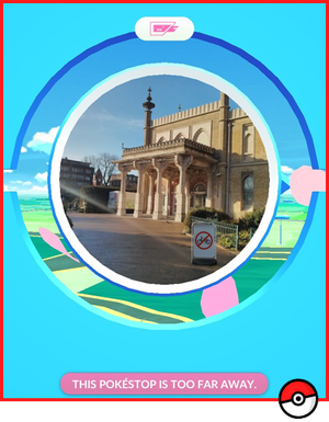
If you haven’t played Pokémon Go yet: how do you interact with this UI? There is a tutorial prompt (shown once) that attempts to demonstrate the swipe needed - but wouldn’t it be better if the UI had some affordance and self-descriptive qualities?
Affordance works in the opposite direction too: If something isn’t interactive, it shouldn’t look or behave like it is, yet Pokémon Go is guilty of this as well. Tapping on the map around the player character shows a blue circle under the finger and gives audio feedback, but nothing about the map is interactive. What's worse, tapping on the target Pokémon during a Pokémon capture (a seemingly-valid interaction) brings up a number of UI elements around the Pokémon for a split second, which appear like positive feedback. This reinforces an invalid interaction, hindering players from learning the flicking gesture. I wonder how many players had the joy and excitement of their first Pokémon capture undermined by this behaviour: repeatedly tapping on their first Pokémon, completely in vain.

Tapping directly on the Pokémon shows UI surrounding it, and the Poké Ball moves, looking like completely valid and positive interaction. Tapping on the Pokémon prevents the tutorial UI (below) from appearing, worsening this.
Affordance can communicate the presence of an interactive object, but often isn’t enough to communicate the nuance of specific gesture or interaction - just because something looks interactive might not communicate the type of gesture, the direction, speed or the intent of that interaction. Our experience of playtesting has repeatedly demonstrated that using animation - specifically animation of hands and fingers - is the best way to communicate a gesture, yet Pokémon Go uses only static imagery - and players may not see any prompting at all.

This help is only shown if the player does nothing in their first capture. Tapping on any part of the screen seems to prevent this UI from being displayed.
If the screenshot here looks unfamiliar, you’re not alone. This prompt only comes up in the player’s very first Pokémon capture, and then only if the player doesn’t touch the screen for some time. Compare this to three other popular ‘flicking’ games below, all of which use animation to demonstrate gestures in the first level; it is clear that Pokémon could have benefitted from animation like this to get the player interacting confidently with the Poké Balls, allowing them to focus on learning the ‘feel’ of flicking nearer-and-farther instead of fighting the misleading feedback and lack of specific instructions.
 Three alternative ‘flicking’ games use animation and images of fingers in order to communicate the gesture required. [Source: A, B, C]
Players can make mistakes, especially while still learning about the game. Players who accidentally tap something (‘input error’) are fairly easy to accommodate, typically by adding an ‘are you sure?’ right before that action is finalised, and Pokémon Go generally handles this pretty well.
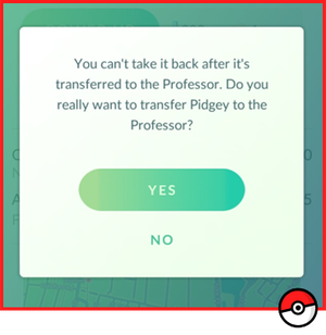
There are a number of ‘are you sure’ messages that fully describe the action that is going to take place, as well as describing the players’ inability to undo this action
Errors caused by players misunderstanding the game are harder to design around, and it is here that Pokémon Go often fails to aid players. Games can sometimes logically determine if players aren’t using features correctly, or are exploring the interface, and they can provide assistance to correct and explain. For example, players that tap on an Egg Incubator item in Pokémon Go are informed that “This item can’t be used here”. This is factually correct, but misses an opportunity to correct the misunderstanding demonstrated by the player - where can it be used? If players repeatedly visit PokéStops but don’t spin to collect items, nothing happens to correct this, which is not only frustrating, but may also impact players’ perception of the monetisation pressure in Pokémon Go, given that Poké Balls otherwise cost real money.

Players tapping items in the item bag will receive a cryptic ‘can’t be used here’ message. The player is demonstrating a misunderstanding or a desire to interact with this item, so why not support that, or offer some specific, corrective assistance?
There are some examples of good practice in avoiding player error here, including consideration for level-up rewards. If the items awarded during level-up go over the limit of the players’ item bag (currently a 350 item limit), they’re not discarded, but the bag just over-fills, keeping all the level-up rewards. Players aren’t assisted in dealing with a full bag, and their attention isn’t drawn to the bag screen, but at least the level-up rewards aren’t discarded.

Players who level-up with a nearly full bag can’t lose items, the bag will simply over-fill. Players probably won’t notice their bag is full until they get to a PokéStop though.
Players should be able to recognise the purpose of an item rather than have to remember it, and using metaphors and familiar real-life objects is a valuable means to achieve learnability and intuitiveness. If players can make valid guesses about the purpose of items because of their appearance, then that is one less thing to tutorialise.
One of the advantages of working within a much-loved brand is in fans bringing prior knowledge on brand-specific elements. The exact purpose and workings of the red and white Poké Ball will be familiar to entire generations, for example, but familiarity breeds contempt, and players new to the franchise can’t be forgotten. Pokémon Go perhaps relies too much on players bringing existing, valid knowledge to the game about the objective of a Trainer, the purpose of Pokédexes, Poké Balls and Pokémon Gyms, and the ability to evolve and battle Pokémon.
Games should also strive for consistency, and perhaps the most blatant of the inconsistencies in Pokémon Go is the use of ‘Pokémon Eggs’ and ‘Lucky Eggs’. Why use the egg metaphor twice in two completely differing contexts, with completely differing mechanics? Pokémon Eggs have to be hatched to give Pokémon using the ‘egg incubators’ (purchasable as IAP), but the ‘lucky eggs’ need no such incubation, and can be used immediately to give an XP bonus. This muddling of ideas again adds barriers to players learning the game quickly and reliably.

Egg, Egg Incubator and Lucky Egg - why mix up the (otherwise consistent and understandable) Egg mechanic with the addition of a non-distance rated, non-incubated and non-Pokémon hatching Egg that gives ‘luck’?
Pokémon Gyms and battling is perhaps the poorest part of Pokémon Go from an understandability perspective. Chief culprit of this is the lack of contextualised tutorial content; players can find information about what to do in a Pokémon Battle, but only in the ‘tips’ area next to the settings, not before or during their first Gym battle, or even in the Gym itself. Even then, the ‘tips’ only describe the swipe-to-dodge interaction, not tap to attack, nor tap-and-hold to special attack. Quite why Pokémon Go omits any hint of these absolute fundamentals is baffling.
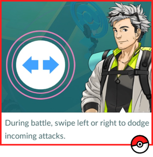
The ‘tips’ section tells players they can dodge, but not how to attack or special attack; the former is discoverable (players are likely to tap the screen), but the latter is unlikely to be discovered without assistance
The effectiveness of tutorial content is significantly reduced by giving information outside of the context in which that information is needed. Players are generally more capable of ascribing meaning to instructions relevant to their immediate situation, rather than ones they haven’t encountered yet, and are therefore more likely to implement and remember these instructions.
One nice implementation of contextual tutorialisation is the short preview of the Pokémon’s attack animation immediately before each capture - which is important to be able to recognise, as this animation signifies a period of invulnerability. Players get a little visual reminder of the attack animation immediately before they need to look out for it.
Players’ memories are fallible, so avoid the front-loading of information, and ensure you present tutorial information in context.

Most Pokémon captures begin with the Pokémon showing their attack animation, giving the player an opportunity to see the telegraphing and length of the attack.
There are a number of interfaces and mechanics in Pokémon Go that rely on trial-and-error learning, including the effective use of the incense and lures, bag item limits, and Pokémon capturing. This isn’t a bad thing, and certainly the game has capitalised on certain player types’ willingness to experiment and deconstruct the game’s cryptic design in order to understand it better.
The issue with trial-and-error learning is in its intersection with randomness. The ‘shrinking circle’ element that appears when capturing a Pokémon is not at all clear; is a larger circle better or worse than a small one? There is no inherent ‘good’ or ‘bad’ state in the size of a circle. Players could experimentally determine this - and maybe that is a fun thing to experiment with for a certain type of player - but as the successful capture of the Pokémon has other random variables, ultimately I don’t know if I succeeded because of the circle size, or some other factor.

Pokémon Red (1996) gave dialog from the player character when a Pokémon broke free from a Poké Ball - this may have helped explain that the Pokémon itself was the culprit, rather than the players' action [Source]
Players will likely have difficulty learning some game mechanics because of the lack of specificity and observable patterns in the feedback - I wonder if this meets the the developer's’ intent? How much of the challenge in Pokémon Go should come from working out the rules or from the interaction itself?
It is a shame that Pokémon Go has hit significant technical barriers throughout launch, as the odd behaviour presented by these server time-outs and bugs only serves to further convolute the feedback presented to the player. Poké Balls that stop moving, misbehaving footstep indicators, Pokémon that never appear - each presents another barrier to understanding the game as players misinterpret bug behaviour for legitimate feedback.
It seems likely that intuitiveness has not contributed to Pokémon Go’s success - clearly there are many other factors at play, including the use of AR and geolocation, as well as the aforementioned branding and release timing. One has to wonder if Pokémon Go’s design is deliberately obscure, perhaps to encourage development of a community, and exactly the media furore that has resulted; Minecraft certainly benefitted from the online groups that sprung up to plug players’ knowledge gaps, not forgetting that Minecraft was at alpha stages during initial launch.
The true effects of Pokémon Go’s poor tutorialisation and learnability can only be revealed by the early retention figures, and scale of abandonment or lack of longer-term engagement of non-fans. All-too-often usability and understandability issues are manifested as general, non-specific complaints from players, perhaps feeling that the game is ‘not for them’ - which is perhaps the biggest crime of Pokémon Go’s flawed onboarding: failing to comprehensively introduce a whole new fanbase to the game that defined the youth of so many.
Perhaps a little more player-centric design and playtesting might have helped Niantic catch ‘em all.
Read more about:
Featured BlogsYou May Also Like