Trending
Opinion: How will Project 2025 impact game developers?
The Heritage Foundation's manifesto for the possible next administration could do great harm to many, including large portions of the game development community.
An overview of how small things can improve player's experience in the game. Some examples from our own game development experience are given and compared.

Have you ever caught yourself in a situation where you play the game and you feel that something’s wrong but can’t tell what exactly? Graphics are charming, controls are great, soundtrack and SFX effects are delightful - it seems that game has a full package, but still there’s something odd that you even can’t identify. Probably that’s because there are some minor things that were ignored when developing the game and lead the players to this feeling. Let’s look from developers perspective, how paying attention to small details can make a huge impact on gameplay experience.
It’s been more than two years since we started developing our game Blazing Beaks. We are a small 2 people team and usually we playtest the game ourselves a lot. It’s very important to sort of restart the mindset and forget the previous gameplay experience every time when we test something new. While that rule works great for new major things like new areas, enemies, weapons or etc., it may fail when it narrows down to small details. When you know every bit of a game and what exactly has been changed, you start to compare things, try to imagine what a new player would feel, raise concerns would it work well or not and etc.
So we are using a different approach - my colleague, game designer and programmer makes changes and gives me a version to try without even telling me what has been changed. And the paradox is that I usually get into the opposite situation than described at the very beginning of this article - I feel that something’s changed in a good way, but cannot exactly identify what. And that’s what the details are for - there are things that players sometimes don’t even realize they exist, but they make a huge difference in the whole gameplay experience.
Below you can find some examples how small changes in our game made a better gameplay experience for players.
Environment details
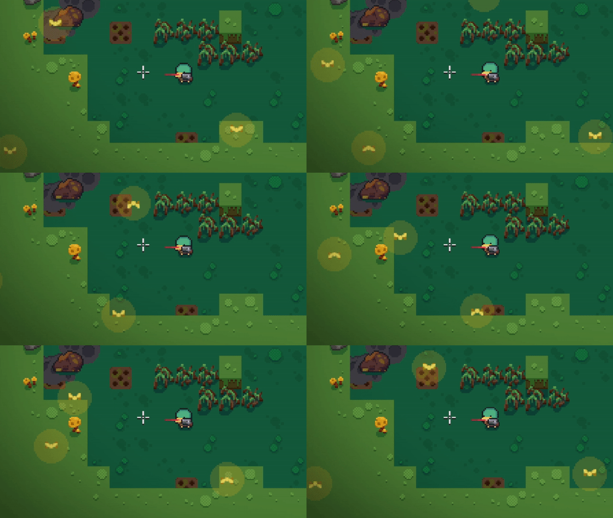
In the very first versions of Blazing Beaks, the Swamp area had butterflies flying around, but from the feedback we realized that some people treated them as enemies and tried to shoot at them. A small change made them less intrusive and more blended to the environment. We received no complaints since then.
Old butterflies
Adjusted butterflies
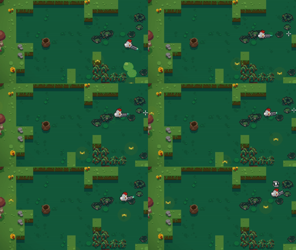
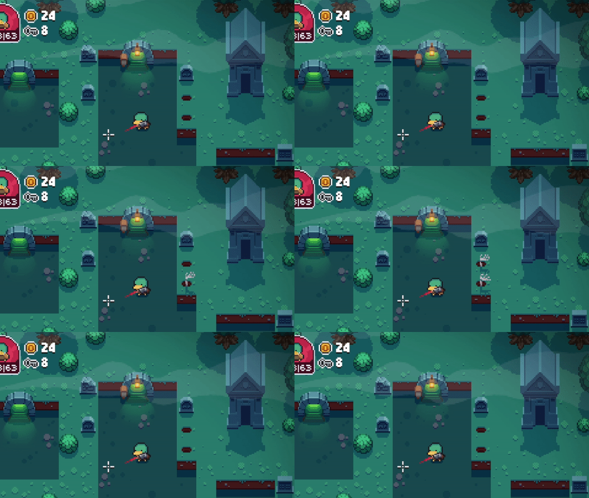
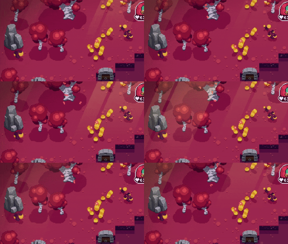
The main goal was to find the right balance so that those elements would not distract the players too much, but at the same time would stand out in some way. Also it’s very important that all the visuals would better represent the mood and vibe of each area players are playing at. Some examples:
Cute skeleton hands and fog in the Graveyard
Falling leaves and sunbeams in Red Forest
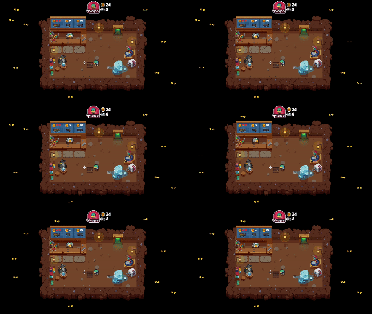
Spooky eyes in the shop
Every game designer seeks for various methods that could explain game specifics in the most simplistic and understandable way. The same principles were applied in Blazing Beaks. For example, there are some doors with a lock. It clearly indicates that the door can be unlocked, but does not explain exactly how. While it might seem obvious that a key is needed, players can think of many other ways how it can be unlocked - for example, shooting at the lock, deploying a bomb and etc. Here’s how a small simplistic self explanatory detail can make a difference. A key icon above the door leaves less room for imagination and clearly suggests that a key is needed to unlock the door.
 vs
vs 
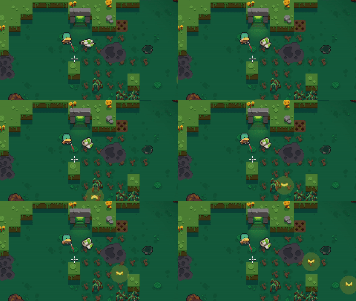
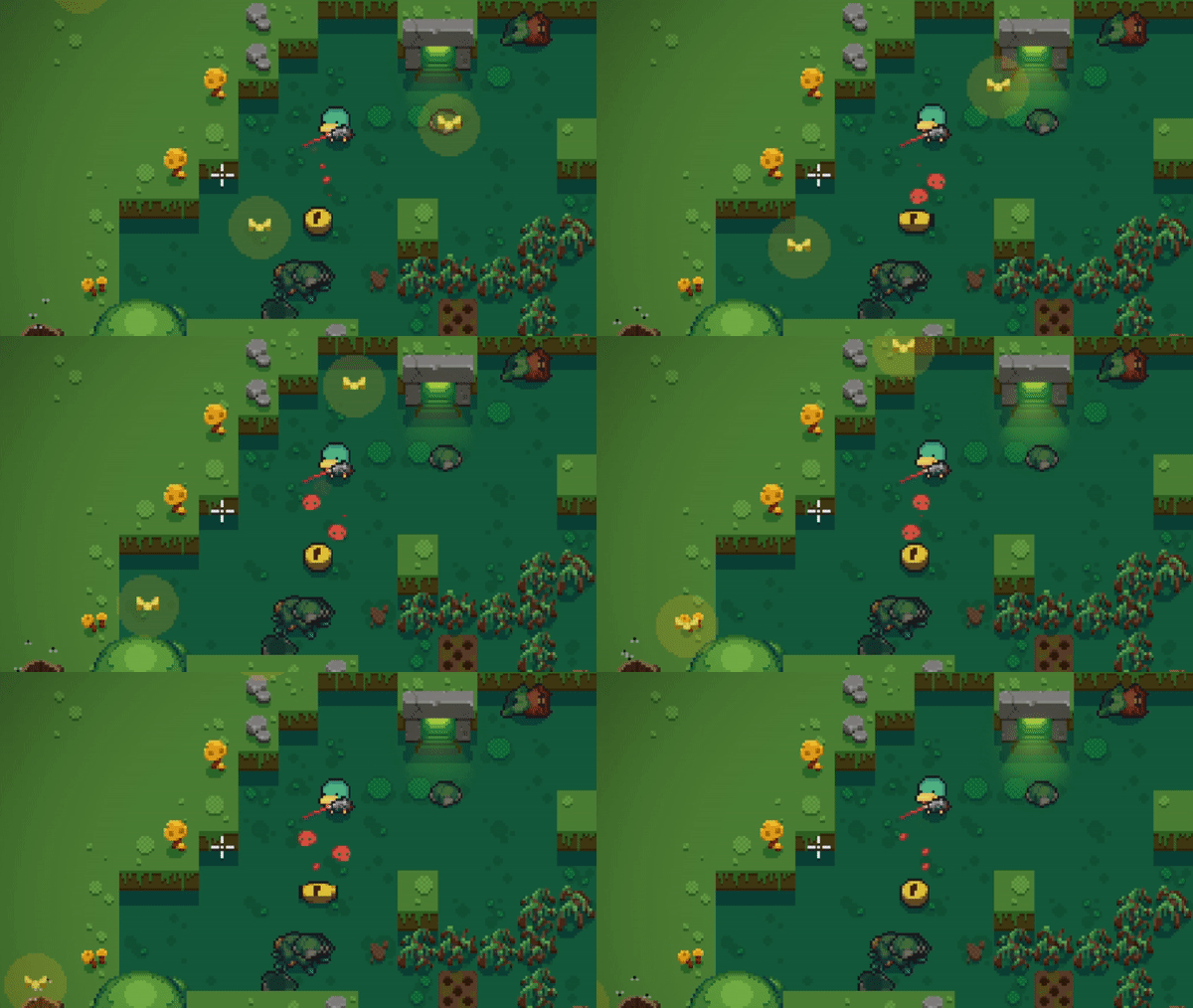
Blazing Beaks has unique artefacts/items exchange system where cursed artefacts are dropped and by picking them up players can trade them into good items in the shop. Those pesky artefacts have a negative impact. In the very first versions dropped artefacts were hard to notice in the level. Moreover, they did not exactly represent having a negative impact and looked similar to in game items. This is how a small change turned things around:
Artefact with no visual representation:
Artefact with visual representation:
Some characters have special abilities, for example, critical hit - killing marked enemies in one shot, or getting additional loot by killing marked enemies. A small icon above enemies let players know when they actually can benefit from their abilities and prevents from the situations where players need to guess which enemy has additional loot or which enemy can get a critical hit.
Critical hit mark:
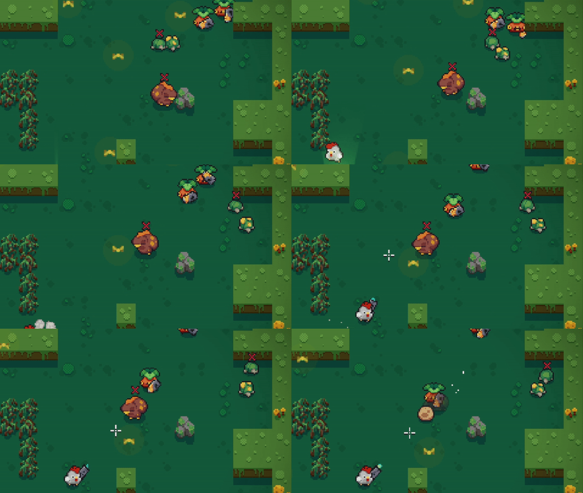
Additional loot indicator:
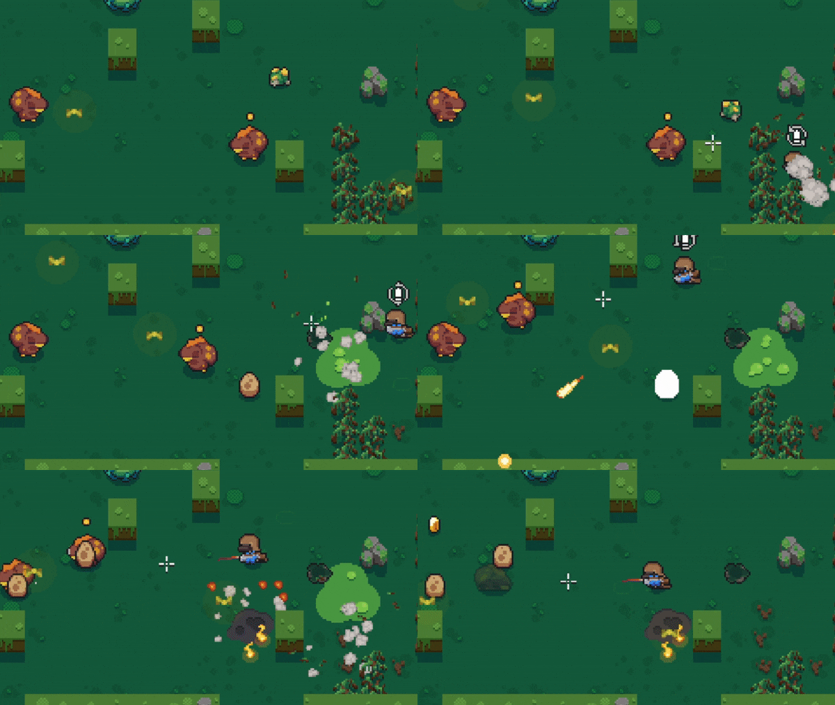
A lot of other changes and adjustments were done to improve gameplay experience.
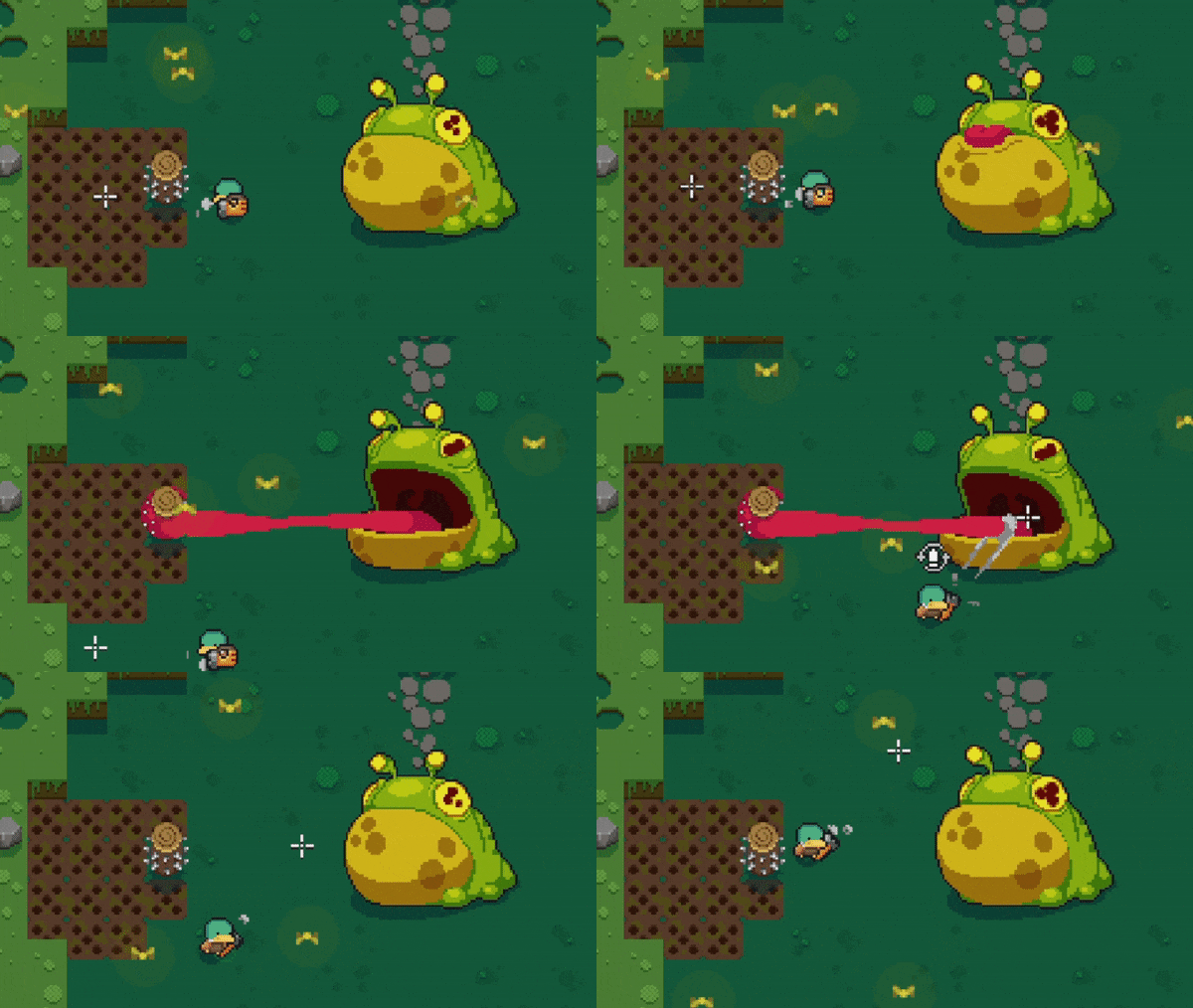
For example, a Newt boss fight. Newt boss has two different attack phases - attack with his tongue and spawning enemies. Previously, there was no indication when the boss will attack a player. The attack being unpredictable gave less freedom to the players as every time they had to prepare for the boss attack even if it’s attack phase was not going to happen. Making a small visual representation just before the attack improved things a lot.
Boss without attack indicator:
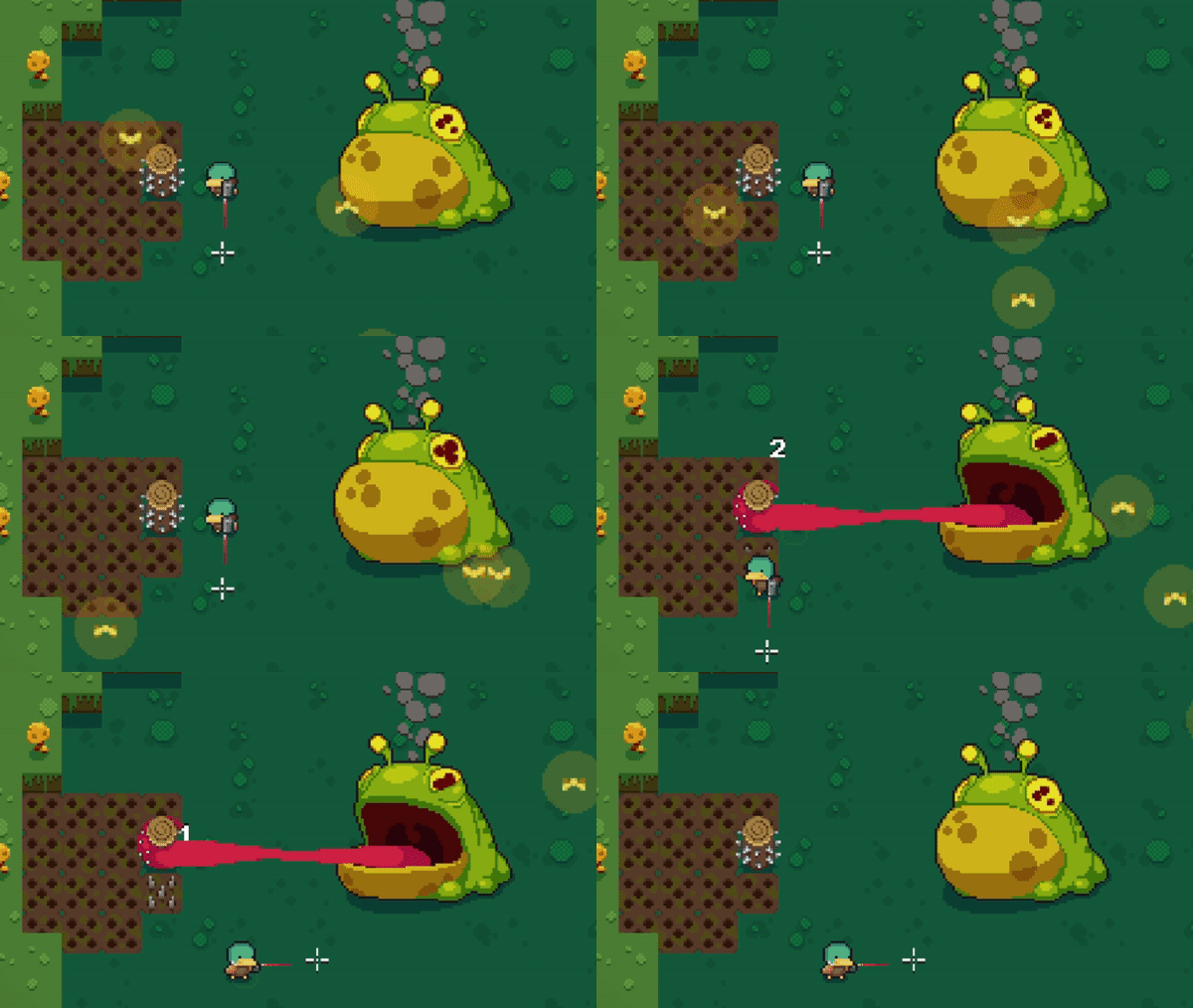
Boss with attack indicator:
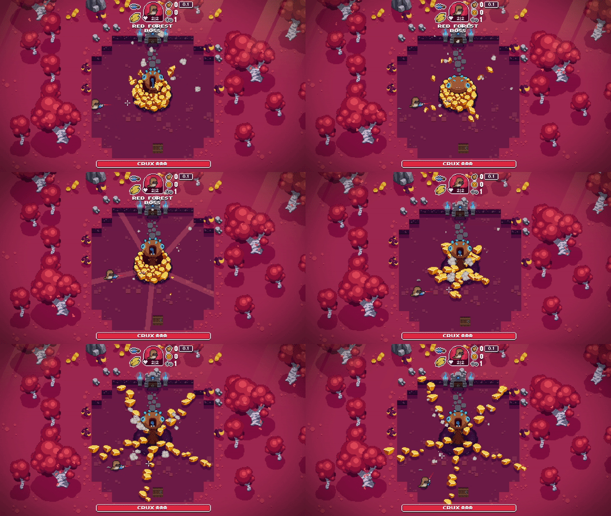
Similarly additional indicators were made to another boss Crux. Crux attacks players by erupting crystal lines which spin around. Players receive damage on touch. Since the position where initial crystal lines appeared was different on every start of attack phase players had to guess where exactly it will be. Having no indication caused bad gameplay experience because if players guessed wrong they received damage from the boss and they could not do anything about it. We added an indication just moments before the actual attack so that players could have some time to react and that solution solved the issue.
Boss without attack indicator:
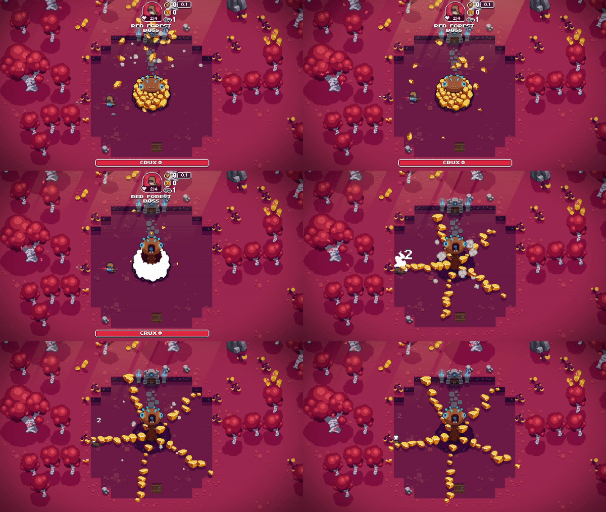
Boss with indicator:
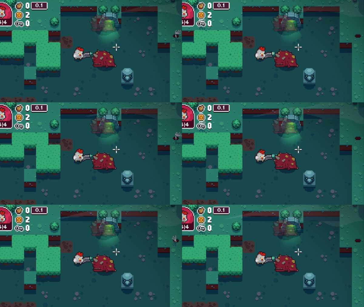
Each level has different amount of enemies in it. It’s important that once you defeat them, they would not obstruct the view, especially when there are elements in the game that are important, for example collectable items, keys, coins or even different door to choose to go through. So we adjusted how dead enemies look and now if there are any collectable items nearby, dead enemies become transparent.
No more door obstruction:
Coin is not hidden:
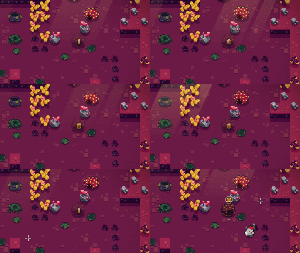
When a new level loads with a lot of action going on and plenty of enemies running around it’s very important to find where the player is spawned as soon as possible in order to plan further actions. Reading the feedback from our community we realized that this aspect needs to be improved. So we made a subtle but at the same time noticeable light coming from the hatch when player jumps from it. This visual effect helped to set player’s focus to the right place immediately after the level is loaded.
Light from the hatch:

Graveyard area has a specific enemy called Puffus which can deal damage to the players if they step on their dead body. Previously dead body was static and it was hard to understand that it’s dangerous. Usually that caused unexpected damage for the players. So we added a subtle pulsing animation so that players could better notice dead Puffus and beware.
Dead Puffus without pulsing effect:
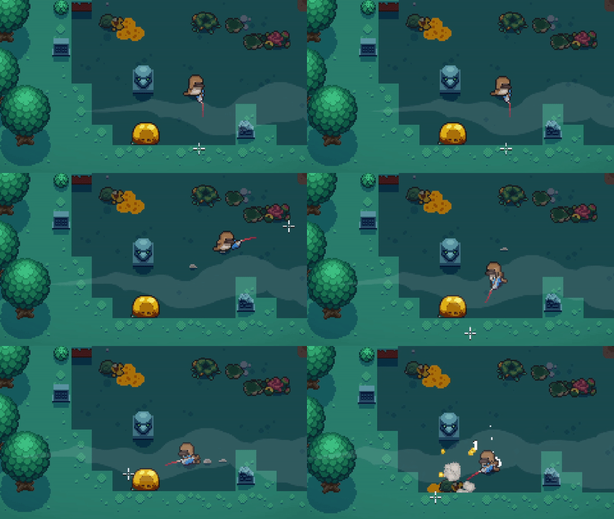
Dead Puffus with pulsing effect:
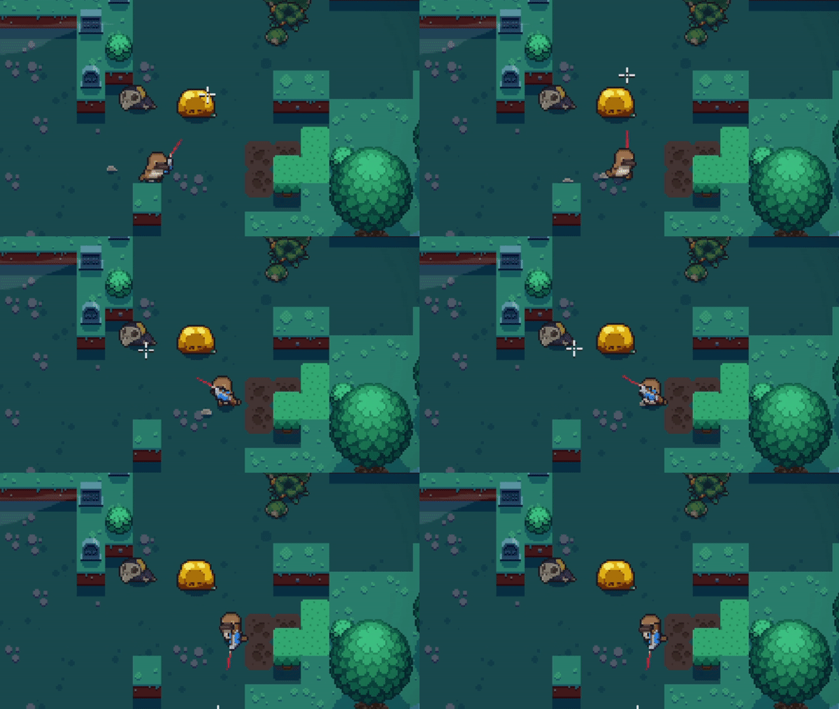
Those are only some of the examples, but the list could be continued. Now imagine, what would happen if we’d remove all the above adjustments from the game. Players would still could enjoy playing it, but lack of such details would create a feeling that something is wrong and does not feel right.
So the lesson that we learned is that polishing the game and adding details that matter should not be left behind, because it is a very important component that plays a huge role in the whole gameplay experience.
Hopefully, those insights can help and inspire other developers to make the best game as possible. If you have any questions feel free to ask!
Read more about:
BlogsYou May Also Like