Trending
Opinion: How will Project 2025 impact game developers?
The Heritage Foundation's manifesto for the possible next administration could do great harm to many, including large portions of the game development community.
This eclectic game combines Wario Land with the overcaffeinated energy of '90s cartoons. Here's how the developers iterated toward the game it came to be.

Pizza Tower is a frantic, blisteringly fast platformer that emphasizes linking movements together to maintain speed as you rush through its absurd pizza-based landscapes with a wildly-animated protagonist.
Game Developer spoke with Sertif, the game’s lead programmer, to talk about the continual creating and discarding process that led to their protagonist’s vibrant, varied animations, how they constantly thought about how the movement abilities and skills could link into one another to create seamless high-speed movements, and the thoughts inspired them to do away with any kind of health system and instead encourage players to strive for personal best times.
Pizza Tower is a wild, frantic game inspired by the Wario Land series. Can you tell us how this combination came about?
The idea of the game came to [Pizza Tower's pseudonymous co-developer] McPig around 2018, but back then, it was meant to be more Wario Land-oriented, where the focus was on the puzzles themselves. That was mostly the idea for the whole year in which the game had two demos, a Halloween one and a December one, both incredibly slow compared to what came next. Then, the SAGE 2019 demo happened with a more free-form moveset for Peppino that eventually became the final one. I was hired a year later, and we both took hints on what the players were doing with the SAGE 2019 demo, eventually morphing into this monstrosity of speed, score attack, and Wario Land.
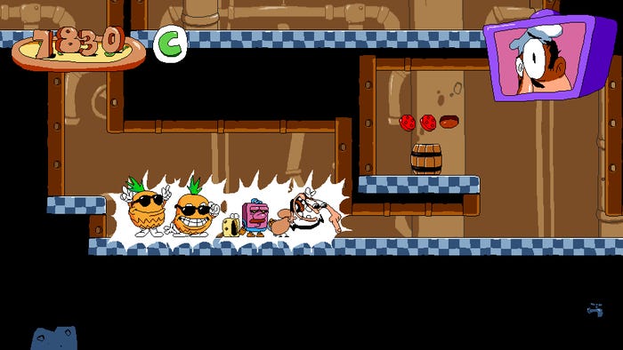
A screenshot from Pizza Tower illustrating Peppino's high-energy animations.
Peppino Spaghetti has a ton of character in his animations, movements, and the faces he makes. What went into his design to make him so expressive? What challenges came from putting so much work into how he looked, moved, and acted?
The idea overall for Peppino is that he is an absolute mess, and we (or rather McPig) wanted to convey that in every animation. This idea carried over from one of McPig's earlier comics, where Peppino's restaurant was haunted by pizza monsters, which was then made into several game prototypes. This then landed on what became Pizza Tower, retaining the idea of a nervous wreck protagonist from a horror comic and taking him into this absurd world of sentient cheese blobs and the like.
The animation and implementation process was usually pretty fluctuating, but the usual way of doing it was the following: we'd think up a mechanic we wanted to add, then once we settled on something, I would start prototyping and testing it. In the meantime, McPig would animate it in Aseprite; then, once we'd finished, we would evaluate it and repeat the process until it was done. This sounds more formal than it was, but that's the gist of it.
On the one hand, this proved to be a challenge as we left a lot of stuff on the cutting floor. This meant that many mechanics and sprites went unused, not to mention the sunk cost fallacy. On the other hand, I truly believe this was the best course of action for this game. As we became accustomed to this make-n-scrap cycle, with McPig being a fast animator and me being a fast coder, we implemented a lot of things we wouldn't have otherwise, scrapping the bad ideas, leaving only the decent or good ones. Would we do it again? No, but it worked, so it's fine.
Likewise, what thoughts went into the actions Peppino could take in the game? How did you decide on his basic abilities?
Peppino's moveset was changed up all throughout the game's development, including the final weeks of release. The Ground Pound, Mach Dash, and Grab Dash all came directly from Wario Land 4, the Mach Dash being Wario's Dash Attack but with three different tiers of speed (which are uncapped). The Grab Dash came from Wario's Attack, and the Ground Pound from his Smash Attack. Then there's the Super Jump, being a Shinespark of sorts, in which you need achieve Mach 3 to fly upwards infinitely until you reach the ceiling. Or his wall climb, where if you touch the side of a wall while using the Mach Dash, either in the air or when touching a slope below you, you will start climbing the wall at the same speed you were using the Mach Dash. Then, once you climb the whole wall, it will put you back directly into the Mach Dash.
The neat part about Peppino's moveset is how we linked different states with each other. For example, Ground Pounding a slope can lead you into the Mach Dash, canceling a Super Jump puts you back into Mach Dash, or crawling while using the Grab Dash puts you into an infinite sliding state which you can link back into a Mach Dash.
All of this was an absolute nightmare when doing level design, though, as not limiting your player can create all sorts of unintended behaviors. So, we added a lot of limitations for a test, with a limited Super Jump where it would only fly up a few seconds before putting you back to normal, a limitation on the wall climb where you would need to use a slope to do it rather than being able to in the air, and a Mach Dash that you only gained speed when going down slopes but also you lost speed when going up one. It was not fun in the end, but it served to realize that we were going down the right track, and we pulled ourselves back into full gear with a more free-form moveset.
The thought process itself, I can’t really speak much of. Everything just fell into its right place. We iterated all through development to the point it just made sense, you know? It’s not easy to tell what we made right, but one thing is for sure: it’s really easy to tell when you messed up, and it’s really, really easy for others to tell when you messed up.
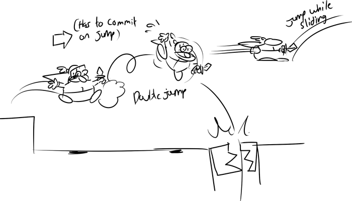
An early sketch depicting the reworking of the game's Knight transformation.
You also frequently throw in whole new abilities for short periods. What drew you to add these changes in gameplay? What did you want these wild abilities to add to the game? And how did you work them in without overcomplicating the core gameplay?
Wario Land had transformations, so why shouldn't we, right? But it also serves as a nice change of pace throughout the levels.
Our transformation philosophy started out like Wario Land's, but it ended up being different. Throughout the first half of development, the transformations had two main roles: to make new paths and to harm the player's pace. However, the more we went fast-paced, the more we realized we needed to change things up. For starters, enemies would no longer give you transformations (e.g the Pizzard used to give you the Knight transformation), and we would also treat them as power-ups rather than hindrances (for the most part). This meant that each transformation was reworked to be as fast as we could make them without making it as monotonous as "just another Mach Dash."
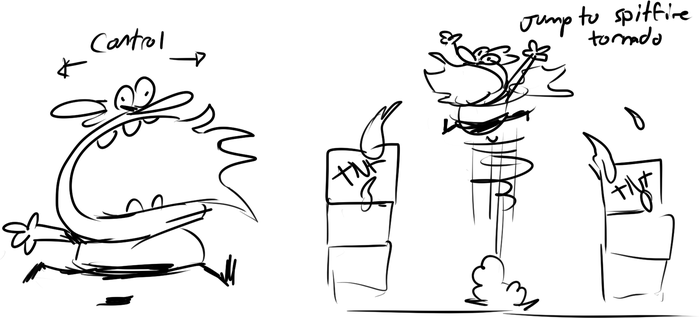
An early sketch from the Firemouth transformation reworking process.
The first transformation to be reworked was the Firemouth transformation. Before, it was fast-paced too, but in a very uncontrollable way, making you run in one direction until you bumped into a wall, turning you around, then letting you shoot projectiles and jump. Pretty simple, but it didn't work with the new moveset, as it was very frustrating not to be able to control it, especially when trying to jump and missing. So, we made it so you could walk and stop on the ground, then added a very high jump to it with the ability to use an Air Dash, which propelled you forward while also adding momentum to the transformation. This meant that if you held a direction, jumped, and used Air Dash, you could gain a lot of speed. This was more in line with our new design as it was now fast-paced but also not a hindrance.
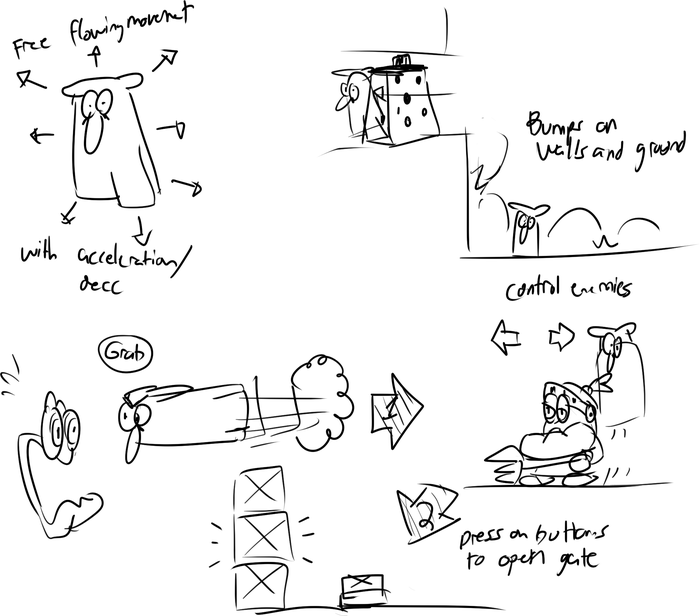
An early sketch from the Ghost transformation reworking process.
The last transformation to be reworked was the Ghost transformation. It went through three iterations. At first, it would just let you move left and right, jump infinitely, and go through cheese graters. That was reworked into a transformation that would let you possess enemies and use their respective Heat Meter Attacks (another scrapped mechanic), but it was way too slow and would break the pace a ton. Then, it finally turned into an eight-direction flying transformation where you got three different tiers of speed to break blocks, which, while still pretty simple, worked great as you could pick up the pace again once you got the Ghost Peppers.
Pizza Tower's stages are designed to encourage speed. How did you design your stages around using Peppino's moves to go faster?
The level design was all over the place throughout development. We scrapped, recovered and re-did a lot of it up to the final months. Most of it came down to just making sure no level felt the same. We would make sure you weren’t taking the same route as the previous level, that you were doing this route with the least amount of slowing down and doing all that while also making sure a highly skilled player would use all of Peppino’s moveset and a new player would use what they knew (which is usually just the Grab and the Mach Dash).
The problem with doing it this way is that it’s really hard to maintain, so, unlike the gimmicks and transformations, we didn’t really iterate over the level design until the tail end of development. It was all about re-doing the levels over and over again until they felt right. During the last three years of development, each level was remade around 2 to 3 times each to accommodate our ever-changing speed-focused philosophy and ensure there were no gaps to fill.
Then, there was the matter of playtesting. We have around thirty playtesters, each with different skill levels at our game. So, when we watched them play through the game, we immediately noticed which sections we needed to make easier. This is incredibly important, as, when you’re making a game, you will know the ins and outs, which state flows into the next, etc, so you will need to tone down your level design before you’re ready to ship. Most people won’t realize that you need to jump at an exact pixel to move forward, they will just quit and refund your game. Don’t be afraid to water down the challenge a lot, even if you can see how complex and neat a level plays out when you have the foreknowledge.
Can you walk us through the design of a favorite area or series of challenges and how it all came together?
Gnome Forest is definitely one of my favorite levels because it’s the first level I officially worked on, back in 2020.
Its design was way too different back then. Basically, the level was still about delivering pizzas, but instead, Gustavo would hand you the pizzas (he was not playable yet) from his pizzeria set in the forest (yeah, he used to be a Gnome). Once you collected a pizza, you would get a temporary HP system, where each hit would make the pizza lose a slice, and if you lost them all, a cutscene would play out where you got sent back in a taxi to Gustavo, and he would beat you up for several seconds, before handing you another pizza.
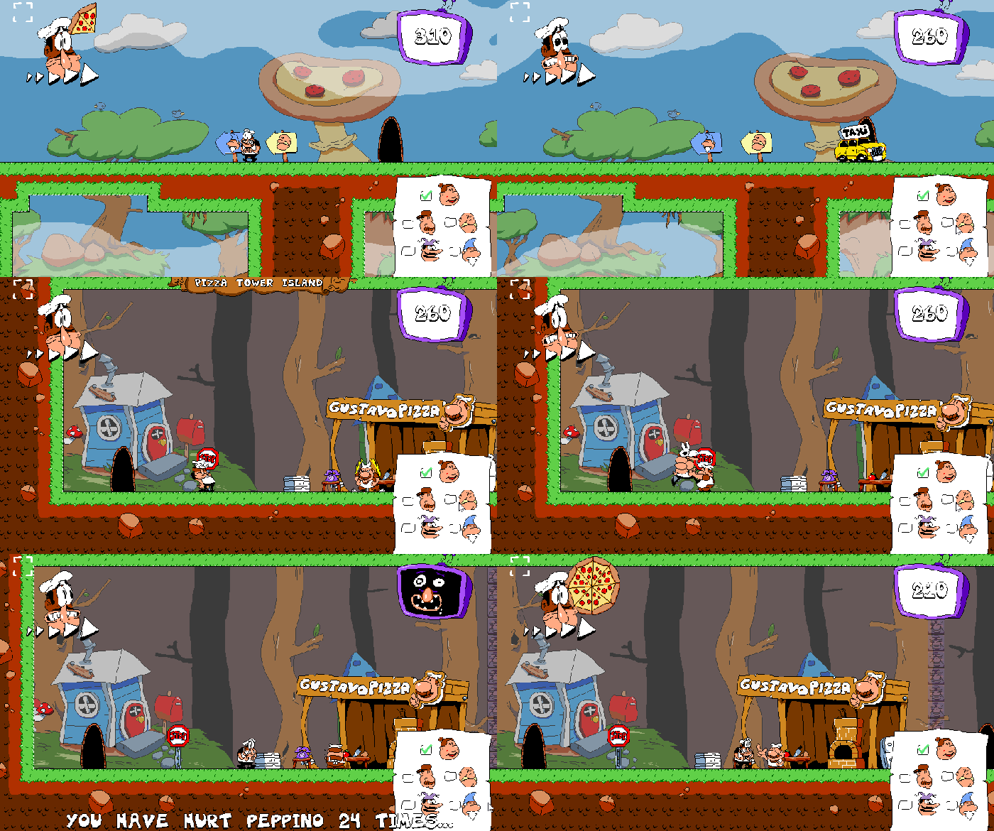
A cutscene of the death sequence. The pizza health meter can be seen in the upper right corner.
At the time, this level featured multiple cutscenes—one for getting a pizza, another for losing a pizza, and another one for delivering a pizza. The people you needed to deliver to were the same Gnomes with the same houses, but instead, it was more like a maze where you would get a checklist, and the level would sprawl through a central hub, and you could get to each Gnome however you wanted. This is also where the first enemy I coded was added, the infamous Pickle. After delivering a pizza, a taxi would pick you up back to Gustavo, where he would give you another pizza to deliver.
Now, the level was fine at the time, as we were still more focused on maze-like level design and such. In 2021, we started to make the game more speed-focused, which immediately created problems for this level as we reworked every single stage to fit the new philosophy. The first immediate problem was the loop of Get Pizza -> Track down Gnome -> Deliver Pizza -> Get sent back in a taxi. It just didn’t work at all. At the time, we thought the issue was the cutscenes were too slow. So we made the initial pizza-getting cutscene mandatory, and all the proceeding pizzas were given to you automatically by just touching Gustavo after getting back to his pizzeria. Then, we got rid of the deliver pizza cutscene, immediately spawning a taxi to get back to Gustavo.
The next problem was the HP system. It was way too harsh, so we just got rid of it. But now, the delivery was incredibly lackluster, so we put it back in and made it harder to lose HP.
Another problem was that the level design didn’t really work for being fast as it was just about finding the houses. So, we streamlined it to something more akin to what it became in the end.
The level as a whole was still lackluster compared to the newly-reworked levels, and it wasn’t until we did another level rework in late 2021 that it turned out better. See, it turned out all we had to do was add a rat to Gustavo and make them playable. Now the level made more sense, so we ditched the checklists, replaced the pizza HP with just a timer before the pizza froze, and made the level about switching back and forth between Peppino and Gustavo in a race to deliver all five pizzas. This worked out well enough for us, but you can’t just throw a new playable character and have it switch back and forth between them and the main one. So, we just made it mostly a Gustavo and Brick level to introduce them properly to the players, alongside a tutorial.
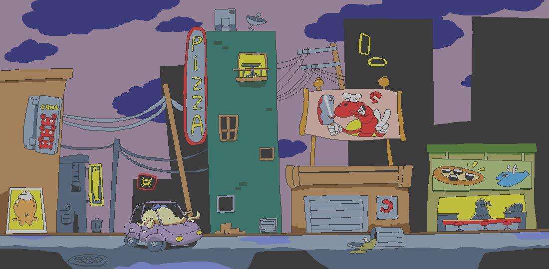
A background from the level The Pig City.
Your locations and foes feel designed to delight and surprise the player (or crack them up). Can you tell us a bit about how you infused each location and foe with the game's absurd themes and how those themes birthed some of the areas and enemies?
Theming for the levels always started out as a single idea, e.g City, Medieval, Space, and from there, prototyping would start. However, this meant that we ended up having way more level themes than we could do, so we ended up fusing [some]. We did everything from shifting enemies around levels to shifting level design and mechanics into a whole other stage, then making the level’s theme around it.
For example, one of my favorite levels, “The Pig City,” initially came from the single idea of “City.” We also had a really old idea for a Circus level which then got fused into City, making its first version. As you can see in the game, that combination got scrapped, but it laid down the general idea alongside various backgrounds that ended up being reused (including the jail room, poop included) and the Smoking Pizza Slug.
We had an old level called “Kung Fu,” which featured yet another city. This one was overrun by Shrimp Thugs that would throw knives at you. Then, we had the final single idea of “Streets,” where we fused both of these levels’ themes and made it a single city. Then, we added a pig theme on top of it with the Pig Cops because, well, it’s a city, and a city has cops.
On the other hand, there’s Fast Food Saloon, a whole new idea born out of fusing the level design from another old level called “Space Pinball” and the aforementioned “Kung Fu” level. The theming was created out of the Space Pinball idea, alluding to arcades, which in turn alluded to those Arcade Bars you can find, and the rest is history. There’s even a decoration in the level that reads Space Pinball.
That’s the gist of it, really; we had so much stuff that we needed to condense it down to the best themes. I believe we had around 28 level ideas total—way more than the final game—but it was for the better.
Pizza Tower has very few ways to lose or meet a fail state, encouraging players to decide what success feels like. What appealed to you about largely removing death/failure? How did you work to create that personal sense of accomplishment to take its place?
We didn’t balance it well, so we just removed the ability to die [laughs].
In all seriousness, this decision was discussed throughout most of development. We used to have a health system that came and went several times, first as a general system where you could die and be booted out of the level. Then, it was part of the old Gnome Forest system, as stated above. Then, it was part of an old Kung Fu mechanic. Then, I don’t really remember.
The overall idea is that we’re making a game that is hard to pick up, to explain, and to master, so we’re gonna lower the stakes, relieving the player and letting them pick up the game at their own pace. Well, until Pizza Time starts, then the decision of not having health makes the escape sequence even more stressful as you can now really die, making you lose all progress in the level. This was the intended effect. Although we still wanted to be a bit more generous to the player by making it so that they could still finish the level even if they ran out of time as they tried to outrun Pizzaface.
We definitely took a chance by letting the player reward themselves by making a game that is technically easy to complete. But the real meat is hidden behind memorizing each level layout, optimizing your routes, and finally getting those elusive P ranks.
Side note: Apparently, the rank screens are too mean for some people, but what can ya do?

One of the game's many rank screens.
You've built a large fanbase for your game. What work went into fostering a group of loyal fans? What did you do to build your audience over the course of development and release?
At the beginning of development, McPig started posting screenshots on Tumblr before deciding to switch to Twitter, because at that time, it was easier to get noticed in the indie scene there. Then he made a Discord server that served to get engagement. Then after two successful demos in 2018, he made a Patreon where you could get early access builds if you paid 5$ or more monthly. Then, with a growing community, the SAGE 2019 demo released. All of this, plus the help of streamers picking up the demos, most notably Vinny from Vinesauce, made the community grow exponentially.
After that, I honestly don’t know how we kept going. Most of the community work was done when I joined the team in early 2020, and the community was relatively static, but we engaged a lot with users on Discord, and McPig picked up the habit of streaming progress on Twitch. This was also when we stopped doing monthly builds, and we got to a point where we had yearly builds up to release. Honestly, people had a lot of faith in us up to the end because even without builds to donate for, we had a constant stream of donations that helped us stay afloat and work in the game for however long we wanted. This resulted in a game we’re proud of, and we wouldn’t have done it without the full support of our community, to who we are thankful (dramas aside).
Around a month before release, we launched the Steam page, which I thought was a mistake at first because we made it too late. Since we were just coming off of having launched a successful Patreon build, we had gathered enough hype to get to around 50k wishlists up to release. This short window between the Steam page to the release helped us keep the game fresh in people's minds.
Then, when the release came, we sent several keys to reviewers and YouTubers. Some of them helped us in the initial release, others didn’t (but honestly, I don’t blame them because we sent out the keys too late). This helped the game get to even more people, resulting in the growth of the Discord server from 5k to 20k members, before we decided to pull the plug on it.
And that’s where we’re at.
You May Also Like