Trending
Opinion: How will Project 2025 impact game developers?
The Heritage Foundation's manifesto for the possible next administration could do great harm to many, including large portions of the game development community.

Featured Blog | This community-written post highlights the best of what the game industry has to offer. Read more like it on the Game Developer Blogs or learn how to Submit Your Own Blog Post
A behind-the-scenes look at some of the improvements we are making to the User Interface of Business Heroes: Food Truck Simulation to make it more accessible to players with visual disabilities.

Statistics show that about 8% of all men (1 in 12 men) and about 0.5% of all women (1 in 200 women) suffer from color vision deficiency. To put that in perspective, that’s about 300 million people living with colour blindness. Adding the number of people living with other types of vision impairments to that number made us realize something critical. We had to take accessibility concerns very seriously in developing our very first game, a delicious food truck business management and strategy game called 'Business Heroes: Food Truck Simulation.'
This post is about some of the improvements we made to the User Interface of the game to make it more accessible to players with visual disabilities. We wish we could tell you that we designed the game to be very accessible from the start, but we didn't. If not for the contributions and feedback we received from Redditors and other community members, we probably would have missed the accessibility issues in the UI until it was too late.
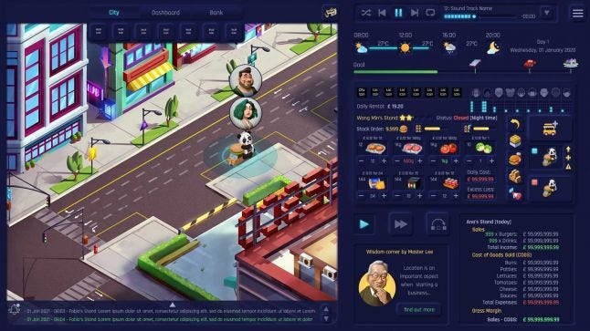
Old Inventory Management Window
Anyone with low vision or even someone just trying to play complex strategy games on a smaller pc screen will attest to the difficulty of seeing some game elements. Just like in the first version of our UI shown above, these games are particularly notorious for having smaller buttons and text because of the sheer amount of information that is usually being presented to the player. Although Business Heroes is a business strategy game with a lot of embedded information, we still wanted players with vision-related challenges to have an enjoyable experience playing the game.
So, when the community alerted us to the problems with the initial colours, sizes, and contrasts we had used in the UI, we moved to fix them. Fixing the accessibility issues eventually led to redesigning the entire UI, and while it added an additional year to the development (it's our first time developing a game), we are very happy about our decision. We are optimistic that choosing to implement the following design decisions and options would enable far more players to enjoy the game better.
Larger Buttons and Text Sizes:
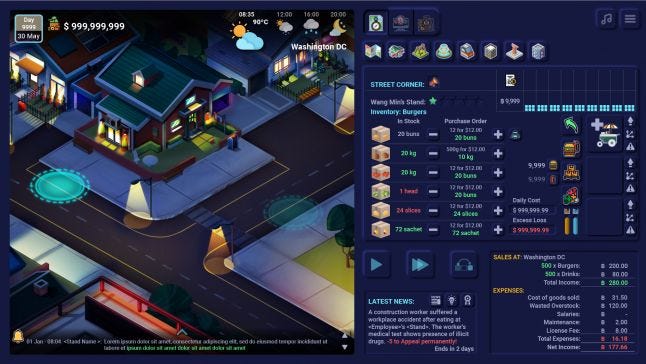
We started off by redesigning the button and text size to also work for players with impaired vision. We redesigned the UI layout to create more space for larger buttons, and we moved several components to a new window entirely.
New Inventory Management Window
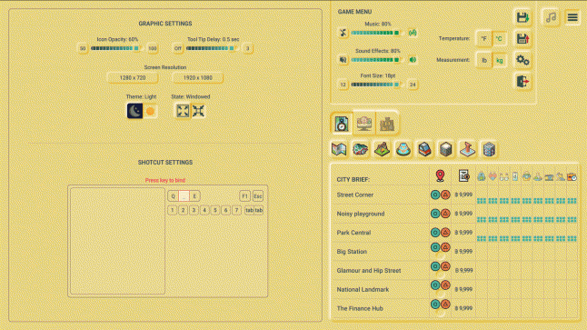
Making the text size work for everyone was a particularly tough nut to crack. We had to consider the impact language translation would have on the interface text and spacing because we will be releasing the game in several languages. While we could not implement a solution that worked for all the text, we were able to allow players enlarge 90% of the game text to 24 points. This can be done in the game settings.
We also stuck with a font choice and text contrast design scheme that made all the information in the UI and environment easy to read.

Font Resizing
UI Colour Switcher and Icon Contrast:
For players with colour vision deficiency, we implemented a design option that accommodates their unique needs and works for everyone else. The UI colour can be switched from yellow to dark blue depending on the players' visibility requirements. This can also be done in the settings section.

Colour Switching
To reduce the potential effect of a crowded UI due to too many colours, we kept inactive icons at 50% opacity by default and you can see their full colour when you place your mouse on them. We however included a function that allows you increase or decrease icon opacity as much as you like. This also has the added advantage of improving the contrast scheme of the UI.

Icon Opacity Control
Plus, we also applied shapes to the different player colours to distinguish players and their competition. This way, players would not have to rely solely on colour to differentiate between other players.

Player Colours with Shapes
Game Music Control:
One way we tried to cater to players with hearing symptoms is to give players control of the music volume in the game. Players can turn it down or turn it off completely. We separated the music sound from the gameplay sound, so no one is stuck with the 'all sound or no sound' option.

Music and Sound Controls
Detailed Tooltips:
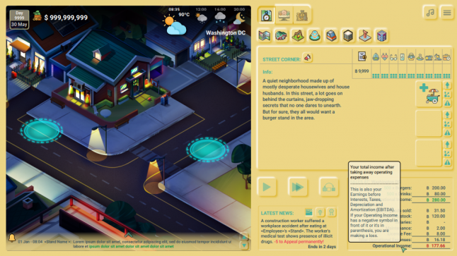
Finally, we implemented a detailed tooltip and business guide feature to make the game easier for non-gamers, new gamers, and teenagers in general. To prevent players from feeling overwhelmed with the UI, we included clear and concise explanations, instantly available at a mouse's hover.

Tooltip 1
Because many young people might be seeing the business terms and concepts in the game for the first time, we also included a friendly business guide, in the person of Master Lee, that provides deeper insights into the meaning of the concepts and business terms used. This way, players will never have to wonder about any aspect of the game while implementing their business strategy.

Tooltip 2
I sincerely hope you enjoyed reading this as much as I enjoyed sharing it. I'd love to read your thoughts, so don't hesitate to share. Thanks!
For more game updates, tips, and developments, please subscribe to our newsletter, join our Discord server, or follow us on Twitter and Instagram ❤️
Read more about:
Featured BlogsYou May Also Like