Trending
Opinion: How will Project 2025 impact game developers?
The Heritage Foundation's manifesto for the possible next administration could do great harm to many, including large portions of the game development community.
In this article I would share how we design a map for the Match 3 game: Block Start Party.


Block Star Party is a Match-3 game on Facebook and iOS. As the name suggests, the game features lovely star blobs that journey through many worlds in the cosmos. Our team recently took over the job of designing and creating new map art for the game. This is one map zone we have made.
.jpg/?width=400&auto=webp&quality=80&disable=upscale)
In this article I'll share how we design this map from scratch.
The story line of this game is quite loose, so whatever theme is interesting could be used for the map. There are lots of female players who play the game, so in choosing the themes, we should consider their preference. Don’t use themes that are dark, cold or have too many machines.
In general, each of the previous maps has distinctive geographic features, of rhythmic undulation; And upon the terrain, interesting elements are placed.
In my previous article, I talked much about the characteristics of Block Star Party maps, you can read it if you want a fuller picture.
First, we come up with a lot of ideas for themes, then invest more time to develop the ones we think are most valuable.
For example, this one is French wine country. I watched a show on History Channel, Modern Marvels. One episode was about wine making. It reminded me the idyllic wine countries.
Then we started to look for photo reference on Google, for terrain and elements. There are many wine production areas in France, and we gathered pictures of each area.
.jpg/?width=300&auto=webp&quality=80&disable=upscale)
Pictures we found of Burgundy were very good looking, so much so that we decide to use references exclusively from that area.
.jpg/?width=550&auto=webp&quality=80&disable=upscale)
This picture looks great, a cozy village lies on green gentle slope, with a commanding mountain high above. This could be used as the overall layout reference.
And we need elements to fill the map, first, a lot of small country houses, chapels.
.jpg/?width=450&auto=webp&quality=80&disable=upscale)
Most importantly, this is a wine country, not any countryside in general. That we need things to make it manifest.
We can put an oversized old wine press machine somewhere. And an arch doorway common to vineyards. To make it more clear, we can put a grape sign of exaggerated size on the head of the arch.
.jpg/?width=450&auto=webp&quality=80&disable=upscale)
And one prominent feature of vine field is that the crop is planted in rows.
.jpg/?width=400&auto=webp&quality=80&disable=upscale)
At this stage, we should consider the color composition. It would be great to use Autumn colors, rich and variegated.
.jpg/?width=400&auto=webp&quality=80&disable=upscale)
However, the last zone is Grand Canyon, and the next zone is Quebec in autumn time, there are too much red and yellow. So we decide to use summer time for this zone, with vibrant green.
.jpg/?width=300&auto=webp&quality=80&disable=upscale)
We would make a draft of 4~5 zones connecting head to tail, the wine country is in the middle.
We use this draft to work out overall layout, and path configuration. We need to consider a few things:
The map should have good balance, the weight of big masses should be comfortably distributed: For example, the mountain is big and heavy, but it’s no important element, so we put it to the top and only display a half; The wine press should be the eye of the map, so we put it near 1/3 focal point.
The winding of the path should look nice, and we must calculate there are enough level nodes. For this game it’s 25~30 levels per zone.
The village should give a sense of leisure country life, so the houses should be casually placed.

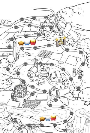
We need to prepared well defined line art for coloring.
We do two things in this stage, one is to make everything fit to the same isometric angle – it’s unchanged across maps.
Another is to make the form of everything clearly defined. At this stage the artist would look to more reference photos.

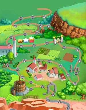
The color should strict follow the concept definition. And we would cross reference the previous maps, that the color style should be the same, with same sun ray direction, contrast, saturation, same whatever things.
After this the design is done, ready for finish painting. We do the final painting job also, I would post a separate article about the procedure, look forward to have your attention!
Read more about:
BlogsYou May Also Like