Trending
Opinion: How will Project 2025 impact game developers?
The Heritage Foundation's manifesto for the possible next administration could do great harm to many, including large portions of the game development community.

Featured Blog | This community-written post highlights the best of what the game industry has to offer. Read more like it on the Game Developer Blogs or learn how to Submit Your Own Blog Post
Why retro gaming isn’t just about pixel art and how to achieve a low poly art style in Unity. In this article I want to share a little bit my passion for polygons and explain how I’ve tried to recreate this style in my current game Hang Line.

This article was originally posted here for RetroGamingBCN.
A lot of the time when people think about retro gaming they think about pixel art. I love pixels as much as the next game developer, but what I’m really into is polygons. Specifically the low-poly textureless art styles of classic games like A-10 Cuba or Virtua Racing.
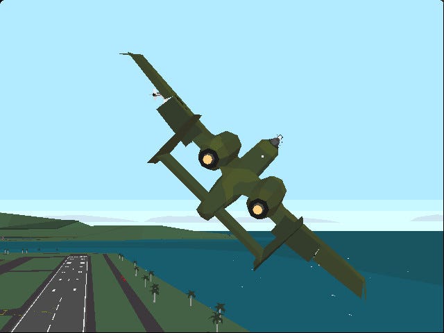
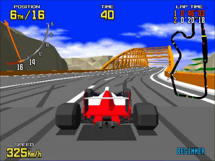
Insane physics flight sim A10 Cuba (left) and Sega’s arcade classic Virtua Racing (right).
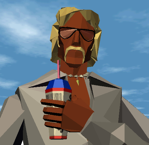
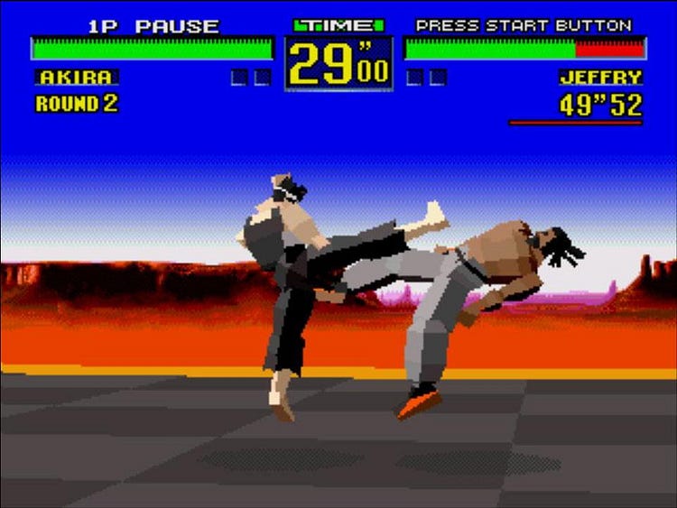
Flares and mullets galore in driving shoot-em-up Interstate 76 (left) and some classic beat-em-up action in Virtua Fighter (right).
In this article I want to share a little bit of this passion for polygons and explain how I’ve tried to recreate this style in my current game Hang Line. Hang Line is an extreme physics climbing game for mobile that has you swinging up mountains using a grappling hook, avoiding avalanches and angry mountain goats.
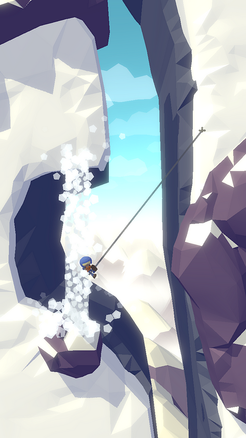
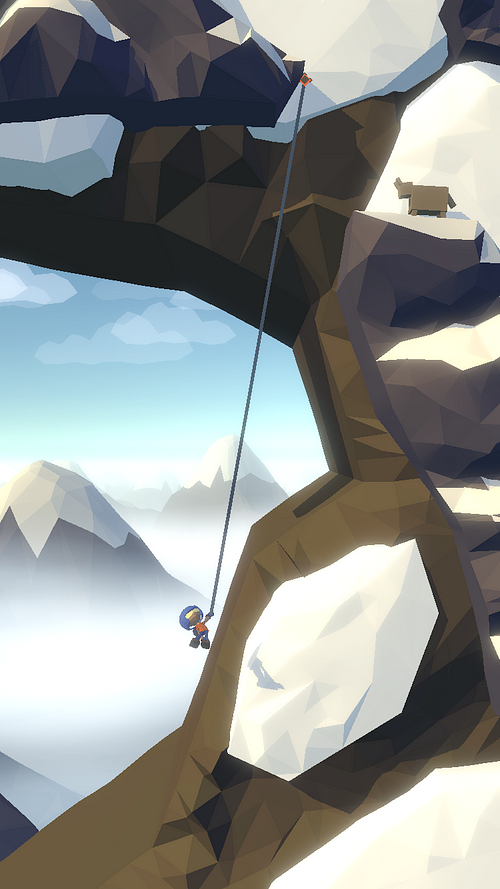
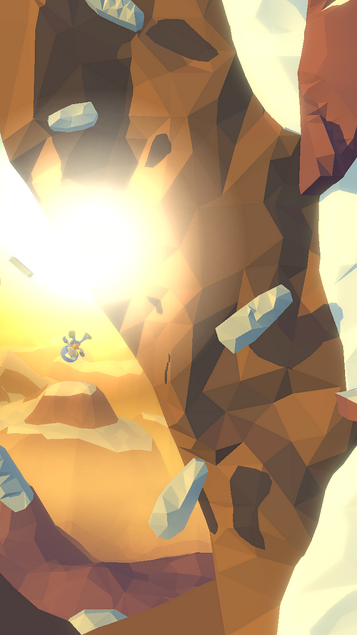
Hang Line — waterfalls, explosions and angry mountain goats.
But before I get to that, let’s take a trip back in time.
Back in the early days of 3D, there wasn’t quite the processing power to handle textures so a lot of games had to rely on flat shaded polygons. This style was put to great use in flight sims and driving games, where draw distance and speed were paramount. A big advantage of avoiding textures was that if you got close up to a surface, it still looked fine. In the early days of textures where texture filtering didn’t exist, those textures could look super ugly up close.

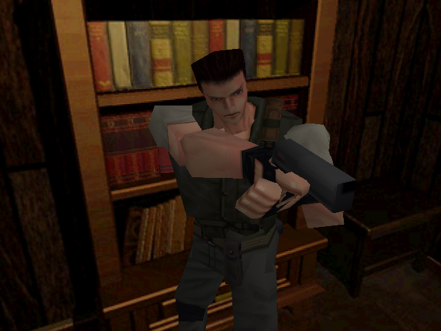
A couple of shots from different versions of Capcom’s original Resident Evil showing no texture filtering (left) and filtering on (right).
Apologies if I just destroyed your memories of Resident Evil, but it’s true that the early days of texture mapping weren’t the prettiest.
As processing power increased, using textures became the norm and the flat shaded textureless style was pretty much forgotten. The strive for photorealism took over and poly counts and texture fidelity soared ever higher.
But in recent years, low poly textureless 3D has had a bit of a revival in the indie dev scene. This is partly due to simple reasons of development efficiency — building something with less polygons is obviously quicker, and even more so if you don’t have to worry about texturing it. But it’s also due to performance. Building a game to run well on mobile often means cutting as many corners as possible, so avoiding having to render textures is a big win.
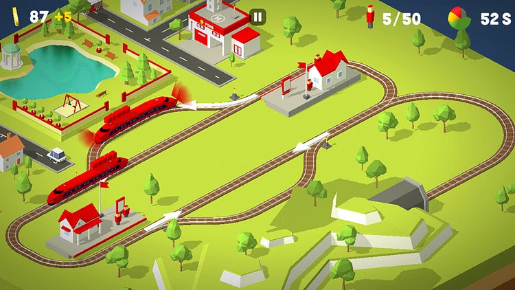
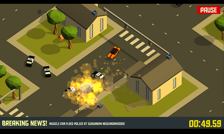
Northplay’s brilliantly designed Conduct This! (left) and the gorgeous Pako — Car Chase Simulator (right).
These days mobile hardware is so fast, striving for maximum speed is getting gradually less important. But in recent years there’s been another motivation for high performance — Virtual Reality. This is due to needing to render the scene twice - once for each eye - at a super high frame rate to avoid the player experiencing motion sickness. A lot of VR games have taken advantage of low poly styles to keep the focus on gameplay and maintain a smooth experience.
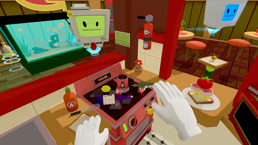
Owlchemy Labs VR classic — Job Simulator.
When I was starting to decide on an art style for my game Hang Line, I drew a lot of inspiration from artists such as Charlotte Oakley and Laurynas Jurgila (PigArt). If you are just starting off with low poly art then I highly recommend PigArt’s YouTube Blender tutorials, I found them super helpful.

“Alaskan ” from Charlotte Oakley’s fantastic “50 States of America” — view the complete project here.
Like a lot of indie developers, I use Unity. Creating a low poly textureless art style within Unity is reasonably easy and there’s 2 methods that are commonly used:
Use just one material then colour each face of a mesh through vertex colours (colour information stored on the vertex of the mesh itself).
Use a texture as a colour palette so that polygons of a mesh will derive their colour from a specific point on the texture.
The following article does a great job of highlighting these two techniques and explaining how to prepare models for importing into Unity to achieve a textureless look: Beyond Retro Pixel Art.
I ended up using vertex colours, mostly because I needed to generate meshes myself — more on this in a moment.
When it comes to lighting, the original low poly games of the early 90s had a lot of limitations to deal with. Some developers choose to mimic these limitations and make it look like the game is running on older hardware, such as Sky Rogue.
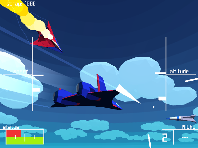
Retro arcade action flight sim Sky Rogue, by Fractal Phase.
For Hang Line I decided to just stick to modern lighting solutions mostly to take advantage of shadows, but I did impose some limitations to keep a more retro look. I limited the scene to just a single directional light and adjusted the shadow quality so Unity would create hard shadows only. This was so the shadows would have no gradients or softness to them, and so have the appearance of being formed of chunky polygons themselves.
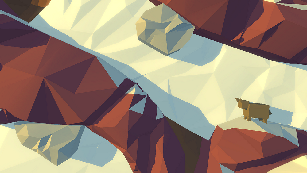
Hang Line hard shadows example. Don’t let the cute goats fool you, they will kick your ass given half a chance.
By far the most difficult problem to solve in achieving the art style I wanted was building the environments. The main issue was that I needed about 50 levels. I wanted organic looking mountains and rock faces that were shaped uniquely for each level. Creating this by hand in a 3D modelling program would have taken forever, despite the time savings of using a low poly style.
What I eventually decided to do was create the art for the environments procedurally. The process involves sketching out the level to define the collision of the gameplay area in 2D. Then I automagically generate a low poly 3D surface out of those 2D meshes.
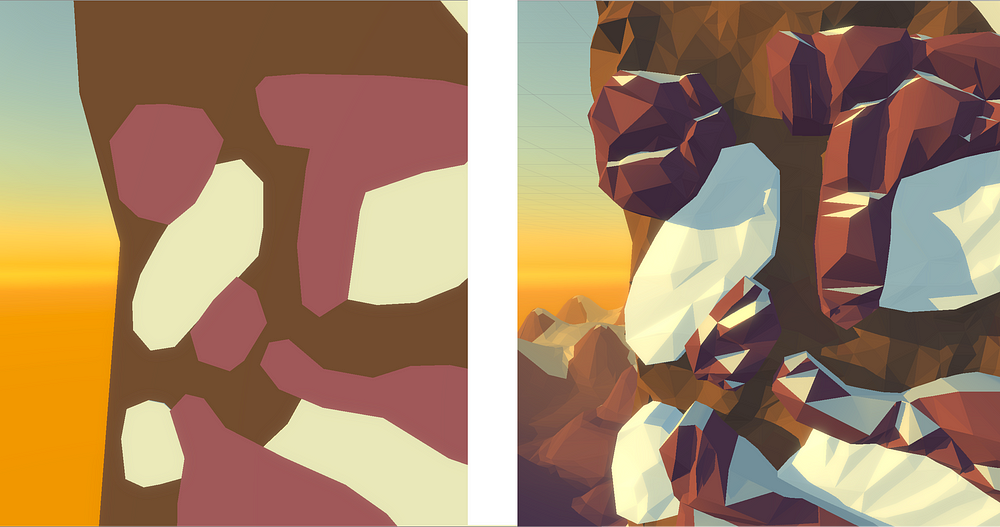
The simple 2D shapes that I build to define the level (left) and the meshes that are automatically generated (right).
Each level has 3 different layers (the 3 different colours you see in the left image above):
The background mountain.
The rocks that you bump into.
The snow surface that you grapple onto.
Each is built as a simple 2D mesh then programmatically converted into a 3D surface. The following diagram explains the stages that the code goes through to take a 2D mesh and build a final rock surface out of it:
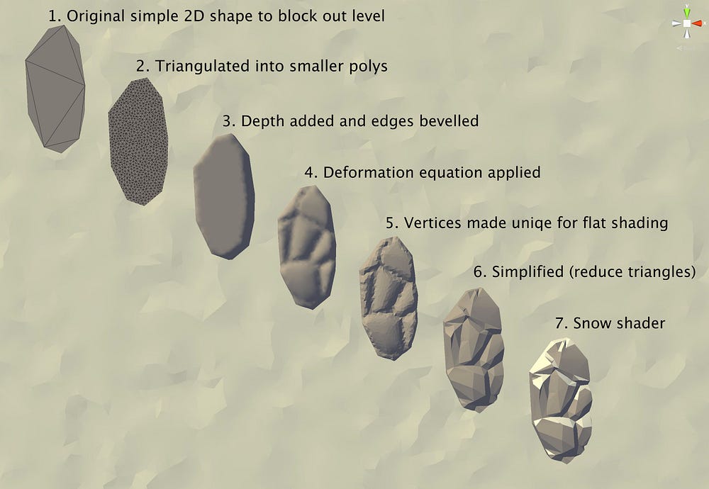
Step by step process of turning a flat 2D shape into a 3D lumpy rock surface.
This technique was extremely difficult to get working but has allowed for a super fast workflow. I can now build a final level from scratch in 3 hours. It also means I can make tweaks and edits super fast within the editor and not have to be tweaking art in a 3D modelling program. And since the art mesh is generated directly from the collision mesh, the two never get out of sync.
You can see a video of the game in action below:
It still needs work to get it looking really great, but like any art style, mastery takes persistence! You can find out more about the game here:
www.hanglinegame.com
And to learn more about the development process, you are welcome to follow me on twitter: @edform
And remember — achieving a retro look isn’t just about pixel art!
Read more about:
Featured BlogsYou May Also Like