Trending
Opinion: How will Project 2025 impact game developers?
The Heritage Foundation's manifesto for the possible next administration could do great harm to many, including large portions of the game development community.

Featured Blog | This community-written post highlights the best of what the game industry has to offer. Read more like it on the Game Developer Blogs or learn how to Submit Your Own Blog Post
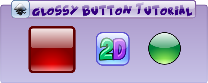
A quick tutorial on how to create a web 2.0 style button in Inkscape. The button can be used in many ways, you can change the shape and colors and use it in games and apps.


A graphical user interface (GUI) is a visual interface allowing users to interact with electronic devices.
To provide an enjoyable experience for the user, buttons, sliders, panels and displays should have a decent appearance in addition to their functionality.
You need GUIs in apps for mobile devices, in websites and in any kind of games in 2D and 3D, so they are some of the most important game assets.
Quite often, the process of user interface creation doesn't get enough attention, even though they are some of the graphical elements players will spend the most time looking at when playing a game.
This will be the first tutorial in a series about general user interface design and special UI design for games, including a guide on how to design an entire UI for a video game. We will start with a simple yet stylish glossy button in a shiny 3D look. The button will be the basis for more interface elements, it can be easily adjusted to your needs.
You can easily turn it into resource bars, panels, sliders and a lot more in a few clicks.
All you will need is Inkscape, a free and very powerful vector graphics program. Now let's get started!
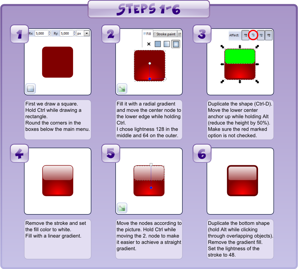
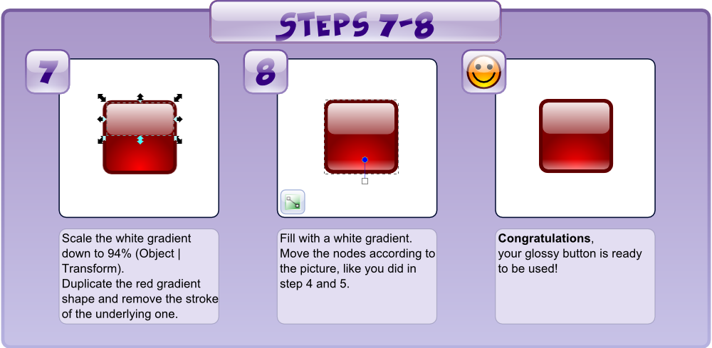
Click the picture to view the tutorial at full size.
Have fun! 

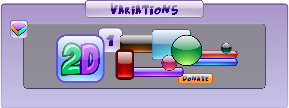
Now you can create an app or game asset of the button by exporting it as a bitmap. The advantage of vector graphics is that you can export it as large as you like without having a loss in quality. We now have a great asset we can use for almost any kind of interface. If you vary in color, shape, stroke width and size, you can create highly diverse buttons and panels out of it.
You can add your logo or a font or design resource or experience bars for your game, even the buttons of this tutorial were created with this simple template.
Artist's advice:
When creating art and playing around with color, saturation and lightness, I recommend to always work on a neutral 50% gray background, to get a more realistic impression of how things will turn out.

This is just a sample of what you can create with the glossy glass button template.
You can download the Inkscape source file for free, including the button and all variations shown above: 2DeeArt_Glossy_Button.svg
Check back soon to see more interface magic!
I will post more tutorials on GUI design, especially for games, soon. Have fun creating awesome buttons!
If you have questions on UI design or requests for future tutorials, please post a comment!

Read more about:
Featured BlogsYou May Also Like