Trending
Opinion: How will Project 2025 impact game developers?
The Heritage Foundation's manifesto for the possible next administration could do great harm to many, including large portions of the game development community.

| Picture Perfect: Exploring Photography Games | ||
| Every day this week, Game Developer is serving up a gallery of interviews, deep dives, and more digging into the evolution of Photography in video games. | ||
| Browse Latest Articles | Submit your Blog | |
How do you craft an environment filled with tension in the absence of direct conflict?

Interior Worlds is a journey through liminal spaces—locations where you transition from one place to another. In it, you’re tasked with taking pictures of seemingly-ordinary locations and things. From the eerie drone of nearby lights and machines to the pounding heartbeat you hear as you get close to a photo op, it feels like you’re creeping closer to some unseen horror. But will you ever actually find that creature?
Game Developer caught up with developer Sodaraptor to talk about the haunting power you can evoke using unclear visuals, how they drew from background ambient noise to create the game’s chilling atmosphere, and how they carefully created a sense of unease by getting players to photograph seemingly-ordinary places.
Game Developer: Interior Worlds sees players exploring liminal spaces and taking pictures of them. What inspired you to create this experience?
Ever since the big liminal space movement started back in late 2019/early 2020, I've been super interested in the topic. Several times, I even found myself going out to physical locations to take my own photos with a similar aesthetic. Eventually, I formed this idea of going around and doing the same thing in an urbex-style game where you're seemingly all alone.
How did you decide on the locations you wanted to create? What drew you to the late '90s-early 00s era that the game takes place in?
At first, I just drew up a few different moodboards with various "popular" liminal space locations, such as a parking garage and hotel. Then, I started taking more inspiration from places I had actually been to while growing up that gave off that same sort of feeling. So you could say a lot of my decisions were influenced by my nostalgia and childhood memories of that era.

What real places inspired the locations? How did they affect the design of the locations?
Most of the locations, while based on real settings, are largely made up. A few, however, like elements of the school and mall, were heavily based on the two I remember going to when I was younger. The school, in particular, shares similar wall, floor, and logo designs as the real-world counterpart, and the mall's center skylight has the same style as the mall I went to as a kid.
The visuals feature an eerie, fuzzy look to them. What drew you to create this lack of clarity in the visuals? What do you think it added to the experience?
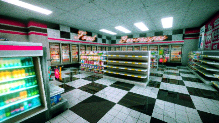
Other than growing up with and being a big fan of that crunchy [PlayStation 1] style, I find that purposefully lacking clarity in a horror game gives it even more of a psychologically "thrilling" edge than just having distinctly crisp visuals. I leaned heavily into the post-processing throughout this project—lots of grain, bloom, and overlays for dust/scratches—in order to try and get players to imagine what may or may not be at the end of that hallway in the sketchy photo they just took.
Audio is a vital part of making the player feel like they're really in these places. What thoughts went into the audio and sound effect design of the game?
I've played a lot of indie horror, and something I've noticed that goes underutilized is the impact of "background ambiance," like drones and pads. Some games opt for the more "classic" style of atmosphere and music, such as a specific musical score to instill tension, which leaves little room for focus on the environment. The low, subtle rumbling and steady, monotonous drone of sweeps found throughout most of the game gave me more opportunity to let the player soak in their surroundings.
How did you design the camera? What thoughts went into what the player would be capable of doing with it?
My friend NormalHumanSixx (who helped with the majority of coding) and I both agreed that having an SLR mechanic would make the gameplay feel much more interesting instead of being limited to strictly exploring. It originally just started as a simple point-and-shoot camera, but we slowly added stuff like a zoom, [depth of field] adjust, and tilting left/right for different angles for more unique photos. We're still thinking of adding even more features for a future update, such as a filter option and portrait mode.
Interior Worlds frequently makes the player take pictures of very ordinary things. You've infused them with a sense of importance with sound effects and visuals, though. What ideas went into creating the effects and visuals around your 'environmental anomalies'?
I liked the idea of having the player's heartbeat grow louder as they approached the 'anomalies' as kind of a way to say, "Something's not right. You're not supposed to be here." Other areas, such as the hotel's pool room or the back maintenance room of the parking garage, for example, were tucked away from the normal, beaten path and had their own unique vibe. I wanted them to give off that strange, ominous feeling even further.

Many of these 'environmental anomalies' seem rather ordinary after you've photographed them, yet exude an unknowable menace for that very reason. How did you choose these places, and what drew you to add such importance to seemingly unimportant places?
A lot of the areas you're required to photograph in-game don't have any specific meaning or purpose, but what I did try to do was pick spots that would give an interesting composition. Something like a long hallway sprawled with barely legible graffiti, or the trashed corner of a dilapidated hotel room felt like natural focal points for a liminal photo.
Interior Worlds only ever hints at horror (and I'm not even sure I could make an argument saying it even does that). How do you create a sense of dread within the ordinary?
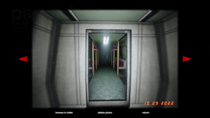
Nearly everyone reacts to the liminal phenomena differently, so one person may find an empty metro unsettling while another may find it dull. Both reactions are understandable, but my intention was definitely to instill a sense of dread and foreboding while walking around looking for good photo opportunities. Just like being in a true, real-life liminal space, I didn't want any one spot to feel comfortable being in for too long.
Spicing things up with subtle audio stingers, some environmental storytelling, and a strange shadow person you may or may not have seen out of the corner of your eye helped solidify those feelings even more so, I think!
You May Also Like