Trending
Opinion: How will Project 2025 impact game developers?
The Heritage Foundation's manifesto for the possible next administration could do great harm to many, including large portions of the game development community.
"In Unpacking it felt impossible to separate art, level design and narrative design, as the three were so closely intertwined."

Unpacking is a block-fitting puzzler about moving possessions from place to place. It's also a stirring glimpse into the life of others that turns inanimate objects into storytellers, with each innocuous item divulging a half-hidden secret about their off-screen owner.
In blending intuitive design with a narrative that asks players to use their own experiences to fill in the blanks, developer Witch Beam Games has successfully turned the ritualistic process of unpacking into a series of therapeutic and introspective vignettes that spark empathy and self-reflection.
Intrigued by how the Australian studio managed to turn an arduous domestic chore into something deeply personal, we asked creative director Wren Brier to help us unpack the design, art, and audio of the meditative puzzler.
Game Developer: Let's go right back to the beginning. How did you unearth and refine the initial concept for Unpacking? How much does the final product resemble that early pitch, and what changed along the way?
Brier: The initial concept for Unpacking was inspired by a real-life unpacking session, when my partner Tim Dawson moved in with me. Some things about the experience seemed very game-like to me: We would finish unpacking one box to "unlock" the one underneath, complete sets of items, and in general create order out of chaos which deep down is something I think a lot of games are about. The idea really came together when we decided to use a series of moves to tell a character's life story.
The final product is surprisingly similar to our earliest vision of it. We came up with seven of the eight story beats maybe a week after coming up with the initial idea, and a month later had a working prototype with the core mechanic and art style nailed down, and those have remained the same. What did change was that Unpacking became less of a puzzle and more of a self-expression game as we realized our early playtesters found it very frustrating when we were too strict about where items were allowed to go. The game also grew in scope a little -- we initially thought we would have about 30 rooms, but ended up with 35, between the extra level added in the middle and three more rooms added to the final stage.
How did you approach designing each space and the items within? Each little puzzle vignette is impeccably realized, down to the most mundane details, so I'm keen to know whether you had a framework for creating each one, particularly as the levels expanded into multi-room affairs?
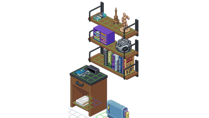
Brier: In Unpacking it felt impossible to separate art, level design and narrative design, as the three were so closely intertwined. As such, I actually greyboxed every room in Aseprite, the pixel art program we used to create the art assets for the game. I drew in grids where items could be placed on the floor, on shelves, inside cupboards and so on. After adjusting the art to accommodate the grids better (e.g. making sure there weren't odd gaps where you couldn't place items), I broke up the furniture into pieces to create the illusion of depth, imported all the art assets into Unity and reconstructed the room there. Then I used the tools my partner Tim created to place grid nodes all over the room on top of the ones I drew in Aseprite.

This was usually the stage when Tim and I (and for some of the levels also Annie Vandermeer, who we hired to help us with fleshing out the story) would start a spreadsheet of items for the room. We had so many spreadsheets! First we would bring in any items from the spreadsheet for the previous level which we thought should travel with the character, then brainstorm a bunch of new items. Some of these would be functional, like a toothbrush or shampoo bottle, while others were what we considered "personality items" that indicated things like the character's interests, job, her health, and so on.
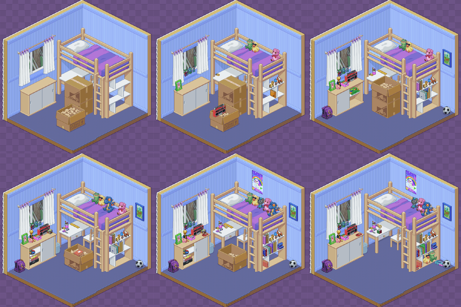
Once we had a list we were happy with I would start creating placeholders for these items in Unity, again using a tool Tim made for this purpose. These were just blocks in different shapes and sizes with the name of the item written on top. I would place these all around the room. If the room looked a little too empty we'd come up with more items, and if it felt too full we would remove some. When working on the later levels with multiple rooms in them, we drew floorplans first to make sure all the rooms fit together nicely and made sense as an apartment layout.
The final step in creating each apartment was packing up all of the items. I'd create boxes in each room and decide which items went in which boxes. The order of the items coming out needed to make sense, but also keep things interesting -- for example, a box that's full of just DVDs would be quite boring to unpack. We also packed items in the wrong room sometimes to direct players from one room to another, to make the completion of a set of items feel more exciting (finding your second boot in a box in the kitchen is way more memorable than just taking both boots out one after another), and just to surprise and delight players sometimes.
The order of items coming out mattered too; for example, players thought a tall glass bottle full of dark purple liquid was wine when it came out on its own, but when it came out of a box right after a bottle of olive oil players realized it was balsamic vinegar.
Why did you pursue an isometric, pixel art aesthetic, and how did that decision impact production?
Brier: We knew from the beginning we wanted to use pixel art because that's one of my core skills as an artist. We decided to go with an isometric style because it lent itself well to the grid-based gameplay we had in mind. I was experienced with pixel art but had actually never attempted isometric art before Unpacking, and it turned out to be a steep learning curve! I also had to change the software I was using.
I started with GraphicsGale which was previously my go-to pixel art program, but it didn't have layer groups, which was something we really needed to keep all of our items organized. It also didn't have good exporting tools. So I switched to Photoshop, which has great exporting tools and layer groups, but not very good tools for creating pixel art. Finally, I found Aseprite, which could do absolutely everything I wanted, and haven't looked back since!
One of the great strengths of Unpacking is how it manages to weave such a compelling yarn by simply allowing players to fill in the narrative blanks using their own experiences. What were the challenges of creating this sort of abstract narrative?
Brier: It was tricky! We referred to it as storytelling with duplo blocks, because it felt like we had these very blunt and imprecise tools to work with. It made it hard to tell a complicated story, so we kept our big story beats simple. Sometimes we had to nix a story thread because we simply couldn't convey it without any words.
For example, at one point we were considering having the main character's parents divorce, but realized we'd have great difficulty translating this into items. Sometimes the gameplay ended up affecting the story -- for example in the 2010 level, the boyfriend actually ended up being even more unlikeable than we initially intended because we leaned really hard into making his stuff needlessly take up as much space as possible, making the player character have to fight for every inch of space.
The fun part though was all the little threads we could weave in, like the character picking up hobbies from her housemates, her struggles in getting her art career off the ground, subtle indications of her relationship with her family at different points in time, and so on. The game can be enjoyed without picking up on these, but they give players who are particularly invested a lot more to explore.

Unpacking also boasts an impressive audio suite, with objects interacting and combining with each other to create a cacophony of delightful clinks, clunks, clanks, and everything in-between. How did you craft and implement that household orchestra?
Brier: I sent this question to our audio director, Jeff van Dyck, to answer! This is what he said:
Jeff van Dyck (audio director): This was an iterative process that started with me recording sounds of cups in my kitchen, but then grew to such a mammoth task that I had to get my wife Angela to take over.
In the end we built a custom foley studio in a spare room, with all of the different possible surfaces that can be used in the game (benchtop, carpet, shelf, etc...). We mostly used items we had around the house that matched items in the game, or borrowed stuff from friends. Then it was a matter of placing and picking up each item on each surface multiple times while recording.
It soon became apparent that there were a bunch of items that had similar sounds, so we started creating a generic library of item sounds that were based on the material they were made of (plastic, metal, wood, etc…). We then saved recording specific sounds for things that were more distinct, like a ukulele or baby rattle. We also added "sweeteners" to sounds on items that had a secondary sound to them, like a puzzle box or hot water bottle.
Being that we recorded in a dry sounding sound proof-ish room, this allowed us to add reverb back onto the sounds during gameplay, when they are placed in bathrooms and kitchens. These are typically bright reverb echoey rooms. We used Wwise as our audio system as it has a lot of power in terms of real-time effects, as well as some soul-saving batch processes.
Excluding music, there are a couple of other layers of audio going on. One is the room tone of each room, so a kitchen typically has a fridge whirring away, or a bathroom might have a leaky faucet. Room tone also gives the sense there is air in the room, bringing it to life, and each room’s air sounds different. The other layer is what’s going on outside of the house, so the sound of the suburb with birds, or the city and traffic, or the next door neighbors and their lawn mower.
We used Reaper for all of the recording, editing, and volume balancing. It also has some amazing scriptability that really saved a lot of time. So the naming process really only happened once, and the rest of the naming and organization of the hundreds of folders was mostly automated.
What design detail are you most proud of, and how did you realize it?
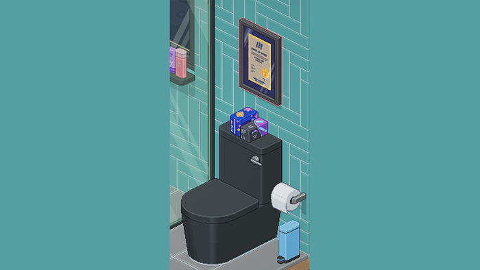
Brier: Now that the game is out and I've seen a lot of player reactions to it, it's definitely the Diploma Moment in 2010. It was one of the earliest story beats we came up with, though originally it was a framed drawing that you weren't able to hang up.
Once we came up with the diploma as an item to indicate the main character graduated from university, we knew that had to be the item you wouldn't be able to hang. A diploma signifies years of hard work, and if the character framed it she clearly thinks it's important. We further emphasized the injustice of not being able to hang it up by letting the player hang it in the level before, which lets them see where it's supposed to go and even lets them feel some pride in displaying it.
We had a window above the toilet in that apartment until pretty late in development, but decided to remove it to have the only bit of available wall space in the apartment be in the bathroom, as a funny red herring for where the diploma could go. I've loved hearing that some players saw it could be placed there and were so insulted by the idea that they didn't even find out the diploma wasn't allowed to be left there, because they refused to place it there at all.

What was the thought process behind adding the playback feature? Could you talk us through the technicalities of implementing that?
Brier: That was a suggestion from Witch Beam co-director Sanatana Mishra! After our high-speed unpacking gif went viral, he suggested giving players the option to create a high-speed gif of their own unpack that they could then post online. As for the technicalities of implementation, I'll pass the question on to Tim Dawson who designed and programmed this feature:
Tim Dawson (technical director): Initially I wrestled with two approaches - reconstructing a player's save file by having items fly out of boxes to their final positions, or actually recording each player action. We settled on the latter because there's so much personality in moving an item somewhere and then moving it somewhere else that would be lost otherwise.
In theory, a playback system for a turn-based game is simple - you record each step, then rerun them somehow. In practice, it all came down to encoding the minimum amount of data I could get away with so we could record thousands and thousands of steps without making save files unusable.
I identified ten unique actions: change room, open a box, take an item from a box, get rid of a box, pick up an item, rotate an item, place an item, interact with a placed item, stack an item on a shelf, and use something in the environment. Each was paired with a second integer that contained either a box ID, grid ID, item ID or usable item ID, which kept the data lean.
Wherever possible I relied on interpreting actions -- for instance, hanging a t-shirt on a clothes hanger would just record "item placed" on a specific grid index. During playback, the system would know what item was being placed (as a 'take item from box' or 'pick up item' event had preceded it) and if the grid index was currently occupied by a hanger, we could assume the t-shirt was being hung on that hanger. Where I could, I relied on game systems for triggering animations and placing items, as there were a lot of specifics when it came to setting masking groups, configuring depth, and all the other complicated rules required to correctly sort densely packed sprites occupying a three-axis isometric projection.
But this dead reckoning approach meant that when something went wrong, things would go very wrong very fast. Clothing would be stacked like books, bathmats embedded in walls -- tiny mistakes would quickly snowball into horrifying de-syncs that made me question if the feature was worth persevering with.
In the end, it came down to a brute force bug hunt -- identifying scenario after scenario where a de-sync could occur and fixing either the way data was recorded or the way it was being played back. My reasoning was there were only a finite number of interactions so if I kept going eventually I'd run out of issues, which appeared to be the case.
Now that the game has shipped, I've seen someone using the gif playback feature to animate two stuffed animals engaging in a surprisingly convincing knife fight, so I feel like it's all been worth it.

Finally, what was one thing you feel you did right during production? Let other devs learn from your success!
Brier: I feel good about how clear our vision for the game was and how little we strayed from our original plan. There was very little work we had to throw out, and little we had to rework or redesign. I'm also glad that we didn't compromise on our original vision for the game, even though it meant extending production time. Being a small and lean independently-funded team allowed us to do that.
Read more about:
FeaturesYou May Also Like