Trending
Opinion: How will Project 2025 impact game developers?
The Heritage Foundation's manifesto for the possible next administration could do great harm to many, including large portions of the game development community.

Featured Blog | This community-written post highlights the best of what the game industry has to offer. Read more like it on the Game Developer Blogs or learn how to Submit Your Own Blog Post
I made a game for js13k, in which you have to deliver a 13kb browser game. I talk about how I designed around this limitation in my entry Backflipped!


I wanted to participate in js13k for a while now, so I finally took the dive, similarly to 7drl this year. The resulting game is called BackFlipped, and you can play it on either the competition site or itch! Also, you can check out the source code on Github.
I had some goals:
I was itching to use Zdog to make a game! Zdog is a pseudo-3D engine for 3D vector art. Minimized it's around 29k, so it's a bit bulky compared to the frameworks specially designed for js13k, but I can make all my other assets using code now.
I want to work out an idea I already have spooking around in my head for a while, and I otherwise would not take the time for. Luckily, the jam theme was a good match for this idea.
To get a js13k T-shirt! Based on last year's contest you need to get into the overall top 33% to win one, and I'm pretty confident I can make that!
Here's a lengthy postmortem detailing my design decisions so I can refer to them later, but also so other people can learn! I might make a separate post about all the optimization tricks I used, but for now the js13k resources are very useful, and I tried most of the tricks listed there.
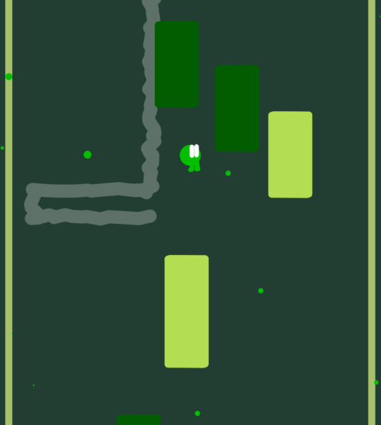
I had an idea for a game where you fall into a well with platforms. The Left or Right arrow keys propel you into that direction, and if you hit a block, you score points. Then, you can kick through the block as well, to break it for more points.
For the "Back" theme, the extra layer I decided to add was the background. When you touch a block but then move away, it moves backwards. Once you reach the bottom of the well, gravity flips and you move to the background yourself. The better you play, the more blocks will move to the other side, increasing score potential.
I ended boosting the speed of the game during development. First blocks would disappear after leaving collision, now they do so on entering of collision to make it clearer you can kick through them. The Up key would not start a jump, but actually slow your fall. If you landed on a block you'd lose falling speed, but now you'll just instantly start another drop after falling on something. The game is around five times faster than in the first version! Because this game has no traditional obstacles (such as spike blocks or enemies), the entire challenge has to come from battling the timer, which I think adds to the chaos of the gameplay.

Early GIF of gameplay.
My idea was to only have a set of levels, but I scrapped that and made it just an endless mode. Now it has both!
While this game has levels, each level is actually just a randomness seed set to a certain value. You can't set a seed for randomness in JS, but you can make your own seeded system. I took one from StackOverflow. A downside is that different browsers generate other levels, but that's not too big of an issue for this game.
At first, endless mode would make you start at a certain time, then as you'd kick blocks you'd build up a jackpot. Hitting the bottom of the level would cash out your jackpot. But it encouraged players to constantly drop straight down and not hit all platforms. I revamped it with an "All Clear" mechanic: all platforms give a little bit of time, but if you hit all the platforms on the way down, you get a couple of extra seconds as well. Endless mode also keeps getting faster and faster as you go, too, and since the level keeps growing and growing on each flip, I think there's a pretty good game balance on this mode now.

Old interface for Jackpot mode: The +sec counter displays the jackpot value, which gets claimed when you flip around.
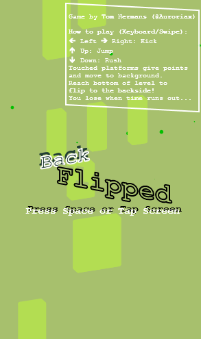
I don't think many js13k participants have "making a title screen" as their top priority. For me it's rather important, because it's the first impression the player will get from your game. I was quite happy to be able to make a simple but cool title screen using css colors and transforms.
 I didn't want to make separate texts for desktop & mobile, so the game shows "Press Space or Tap Screen" on both platforms.
The game runs like normal in the background, except with the player, trail, and collisions disabled. Also, the title screen gets recycled as a game over screen by replacing the text. This makes the game seem more lively since it's a screensaver when you're not playing!
In other parts of the game the UI is minimalist: there's a timer, a level/score indicator, and a progress bar. A text box shows game help on the title screen and other info when needed, for example upon game saves.
I wanted a screen-filling responsive game, so I use Zdog's zoom property to make the game fit to smaller screens, with @media rules in CSS doing the UI.
I did not plan to enter in the Mobile category, but someone wanted me to submit a simple mobile web game as part a test, so I decided to add it to BackFlipped.
I settled on using swipe directions to input the same direction arrow key, using a GitHub gist as base. It works a bit finicky (especially with short swipes) but it's good enough to play with one finger. You do have to swipe a lot when the game starts getting faster! I also used these controls as an excuse to add input buffering: so if the game can't handle player input in the current step, it'll repeat it for a couple more frames in case the player timed just a bit too early.
The version I originally submitted for js13k had broken swipe controls. Luckily, a short email to the js13k team with a new version of the game was enough to get the jam version updated!

This is pretty much how the game looks like on my older smartphone... The text isn't very big, but at least it fits!
In Zdog, the 3D effect is only really visible when the camera rotates. My game didn't require a lot of rotating though, but I decided to make the camera a little bit skewed to convey depth a bit better.
The screen flips around once you reach the bottom. I can only make the Zdog illustration rotate around its middle, which caused issues when the player was further away. The fix was making the player jump back to the origin when the camera starts flipping, then moving all other objects to the same position, relative to the player before the jump. Now the transition is super smooth!
A lot of the things that look like they're exactly behind the player, are actually placed diagonally of that in 3D space. I did this to combat Z-fighting, when the renderer changes in which order overlapping shapes are drawn. Now what looks neatly when watching from the game camera, is actually not placed behind each other:

You'll notice the trail and the player are in different places, but from where the camera usually is it seems like they're in the same place.
But it works wonderfully when watched from the game camera. And that was good enough.
If you have a game with only flat colors, it's a missed opportunity if you don't add multiple palettes. I tried it in my game Mobility!, but I only ended up changing the background color, not the entire palette.
Backflipped defines six different colors: foreground and background, blocks on the fore- and background, character body/dots and eye/trail color. The background colors are most important, because everything else needs to have a decent contrast color with it.
The block colors also need good background contrast when you're on their layer, but need to fade away into the background when they're not: a tricky balance. So I used a palette creator designed to test the contrast of colors, and ended up making a few palettes that use the flipping mechanic of the game metaphorically: for example, Dawnbreak switches between dusk and dawn.
Coil subscribers get two extra color palettes that are unlocked from the start. I think this is a good cosmetic goodie to offer to subscribers since it doesn't influence gameplay too much, but does look very fancy and premium. Overall, I'm very happy with the variation among these seven color palettes!
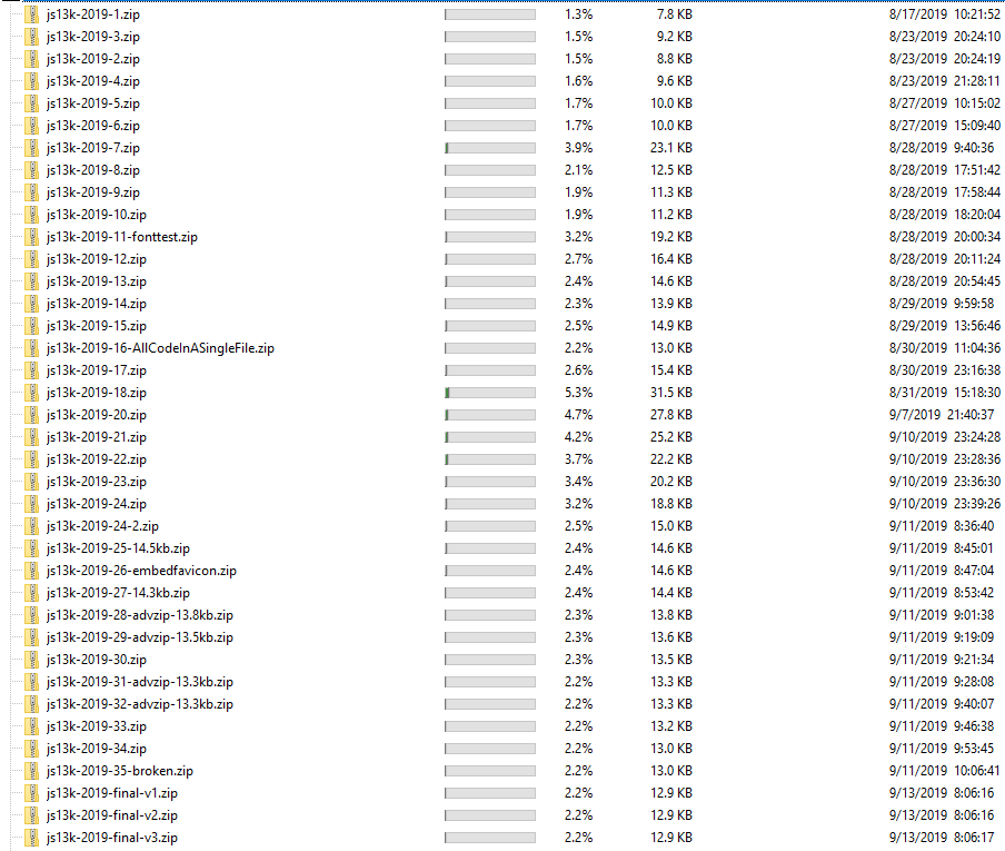
I kept a close eye on my minified file size at the start, manually minifying code and combining assets in a single file. Later on, I found it easier to focus on getting the game done and worry about file size later. I found it risky to start optimizing too soon, as it might make my code messier than it already is, but this benchmark gave me an idea about how big I could make the game in a month.

I zipped the game at multiple times during development, with widely fluctuating file sizes. Screenshot from WinDirStat.
As the end kept crawling closer, I tried automated linting solutions, but I couldn't get them to work. I ended up writing a manual linter in Javascript & HTML. It allows you to paste HTML, CSS, and JS, assign filenames, and hit a button to get a single output HTML with the contents of the other files embedded. I actually ended up learning a bit about how RegEx works to minimize the code a little bit (adapting xem's MiniMinifier), and I might expand it to be more user friendly.

Screenshot from my linter: clean files come in, messy combined file comes out. Combined with minification, this saves around 1/3th of characters!
The main way I lost file size was by removing unused Zdog functionality, like shapes I wasn't using. Afterwards, the removals got more specific, resulting in a very messy but small version of Zdog.
I checked the game with the entry bot which helped me spot some last minute issues. Although I forgot to submit the game with the bot, manually filling the form instead. Ah well!

The full source code (except favicon) for BackFlipped. Screenshot from Visual Studio Code.
My main realization was that, no matter how much fun it is to optimize the file size of your game, you shouldn't forget to make the game fun to play as well. Balancing the technical and gameplay related issues was very hard, and it almost went awry, destroying my motivation for the project. Luckily, after iterating some more and having a few more testers, I did manage to make the game fun.
Finishing it was also pretty hard: thirty days for a 13kb game sounds really generous, but knowing when you should stop adding new stuff to focus on minifying and polishing what's there was also pretty difficult. I ran into a couple of annoying last-minute bugs, but luckily I was able to get it into a shippable condition in time!
You can play BackFlipped on itch and on the js13k competition site. Also, check out any of the 244 other submissions for the jam— some really interesting games to find there, and you could fit them all on two or three floppy disks!
Read more about:
Featured BlogsYou May Also Like