Trending
Opinion: How will Project 2025 impact game developers?
The Heritage Foundation's manifesto for the possible next administration could do great harm to many, including large portions of the game development community.
Looking at the game "This War of Mine" by 11 bit studios. What makes it a memorable experience, what does it consist of, how can we improve it?

"This War of Mine" by 11 bit studios provides a unique and well crafted game experience. Here, I analyze it and learn what makes it so memorable and what aspects of the game can be improved. I’ll start with an overview of game goals and mechanics, analyze the main game screens to see what works and what can be improved, provide a summary at the end.
Every game has goals it needs to achieve and may use different techniques to do so. To judge how successful a solution is, we must first establish our starting point.
Themes and Ideas: consequences of war, survival, witness accounts, slice of life, pointlessness and impact of large scale conflict, values and financial aspects of war torn areas, people’s actions and reactions to war.
Interaction type: control over a group of protagonists, indirect commands by point-and-click.
Camera type: 2D, free to be controlled by the player.
In-game Time: Timer, day/night cycles. No pause button - game pauses only in inventory or game menu.
Main screens: survivors introduction, shelter, inventory, daily event action prompt, night planning, scavenging, day card, day log, character screen.
Win state: At least one survivor is alive by day 42.
Fail state: All of your survivors die before day 42.
Fun Factor: Challenge, moral choices, novelty experience.
How is challenge created: limited inventory space and item quantity that can be brought back from scavenging, time constraints, daily needs of the survivors (food, sleep, recreation), danger posed by other survivors in the game, scarcity of daily required resources, the rarer the resource, the more other resources and actions it requires to obtain.
Visual Elements: 3D in 2D perspective, photos, illustrated UI, 3rd person view.
Visual presentation: “sketch” filter applied to all the visuals, documents, photos, bw film, witness accounts, cold, minimalist, reserved, almost realistic, light grunge, high contract, muted colors.
Color: black and white with varying shades of grey, desaturated palette applied on top, orange as highlight.
Font: Condensed Sans-Serif font for HUD elements. UI elements and status effects in caps, names, skills and conversations in regular text. Diary entries, radio broadcasts, thoughts and notes throughout the world use a decorative handwritten font.
Games with similar elements: Fallout 1 and 2, The Sims, Isometric RPGs, Survival/resource management games.
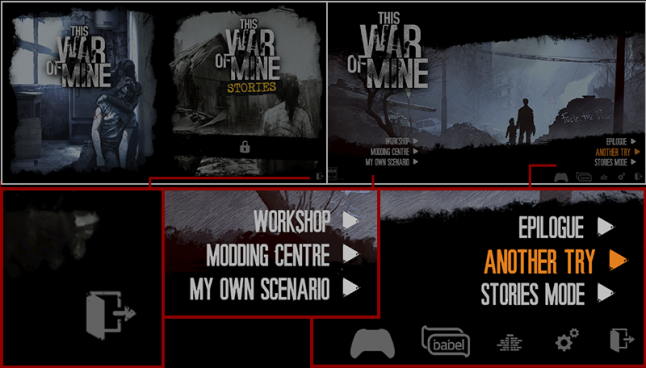
The game starts us at a double screen, where we choose either the game or the additional content. As you can see, the same option is present on the next screen too. This creates an unnecessary barrier between the player and where they want to go, so keeping options all in one screen would allow for faster navigation.
Moving to the next screen we see the text or icons used for navigation. This is a good way to make commonly used options prominent while the less frequently used ones are minimized. This screen also shows us that the game uses the color orange as the active state for buttons. The background illustration sets the tone for the game we are about to experience very well.
NOTE: If you show players a menu, they expect it to represent a complete list of options available to them. An easy and common mistake here, is to hide the menu or exit option behind the “Esc” button, without any visual element on screen. This is optimization that hinders basic user experience. Avoid this! Keep the visual communication clear and straightforward – show all the options. If your game supports both a mouse and keyboard, the essential options must be accessible by both.
We can improve several things here. First, make the exit option more easy to choose – it will be used frequently and hunting for it every time you want to exit the game is not optimal.
Second, make the icons equal size, because right now, some of them are bigger but not more important than others. You can also see that the exit icon has grunge effect applied to it, while the others do not, so keeping a consistent style between all of them would be an improvement too.
Third, that Modding menu on the left isn’t visually anchored to anything. Unlike the menu on the right, which has a nice black background and is anchored to the right edge. Modding menu options can also be grouped under one option - "Modding", which will reduce it’s size and make the menu easier to navigate.
Let’s explore further.
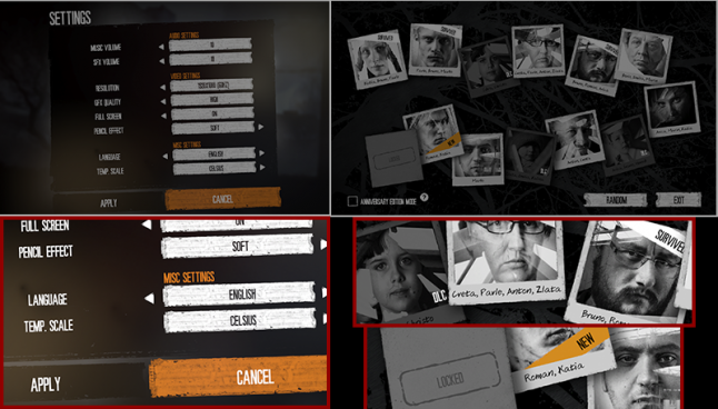
Here we have the game settings and survivor selection screen for a new game. Note that settings appear as a window on top of content, whereas the selection screen occupies the whole screen space.
In settings we see several interactive elements, which again, teach us the visual metaphors the game uses: window name in top left corner, orange section names, two buttons at the bottom. The UI follows the industry standard of placing descriptions on the left and options on the right.
Interesting design choice here and elsewhere in the UI is reusing the button background image. You can see it in this screen recolored 3 different colors, later on it’s flipped horizontal or vertical. It’s a good way to preserve tone and visual style, while adding diversity with minimal amount of graphics.
Can we improve something here?
We start seeing the limitations of using condensed all-caps font. The design starts to rely on the orange color to distinguish different text type, but that can cause confusion, since active elements use the same color. Introducing another font would help here - non-condensed lowercase, for example, or use the handwritten typeface we see later on.
The content is aligned in two columns, but content on the left is centered, while the one on the right is left aligned. This was probably done to keep names closer to options, but another way we can fix it, is to make the window itself smaller. Keeping a consistent layout, makes content easier to navigate.
In the survivor selection screen, we see several good designs. The DLC promotion fits organically in to the game itself and is very effective; new survivors and played ones are marked accordingly; a blank photo at the bottom left indicates there is more content to be unlocked; there is an option you can check to experience only the new content from the anniversary edition. A good design that takes all types of players in to account.
How can we make this section better?
We can try and change the photo cards layout to be aligned in two parallel lines; if the intention is to form a connected path with the photographs, then a good way to do it would be from left to right. This would take the player’s attention effortlessly across the whole screen – right now it leads away from the buttons.
There is also a tree background image here that is not helping connect the content together. Maybe the amount of options is too large to form a neat tree/leaves metaphor. Keeping the background simple and clear can help large amounts of content stand out and be easy to understand.
There is also a bit of ambiguity here that can surprise the player. Before this, we were using buttons to progress back and forth between the screens. On this screen, choosing a photograph starts the game, and the two remaining buttons are a game mode option and navigation button. This unpredictable behavior should be avoided. The UI must get out of the players way and be a reliable tool for game interaction. You can not rely on a tool that changes its behaviour from screen to screen. We can make this interaction more clear, by simply adding a start button that becomes available when the player selects a photograph. That way, we adhere to the same metaphors we established earlier.
The game opens on a bleak city landscape. Moody music plays and we slowly pan right to our shelter. Great establishing shot that sets the tone for the game.
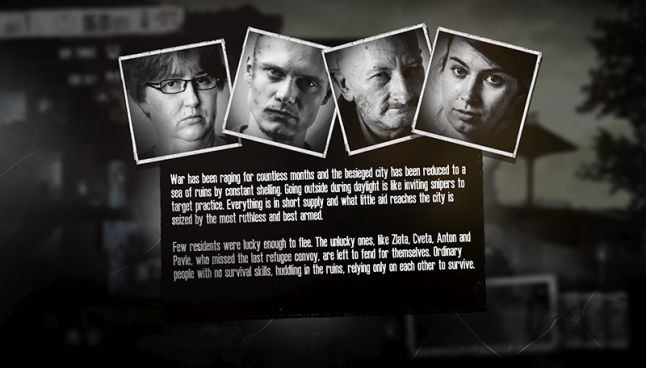
Here we are shown the introduction to the survivors screen. Let’s analyze it and compare it to what we’ve seen before.
Condensed white on black text is hard to read in large blocks. White text tends to “grow” visually, making the letters fuzzy, and the fact that it is condensed, merges it in to a white mass that requires effort to read. Replacing the font with a regular, more comfortable alternative is a must.
We can see that this screen is unlike the ones we’ve seen before – it has not buttons! It’s easy to guess that any button or mouse click will dismiss it, but is this really necessary? A player can easily dismiss it by accident and won't be able to come back to it. This is a screen that starts the story – it’s important to the narrative, so adding a button to dismiss this screen will solve the problem.
NOTE: Often times while working on UI elements, designers find themselves at a loss for what text to put on a button. Times where the generic “OK” or “Accept” seems too impersonal and something else is needed. This is when continuity mistakes are often made and new novelty interactions are introduced – “x” buttons at the top right for example. Watch out for these unusual cases and stick to the previously established interactions. Don’t reach for the easy solution before checking if and how it fits with the rest of your design.
A small inconsistency here is that the portraits are now in frames instead of photographs like when we chose our survivors. This is a small change, due to the fact that photographs are now dedicated to depicting events. Not necessarily a good or bad design choice, but something to note while checking for continuity.
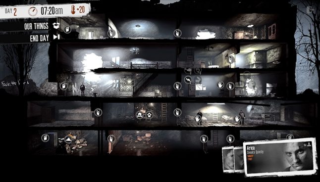
After dismissing this introduction, we get our first major game screen. This is our survivor’s home and we’ll be spending a lot of time here. The main 3D model has flat UI elements on top of it which creates a nice contrast. All elements are easy to see and interact with.
One interaction that is not explicit here is the point-and-click nature of controlling the active character, but it is supplemented with icons on all objects of interest.
Visual design of the shelter sets the mood wonderfully, with its bleak interiors, punctuated by beams of light and sparse color. Not completely hopeless, but also matching the severity of the main game idea – civilians in times of war.
Let’s see if anything here can be optimized:
Let’s look at the UI overlay first. Utility in the top left corner, characters in the bottom right, a half-transparent exit button in top right.
When you want to have the maximum emotional impact in a game, the best choice is to eliminate as much distraction as possible, UI included. Maybe we can group all these elements in one place and leave more room for the game world.
NOTE: A great way to see what can be hidden away or downsized, is to create a priority stack of functions – most frequently used and important in the game go on top.
Here, the most frequently used functions are the “end day” button and information about the time/temperature. Perhaps arranging all of them in to one long top bar would save space and make their use more convenient. This way, the player doesn't have to hunt for them all over the screen edges.
Another big piece of the UI is the character cards that show portraits and status effects, while also serving as buttons to switch between characters. A small “bio” indicator lights up when the characters have something new to say.
The switching between characters doesn't work too well, as there’s a very small space between cards. The choice of presenting characters this way was probably made to show their faces and therefore keep the human element in the game. It’s supposed to remind players that the human figures on screen are not just puppets, but living, struggling people. It’s debatable if this actually enhances the game experience, but if we were to try and improve it, maybe making better use of the card space is a good way to start.
The cards can be moved to the top right corner, to link to the rest of the UI. Names could be on top of the card, to match the window names metaphor the game uses. The status effects can go below the portrait, to use more vertical space. Switching between survivors, can be made abstract, with arrows on both sides of a card to cycle between available ones. Maybe we could go even further and allow for an option to hide the cards or minimize them, leaving just the name and arrows for navigation.
If we wanted to minimize the UI impact on immersion further, we could use a black background image instead of white for the top bar, making it less noticeable.
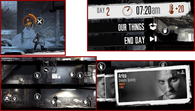
Next, let’s look at the round icons. These are really great at conveying different things effectively in a small space. The round icons are buttons, but also progress and amount indicators. Any started task is illustrated with a round progress bar and can be canceled by pushing the x icon. The game does not explain that tasks can be interrupted without loosing progress by ordering the character to move. Perhaps a pause icon could be displayed along with an x icon to make that fact clear. Right now, this can be discovered by trial and error, as tasks not completed the day before, can be resumed the next day.
How can we improve on the icons?
First, in the shelter, we can remove the door icons inside. Survivors open doors automatically and opening only the main door has an in-game purpose. Removing some icons from the screen would make others more clear and easy to use.
Every crafting station in the game has an upgrade icon next to the craft icon. It leads to a screen that is very much like the crafting station one, so the upgrade can be made in to just another item in the item crafting list.
Another interesting mechanic in the shelter, is the ability to craft new items and place them in the environment. This ads a layer of personalization to each game and while the placement slots are limited, there is far more space than the player will need. This means you can place objects without having to consider space as another commodity that has to be managed.
This player choice creates an unintended consequence – it’s unclear if the placement of objects matters. Will a rat trap work better in the basement, a bed be better in the attic, a stove in the kitchen? This is never explained to the player nor are there instructions that would answer this question. Since this is not a game that expects the player to guess mechanics, it creates ambiguity that is frustrating and confusing. The solution is to add in-game consequences for the object placement. This would meet player expectations as well as raise immersion. Or, get rid of the placement mechanic and have pre-set placement for objects – several upgrades like door and shelter reinforcements already act this way.
Now let’s see what else we can do while in the shelter.
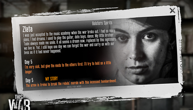
If we click on the survivor card a new window opens on top. This shows the character backstory as well as some of their recent thoughts. The window has a grunge, torn-paper design and makes great use of associating the portraits with the words, by having them side-by-side.
The new entries are highlighted in orange, while a small text at the bottom says “drag for more”. The window has an x button for closing it.
If we were to redesign this, what would we improve upon?
First, change the typeface. There is a handwritten typeface in this game that is used for thoughts and notes, but it is not used here, surprisingly. It would fit the narrative of the diary very well.
Adding a prompt to scroll down is not the best solution and it does not comply with the established standards in UI. Showing a scroll bar is a much simpler and straightforward solution.
Perhaps a better frame design. The current grungy frame does not look like an in-game object, so why not add to the immersion and design it as one? Create a background that would make this window look like a page.
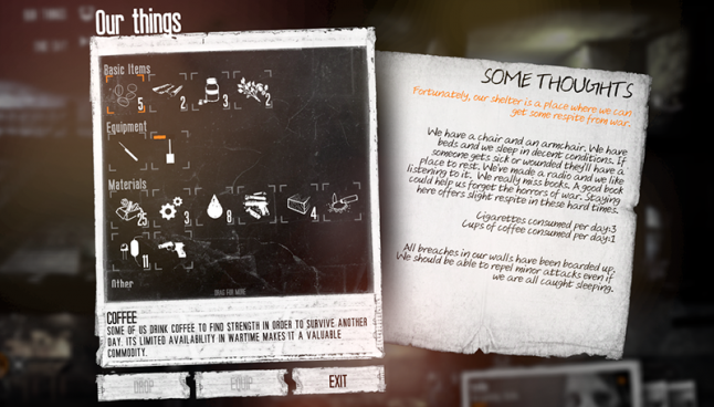
Another thing we can view in the shelter is the group inventory, simply titled “Our things”. It shows all the resources the survivors possess, as well as overall shelter status.
Let’s see what works here. First, the icons are great at conveying meaning and they are thematically appropriate, using the outline, sketch visual style that you would expect from handmade notes. Second, the window is in-line with the layout we’ve seen before and that makes it easy to navigate. Third, the notes on the right are presented as a piece of paper, which adds to the immersion.
What can we improve?
This is an information dense screen and designing it with importance hierarchy in mind would help make it easy to use. The item description is hard to see due to the grunge background and condensed text, so choosing a different typeface and background will help.
The shelter status information is an unexpected addition here. If you were searching for it, the inventory screen is not where you’d think it would be. Maybe renaming this screen to “Our home” would be a better fit, since that would imply many things, inventory and status included.
The handwritten font on the right is arranged in a way that is hard to read. The orange color on white background is hard to read too and the formatting is unusual and does not follow conventions we have seen thus far. Separating the text with section names and using different fonts would help it be easier to read.
Each item icon is outlined by white corners that turn orange when the item is selected. The corners themselves ground the icons nicely in space, but adding a full square frame around the selected item would improve the UI. It would be much easier to see an orange frame and what is selected.
There is also a “Drop” and “Equip” button here that will be rarely used in this location. In a game where resources are scarce, the option to drop something can be omitted without consequence. Equip is used in rare cases and has alternatives in the game world.
Here we also see an “Exit” button which was not on other screens we’ve seen in the game so far. We now have two different exit metaphors – x and exit. Choosing one and sticking to it is better than introducing new ones depending on the situation, since it simplifies the UI and establishes continuity in the way players interact with the game.
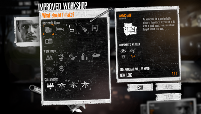
Similar to the inventory screen is the craft screen of different craft stations available in the game.
There is a portrait of the person who the crafting task will be assigned to, which is a great way to help the player. The visual design has some nice additions to distinguish crafting station from one another – here, a nail and hammer. Instead of a note on the right, like in “Our things”, here we see a description of the item. Items that are available for crafting are white, while unavailable ones are gray, which makes it easy to see all the options at a glance. Missing components are highlighted in orange, which makes understanding of why something can not be crafted much more easy and fast.
How can we improve this? Let’s start by looking for things we can omit.
Under the “IMPROVED WORKSHOP” text, there is an orange on white flavor text, that is hard to see. It does not make the process more immersive if the player can’t see it, and there’s also loads of other important information here. We can remove the flavor text to add some space and clarity to the overall design.
To keep design continuity, the “IMPROVED WORKSHOP” text should be lowercase.
The item description is written in a gray color on a busy gray background with condensed font, which makes it hard to read. Using a different font and color would fix that.
Perhaps writing the name of the item to be crafted in orange is unnecessary – there is already a nice descriptive icon below it. Using white for the name will do.
Another text we can remove is the long and uninformative description of how many items will be crafted. This can easily be shown the same way the game shows quantity in inventory – with numbers.
NOTE: Reading breaks up game flow. For this reason, you often see people skip tutorials and hints, even when they are crucial to the game. Players will try and preserve game momentum, so don’t try to interrupt it with large amounts of new information in form of text. Introduce this information gradually, in easy to understand language and small amounts. Information that is broken up by action will be much easier to remember.
The last thing we can improve here is right-align buttons. Before, they were always justified to the window width, so doing the same here is best.
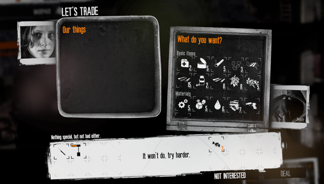
Another inventory related screen that we can get here, is the trade screen. It has a nice layout, with the player inventory slightly above the traders’. It even provides a portrait for the trader, which is a nice thematic touch. Since there is no currency in this game, the price is replaced with slightly vague description of item scarcity and so is the trade outcome. A very unique approach that captures the flowing nature of barter and ads a human touch to the otherwise dry exchange of goods.
Improvements for this screen are small. Continuity is again broken, by the inventory backgrounds switching from paper to imitating real containers. This is a more immersive approach and applying it throughout the rest of the game will increase immersion.
The phrases written in orange are not important to the task being performed. Removing them would help put focus on other important elements.
If you click on an item, a small description of it’s value/scarcity will appear in the bottom left of the inventory. This information is crucial to the trade, making it more noticeable will help the player.
Aligning buttons to the windows on screen and making them the same style and color as the others will help preserve continuity.
The last event we’ll look at in the shelter is the random guests that can come knocking at your door and how that is illustrated.
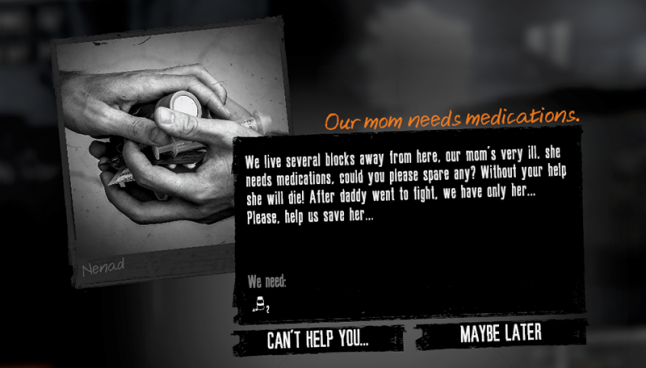
Here we see that a different window is used than the white paper ones we’re used to – black instead of white. The section name is orange and in a handwritten font, we then get a block of text describing the situation and an item if applicable. The large photograph on the left is a creative way to make each encounter feel unique and add a feeling of realism.
What can we improve?
Firs, we’d need to restore continuity. Window names are aligned on the right side instead of left. Here, the title is the beginning of a conversation, so why not make it part of the main text? It will be easier to read. Second, the photo alignment is a bit off and that makes it less noticeable. Placing the photo to the right or top will make it more impactful. There is also a name on the photo that is hard to read, making the photo frame white would preserve continuity and make the text clear.
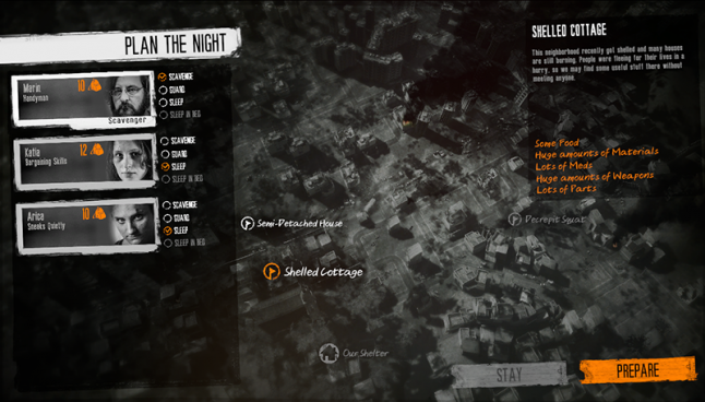
At the end of a game day, we get to the intermediate section of planning the night. Here we have a great map with interest points that get revealed or can be blocked off by game events. Each of our survivors is assigned a task and we can either prepare to scavenge or keep everyone home. It’s straightforward, easy to understand and use.
Once again, the continuity on this screen is broken, by introducing see-through background. The change doesn't serve a purpose, so keeping the same paper aesthetic is best. Without a background image the text on the right seems to float visually. Alignment is again inconsistent, with text aligned without taking in to consideration the UI before.
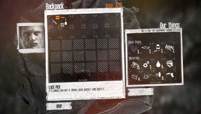
If we choose to scavenge during the night, we are taken to the inventory screen, where we can supply our scavenger with tools. We see a great background image of a backpack and the layout follows the familiar inventory layout. Great use of the icon space here, to show tool durability, a plus/minus button to add/remove item and an indicator on the tool equipped by default.
Can it be made more intuitive? All of the previous points about layout and text visibility still can be used here. Apart from them, the new element here is the inventory squares. The player will expect them to indicate that there is a way to add more carrying space, but no such mechanism is common in the game. This element causes confusion and removing it will help set proper expectations.
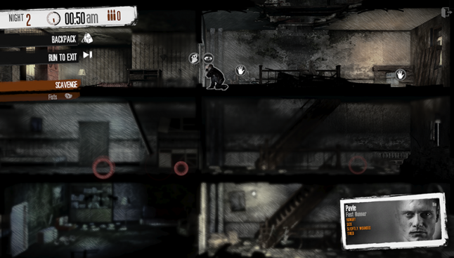
The scavenge mode is similar in basic premise to the shelter. The difference is that this is the intense part of the game where other survivors pose real-time danger. They will react to the scavenger in different ways depending on the scenario, building and player action.
The main goal of scavenging is to get resources with as little physical and psychological damage as possible. More rare resources often times require tools to get to, and stealing from other passive survivors will carry a moral penalty.
Several new game mechanics are introduced here, like stealth tactics, combat, field of vision and hearing, limited carrying capacity strategy. Field of vision is masterfully weaved in with the vulnerability of the scavenger, which creates an atmosphere of anticipation and promotes caution. Multiple sound sources are often scattered throughout the level, some of them objects and rats, others are people, but all cause the player to be cautious.The default move speed is sneaking, but the player can also double click to make the survivor run.
Let’s look at the interface here.
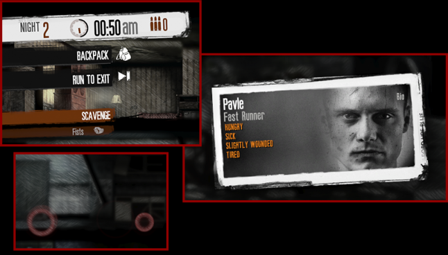
We see the familiar status indicator of day and time at the top. Temperature is now bullet count and there is an option to switch between combat and scavenging. There is also a penalty here for not returning to the exit before dawn – 4 AM. The option to run to the exit helps escape dangerous situations quickly and helps the player navigate complex buildings faster.
The bullet count is rarely used, considering the game promotes a non violent playthrough, guns are rare and combat often caries heavy costs. Having the bullet count next to the weapon option makes more sense.The combat/scavenge option would benefit from a switch-like visual element to indicate that the modes are mutually exclusive.
The character card here can be replaced with a health indicator, since the rest of the status effects are apparent by the way a character moves – slower or faster.
The sound wave the character makes is hard to see most of the time, since it’s transparent. Having some color too it would help the player to see the sound range of noise more easily.
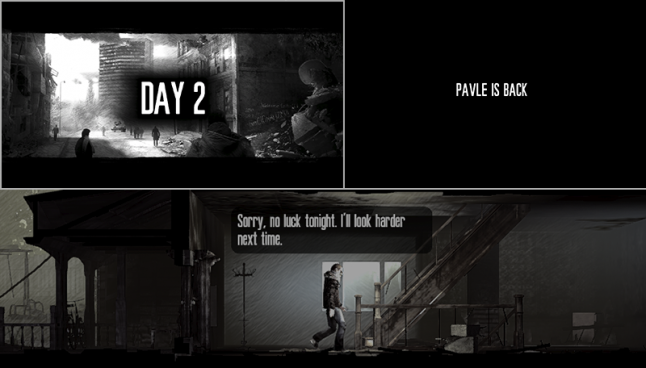
When the scavenger reaches the exit or nighttime runs out, we get a black screen that gives us an idea of the outcome. It displays different text if the scavenger died, escaped in time or not. We then get a day card that displays the day count and an illustration based on the state of the outside world – snow, crime outbreak etc. If the scavenger returned in time, we’ll see an animation of him entering the shelter and dialog based on what he has in his inventory.
This is a great thematic transition from one day to another. Perhaps the plain text screen can be omitted since we can see the scavenger returning – no need to tell us he is back, or we can include this information with the rest of the day summary information.
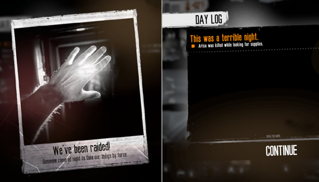
On the next screen we may get a photograph of an event – someone dying or a raid. Next we see a day log that will outline the details of the night, like the supplies scavenged/stolen by raiders etc.
A missed opportunity here is to make the day log actually look like a journal that one of the survivors is writing. This would make the screen less utilitarian and add a human touch to it.
Lastly, I want to show the exit menu to illustrate once again that the game takes some liberties with style continuity.
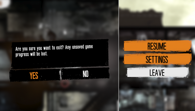
The game aims to create as much emotional impact as it can, but does not utilize the visual presentation to it’s fullest.
The most common UI/UX missteps in this game:
Inconsistent visual style between equal elements
Neglecting element importance and frequency of use
Incorrect font utilization
Element alignment issues
Most effective UI/UX solutions in the game:
Unique visual presentation – mixing photographs and illustrations
UI experience themed as survivor accounts and diaries
Minimal approach to the UI to keep the experience focused on real life elements
Round UI icons serve as buttons, progress indicators and quantity indicators
Contrast between realistic game graphics and flat illustrated UI provides ease of use
Limited field of vision allows for suspense when scavenging.
Objects have several visual states to indicate progress – debris crumbles as it is cleared, barred doors loose planks
By analyzing the main game screens, we can see that there are many elements that are done really well here. If you want to create an immersive experience, this game has several great solutions to show you.
Read more about:
BlogsYou May Also Like