Trending
Opinion: How will Project 2025 impact game developers?
The Heritage Foundation's manifesto for the possible next administration could do great harm to many, including large portions of the game development community.
Can the original Zelda game still have things to teach designers? Activision's Mike Stout (Skylanders) dives back into the 1986 classic to see how Miyamoto handled pathing, challenge ramping, and more.

When going back to replay classic games I played as a kid to mine them for knowledge, I always fear that any games from the NES era or earlier are too old to learn much from.
I tend to assume that many elements of modern design will be missing: no training, bad difficulty ramping, haphazard level design, and so forth. Before writing this article, I was under the impression that many "good design principles" I've come to know and love were invented during the SNES era and iterated on from there.
The NES was the Wild West of game development, I thought, lawless and free.
So when I went back on Link's 25th anniversary to play the first Zelda game and maybe write an article about it, I was a bit gun-shy.
As it turns out, I was totally wrong! Instead of finding something outdated with a ton of nostalgia value, I found an excellent primer in the fundamentals of non-linear game design.
In an interview, creator Shigeru Miyamoto once said that with The Legend of Zelda, he wanted to evoke the feelings associated with exploration in the player:
"When I was a child," Miyamoto said, "I went hiking and found a lake. It was quite a surprise for me to stumble upon it. When I traveled around the country without a map, trying to find my way, stumbling on amazing things as I went, I realized how it felt to go on an adventure like this." – via Wikipedia
To achieve this feeling, Miyamoto and company invented a number of really clever tricks to create non-linear levels that are still useful today.
I can still hear the music in my dreams... MY DREAMS!
While going through The Legend of Zelda, I played each level and then did an in-depth analysis of the level on paper. This kind of analysis is pretty standard fare; I do it all the time on colleagues' level designs. There are a few things I'm always looking for:
Level Flow. How do the spaces in the level fit together? Where is the player supposed to go, and will she know how to get there?
Intensity Ramping. Does the intensity of the experience ramp up in a satisfying way? Do monsters get more difficult as the level goes on? Does the player get a chance to learn how the enemies work and then display her mastery later on?
Variety. Is there sufficient variety in the gameplay? Do enemy encounters frequently repeat themselves? Are the spaces varied in interesting ways?
Training. If the design requires new skills from the player, does it teach and test those skills appropriately?
In this article, I'll apply the same methodology to the first level from the original Legend of Zelda. Fortunately, this is made easier by the fact that top-down maps of the level designs are easily and readily available. I'm only going to cover the first dungeon in this article, but the principles apply to all of them.
If you'd like to check them out yourself, you can find the maps I used here: Mike's RPG Center. (By the way, Mike is awesome and gave me permission to use his maps in this article. Thanks, Mike.)
Breakdown
Based on my memories of the game, one of my assumptions going into this experiment was that the rooms in the dungeons were laid out haphazardly. I always remember getting the feeling that I was navigating my way through the rooms almost randomly, spitting in the designers' faces and getting to the end only because of my mighty gaming talents!
After analyzing the flow of the dungeons, I quickly abandoned this notion. As it turns out, the dungeon layouts are very carefully planned and the flow is very cleverly executed.
First, I analyzed the critical path. The critical path is the shortest path through a level without using secrets, shortcuts, or cheats. Basically, it's the path the designer intends the player to take through the level unless she gets really clever.
It's worth noting that the critical path often doesn't require a player to complete 100 percent of a level; it just requires her to complete the mandatory objectives within the level.
For each of the dungeons, the critical path is almost always linear. There are very few instances where the player is required to re-traverse ground she's already seen. The only exception to the linearity rule tends to be two or three rooms at the beginning of the dungeons that allow you to choose between a small subset of rooms.
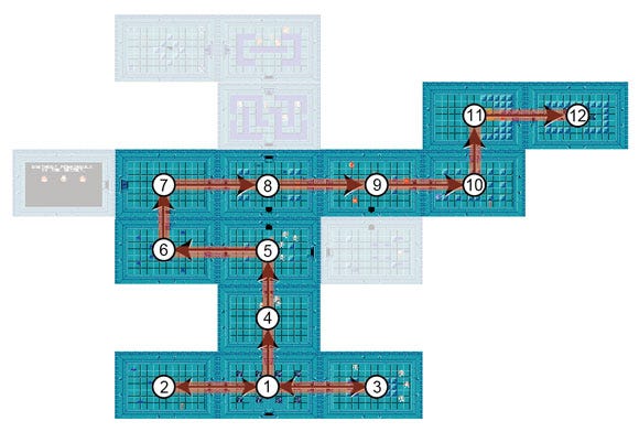
The player begins in Room 1 and can choose to go to Room 2 or Room 3. Rooms off the critical path are faded.
Optional rooms (and sometimes entire paths) branch off from the critical path and reward the player with bonuses. The levels are also full of shortcuts that cut across the critical path. If the player has bombs, for example, she can skip from Room 5 to Room 8 in the above diagram.
Analysis
If Miyamoto's intent was truly to give the players the feelings associated with exploration, then this design is a masterful execution of that intent.
The linear layout of the critical path was very interesting to me, because when I played the level, it felt much less linear. I often re-traversed rooms I'd seen before. I tried to visit every room, and I tried to collect every item.
What I found out was that the Zelda development team was able to create the illusion of very open level design by using a few very clever tricks:
As I've mentioned, the critical path is almost entirely linear. This means that it's much easier for the player to find her way through the dungeon without getting hopelessly lost.
Rooms branching off of the critical path make the level feel less linear.
A small bit of room re-traversal at the beginning of the level makes the level feel less linear, but because it only includes a small number of rooms the player probably won't get lost.
Giving small, hidden shortcuts through the level allows the player to feel clever, and allows the designer to disguise the linearity of the level.
In short, the optional paths and shortcuts give the feeling of exploration, but the linear critical path means that as long as the player visits every room in a dungeon she should be able to find her way through.
It would seem from analyzing the flow that the level design strikes an excellent balance between giving the player the feeling of exploration and keeping them from getting too lost.
Breakdown
When analyzing intensity ramping, I generally look for two things:
The enemy encounters should usually ramp up in difficulty over the course of the level.
No encounter should be repeated twice. This gives a greater variety, and also keeps the player constantly answering new questions as she goes through your level.
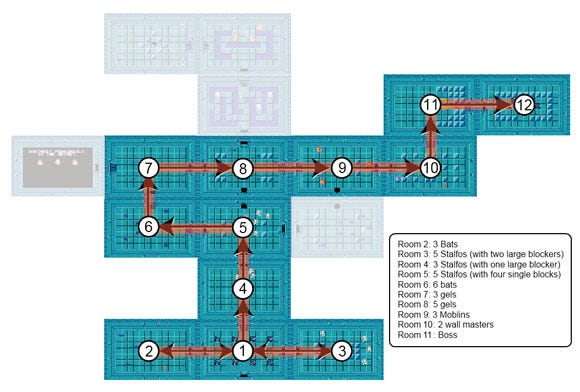
When looked at in the correct order, the enemy setups ramp up in difficulty well and never repeat.
Analysis
Once again, my initial impressions were WAY off. When I was just looking at the maps or wandering through the dungeons -- or remembering them -- the assortments of monsters and the layouts of the room seemed to be fairly arbitrary. They didn't seem to ramp up intelligently, and I was SURE encounters were repeated.
When I started analyzing the encounters, it initially looked like I was right. However, when I looked at JUST the encounters on the critical path, a pattern emerged. The monster sets and room layouts ramp up VERY clearly along the critical path.
For example, the player fights five Stalfos in Room 3, but the two blockers in the room make it much easier to avoid them. Then, later, when she fights three Stalfos in Room 4, the setup is harder, because there is only one large blocker in the center of the room, which obstructs your movement more than the enemies'.
Basically, it's clear that the design behind these encounters and their placements in the levels were intentional, subtle, and very well executed.
Breakdown
As I mentioned above, none of the encounters are ever repeated. The combination of level design elements (blocks) and monsters are always different.
Analysis
One criticism I would lay, however, is that there might be TOO much monster variety. In the 10 rooms that contain monsters, the developers use six different types of monster and a boss. In most modern games, there would be fewer enemy types and the rooms would ramp in intensity by combining monster types together. For example, if the dungeon contained only Stalfos, Bats, and Moblins (and the boss, of course) some of the later rooms could contain all three types, and would be more difficult because of those combinations.
The game does this kind of mixing much more often in later levels, so it's hard to understand why the team wouldn't do it here. Perhaps technical constraints?
Breakdown
Training is a prominent feature of most modern games. Back in The Legend of Zelda's day, though, you had to read the manual if you wanted to have any idea of how to play the game. By the time the SNES era came around, many AAA games were including training in their designs, but it seemed very rare on the NES.
Interestingly enough, the original Legend of Zelda does contain some training -- though it's much different than it is in modern games. In The Legend of Zelda, training is accomplished mainly by the "black rooms" where an NPC gives you a hint.
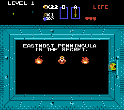
Not the most helpful of hints, unless you're playing the Japanese version.
In the case of the first level, for example, the hint is "eastmost peninsula has the secret," which tells you you need to get to the end of the dungeon. This is not a particularly helpful hint.
I did a little research and discovered that in the Japanese version of this game the hints were different than the American version. For example, the Japanese version of the message in Level 1 tells you that you need money to shoot arrows. This is a much more useful bit of training.
Analysis
This finding surprised me more than the others. I remembered the black rooms, but I'd never considered them to be training, since they were fairly useless.
Once I found out about the translation issue, that all changed. It's clear that Miyamoto and his team were trying to guide the player, and to train them on important things they need to know.
The black room method was not very successful, which is why I think they eventually abandoned it in later games.
Given all of the above, there is one design decision that left me scratching my head.
For example, in this first level, the bow is not on the critical path, even though you need it to beat the game. Why didn't the designers force you to get it? Perhaps they wanted you to revisit the dungeon later, if you forgot it? Given the extreme attention they've paid to helping the players not get lost, though, I'd doubt it.
They do this very successfully in Level 4 (which you can see in the appendix below) so I'm not sure why they decided not to do it in so many other levels.
By the time we get to A Link to the Past on the Super Nintendo, six years later, they've fixed this problem, so it's clear they weren't satisfied with it, either, but still -- I wonder what their intent was.
It is possible to achieve the feel of non-linear level design by taking a linear path and adding short offshoots.
Ramping encounters up along the critical path still allows you to have a good intensity ramp even if your level designs aren't all linear.
Miyamoto and company intended to have training in the game, but it was excluded because of localization errors.
I want to point out how awesome it is that they were making this stuff up back then. These Masters of Game Design discovered these tricks and built on them as time went by.
How fortunate we are, to be able to look back and learn from them.
I wanted to include a few more level breakdowns, but couldn't find a good spot in the article itself. As such, I've included this appendix which breaks down Level 4 and Level 9 to show how the trends I noted earlier in the article continue throughout the game.
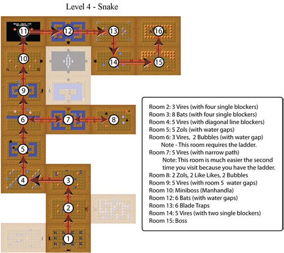
Level 4: Snake
Notes
This level is very interesting. The flow is generally linear and ramps well, as with Level 1, but the designers stop the player in Room 6 and won't let him continue until he gets the ladder in Room 8.
As with Level 1, the designers put in a number of optional rooms. In this level, they've made it so that the optional room next to Room 2 uses the key from the room to the left of Room 1. This means that the player could potentially have to run around the level for a while if he uses the key from Room 3 in Room 2.
This isn't too much of a problem, however, since they block your forward progress in Room 6, which keeps you from getting too lost.
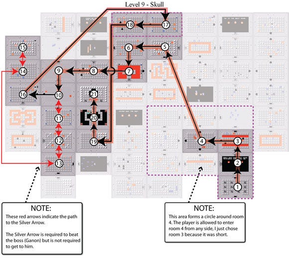
Level 9: Skull
Notes
When I traced the critical path in this level, at first I was very overwhelmed. As with the other levels, there is a minimum amount of re-traversal required to get through this level, as the critical path is extremely linear.
One surprise was that the silver arrow is not technically on the critical path even though you can't beat the end boss (Ganon) without it. In a modern Zelda game, they would have put a gate in front of Ganon's door (and, for that matter, others throughout the level) which could only be opened when hit with a silver arrow. That way they could ensure you had to pick it up before you got there.
I've outlined the path to the silver arrow with red lines, so you can see where you'd have to go to get it. It involves re-traversing 5 rooms, which is a large departure from the norm.
Read more about:
FeaturesYou May Also Like