Trending
Opinion: How will Project 2025 impact game developers?
The Heritage Foundation's manifesto for the possible next administration could do great harm to many, including large portions of the game development community.
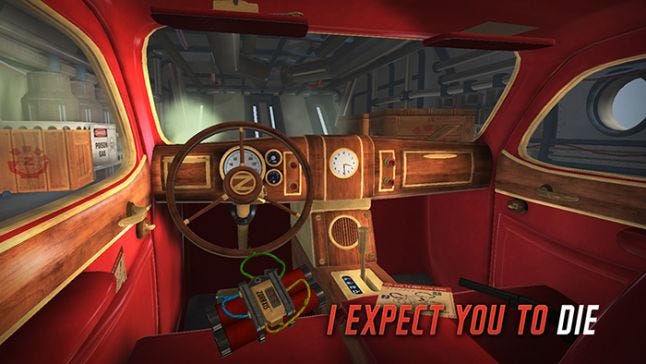
In the GDC talk 'Lessons Learned from I Expect You To Die,' Shawn Patton of Schell Games talked about unique VR prototyping techniques his team has developed.

VR development has unique strengths and weakness, and will require unique new kinds of brainstorming and prototyping. That was one of the main takeaways from the 2016 GDC Session "Lessons Learned from I Expect You To Die."
They key to protyping in VR may prove to be something that Schell Games has dubbed "brownboxing..."
Jesse Schell kicked off the presentation, sharing some broad insights learned from making this witty VR game that puts players in the role of the most inept super secret agent in history. He also described how controls were refined for both mouse and Vive. Then he passed the mic to Schell Games’ Shawn Patton, who shared insights on what worked (and what didn't work) in their process of designing additional levels for the game.
The initial level of I Expect You To Die, which is set inside a car, has been a smashing success. It has consistently been the top-rated VR game on the Oculus site. The challenge for Schell Games was figuring out why exactly it was effective, so they could expand the game and create other equally successful locales.

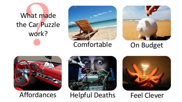
What made the car puzzle work? What made it a great example of VR level design? According to Schell Games, it was:
Comfortable--there was not a huge disconnect between the player's body position and their position in the game. The player was probably seated, and their character in the game was sitting behind the wheel of a car in an identical position.
On budget--They car level could be made fairly quickly, because it didn't have any elements that were particularly hard to create. Patton mentioned that the team had thought of doing a bathroom level... But there’s water in bathrooms, there are towels, there are mirrors. All of these things would be very hard to represent, which would put them "over budget."
Full of affordances--This basically means that there were lots of things to fiddle with in a car--visor, keys, gear shift, glove compartment, as well as the many objects placed in the environment.
Helpful deaths--Failing was fun and instructive, not frustrating. To illustrate this, Patton showed a clip of a tester discovering a cigar and a lighter, and sparking up the stogie. Then the tester tossed the lighter aside, and it promptly ignited a stick of dynamite. The tester laughed uproariously as he was blown to smithereens, and he learned a lesson that he could apply when he hit restart--don’t toss a lighter aside without extinguishing it.
It makes the player feel clever--Puzzles solutions weren't arbitrary or obtuse.

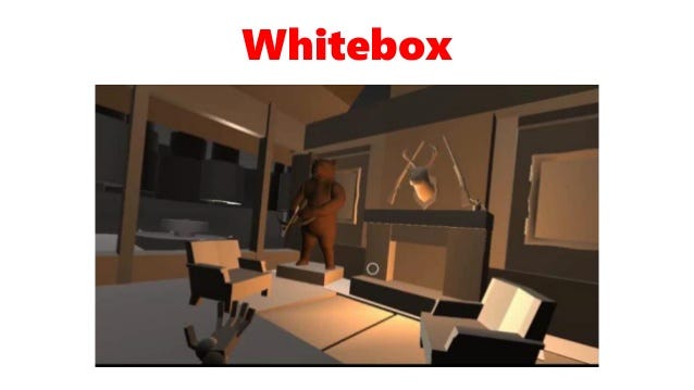
Applying these rules, the team at Schell Games decided to tackle two new locations--a hunting lodge and a window washing stand. The locales seemed to fit their definition of what made the car puzzle work, and they set to work whitebox testing the locales, creating low-poly mockups of the environment and the many potential affordances that could be placed within.
The results...were terrible. The team had missed something vital.
They eventually determined that while these levels fit the criterion laid out above, they failed in several important ways:
No clear goals that were literally right in front of the player
No perceived sense of freedom, no balancing of tasks that made the player feel in charge.
No clear bread crumbing, with goals the build from the affordances, fit together neatly, and lead naturally from one to the next.
No clever intuitive puzzle solves that make the player feel smart and cool.
No awesome moment that lets the player be a hero.
The developers eventually hit upon a much better method of prototyping VR levels, one that quickly helped them determine if an environment would meet all of these criterion without doing any whiteboxing. They dubbed it "brownboxing."
Brownboxing looks like this:
They literally created real world mockups of the many features and affordances in the level, and tested how fun and intuitive they were to fiddle with before they implemented them in the game.
It's charming to think that the key to prototyping in this bold new frontier of game development...may involve lots and lots of cardboard.
Read more about:
event-gdcYou May Also Like