Trending
Opinion: How will Project 2025 impact game developers?
The Heritage Foundation's manifesto for the possible next administration could do great harm to many, including large portions of the game development community.

Featured Blog | This community-written post highlights the best of what the game industry has to offer. Read more like it on the Game Developer Blogs or learn how to Submit Your Own Blog Post
How we made levels for our mobile shooter where you can simply remove your "ship" from the game and put it back at any time. And without not use any kind of level editor.

This blog was originally posted at www.longhathouse.com.
Level design is, without doubt, one of the hardest challenges we faced in Magenta Arcade. This aspect on single player games is basically what makes your central Game Design shine. In other words, without any good Level Design, the end experience will crumble, no matter how good you planned the moment-to-moment gameplay.
This is especially true in games like platformers or shooters: imagine a Super Mario World level without any holes, and turtles standing equally spaced in the vast, straight level from start to finish: that would be pretty boring. Or an Gradius level comprising only on those first enemy ships, squared obstacles and power-up ships placed randomly from start to finish. That would make what are really good game designs into a bad experience in a whole.

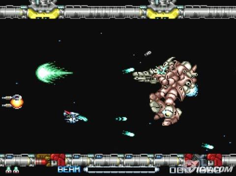
Also, we figured it out early that just our favorite shooter like R-Type’s levels won’t just cut it out for Magenta Arcade, because in it, your finger is the ship, and taking the finger out of the screen don’t do anything: you are just in another plane now, and the enemies keep in there.
This was actually our first experience fixing level design, our background comes from infinite and procedural games, so for us this game is an excellent learning experience.
Our level design is implemented as a simple timeline that calls both pre-made and made-on-the-fly functions (with closures!) over time.
Here is a very example of a regular Level of Magenta Arcade, how we see it in the code:
…
After 2 Seconds, call this function that spawns two enemies.
After 3 seconds, accelerate the camera to 50px/s.
At the same time, call this function to spawn more enemies.
After 1 second, add a generator that will keep spawning enemies in this X position of the screen for some time.
After 5 seconds, check if there are N enemies on the screen, and if not spawn 4 more from the sides.
After 10 seconds, call the boss
…
(Doing so was only possible because of the special powers of Actionscript: we discovered that it is a very powerful language, and most prejudices we had with it were just shown they way to the door. Too bad it is closed to just a few types of applications, but I might be trailing off here.)
This gives us a series of positives and negatives. The main positive is that we can do anything, at any time. We aren’t restrained to pre-defined functions of an editor at all. As a matter of a fact, we didn’t had to make any level editor or use third-party software. So it saves time in that direction.
Obviously, the bad part of this is that we can’t see anything, and testing a super tiny change that can potentially change all the experience is always annoying with compilation times, etc.
Another bad stuff is that the level is measured by time and never by distance. That makes beautiful (or even playable) formation of enemies extra hard, if we need to adjust the speed or position of the camera over time.
Ok let me explain something about Magenta Arcade's ruleset: It is a shooter where your finger is the ship, and like so, you can remove and place it anywhere, only risking yourself if your finger is attacking and on the screen. Out of it, you are somewhat safe (excluding some situations where enemies can shoot at the screen if you don't shoot them down before).
Turns out we cannot just place enemies randomly: there is special care needed in everything, and enemies cannot just be placed arbitrarily on the screen.
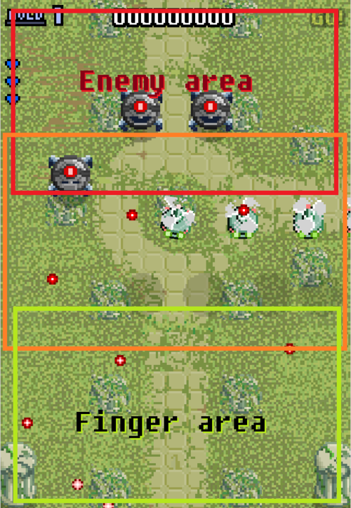
For example, the first and foremost thing you have to think about when designing level design for a game like this is the finger of the player and the position of the device in her hands, and their relation.

In the image above, you can see how we divided our screen to distribute our enemies. Basically, we should fill the red area with enemies and the green should be where the finger should be (or be directed to). It might feel fairly obvious, but there are many, many reasons for that:
The finger is not invisible: putting your finger in the top, red part of the screen may result in you not seeing what’s below it, thumb or index finger alike. For example, it feels totally unfair if you lose life as a result from a shot given from behind the finger.
The movement to hold the mobile device in this position and orientation and putting your finger in the top of the screen is not an organic, easy-to-do one. You shouldn’t force the player to do it, never, by placing power-ups in the red side or lots of enemies in the green side.
Probably as a result of the two reasons above, in our game design shots normally go straight up, and then, for that to keep working, the finger should stay at the bottom part of the screen, while enemies on the top.
Power-up buttons should be near the player and further from the enemies, so they should normally rest over the green or yellow areas. But buttons can be put farther for challenge purposes.
Clearly seeing an enemy robot go from the red side to the yellow and then to the green side is not a problem. But, if that enemy shoots in the direction of the finger, it can generate a lot of unfair situations. Also, an enemy that is on the green side should be on it’s way to leave the screen: we found out in playtesting that if something stays alongside the finger in the green area, even if it doesn’t shoot, it is simply not fun: it makes you feel limited and forces you to press your finger against a corner to play.
Also, enemies can appear from all sides of the screen, and that needs some care. Enemies coming from the top line of the screen are OK. But enemies coming from the sides (and even from the bottom, that actually happens sometimes) need extra care as well.
What we do is count on free space and active enemy placement to guess where the player finger is in the moment and spawn enemies in the opposite side. One thumbs up of using closures and pre-made functions is that we can watch the game space at any time super easily and, for example, check for the finger’s position to spawn enemies. Using that resource means less unfairness for the player most of the time.
In Magenta Arcade you can, at any moment, leave your finger of the screen and be immune to usual enemy shots. That was a interesting challenge for us: how can we design a shooter level for a game with that mechanic?
In the iteration phase, we tried many things to pressure the player to keep the finger on the screen: like a second health bar for the bottom part of the screen or a time limit. Most of these thing were scrapped, some of these things we are going to talk about when one of us make a post about Magenta Arcade’s Game Design in general, but we decided to leave most of the work to the Level Design itself.
The solution was dividing the level in what we called bursts. To explain what a burst is, take a look at this example in the way we see levels in the code:
…
After 1.5 seconds, spawn a really big enemy.
After 2 seconds, spawn some helicopters from the sides.
Go to the next burst
After no time at all, accelerate the camera.
After 2 seconds, spawn 2 enemies.
…
So you see, that command in line 4 means that only after the player destroys the big enemy AND the helicopters the timeline is allowed to continue. So, the camera accelerating? We guarantee that it will only happen without any enemies on the screen.
That makes a constant challenge in the level design: the player has to destroy things in order to advance. That more naturally makes them want to keep risking themselves.
Actually we can control which enemies are added to the burst and which are not, so we can make fun things like infinite enemies generators while you wait for an enemy to be destroyed at the top, and etc. Again things like that forces and forces the player to maintain his finger on the screen, or else it is only gonna get harder and harder to start attacking.
So the player need to risk her finger to destroy everything in the screen and reach deeper into the level. The boss would eventually come, and it’s the same: the boss would stay on the screen until you risk yourself to destroy it.
So, alright, we have general rules for designing the levels that can accommodate ergonomics and game design, we can divide our levels in a nice way that automatically forces the player into the screen, we have a bunch of cool enemies and power-ups.
Well, after we had the resources to populate everything, general rules to apply, we still need iteration. It is key. A level never comes out perfect the first time, and if you do it too much, you actually get more and more comfortable with your pipeline that you can do even more sick bursts and levels. I think that applies to any kind of level design.
Feedback is also essential. We try to take a moment to check out where people are getting frustrated, having fun, feeling everything is super easy and whatnot. Listening to feedback also helped us a lot. Then we try to iterate more.
And that is it, we iterated to find out level design rules and good practices and iterated to get the levels better and better. We still think the levels aren’t perfect yet, and probably never will, because there is not such a thing like perfection: Level Design can be iterated indefinitely.
See ya,
João Brant
Read more about:
Featured BlogsYou May Also Like