Trending
Opinion: How will Project 2025 impact game developers?
The Heritage Foundation's manifesto for the possible next administration could do great harm to many, including large portions of the game development community.

Featured Blog | This community-written post highlights the best of what the game industry has to offer. Read more like it on the Game Developer Blogs or learn how to Submit Your Own Blog Post
A completely personal take on what design decisions could have made Tokyo Jungle a more enjoyable game.

Have you ever played a game that you really liked, but certain parts of it disappointed you (for the record, I totally dig Tom Francis' proposed ending to BioShock)?
Did the lack of knowledge pertaining to the developer's budget/timeline/goals/etc., stop you from thinking "Why didn't they do it *this* way?"
If you're passionate about a particular title, then probably not. And why should it? As the end-user, you ultimately care about your own experience, and a game's faults might seem all the more painful if seemingly obvious and feasible changes could have eliminated them.

tokyo_jungle_4
For me, that game is Tokyo Jungle, and here's what I think would have made it better:
Let's start with the easy, somewhat less subjective field of UI. I don't think anyone reading this enjoys manually scrolling through the thousands of words that make up a typical EULA (and sometimes studios don't even want to write their own). The fact that Tokyo Jungle pops up a EULA every time you start the damn game is infuriating. It shouldn't be there at all, really, especially since its only online component is a global leaderboard.
The leaderboard is not all that great either. It takes a very long time to load, and it's retrieved whenever you finish playing Survival mode. Why not do it in a separate thread and let the user move on? Or at least only force this path if the player has gotten a new high score? What makes the delay even more frustrating is that it needs to be endured in order to register all the unlockables of the playthrough. Simply quitting a game does not record any of the collected items, story mode pieces, etc., which should be saved instantly.

tokyo_jungle_3
Finally, the world map is quite useful, but also somewhat confusing. Its most zoomed-in level is quite small and doesn't clearly indicate accessible areas. The location-labels are a bit misleading as well since they contain a bar that fills up and an icon inside the right edge of the bar. At first I thought the fill indicated my dominance of the area (how many spots I marked with my animal), while the number of icons represented the amount of food within its borders.
Turns out it's actually the fill that reflects the quantity of available food, and the icon is just a label for the fill. To make this indicator more intuitive, the icon should be outside the bar on its left side, or alternatively a "food" caption should be displayed within the fill.
Aside from the herbivores' double-jump and inability to consume other animals, there's not a lot of mechanical variety between the various types of fauna. Sure, there are statistical differences, but the gameplay is exactly the same. Expect to see crocodiles scaling buildings by jumping from one extruding air conditioner to another. Creating custom gameplay for each animal would've been a sizeable undertaking, though, so I'll give Tokyo Jungle a grudging pass here.

tokyo_jungle_1
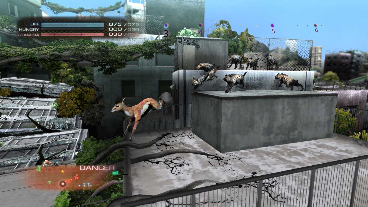
What's less excusable is the stealth mechanic. For something that's presented as a large part of the game -- especially for those peaceful herbivores -- there's no clear way of telling what is an animal's zone of awareness. This is exasperated by the fact that many animals spot you while they're off-screen, especially in lower-left and lower-right corners of the view window due to the perspective of the camera.
The minimap helps to spot these potential threats, but not while it rains, and it's more of a band-aid solution anyway. A circular outline for each animal's field of vision would've helped, or at least some arrows on the edges of the screen indicating potential dangers. A further aid would be displaying the exact threat-level of each animal, and possibly a countdown timer showing how much longer before it reverts to a neutral state.
Toxicity can also be problematic to detect. Hiding inside of buildings or underneath bridges doesn't seem to help when it's raining, and contaminated food is hard to detect due to the very subtle purple visual that can blend in with the background. Simple icon indicators similar to the alert exclamations could have easily removed this ambiguity.
Despite the annoyances mentioned above, Tokyo Jungle's biggest failing is in how it handles its Survival and Story modes.

tokyo_jungle_5
Tokyo Jungle was originally a retail game, and it's painfully obvious that it was modified to fit a price tag. Story mode -- the main campaign -- consists of 14 short missions, and each one needs to be individually unlocked by grinding it out in Survival mode.
I suppose this approach greatly extends the overall playtime, but it's quite frustrating to progress through the narrative one small step at a time after jumping through some hoops in a completely separate game mode. This is doubly perplexing as unlocking the story missions often involves a certain knowledge of the game's mechanics, but those same mechanics are then explained in the unlocked missions. The whole arrangement reeks of a production change that was implemented late into the game's development.
The story missions could use a few more checkpoints as well, but they're quite fun as they contain lots of silly and amusing sequences that slowly unravel the game's mystery: what happened to all the humans? It's a neat premise, and it shouldn't be so heavily gated (especially if it was a questionable way to justify the price since the game was released as an inexpensive downloadable title outside of Japan).
Instead, Story mode should be featured first and foremost, and the animals played/fought during its missions should then get unlocked in Survival mode.

tokyo_jungle_2
Survival mode itself is an even bigger mess.
Its main goal is to live for 100 years and complete various side missions to get as high a score as possible. In order to provide variety and ensure that players get different scores, Survival mode employs randomization and high-threat events/encounters common to roguelikes. The problem is, all these gameplay systems conflict with each other.
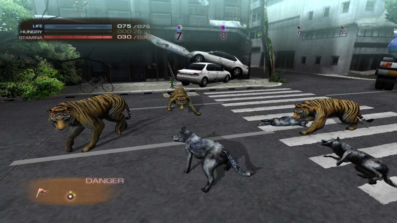
Hunger is greatly boosted in comparison to Story mode (it takes 90-120 seconds to die of starvation) and the missions are on a strict time limit. This means you are constantly on the run if you hope to get a high score, which also doubles as the currency for unlocking new animals. Completing the side missions awards statistical bonuses and unlocks new costumes as well, providing further incentives to rush through the game.
This approach completely invalidates the stealth mechanic, makes exploration of the cool urban environment impractical, and prevents the player from messing around with fun, emergent events such as battle royales of bears fighting chickens fighting giraffes. The random toxic rains and food shortages add further frustration as they can make some of the side missions virtually impossible to complete.
A better approach would've been to tone down the unreasonable hunger meter and remove any other time pressures. Next, the randomization could be more prevalent, starting off each playthrough in a different area with a different mission set. New objectives could come in as old ones are completed, and the resulting pace would let players get comfortable with the game and experiment with its most fun components.
If this led to seemingly infinite playtimes, the randomization could be skewed to provide a gradually increasing challenge. Better yet, the statistically-boosted animals of other players could enter the gameworld as AI-controlled bosses to help crown the real king of the hill. Finally, new animals and costumes not present in Story mode could still be used as prizes for playing through Survival mode.
Agree? Disagree? Have any other examples of a game where certain design choices seemed downright baffling? If so, feel free to leave a comment!
Radek Koncewicz is the CEO and creative lead of Incubator Games, and also runs the game design blog Significant-Bits.
Read more about:
Featured BlogsYou May Also Like