Trending
Opinion: How will Project 2025 impact game developers?
The Heritage Foundation's manifesto for the possible next administration could do great harm to many, including large portions of the game development community.
The clever conceits that allow The Tartarus Key to serve up retro, PS1-style horror (and laughs) minus '90s-era frustrations.

What do you do when you want to create a horror game without it being too scary? Two-person developer team Vertical Reach ran into that conundrum with their latest game. Creators Kevin Colegate and Leonor Parra liked the feeling of being scared but didn't want to deal with the jump scares and other elements associated with horror games.
"We wanted to make a horror game that was a lot more about the kind of the atmosphere or the tenseness of everything instead of necessarily like, 'Oh boo, something jumped out at you,'" Colegate told Game Developer. "And that naturally sort of evolved into this kind of escape room format."
That idea grew into The Tartarus Key, out now on all platforms. It's a PlayStation 1-style escape room game where you have to solve a number of increasingly complex puzzles to get out of a mysterious mansion alive. Along the way, you'll have to help other victims while learning about the rich weirdos who put the whole plan in motion.
So what starts off as an eerie game with darkness lurking around every corner morphs into something much more palatable, even for non-horror fans. It also allowed the team to create a throwback PS1 game, which has become more common over the past few years, especially for indie development, and put what they wanted into it. The result is a game that feels very retro but also subtly modern.
Colegate and Parra are fans of old-school horror games like the first Resident Evil. They used some of its least scary elements to craft The Tartarus Key's atmosphere. So while the game is technically classified as horror, it has this over-the-top, campy charm that makes it suitable for those who can't stand jump scares.
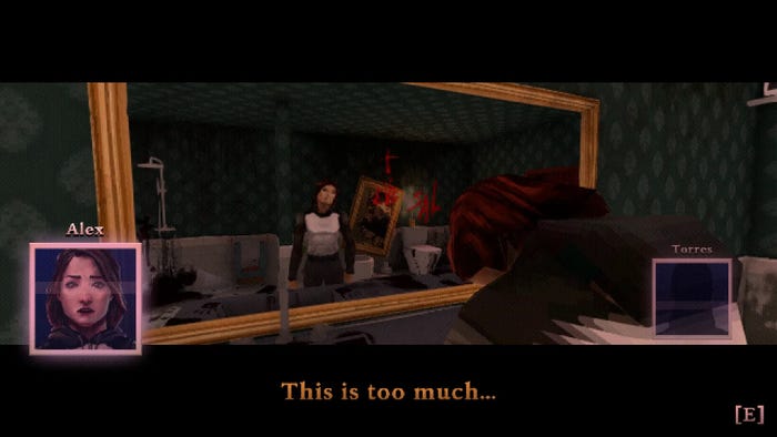
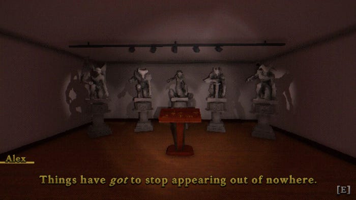
A lot of its light-hearted nature stems from the content of the puzzles and some of the dialogue, but especially the PS1-inspired, low-poly, "crunchy" graphics. The visuals increase the horror in certain situations, thanks to the abstraction of early 3D art but mostly lean into the cartoonish aspects of this kind of game.

"We looked into why we preferred horror games of that time. They were a little silly, very over the top, but they weren't very scary," Parra said "And I think a lot of it was because the graphics are [such] that you don't know what's there. And I think that really worked for us."
The team put its own spin on that identifiable art style, shaping something they called "retro plus." In these older games, the characters "have a pillbox [design], with each part of the body [being] a separate capsule," Parra explained. "We decided to have just a full 3D model of the character instead, with joints instead of [being] separated at the elbows, knees, and hips."
Vertical Reach didn't want a game that was "horrifically ugly" like an actual PS1 game, as Colegate explained. Instead, the target was creating a look that evokes what we remember about that era of game design and not what it actually was.
Another example is the UI. Anybody who's played a point-and-click or escape room-style game knows that the inventory is arguably the most important aspect of the experience, but Vertical Reach had to modernize it for accessibility purposes so players could actually see what they were looking at. When you render a game at under 480p, you need to make some compromises on accuracy. But this is one of those cases where it worked in their favor.
"It was this case of, well, how big or small can the text be, especially if it's going to be presented in kind of chunky pixels. And in a funny sort of way, it actually helped a lot," Colegate said. "If we wanted to make sure that people could read the game, the text had to be quite massive in comparison to what you see nowadays. And then it resulted in a UI where everything is so much larger that even though it's pixelated. "It kind of tackles that accessibility problem on its own."
You can't slap together a retro throwback game and call it a day. Games have grown a lot since the PS1 launched in 1995, and plenty of games from the era could be considered barely playable now. Players are used to certain playstyles and features that just weren’t available back then. That meant the developers had to go retro plus to account for "modern sensibilities." That meant thinking about elements like shadows, ambient occlusion, and more.

Something obvious is the choice to use a first-person POV for our hero, Alex. I didn't even think about how that simply wouldn't have existed on PS1 (when most first person games were thought of as "Doom Clones") until the developers mentioned it in our interview.
Going back to the accessibility question, there aren't a ton of alternative settings in the game (this is a two-person team supplemented with help from publisher Armor Games Studios, so you're not going to see what typically shows up in triple-A titles), but they put them in where they could based on playtester feedback. There are a couple of font options and subtitle backgrounds, and players can turn off filters and wobbling if it makes them feel sick.
In a similar vein, a lot of work was put into the puzzles themselves. Most puzzles in The Tartarus Key involve finding clues around rooms to unlock the next door and move through — you know, like an escape room. In order to do that, the team needed to think about how to make those clues stand out amongst background assets, especially when everything is so low-res.
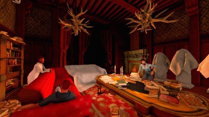
They relied on a few tricks. First, they had to first design assets that were specifically interactable and those that weren't. "There's a lot of asset reuse, right? We've got a lot of bookshelves, we got a lot of books… and if it's an inventory item, we would try to make it a unique asset that's just on its own," Parra said.
Next, they would render important objects at a slightly higher resolution. For example, in the introductory room, you'll pick up postcards. While the floor is a texture rendered at a certain resolution, the postcard was twice that. This makes it stand out subtly to the player. A lot of it also came down to placement. Some clues, like pieces of paper or a vase, do blend in with their surroundings, but others are placed in odd ways, like a book sticking out of a bookshelf or a white sheet hanging in the middle of a room.

So while you could just walk around a room and see what comes up when you click, there's also something working in the background that'll make you subconsciously know which clues to interact with.
When first encountered The Tartarus Key, I was immediately on board thanks to the concept. I'm drawn to PS1, retro-styled horror games, especially with a puzzle focus that evokes older Resident Evil or Silent Hill memories. But what I wasn't expecting was a title that was so grounded and often funny. It managed to create puzzles that can be complicated, but always solvable with enough time and patience. Limiting each to one room certainly helps, but there are also tricks here that help it feel easy to understand, even nowadays. So you get the best of both worlds.
"There were quite a few early Resident Evil puzzles where I was completely stumped. And it's not because they were badly designed. It was more because they were doing something entirely new at the time and hadn't developed the kind of puzzle language required to make sure… all the details were effectively communicated," Colegate said. "Obviously that's just naturally kind of come along, just by the nature of being made now in 2023."
You May Also Like