Trending
Opinion: How will Project 2025 impact game developers?
The Heritage Foundation's manifesto for the possible next administration could do great harm to many, including large portions of the game development community.

Featured Blog | This community-written post highlights the best of what the game industry has to offer. Read more like it on the Game Developer Blogs or learn how to Submit Your Own Blog Post
The past few months I have been doing research in the level flow and environment design in games like, "Uncharted 4" and "The Last of Us" This blog will be a crash course on: What is level flow & how level designers apply them.


For the past few months I have been researching several different games. During that time I have been researching games like "Uncharted 4" and "The Last of Us" (made by Naughty Dog).
With this article I want to share my knowledge with my fellow peers, in the hope of empowering and motivating them to learn more about level design. This will be a crash course on the different elements of level flow, that level designers can use to make informed decisions about their level design.
My definition of level flow:
"When the player knows what to do, where to go.
But not always know how to achieve/get towards that goal."(keyword: Spatial Awareness)
It is a state where the player has a pleasant experience, traversing through the level. It goes hand in hand with game flow.
This definition is quite vague and that is because level flow is a broad subject. For simplicity I will split up "level flow" into four (4) smaller pieces. In high-level terms, these are some of the elements we level designers use to guide the player(s)..

"I need to know about geometry and composition? But I am not an artist?!"
Yes, I am also not an artist but I do believe that everything is in some way intertwined with level design. Mastering small bits about these subjects will allow you to make more informed design decisions.
Geometry
Think about collision, physical interactive objects, shape design.
Composition
A) Focal points. Funneling the player with use of Geometry/Assets.
B) Contrast (positive & negative space): Between, Space, Lighting or Color.
Scripted Events
Companions, Enemies (AI), Moving/Patrolling around.
Other events that makes the player move: such as an explosion or a fallen tree trunk.
Storytelling
Text/Signs (direct)
Assets placed in a particular order, like pickups scattered across the map or barrels in a corner (indirect)

Geometry, Composition and Scripted Events can be combined to create Storytelling elements. Being able to master these sections will allow you to guide/move the player to where ever you desire them to go.
Here are some examples of flow elements that can be used to guide the player through the level.
Lines, Arrows Shape Silhouettes, Pathways...
Lines have two points, a begin and an endpoint. A line affords direction. It is a 2D object that moves in a direction. We can see lines as arrows and arrows afford direction.

In this example, multiple objects in the scene will hint towards this focal point, the mega structure.
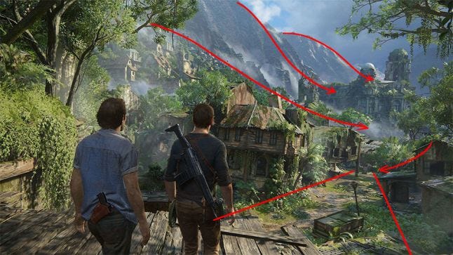
Nathan Drake points at the landmark. (not in this picture, but in game he does)
The pathway underneath them, leads towards the landmark.
The shape of the mountains.
The shape of the houses (especially the roofs)
The contrast between the mountains and the forest.
As you can see lines are powerful tools to indicate direction. They help to guide the players eye from A to B and visa versa.
Landmark definition:
An object or feature of a landscape or town that is easily seen and recognized from a distance, especially one that enables the player to establish their location on the map.
Landmarks can be used to determine someone's location, approximately from the landmark. Therefore it is a method to improve flow in the level. An exceptional level designer would work together with the environment artists, to make sure that each area is recognizable. They should work together to determine the line of sight and the visual language of the area.
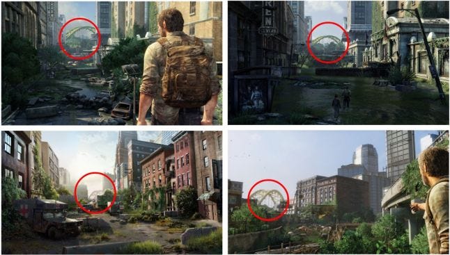
In this example, Joel will be able to see the bridge from multiple angles. This allows the level designer to create a level that doesn't go into a linear/straight direction. As walking straight towards the objective is boring and no fun.
The high buildings on the side also helps to frame the bridge, funneling the player towards the objective. The only indication the player needs to know is how far away they are from the bridge. If they are approaching closer to the bridge, they can assume that they are going towards the right direction.
Using Color as Affordance:
Color can be used to indicate the player, that a certain object is able to afford something. It can be used to contrast the scene, shifting the focal point.
.jpg/?width=700&auto=webp&quality=80&disable=upscale)
In this example, all reachable & climbable ledges have these "light yellowish" color casted on them. Informing the player that those afford to be grabbed/climbed. This is a clever way to indicate something to the player, without it breaking the immersion. By blending in with the cliffs, using the same "earthly" tones.
You can also use color to invoke an emotion from the player.
Bright shades of red and yellow might indicate danger , while a blue color let them think about water, the sky, calmness or peace.
Repetition is beautiful as humans can see patterns. Nature is build up out of patterns and we love it.
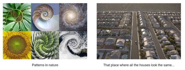
But when you repeat it too often, it becomes boring. You can compare it to listening to the same song for 100x times. At first you might like the song, although after repeatedly listening to it, you might come to hate it.
This problem is also true in level/environment design. Do not let the player(s) traverse through areas that all look the same. What is the point of exploring if everything looks the same?
You can keep it look coherent, but be sure to have a bit of variation. As mentioned in the previous point: Color is a nice way to break up the monotone feel of a scene and to attract the players attention.
In a static scene, movement will catch the players eyes. When characters or objects move from one position to another position, they create a line. (See example 2.1) As I mentioned previously, a line indicates direction. We can use a dynamic element to guide the player through the level, creating flow.
Video by: Dops Gaming
Do you know the way?
In this example, Nathan breaks out of prison with two of his comrades. In this action packed scene, your goal is to escape the prison. The player can experience this scene as stressful and rushed. You aren't prepared for this. You don't even know the layout of the prison and now you have to make a break for it!
During this moment, the player doesn't want to constantly think about where they need to go and accidently get lost. This is where the two side characters take it over and guide you through the scene.
I don't know where to go, guess I follow everyone else.
This is another example of movement being used. Similar to the previous example, the player is confronted with a high intensive experience. Where "yet again" the goal is to escape from the mess you're in.
Video by: theRadBrad (fragment: 10:30 - 13:30)
In all the chaos you don't know where to go, so you follow the crowd. Where ever they go, you will follow. Your only goal is to get out and keep Sarah safe.
The crowd is moved by "seemingly" uncontrollable events in the scene. An exploding car would drive the crowd to the opposite direction, towards safety.
It doesn't have to be complicated. The previous two examples requires the developers to create AI with a behavior system. Although that could be really cool, it's also complicated.
Video by: IFreeMz (fragment: 42:18 - 42:30)
A subtle tumble weed rolling in a certain direction or in this example; a swan flying away into the distance. It tells you to keep moving in "that" direction.
The easiest noticeable storytelling elements are:
Text, signs
Decals
Meshes placed in a deliberate order
You can make patterns or create contrast to highlight an object.
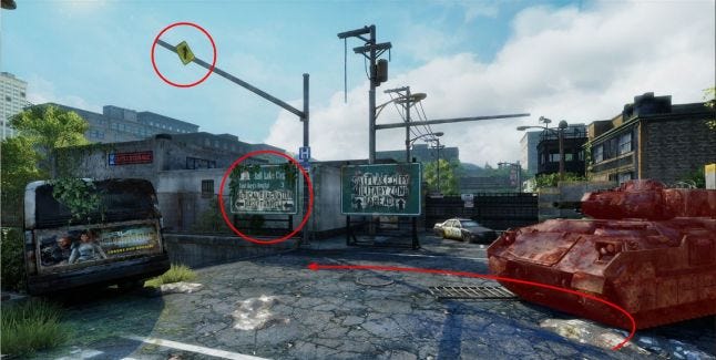
Due to how the tank is angled 45 degrees, it naturally guides the player towards the left side. The tank is used as a physical barrier/obstacle to guide the player to the left.
Signs will tell you where to go. The left billboard reads: "Medical Evacuation, Use Tunnel" while the right billboard reads "Salt Lake City, Military Zone Ahead". Given that the theme of the game is about survival, the player wants to avoid danger.
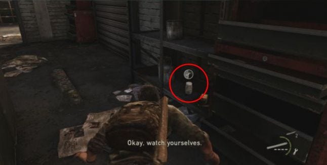
Another example is to use breadcrumbs to assist your player through the level. It can be a way to indicate the player that they are on the right path.
Well, 3D levels are created in...3D.
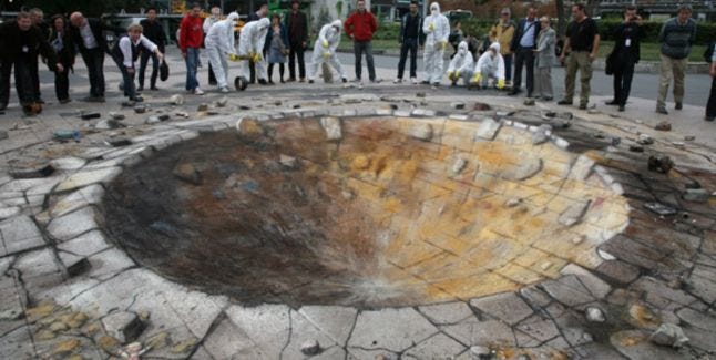
Cool 2D -> 3D street art from talented artist: Julian Beever
It is easier to make a 2D picture look nice from one view. But in games where the player can freely roam around and explore, they usually have multiple views on an object.
You and the environment artists can make everything look nice, but you probably don't have all the time of the world to make it perfect.
However, as a level designer you can plan ahead and make sure to get the most out of the level, by setting up rules for yourself.
Limit the views the player can have.
Pay detail to the more important aspects. What do you want the player to see?
Try out different lighting setups.
Guide the player through the map with use of flow elements! Make the chances that the player wants to go off-track unlikely! Don't place landmarks at spots where you don't want the player to go to. Uncharted 4 levels feel very open. But secretly their levels are linear, with a golden path.

There is no point in going off road, there is nothing there anyway... oh look a cool mountain! (road 66)
A dedicated button!
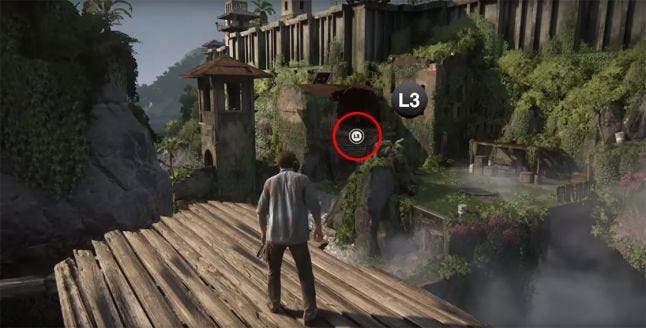
With a press on a button (L3), they allow the camera to momentarily reposition itself, aiming at the focal point. Using this method, the developers have total control on what they want the player to see.
To demonstrate on how you can used your now new profound knowledge to recognize flow elements in other games, I will dissect a level section in Uncharted 4. (Chapter 2: Infernal Place)
Something to keep in mind: Nathan doesn't have a map, he doesn't use a compass. What a badass.
Video by: Moghi plays (fragment: 8.49 - 10:50)
Steps performed by the player:
The player sees a tower and grapple hook his way towards it.
He proceeds to climb up the tower with use of the grooves.
Climbs inside of the tower.
Walks around the plateau.
Falls in the ocean, trying to find a pathway.
Re-spawn
Can you recognize what goes "wrong" in this small section? What do you think caused the confusion by the player to suddenly fall off the map, into the ocean? Was the player misinformed, weren't there enough flow elements?
To my observation, they placed a lot of flow elements to guide the player but because of a few poorly placed assets. It unintentionally outweighed the other flow elements placed by the designers.
The cues that should had helped the player
Direction
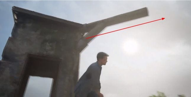
This wooden bar seemed to afford to be hooked. It doesn't, but it does points towards the objective.
Direction & Shape Language
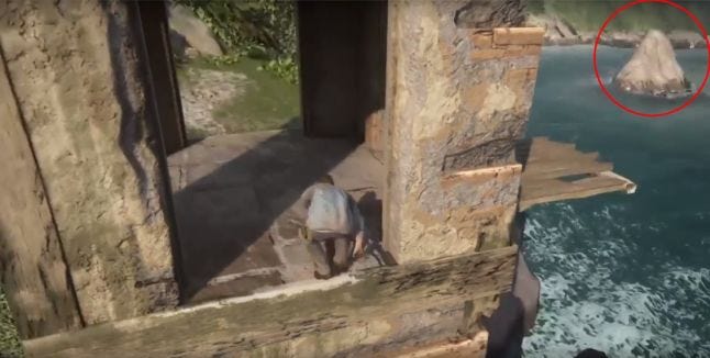
A pointy triangular rock. Points & triangles can be seen as arrows, arrows indicate direction. In this case this rock is telling us to go upwards.
Color
.jpg/?width=700&auto=webp&quality=80&disable=upscale)
These grooves have a light yellow rim. In example 2.3, I explained that Uncharted 4 likes to use color to indicate towards the player, that it affords something.
Text & Speech
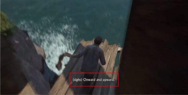
Nathan knows something you don't know. "Onward and Upward" he says. He hints to keep going up. This is a critical cue that gets triggered a bit late.
Summarized
With so many flow elements, the player shouldn't had to be confused right?
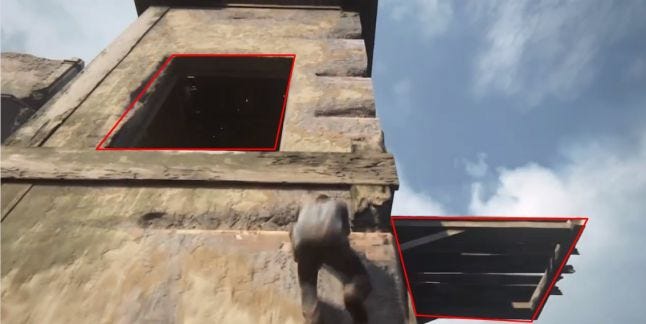
The reason for the confusion was likely because of two elements.
The doorway
The wooden balcony
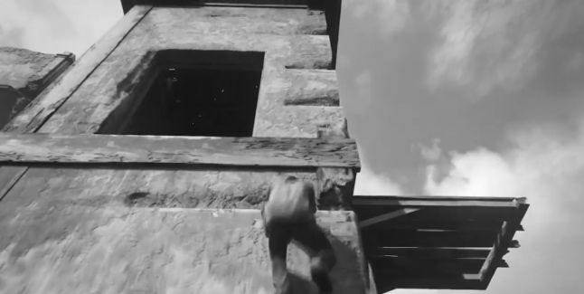
When we convert the picture to black and white, we can see that the difference in contrast makes your eyes focused on the doorway and the wooden plateau.
The doorway affords to be walked through, gates are strong methods of guiding the player. They have a strong attraction to them. You want to walk through it to see whats on the other side. The imbalance between the contrast in shape, lighting and color made the doorway and wooden board pop out more than intended.
A potential solution to this problem would be to highlight the grooves a bit more. With use of decals, color or by perhaps destroying part of the construction. Any kind of additional indication that tells the player that they can climb the tower.
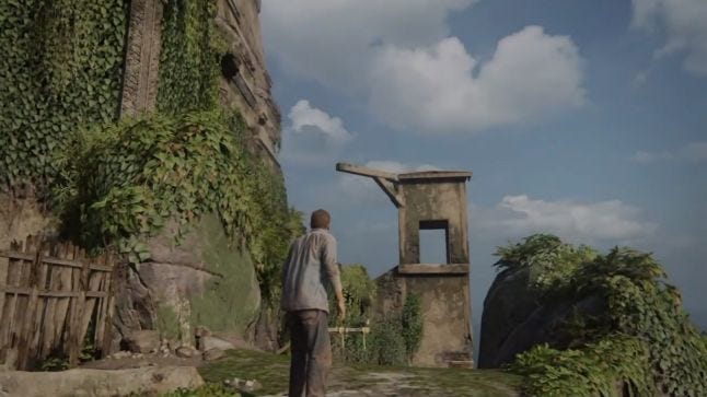 But nonetheless, without applying my potential solution. You can also jump of the cliff and the game would re-spawn you on a spot with a nice view of the wooden bar. It almost seems like they intended you to struggle.
It almost seems like they intended you to struggle.
Another theory of mine is that the designers at Naughty Dog planned this all along and this part was supposed to play out like this, to slow down the pacing of the player. Showing them that it is important to look around the environment to find clues. There are really uncountable ways to guide your players.
We might never know the truth. ;)
LinkedIn: in/trinhleveldesigner/
Portfolio: https://www.trinhleveldesigner.com/
Disclaimer: At the time of writing this article, I am a 4th year level design student at the Breda University of Applied Science (NHTV). I have no affiliation with Naughty Dog. This article is my own view on their awesome level design. Thanks for reading!
Read more about:
Featured BlogsYou May Also Like