Trending
Opinion: How will Project 2025 impact game developers?
The Heritage Foundation's manifesto for the possible next administration could do great harm to many, including large portions of the game development community.
Developers C. and Tom Bedford tell us why their neon, funky homage to lowpoly horror straddles between two worlds.

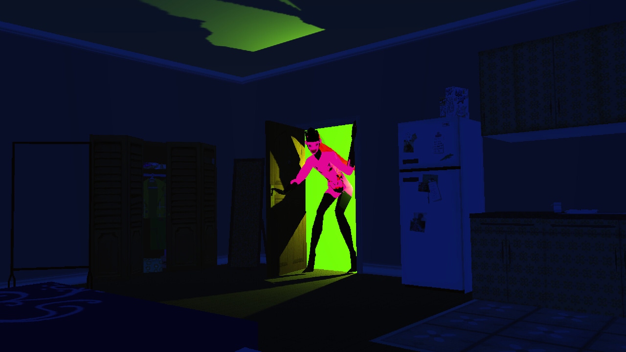
Sorry We’re Closed is a horror game split between two realities—one ruined and industrial, the other vibrant and tantalizing. Players look into either world using their Third Eye in order to overcome a demon curse (and maybe get caught up with some hot underworld denizens along the way).
Game Developer caught up with C. Bedford, the game’s creative director, and Tom Bedford, its technical director, about the freedom of allowing clashing personal tastes to mix, how they recreated the sense of watching a horror movie with friends by using different visual styles, and the challenges that came from having two worlds laid on top of one another.
Game Developer: Sorry We're Closed features a striking visual aesthetic that is a mix between a scalding neon Biblical sex party and a rusted-out metallic nightmare. What inspired the creation of this game?
C.Bedford: It’s a clash of what we enjoyed in games growing up and our tastes now. The inspirations are actually really varied, coming not only from video games but TV shows, films we like, and music.
I was definitely enamored by Silent Hill as a child—the world really fascinated me—but so did the world of games like Jet Set Radio! I have a lot of different aspects of me that are hard to separate. I used to feel a bit lost creatively as so many other artists seem to have a specific style they both enjoy and create. It felt like I was always stuck between multiple worlds—a bit isolating in a way. Now I’ve decided not to be bothered by it anymore. If I like something, it goes in, even if there is the risk it might clash. I don’t care anymore! Some musicians I’ve had on repeat while working on this project are VHS Head, clipping., Mid-Air!, Unloved, Ital Tek, FKA Twigs, Moses Sumney, and Phono Ghosts, to name a few.
Tom Bedford: During development on Sorry We’re Closed, I often focused on the feelings I experienced playing games as a kid, especially the first 3D games I played, like Rayman 2, Half-Life, and the N64 Zelda games. They all had elements that terrified me (under the well in Ocarina of Time!), alongside comedic interactions with NPCs and locations I wanted to explore. These games could be scary, alongside colorful characters and vivid VFX.
Can you tell us a bit about the design of the game's twin visual styles? There are some clear Silent Hill inspirations in the look of the rusted mechanical world, but what drew you to mirror this with such a vibrant art style?
C. Bedford: As much as I adore Silent Hill, we have no intention of recreating it beat by beat. The vibrant style is just a personal taste of mine. If I like something, I try to find a way to make it work with everything else. Some of the most exciting media to me mix multiple elements that feel like they won’t work. I feel that the styles go hand in hand, especially if you were to think of it like an industrial club scene. Rather than the harsh neon colors being next to this dark industrial look, it’s actually what connects the protagonist’s world to the demonic world. It’s what binds the two together. Something that trendy humans and demons can agree on [laughs].
Tom Bedford: It was important for us to have characters that can express themselves in the world. Their vividness allows us to push away from the game being always moody or oppressive. We can explore other sides of the cast as well as amusing or romantic situations.
From a gameplay perspective, the art direction allows us to get away with more cartoon-like effects. It doesn’t feel out of place if we unlock a cupboard and the door snaps open without animating or if a stunned enemy has stars floating around their head. We are very happy for it to be a game that doesn’t always have a serious tone.

What were you hoping to express with these two styles? What mixed feelings were you hoping to evoke?
C. Bedford: Fluidity, change, the different dimensions people can have, depth. I want to capture the feeling people get when watching a horror movie with friends. There are elements that are scary, but you’re chatting and making jokes along the way. Honestly, rather than it being a super scary experience that’s typical of a horror game, we are going for more of a Rocky Horror Picture Show meets Scooby-Doo meets The Cell. I want people to wince a little, but I mainly want people to laugh, all while it looks as if it takes place on a fashionable runway.
Tom Bedford: We watched Twin Peaks together several years ago and sometimes it is like we watched different shows. I enjoy revisiting comforts in the everyday interactions and relationships—a happy place where you can eat some cherry pie. Then C.B. reminds me there were also the horrors taking place there at the same time. We hope players can experience a similar contrast as they dip in and out of the demon world.
Lust seems to infuse many elements of the game's characters and visuals as well. What thoughts went into subtly (or not) weaving this into the design of the game and its characters?
C. Bedford: It’s not subtle at all! Sex and sexuality have always been a major influence on my work. My mother never shied away from explaining the world of sex to me as I was growing up, which I think gave me a healthy relationship with sexual imagery and the ability to create a variety of character types that don’t always fit with what is conventionally attractive. I honestly believe anyone can be sexy, and I’m always on a quest to further stretch people’s ideas of what "sexy" means. The antagonist of our game is sporting a huge monobrow, which isn’t something people typically consider a desirable trait, but I would like to change that! I’m happiest when I make someone question what they believe they find attractive.
Sorry We're Closed is a game in which two worlds are layered on top of one another and players can see between the two using their Third Eye. What challenges came from letting players swap between these worlds? How did you solve them?
Tom Bedford: We had to be careful with the playspace so we wouldn’t trap players in geometry. It isn’t going to be a good time if you open your Third Eye and you’re stuck inside a table from the other world! We decided early on that the area where you can walk must be the same in both worlds.
There are several states the player might be in at any one time—their Third Eye could be open or closed, they could be in third or first-person perspective. We also had to consider the physical size of the vision, as the Third Eye can be open, but distant objects are still outside of its area of effect. Once we had a stable system for keeping track of these states, we could use combinations of them to create unique interactions.
When designing the two worlds we wanted to make sure players didn’t feel like they had to scan the whole environment with the Third Eye to find hidden objects to progress. We don’t want to waste people’s time. This meant creating puzzles where there is always something of visual interest to attract attention, but to find the solution, you need to see what is possible with the interactions in both worlds.
C. Bedford: The technique we use created quite a few limitations on how the levels were physically built. I had to be conscious of the texture work so gaps wouldn’t appear in the geometry as the player used Michelle’s power. The fact that the player can see things in first person as well meant that every area needed to be fully designed, even if you wouldn’t normally see it while walking around.
One issue we constantly battled was designing something that looked cool or interesting when you swapped vision, but one state would be obscuring the camera angle we chose! It was such a delicate balance, as all of our fixed cameras are chosen specifically for ease of movement with modern controls.
The solution to most of the issues was to be more aware of the process, do lots of testing, and looking around each area carefully.

How did you make these two worlds play differently? What ideas went into giving the two lands completely different ways for the player to interact with the enemies in them?
Tom Bedford: We wanted a mechanic that would allow us to change the appearance of the world and characters, offer alternate dialogue to let us examine these differences, and use it as a tool for solving puzzles. In early builds, the Third Eye changed the entire world when activated, but we found limiting the ability to a small radius around the player gave many benefits. Firstly, it looks really cool to have the world change as you walk around! More importantly, the physical shape gave us something we could use to offer more varied interactions.
C. Bedford: Initially, the idea was that there would be different enemies in each world, giving the player a reason to swap between them. Then it transformed into there only being demonic enemies in rundown, abandoned areas and the Third Eye let the player see into the past and learn about the lives of other victims. In this initial implementation, having the vision open prevented you from engaging in combat. You had to close your Third Eye to fight.
This was kind of interesting, but the pacing felt wrong, as we have other areas that skewed in favor of exposition and dialogue. Solving puzzles with Michelle’s vision ability was already there, but something was still missing with the combat. After adding a physical shape to the Third Eye we considered how it could help players fight enemies rather than it being strictly environmental.
We thought about the player position while shooting—that it was a lot like a lightgun game you’d play at an arcade. Something that is really fun with this play style is having to shoot weak points on a moving target. We then came to realize the vision could be used for precisely that! We had to decide on how to balance the risks and rewards for a mechanic like this, but it completely transformed the game for the better. This meant the player had something really satisfying to do during combat.
Michelle will fight back against her curse by fighting eerie, surreal beasts from Hell. What thoughts went into their design? Could you tell us about the creation of one of your enemies and how it connects to the varied visual styles of the game?
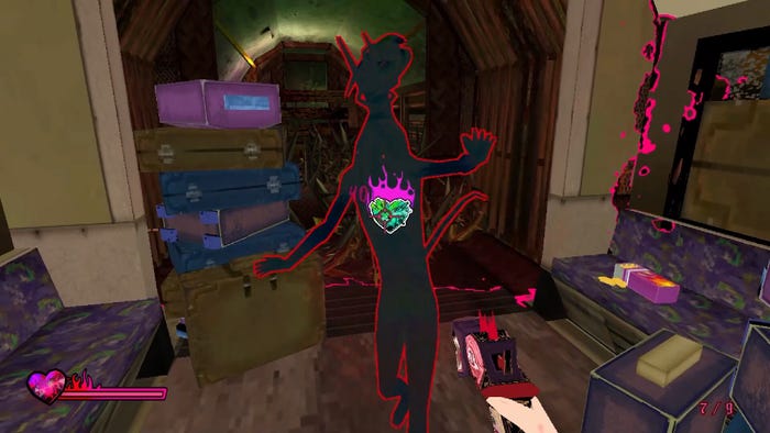
C. Bedford: The first thing that came to mind was not wanting to use humans outright, or disfigured people. It’s normally the go-to for horror, and it so easily begins to fall into "wheelchairs are scary!" which I don’t like. With that I decided to go with making our enemies more animalistic. In these areas where the demon world is leaking into Michelle’s, people are being affected by it and taking on another form entirely. Or even the other way around—smaller animals are affected by the darkness, making them more human-like. They come from a world of confusion, where the lines are blurred, so it made sense to have things be a mesh of recognizable creatures and features.
I try to keep the enemy designs in line with the locations and theme of each level. For example, in the underground station area from the demo we have rats, which you’d typically find in this kind of place. I think they’re a great symbol of hoarding, which ties with the previous victim we come across in this area. She’s obsessed with money, acquiring wealth, and hoarding more cash. I wanted to tie things together in this way.
In other instances, some enemy designs are just things I’ve had in nightmares that I thought were useful for a horror setting!
Likewise, Michelle has hellish weapons she can use against the monsters. What ideas went into creating weapons that felt like they were born from hell?
Tom Bedford: It would be a shame to have these bold characters and not have striking weapons to go alongside them. Early thoughts were of a demon companion that changed form between the different guns. While that aspect didn’t make it into the game, you’ll see every weapon still has eyes and teeth—they’re certainly not from this world!
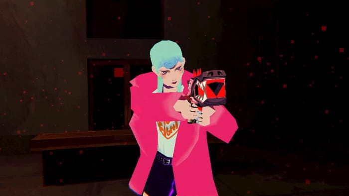
C. Bedford: I just went with my gut and "the rule of cool" when it came to the weapons [laughs]. There’s just so much fun you can have with a character's weapon. It basically becomes part of their silhouette and an extension of their personality. Michelle, as a character, is conscious about her attire—the weapon would have to be something she wouldn’t be embarrassed to hold or clash with her outfit. The great thing about video games is that you create the world, so I could supply her with such a thing—otherwise, I’d have to write dialogue with her complaining how unexciting her gear is.
You May Also Like