Trending
Opinion: How will Project 2025 impact game developers?
The Heritage Foundation's manifesto for the possible next administration could do great harm to many, including large portions of the game development community.
Laura Saada with mobile publisher Playdigious dives deep into the harrowing process of bringing a frenetic button-centric "roguevania" to touchscreen devices.

Laura Saada is lead producer at Paris-based Playdigious.
First of all, before anyone asks: yes, Dead Cells will be a premium mobile game. It is a premium game on PC, on consoles and it is a premium game on mobile. No argument here.
One year ago, Motion Twin (Dead Cells’ developers) entrusted us to take on the challenge of bringing Dead Cells on mobile and granted us full latitude. It was a big day for Playdigious since Dead Cells won several prestigious awards, got some amazing coverage and of course a lot of players and us loved the game.
What a challenge! (And some pressure on our heads.)
When we started working on Dead Cells, we couldn’t even imagine what challenges were waiting for us around the corner. However, we’ve tackled challenging ports before. We previously worked on Shiro Games’ Evoland 2, a complex 20-hour-long RPG. Even its developers didn’t believe it was doable on mobile, due to this complexity.
But we did it!
Now that you’ve got the setup, here we go: how do you port the precise, frenetic, action-packed, controller-centric roguevania game that is Dead Cells to mobile and tablets devices that utilize a single touch screen?
The first thing we did before anything else, was to make sure the game could run on mobile devices. We made a very rough first build, without controls or anything, just to check performances and see if there were any technical blockers. Spoilers: there weren’t.
A Switch version was also in the pipeline, so we weren’t that worried about it. The thing to know about mobile nowadays is that mobile devices are way more powerful than what a lot of people expect. Obviously, there are some additional constraints on the technical side, such as the variety of devices to manage, specific texture optimization, RAM usage, not to mention various OS versions. We won’t talk about the Android platform with strong GPU disparity etc. However, generally speaking, high-end mobile devices nowadays are very close to a Nintendo Switch in terms of technical power. So, if you’re planning a Switch version, please have a look at mobile and see if it would fit. It’s an awesome platform with a huge reach and there’re already some awesome games on it and…Ok I’ll stop here, this is for another article (sorry, but I do love mobile).
Let’s get back to Dead Cells. So, there were no technical blockers (we won’t talk about the Haxe/Heaps engine here and that’s not my place to do so anyway). I’m not saying this was easy -- on the contrary, it was a very difficult task, but not impossible. Porting a game, specifically on mobile, is not trivial. It does require some hard work and I’m still really impressed with the work our developers are doing. However, with a little experience it gets easier. Unfortunately, Dead Cells won’t be supported on “old” devices but (thanks to QA) we are confident that it can run smoothly on all supported devices.
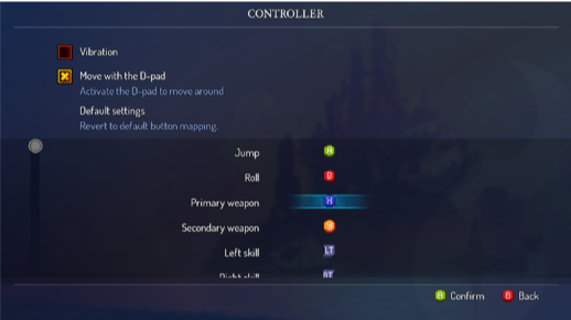
2.1 Controller settings PC
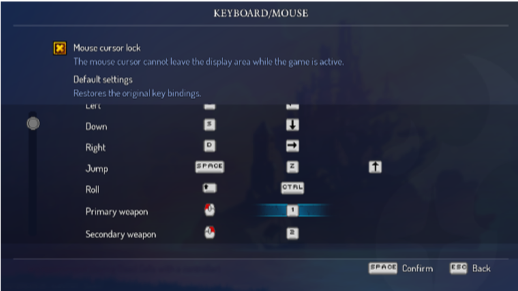
2.2 Keyboard settings PC
We knew (and will always know) that a mobile port will never be the exact same experience as it was on the original platform (PC or console). For Dead Cells, the main challenge was to take all the controls and find a way to make them enjoyable on mobile.
Now that a first build is here and works, it is time to start thinking about the UX and do some mock-ups and tests.
Where should we start?
On Dead Cells, one of the key features is movement. The player needs to move the character easily, run to the left, the right, crouch, and jump. This is a question we knew well, thanks to our previous porting experiences.
Moving left and right was not too difficult to solve: let’s use a virtual floating pad. It is way more precise today than it was in the past and lot of action games on mobile are using it. Players are already used to it, and we can tweak and tune it as much as we want.
Jump and Dodge, not so much. Both are required in Dead Cells and used so many times.
How could we let players use them easily?
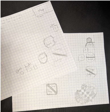
3. First Jump and Dodge drafts
My first mock-up was something like one button for both actions, and I wanted to let the player slide from one side of the button to another, to either jump or dodge without too much gesture. We tried a little.
That didn’t work. It was a nightmare to play, the precision was not here at all and players would mis-click every time. Big nope!
Let’s get back to basics, shall we? One button to jump and one button to dodge. With the right positioning, that could be it. We’re getting closer to the game feel we wanted. But still, this is a lot of buttons on screen, so we tried something else.
Get rid of the Dodge button and use a Swipe on the right part of the screen to dodge.
Yes! That works too!
“Swipe-to-Dodge” was a great idea but wasn’t the best for the whole team. It is a very different way of playing and we weren’t all happy with it. So, by default, we kept the basic two buttons idea.
Let’s talk about what came next: using skills, weapons, and potions; how to pass through a door without breaking it; how to talk to a character; how to pick up items or interact with stuff, etc.
Skills & Weapons: Jump and Dodge buttons worked well, ok let’s do the same! The challenge here was to find the right positioning for the virtual buttons. We checked other successful action games on mobile like Fortnite and Lineage 2 to have a better understanding of players’ habits when playing: How do they move? How do they jump, How do they manage an interface with a lot of buttons? Thanks to benchmarks set by other games, we figured we were good here.
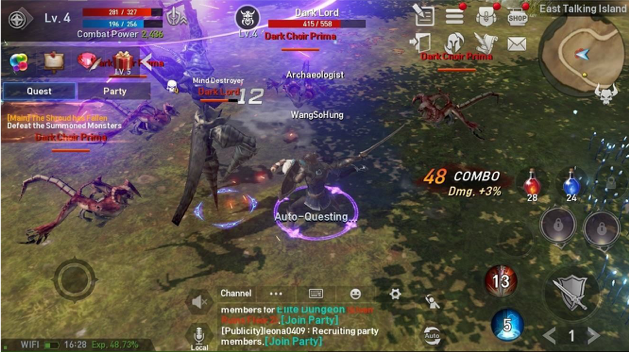 4. Lineage 2
Menu and Potion buttons (and homunculus but shhh! That comes later in the game): On PC you just have to press “Esc” to open the Menu and Settings; on consoles, you press Start or Options. But on mobile, you need something on screen to open it. For a long time, the Menu was just on the HP bar and we were used to it. It wasn’t the first time this was used on a mobile game; I was confident that it would be enough.
Good lesson here: When doing UX design = NEVER EVER EVER assume too many things for players. And please, playtest. Because yes, playtests showed me how wrong I was. Putting the Menu on the HP bar wasn’t enough at all, we needed a Menu icon! So, we listened and added one.
Interaction: How should players control passing through doors, talking to characters, pick up items and weapons, etc.? How should all those different actions work on mobile? We didn’t want to add too many things or give players more controls to understand. One button would be enough, so we added exactly that: a new “Interact” button. Finding the right visual asset for this one was not an easy task but with the right icon and some visual signs and feedback, this button became very simple to understand and use.
For all of those buttons, a lot of mock-ups and tweaks were involved, but thanks to some playtests, we managed to get something nice. Additionally, right from the start, we had this idea of letting players choose how they wanted to play, so we integrated some nice features inspired by Evoland 2… But we’ll get back to that later. At that time, I still personally thought there were a lot of buttons in game, but when playing, I kind of just enjoyed the experience and forgot about that pretty quickly.
Ok let’s recap all the things we needed to fit on one small screen:
A floating pad (left of the screen -- no discussion here as players are used to it, so let’s not change their habits)
Jump and Dodge
Skills and Weapons
Potion
Menu
Interaction
+ all the UI already there on other platforms: HP bar – Gold & Cells count – Map – Timer etc.
And we needed to adapt to small screens and a completely different way of playing: holding the device with two hands wrapped around it, sometimes on the go.
This required some harsh UI work.
We just couldn’t keep the existing UI; everything was at the bottom of the screen, and this doesn’t work well on mobile since players have their hands and fingers there. They wouldn’t see a thing.
We moved almost everything; the HP bar got a new spot on the top left corner of the screen, with both Gold and Cells as good company. The Map is moved to the top right corner, with the Timer, Keys etc.
That left us a lot of space at the bottom – and that’s where we placed controls. We put the pad zone on the left and other controls on the right, with the little exception for the Potion and Homunculus controls behind the HP bar.
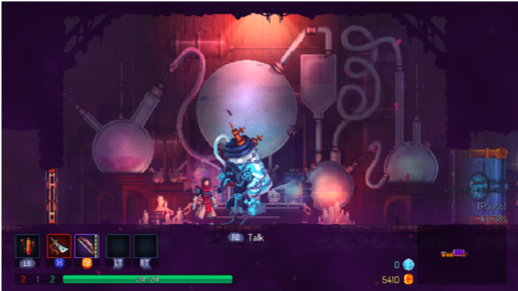
5.1 Original PC UI
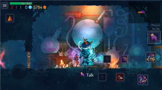
5.2 Mobile UI (WIP)
We never found the perfect fit for every player. And this, just within the office. We all had our own ways of playing, our little habits playing the game on PC or consoles, and our little habits when playing on mobile in general.
What could we do? Easy. We did what we did for Evoland 2 and what I expected we’d have to do from the start: Give the player freedom.
You can translate it as: let players customize their controls and experience to their needs and envy.
We did some playtests specifically for the mobile version, and one big thing that came up was that the right direction was to give players the freedom to customize their controls.
I already talked about it briefly, but as the button positioning was really tricky. We implemented what we call the custom controls: an interface in the Settings letting players move and resize the buttons as they want. We hope all our iterations on controls and positioning for the default settings will be enough but if not, that’s ok: controls can adapt a little to the players. We did limit it to positioning and size only, to make sure everything is still working nicely with those changes.
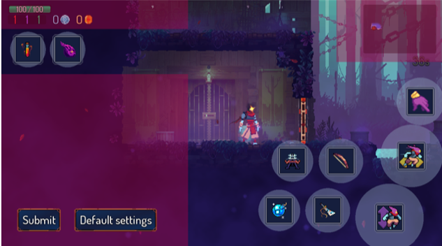
6. Custom controls (WIP)
Also, remember the test on Swipe to Dodge that we put aside? Surprise! It’s back! Not available by default but as an option. Players will just have to activate it et voilà!
Another option often asked is a fixed pad. This is something that came up with playtests and some past experience with mobile games. We can show it this way, 80 percent of players prefers a floating pad and 20 percent a fixed pad. So, just like with the Swipe to Dodge, it’s now an option the player can activate or not.
One last thing: at the beginning of this article I was talking about mobile not being exactly the same experience compared to other platforms. That’s ok. On the suggestion of Motion Twin, we actually added a nice new game mode to make sure the core experience won’t be affected too much by those new controls. At first, we weren’t really convinced. However in the end, it became by far the team’s favorite control option. (Thanks again Motion Twin for pointing this out.)
The idea was to help already on-board Dead Cells players to make the transition to the mobile version, and maybe attract new players to discover the game this way. Or maybe, it was just to have a cool new way to play Dead Cells with a focus on placement, dodging and long-range attack. We called it Auto-Hit. As its name suggests, primary attack (melee attack) will hit automatically nearby enemies. One weapon slot is dedicated to melee weapons only, and the second for the rest (long-range and shields).

8. Corgi jump
If we sum up, we now have:
A UI specifically thought for mobile (and tablet)
Two game modes: Original & Auto-Hit
A custom controls feature (positioning and size)
An option to Swipe to Dodge instead of a button
An option for a fixed pad
External controller support (MFi and Bluetooth)
All of that to make sure we’re as close as we could get to the original PC and console experience.
When porting a game on mobile (or console or anywhere), you do have to make some concessions. You do have to make the controls and interfaces fit the aimed platform. But you can also embrace it and add or modify some features to push it to its full potential on that particular platform.
For us and Dead Cells, the difficulty was to translate all the controls to a touch screen (and on mobile, the controls are often the UI). We knew there wasn’t a perfect solution for everyone, so we decided very early to let players decide for themselves. There are controls by default, and I personally hope this will be a good fit for them as it is. But if not, a lot of other options are available. Hopefully players will appreciate those options and will enjoy this new experience of taking one of their favorite games everywhere.
Porting a game, any game, is not an easy task. There is an infinite constraint from the original platform to work with and that’s why a lot of developers are often frightened when talking about it. But it is not impossible. I agree, some games won’t be right for it, but during the porting process, some devs might discover new ways of playing, and some might work so well you’ll ask yourself “why wasn’t it on this platform before?!”
You May Also Like