Trending
Opinion: How will Project 2025 impact game developers?
The Heritage Foundation's manifesto for the possible next administration could do great harm to many, including large portions of the game development community.
HoloVista co-director Nadya Lev and lead producer Meredith Hall break down the development of this one-of-a-kind mobile hidden object game.
August 31, 2021

Author: by Meredith Hall (Lead Producer), Nadya Lev (Co-Director)
Game: HoloVista
Developer: Aconite
Release Date: September 30, 2020
Platforms: iOS
Number of Developers: 16
Length of Development: 6 months prototpying, 12 months pre-production, 16 months production
Number of Discord Messages: 65,000
Introduction
HoloVista - our first title as a team - is a premium mobile game. The entire game plays out on a fictitious Instagram-like app, and its sci-fi story takes place a few years into the future. You play the game as protagonist Carmen Razo, with your device acting as her phone. Carmen is a recent college graduate who just landed her first job at a mysterious architecture firm, and through Carmen’s eyes you discover a dangerous project that this firm has been building in secret. You experience a week in Carmen’s life through the places she goes, the people she chats with, the photos she posts on social media, and her feed.
The social media app in our game has a camera button, just like Instagram does. When you hit the camera button in our game, it opens to a virtual camera. Every time the camera opens to a new scene, it’s meant to convey that you’ve traveled to a new location in the story. You can look around the scene in 360, using your phone’s gyroscope and accelerometer. You’ve given a list of objects to photograph - this is meant to put you in Carmen’s frame of mind as she documents the various places she visits.
HoloVista’s narrative starts off fairly normal, then melts down into a chaotic, hallucinatory fever dream as time goes on. Just like our development cycle! J/k; as you’ll see below, our process thankfully got more streamlined as we approached our ship date. Shipping our first game during the pandemic was quite the roller coaster. After ten months, twelve award nominations (including an Apple Design Award win), and countless sleepless nights reflecting on it all, we’re ready to spill the tea on what went horribly wrong and wonderfully right during our game’s production.
WHAT WE GOT RIGHT
Running a Disciplined Beta
As we approached launch, we had a pretty clear idea of the areas in which we were lacking, and wanted to confirm our theories. We did a round of beta testing, which allowed us to make informed decisions about what was and was not within scope to fix. We ran this beta about a month before our release as a final review following many cycles of playtesting and iteration.

An overview of part of our high level timeline towards release, including our beta timings.
We structured our beta questions to have numerical scale answers where possible and set clear expectations on what each number ‘meant’, so rather than sifting through pages and pages of text to ascribe our value to them, we could quickly have quantifiable data. We then set up for the survey to filter straight into Zapier, to populate into a spreadsheet for easy data representation, but also to ping us in Discord to let us know when we got a response. We used logic jumps in order to capture exactly the information we needed, and skip questions people didn’t have more detail for. If someone gave a low rating on a section, we captured more key information there. To encourage completion, we wanted to make the form as short as possible.
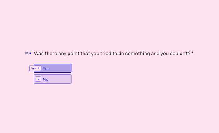
An example of a question in Typeform. These were shown one at a time, to help keep focus during responding.
Our beta test audience went outside personal and direct invitees to a broader audience we sourced from numerous spaces - our mailing list audience, target audience spaces like specific Reddit subreddits, and various Discords. We captured information around what players felt the themes were, as well as quotes from playtesting, to get a sense of what they took away from the experience and how it aligned with our goals.
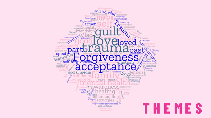
An example of a generated word cloud of the themes collected in responses from testers.
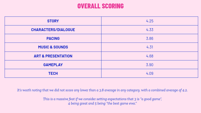
A collection of the aggregated scores for each of our key areas of discussion.
One thing we have always done with our playtesting is use the results in actionable ways. This doesn’t mean acting on every piece of feedback we receive, but capturing feedback, and looking for commonalities to confirm what is actively a problem for many players, rather than a mismatch with select players personal taste.
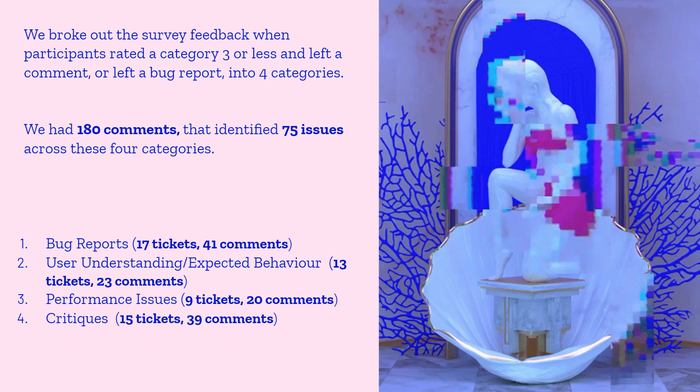
A breakdown of the key issue areas identified in survey responses.
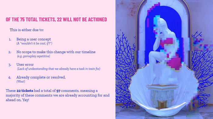
A further breakdown of the key areas identified.

An archived capture of how we ticketed feedback and critiques, with the players’ responses in the comments section.

An example of the backlog generated, grouped by key areas.
We evaluated feedback by prioritizing both frequency and impact. In other words, is this a piece of feedback that is raised often, and does it have a large impact on the final experience of the game? It’s important to take every bit of feedback with a grain of salt - which was part of why we reflected positive and negative comments against one another in each section. Some things are simply a matter of taste, but if our timeline and the impact it would have on a final rating was low, it didn’t make it a compelling direction to chase. For example, a portion of testers found the music repetitive, but still rated the experience highly overall.
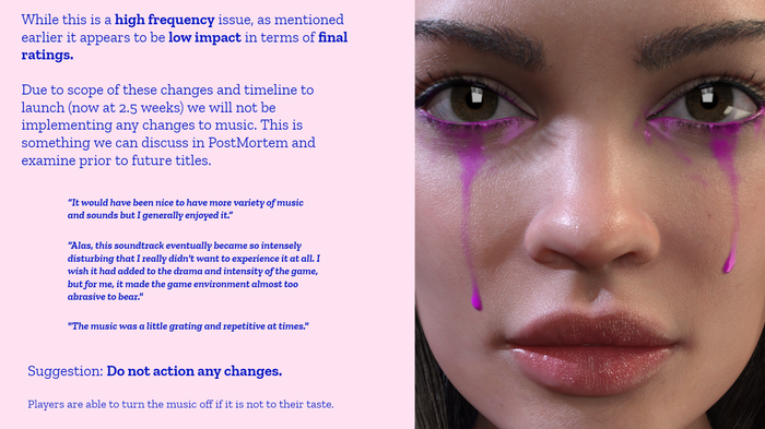
An example of how we understood frequency vs impact, and made decisions on actioning change.
This process meant we were able to tidy up issues for release, beyond just technical bugs, to ensure we were presenting an enjoyable experience rather than just a playable one. This process also did a lot to validate the team's concerns across disciplines - we confirmed that issues we'd identified and were already working on were indeed problems, and were able to discern which problems we hadn’t been working on yet were solvable.
Once we finished the beta, our producer put together a deck to distill the key discoveries to the entire team. The deck helped to quickly build consensus around the remaining objectives, and boosted morale as we hurtled towards the finish line.
You can see the questions we used here: Beta Questions
You can see the full final deck of results here: HoloVista Beta Testing Report - Gamasutra
Art Direction
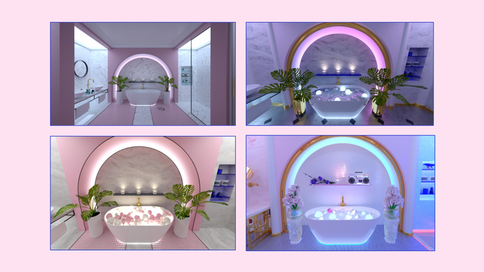
One of HoloVista's core themes is the tension between keeping up outward appearances versus a person's true inner life. Distilling that general theme into a specific, cohesive narrative and strong supporting art style required strong active listening between the co-directors, narrative designers/writers, 3D artists, game/level designer, sound designer, and composer. In order to keep the creative team aligned, we relied heavily on written documentation, mood boarding, and a detailed style guide that we created early on in the process.
The first step of art direction was to set the overarching themes. We knew that we wanted to tell a story about social media and the notion of multiple selves.
Mood boarding was integral both at this early stage of shaping the story together with the narrative designer, and later when the art team joined the project. As visual thinkers, we communicated the story's high-level themes in the earliest stages with images as much as we did with words. Often, the co-directors discussed a theme or scene on a high level, then created mood boards separately and met to compare them. We frequently ended up with a remarkable overlap of similar/identical images that we'd both pinned independently. This confirmation that we were on the same page helped us to move quickly, but differences of opinion were just as useful. When co-directors' mood boards diverged, that opened up a conversation in which we made new discoveries, gained deeper insights into each other's perspectives, and further refined the vision. As with visuals, co-creating a playlist helped us to convey our ideas for HoloVista's sound to the composer.
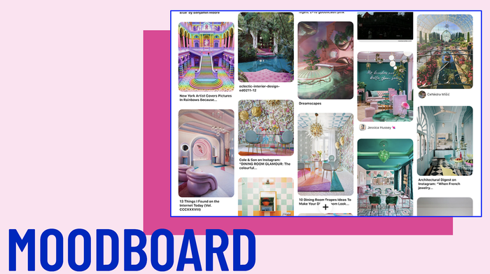
Creating mood boards helped us to communicate not only visual motifs, but also thematic concepts and emotions.
Along with a mood board for each scene, artists received a story summary (contextualizing what's happening to Carmen in each room) and a scene description. A short excerpt of a scene description reads: "the Entertainment Room is about secrets and shame. It looks like a storm has torn through it. CDs and records are shattered, shards wedged into the wall. The plants are upended, the couch flipped. Clear violence has been done here. The fireplace is filled with wild-looking mushrooms." Vivid, specific descriptions helped the artists to bring out the emotion of a scene quickly.
By virtue of being a hidden object game, HoloVista had a great opportunity to use various props to convey specific motifs. Our narrative designer came up with a list of "key objects" for each room. Described in detail (and often accompanied with a visual reference), these objects taught the player something about the story and advanced the plot. In addition to the key objects, the level designer and artists needed to populate the rooms with dozens of other items so that players wouldn't breeze through the hidden object gameplay too quickly. These objects, too, needed to be narratively significant whenever possible. The team had access to a "Repeating Objects/Motifs" document on our Wiki that helped us fill out the scenes with objects that reinforced the story's themes.
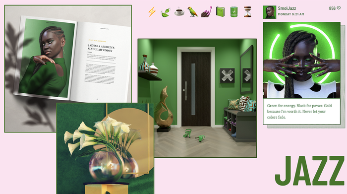
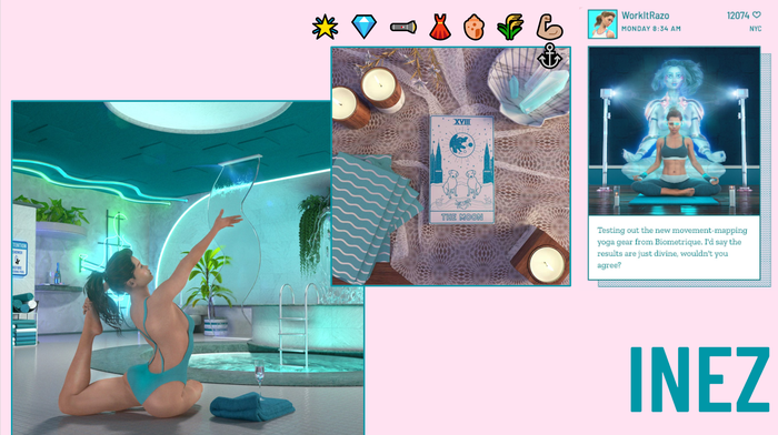
Well-defined color symbolism helped the art team to create a distinct vibe for each character.
Another tool that helped align narrative, UX, marketing, and 3D art was the Style Guide. The style guide contained all the typefaces, patterns, and logos found in HoloVista's world. Each character had their own color symbolism, and each fictional brand that appeared in their game had its own logo. For example, the style guide included a design for Carmen's favorite brand of vodka, "Tsaritsa." Any 3D artist could grab the logo from the style guide and put it on a label for a bottle in any scene. We made the style guide early on, and multiple departments (most notably, art and marketing) referred to it at every stage of the process.
Overall, the use of visual/auditory mood boards, well-written scene descriptions, a list of repeating visual motifs, and a thorough style guide helped the team stay aligned.
People-First Approach
Realistically, our team structure in any other context should’ve been a disaster - we had an entirely remote, global team, who were working together for the first time. For many of us, HoloVista was our first games project. However, one of the best things we did early on was to structure for a ‘people-first’ approach to workflow, communications, and project management. We achieved this with a lot of flexibility and prioritizing communication, even if a lot of the time that communication was asynchronous.
During our time on HoloVista, there were multiple instances of devastating wildfires, protests, and of course, the pandemic. As a team, we were grappling with all of these things as individuals, as well as personal life challenges that occur through any development process. This could have been the end of many projects like ours. Dealing with these kinds of events on a global scale has the potential to have a debilitating impact on a team and a project. Having a people-first approach from day one meant we already had structures in place when we had to grapple with chaos, since we’d given ourselves buffer room from day one. We had a lot of frank, honest conversations about the impacts it was having on our mental health as individuals, as well as encouraged time off and recognised the unavoidable fact of reduced productivity during such trying times. The more we pushed ourselves when we had nothing left to give, the less likely we’d be able to deliver. We tried to reconfigure the way we approached the project, and the expectations we had for ourselves and one another. Largely, we succeeded, and if we hadn’t, we probably wouldn’t have shipped a game. Our central expectation was simply honesty. We set that policy by having us as directors show that vulnerability. Had we chosen to not be vulnerable in that way, I imagine we would've all done the same thing - retreat, lock ourselves off, not communicate - raise our walls to survive, rather than leaning on each other.
For a lot of us, HoloVista became a safe haven throughout that time period - something we had the ability to impact and affect, while the world around us was in turmoil. By planning early on to give ourselves slack in our timelines wherever possible, or knowing what we would actively cut if our timeline would not provide us adequate space to deliver without crunching or halfassing, the critical path was achievable and accessible. This took a lot of the pressure off, and meant that many members of the team were comfortable taking time off where they needed it to recover mentally before tackling the next ‘thing’, and we frequently took on teammates responsibilities when support was necessary, with the understanding that they’d do the same for us when we were in trouble.
We were lucky to have the flexibility to do so - we were able to move dates, thanks to the fact that we were self-publishing. Not everyone has this luxury, and we recognise the privilege of that, but it was important to us to still deliver on a timeline that made sense to the business. Balancing the needs of the team against the needs of the project was a constant challenge, and it meant that circumstances sometimes shifted in unpredictable ways- which certainly did inconvenience production from time to time. Still, at no point did it ever feel like we weren’t in it together, and being as transparent as possible to one another along the way.
In the same way, a lot of our development was about imagining the kind of experience our players were going to be looking for in a year like this. This meant considering the value of being able to ‘escape’ into a virtual space from your home and what our players might want from playing our game along the way. In the game itself, we ended up accentuating the theme of exploring how to forgive yourself. In a year of difficult experiences for many, was one of the things our players reported back on most.
Accessibility
Accessibility was a huge point of importance for us from day one. We chose mobile because of the fact that it was an accessible format for a lot of people, and it was a space we felt excited to innovate in. Because a number of us on the team have personal experience with accessibility issues, we had to focus on making something that we could play.. This meant we were always considering potential accessibility impacts of each design decision at the point of decision making, rather than trying to walk backwards from design decisions we’d already made.
One example is motion control. We knew many players would love the experience of moving the phone around to view the room and find objects, but if you were a player who was not particularly mobile, someone who wanted to lie in bed and play, or even just someone playing part of the game on a bumpy bus, we knew we needed to provide an option to turn off (and switch on) this motion control where relevant.
For areas that we didn’t have personal expertise, we engaged experts wherever possible to give us advice on both the content and the potential impacts - both within the narrative, as well as active in-game moments. We did a full review of our content and assessed what sort of impacts it might have on our players, similar to analysing the game experience, and then made conscious decisions about what was within our scope, budget, and skillset. We ended up with a relatively comprehensive number of options that we knew would have a demonstrable effect on certain players' experiences, and were able to list these on the website to show people who might be unsure if the game was for them.
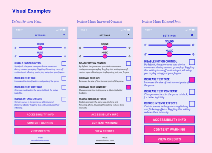
An example of what toggling on some of the options does to the text size, contrast, and visibility.
Knowing we were exploring some themes that could be difficult for our players, we wanted to ensure that our players were aware of the things they would face. Considering the events of 2020, and the fact that there was content in our game that explored things like (spoiler alert!) medical experiences or debt, we didn’t want people to pick up our game expecting a perfectly jovial experience and then be hit with something a little too close to home for the time. It was important to us from day one that we have clear content warnings available both online and in-game to help people make decisions around what they wanted to engage with, in the same way the accessibility information provides context.
Playing Beyond Games
Our team's background is pretty varied - we come from a broad range of experiences spanning across art, theatre, music, installation art, publishing and more. From day one, our conversations around games were informed by experience and theory external to the gaming world.
We’re always interested in how we as people connect with themes, how we feel seen as players, and trying to find common threads between our content or project and humanity as a whole. We all primarily play games because we like to connect and experience stories, but we all play them for different reasons, so trying to understand the deeper threads of why we played games that we liked and that were similar to HoloVista helped us to understand the goals of what we were creating.
We had a mailing list where we tried to focus content around the kinds of discussions our audience might want to have, especially when we couldn’t talk about the game. Our first welcome email tried to set the tone for the sort of things our game might consider and talk about - and to good results - we often had people replying to our mailing list emails, or clicking through to see more of the content we’d shared, whether it was our team talking about games and movies and music we’d enjoyed, or wider concepts we’d come across and talked about in detail.
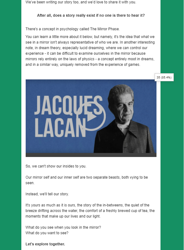
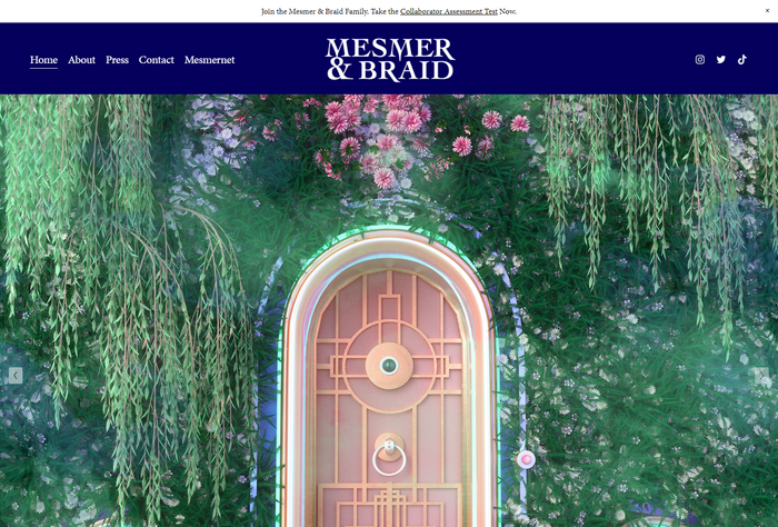
One of the best things we did was to engage with running an ARG - a medium that overlaps greatly with other games-adjacent disciplines. We were incredibly cautious about this - we knew creating and running an ARG would take a huge amount of time away from development, so we engaged some experts to help us craft all the materials, while we worked with them to funnel our audiences across social and mail into their storytelling. We ended up playing around with this format on TikTok, which eventually led to the ARG going viral on that platform.
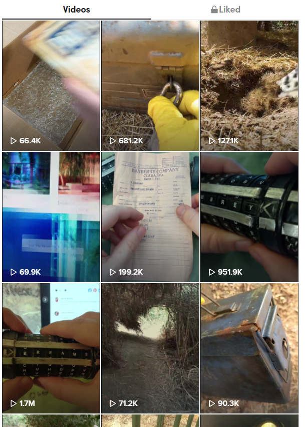
TikTok is a hugely underutilised platform in game development, and with enough content consistently you can hit high numbers of eyeballs. It’s great for the awareness part of your funnel, but we ended up having a fan-made Discord pop up with players advocating to solve the puzzles together, and a whole new set of players who engaged with the ARG and eventually with our content. Players connected deeply with @blurbex49, our fictitious urban explorer who was trying to uncover the secrets of Mesmer & Braid, the in-game architecture firm, and formed really fun parasocial relationships with him. You can see a full breakdown of the ARG at: https://youtu.be/RSie8WJsslU


All in all, considering our game as not only a game, but what it would try and do if it was a book, movie, album, folk tale - all these potential differences in storytelling allowed us to embed it with more layers of meaning for ourselves, and therefore our audience.
WHAT WE GOT WRONG
When we started working on HoloVista in 2018, the original mechanics were quite different from the final version we shipped in 2020. Back then, it was still an Instagram-like social media simulator, it still let you capture and post photos, and it still had a theme of “inner life versus performed identity.” But instead of progression via hidden object gameplay, the game was 100% branching narrative.
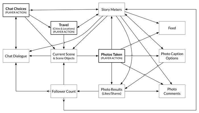
Here’s the game’s proposed systems flow in July 2018
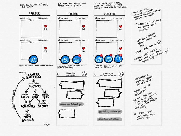
Those story branches opened up in a novel way: it all depended on which photo you took during the camera gameplay. There were no instructions or prompts when the camera opened up in these early versions, and players had free reign to take any picture they wished. For example, our player-character might find themselves put up in a fancy hotel room, paid for by a sponsor. They faced a choice: should they photograph the beautiful flowers arranged on the table, or a disgusting roach on the floor? If they posted the latter, the in-game consequence would be that their sponsor dropped them. We felt that this mechanic opened up an exciting choice space, helping us tell a story about how sharing certain things online may or may not align with reality, and result in unexpected consequences.
We fell in love with this concept. We built a prototype using some throw-away copy and images that took about 5 minutes to play, and playtested it with about 20 people. Everyone seemed to love it. We also added some “story meters,” and told ourselves that we’d fully figure out how they work later. Bolstered by the positive reception to our 5-minute prototype, we promptly hired a talented narrative designer to create a story, and set out to build what we naively referred to as “our first vertical slice.” This one took about 15 minutes to play.
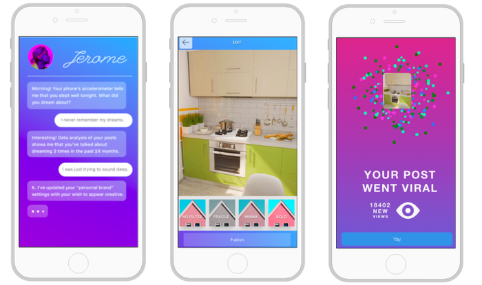
Snapshots of one of our earliest playable prototypes for what would eventually become HoloVista, built on Proto.io
Like HoloVista, the narrative of this 15-minute prototype took place in New York and dealt with themes of identity under capitalism. Unlike HoloVista, it was set much closer to the present day. The player gets caught up in a local drama related to the cancellation of a young journalist over a tone deaf-article she’d written. As the comedic drama unfolds, the player experiences a chaotic night out on the town, traveling through spaces including a trendy art gallery with an obnoxious corporate sponsor, and a ritual held by Brooklyn witches to hex corporations. We painstakingly designed characters (including, in one case, a character’s family photo and dog!), created fictional in-game brands, crafted environments, workshopped the copy, and coded up the gameplay. Months later, we brought the game to XOXO Fest, and began to test with everyone who crossed our path.
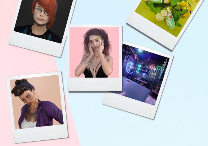
Images from our original storyline; we even made a little splash page for it
But there were several big problems. As we tested the game for 15 minutes, we got very different reactions than we did for our 5-minute prototype. People didn’t realize that they were making choices as they took photos! And they weren’t taking the time to look around each scene. They were breezing through the scenes that had taken us many painstaking hours to build, snapping photos haphazardly, and feeling unsatisfied with what felt to them like a linear experience with no clear goals. They were lost, and that led to them reading less and less text as they continued to play. And the story didn’t quite resonate; the contemporary themes seemed like they were hitting a little too close to home, reminding them of phenomena they found exhausting in their daily lives on social media.
We soon realized that we missed a crucial step. There should have been a round of playtesting between that 5-minute proof-of-concept made with throwaway assets, and that 15-minute prototype put together using high-fidelity writing and art. We realized that what people were responding to positively in that 5-minute prototype was the novelty of the camera gameplay, and that there was not enough time for them to start tiring of the perceived linearity. Putting together an intermediary prototype with lower-res assets but longer gameplay could’ve helped us to realize that we needed to spend more time with the game design, before spending too much resource on art and narrative. We also realized that having underbaked mechanics set up the narrative designer for failure.
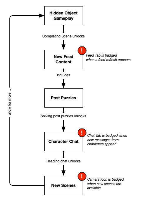
The core loop for the shipping version of HoloVista was very much simplified from our original design
From that moment on, playtesting became a regular part of our development cycle, and that helped us to only up-res when hypotheses were better-validated. The next time we brought a narrative designer on, we first prepared a document to explain thoroughly how narrative would work within a fully tested core loop. As for the story, we pivoted to a more fantastical storyline to establish some critical distance between the player and the topics we wished to explore, which enabled us to explore those concepts of self vs social media self with more depth.
We were aware from day one that the space we were playing in was risky. Mobile alone is a difficult space - most games media won’t cover mobile games at all, so promotion can be tough. Add to that it being a deep narrative experience, with hidden object mechanics, and a relatively new way to visually tell the story -we knew we would have a challenge in communicating it to the audience. Not to mention - as a new player in the space entirely, we had no clout to our name to help us with marketing or recognition.
We discussed a lot of options early on -whether to go FTP or premium, and despite a lot of gentle advice that premium mobile was going to be an incredibly difficult space, we still forged ahead with the hope that we could be the exception to the rule. Commercially, it was not.
During early production, we looked to successes such as Reigns and Monument Valley 2, but we should've been more honest with ourselves that the exceptional premium mobile titles we were looking to all had one or more preconditions that we lacked (a simultaneous launch on PC/console, a previous reputation as a studio to build on, backing from a publisher which builds audience trust) and that they belonged to a different era. We chose one of the most difficult formats, on the most difficult platform, hoping we could be the exception to the rule, not recognising that many before us had been through the same experience and encountered problems.
In this industry, we have a bit of a saying - “no one goes into game dev without a bit of naiveté” - and it’s hard to say how we would have managed making the experience we did work in a FTP context, or even a chaptered payment approach. A lot of this came from it being the first games project for the directors, but also our goals - we had really specific goals we laid out from day one, that straddled a lot of spaces. We wanted to achieve a level of cultural and critical success, but we were hopeful we could potentially achieve a high level of commercial success also. These were expectations that meant that when things didn’t go exactly the way we wanted in specific spaces, there was a fair bit of disappointment.
On the bright side, this taught us a lot of lessons for next time - and without that naiveté, we don’t think we would have achieved the cultural success or recognition we have, because we likely wouldn’t have even stuck with mobile for this kind of storytelling.
A lot of people are surprised when they find out what tech we used to build HoloVista. Rather than Unity or Unreal, we actually developed the game in HTML5, with a React Native wrapper.
This meant a huge amount of challenges along the way as we got further along, including a critical memory leak bug as we got closer to launch that caused players to suddenly encounter a white screen. It was one of those bugs that gives you very little context - it was happening on a huge variety of devices, at different points in the game, and required a daunting level of timeboxed exploration to understand why it was happening, reproduce it, and try to resolve it. The headaches this caused for dev and QA, as well as taking up a large amount of their time towards the end of development that could have been spent resolving other problems.
This tech stack also limited our ability to release on other platforms. On Android, the time of troubleshooting how the Javascript and CSS behaved across various devices would have pushed our launch window too far out. We decided to launch just on iOS. As for PC and consoles, the game would most likely have to be rebuilt entirely in a game engine to work. Building the game in an engine from the start likely would have given us more options for porting.
For the game’s environments, we went with Maxon Cinema 4D, rather than Unreal. Overall, we don’t regret this choice, because it allowed us to achieve a breathtaking level of visual fidelity. However, this choice presented challenges, because updating the game with renders from C4D took time. The scenes were exported as equirectangular JPGs, which were then wrapped around a sphere using Three.js. Thus, scenes needed to be added to builds manually before anyone could review them in-game. This sometimes delayed key design discussions that needed a quick decision.
To mitigate this issue, we instituted a “web build” that lived at a URL, in addition to an iOS build that lived in TestFlight. The web build reflected changes to narrative in real time (pulling from a Google Docs spreadsheet), and non-technical team members could update it with the latest images so that the co-directors, narrative and game/level designer could preview the environments without waiting for engineering to push a new build to TestFlight. However, this redundancy took up resources and created confusion. The web build was often buggy, failed to reflect the latest UI/UX changes because its front-end wasn’t kept up-to-date, and broke towards the end of the game because its codebase eventually diverged too much from the React Native version.
In the future, we’d have a clearer process, and we’d likely choose a slightly different development stack. We’re always willing to try something a little left of center if we can make it work, but there’s a chance we would’ve had an easier time (especially with the memory issues) had we been using another stack.
For a long period of early production, the team felt that the process of working had been going smoothly enough, and that therefore we didn’t need to bring in a full or part-time producer as the executive team were able to manage it. Once things got busier, our team got bigger, and our directors were swamped with active development work, it was clear we needed to add more structure.
The first few times that we heard that we needed a producer, we felt that we could go “just a little longer” without making the hire. The rationale around not bringing in a producer early enough can be as simple as “we don’t want to spend on extraneous headcount if we can do this ourselves.” However, this is a fallacy. It’s clear to us in retrospect that a studio can easily burn more cash not having a producer than it would otherwise, because producers help to implement processes, parallelize work, enable more delegation across the team, forge realistic plans, and identify the gaps on a project. A good game director can and should be doing all of that as well, but if both co-directors are also individual contributors, dedicated project management becomes nearly impossible with a team of more than 5 people.
We were using project management tools/methods before our producer joined, but once she arrived, the process became more agile. We started doing daily stand-up, organizing work into biweekly sprints, and following a more formal process for prioritizing and tracking our tasks. As a result, our milestones and timeline became more closely aligned with reality, our objectives week over week became more concrete, and the resulting clarity helped us with everything from hiring to marketing to avoiding crunch.
We iterated on design as frequently as possible. Process, however, was a different story. Because the decision wasn’t made to bring on a producer role until halfway through the project, we also didn’t have the time to find the best iteration processes or tools.
As many producers know, trying to amend a workflow mid-project can be like fixing an engine while the plane is in the air. Instead of being able to figure out how best to communicate information, where it should be communicated, and how in the earlier stages of the project, we had to simply mandate an immediate process and do our best to make it work.
For example, we hadn’t had stand-up throughout most of the process - which, for a remote team, meant it was difficult to know what had and hadn’t been worked on or was ready for hand off. We should have implemented this far earlier, to ensure we could have a more explicit sense of the orange or red flags that were coming down the pipeline.
There also was no clear process for where builds were at, or when they were submitted. We attempted to implement some structure once production management was on board, but with so many different people working in different versions (for example one person working on the HTML web build, another on the IOS version) sometimes it was difficult to keep track of who was working on what, how, and how we kept track of changes. At times when multiple people were touching content, there were moments where one person would break the content accidentally, and we’d have to then dig to find out who, how, and when that had occurred.
We also didn’t necessarily have the time to test tools in the way we might have - we ended up working inMonday.com for task-tracking, Discord for conversations, and Confluence for GDD materials. Discord not having threading (which it does now, yay!) meant that a lot of deeper design discussions ended up transitioning into 1-on-1 conversations, so if they weren’t communicated into Confluence or Monday, we then had to chase up that decision making and capture it, instead of it being directly captured. Monday, while visually pleasing, required a lot of setting up and was at times clunky or even buggy, causing us issues in knowing where tasks were at. The entire team had different ways of working, so having documentation around things like core hours or reporting would’ve helped us a lot in terms of managing the broader task tracking, velocity, and being able to get more detailed information to help with setting accurate timelines ahead of planning our sprints. Confluence worked well, but often spiralled out into lots of new pages with lots of design information, which wasn’t necessarily kept as organized - because a framework hadn’t been established from the start.
All these things have changed how we plan to work in pre-production, what we feel is going to be critical in terms of establishing frameworks, and figuring out how our reporting and planning is going to work. It also meant we made some decisions around our team culture materials - how to adequately set expectations from day one for contractors and employees, and to make them both more comfortable and more clear on how to bring information to the broader team.
Conclusion
During the launch of the ARG just a few short weeks ahead of the game’s full launch, the ARG players organized a Discord server. We lurked in it, of course, watching them work through the puzzles that we laid out for them. A bot greeted us with a set of rules. They were simple - no bigotry, no harassment, no gamejacking - and the final rule was this: “Call your mom - She misses you!” Reading that then and there resonated. Both players and makers of games can become quite obsessive, and sometimes in the face of painstakingly trying to solve a hard problem, especially when working on it feels like the only thing in your control in a chaotic world, the rest of your life can just… fall away. But 2020 was hard for a million reasons beyond game development, and the biggest lesson we learned was that it’s important not to let the process derail you too much on a personal level. So, seriously- Call the people in your life who matter to you. We wouldn’t have got to the finish line without the support of hundreds of people on an individual level who gave us time, energy, friendship, or even just a shoulder to cry on. It’s corny, but it’s true - like raising a baby, it takes a village, and thanks to our village, HoloVista found a home.
Read more about:
game-developer-launchYou May Also Like