Trending
Opinion: How will Project 2025 impact game developers?
The Heritage Foundation's manifesto for the possible next administration could do great harm to many, including large portions of the game development community.
Reprinted from KravenManor.com, this blog post details the trials of creating a haunting first person game in UDK, what mistakes the team made early on, how they course-corrected and delivered an amazing experience.


My girlfriend Siru and I
Hi, my name is Ben Roye and I am the Game Designer for Kraven Manor. A postmortem is an article written to expose very transparently all of the good and bad things that happen during development of a particular game--in this case, Kraven Manor. It also takes a look at what the team learned, and how that knowledge could be applied forward to future games made by the team, or to game development in general.
Some of the core ideas for Kraven Manor were based on a board game called Betrayal at House on the Hill. Ben Klingler already talked about this is a previous post; however, in order to give context to what I'm about to go into, I will recap. Betrayal is a very modular game. Players draw "room tiles" and place them wherever they want and wherever they fit. This allows players to essentially create the mansion's floor plan in front of them--it gives players a grand sense that they are the architects of their own game. It's a powerful emotion. We wanted to incorporate that emotion into Kraven Manor early on in the design process. Betrayal also had "haunts"--cooperative objectives that, if satisfied, would win the game for the players. Kraven Manor also had haunts early on. The statue haunt, now the entire Kraven Manor experience, was meant to be one of many haunts that would occur semi-randomly for the player. This would give the game some replayability and potentially a longer sales tail since the game could be played through more than once.
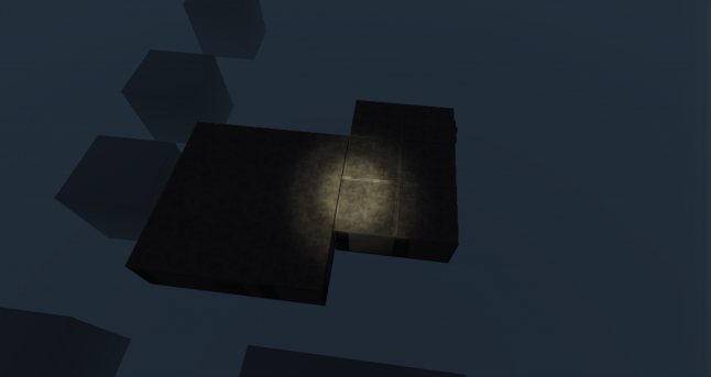
Structured Randomness: The technology picked the order of the rooms for the player.
We knew even before we started developing the game that we had some pretty neat design principles set up. Kraven Manor would essentially be a player walking from room to room, with new content popping up semi-randomly in front of them. When the game started, the game's tech picked 1 of 3 random haunts for the player to complete during their playthrough. The structured random experience was intended to take the player through a game not unlike Blizzard North's Diablo. There were certain story bits and larger mechanics that the player would experience in an order of the level design team's choosing; the order of the rest of the content--the minor details--would be left up to the game's technology to decide. Specifically, we said that there had to be distinctions in the type of rooms that the tech would call for:
Story rooms: rooms that held story-based content and drove the narrative forward and the haunt closer to completion. The player had to find these in a linear order in order to make sense.
Exploration rooms: these rooms sometimes included hallways and sometimes were just dead ends. They held gameplay that I will discuss further down the page, but were mostly just for giving the player something to do in between story moments.
Puzzle rooms: these rooms specifically held puzzles that the player had to solve to progress further into the manor. At this point in time, the puzzles all were 3D map puzzles. (See side story below.)
Safe Haven rooms: These rooms were the only safe rooms in the manor. They contained a projector that players could turn on to access the game's interactive game menu. Projectors also allowed the player to play film reels that they had been collecting all around the mansion in order to glimpse small segments of a longer backstory film.
The 3D Map: Early on, the lead level designer and myself came up with an idea that the player would encounter rooms that they could move and rotate by interacting with an map. The map doubled as a way to show that the rooms were moving in real space when the player interacted. There was a problem with 2D maps because they didn't connote the Z axis very well. So we prototyped a 3D map that would better illustrate how the rooms were moving in relation to one another. This 3D map prototype later became the room table in the entryway.
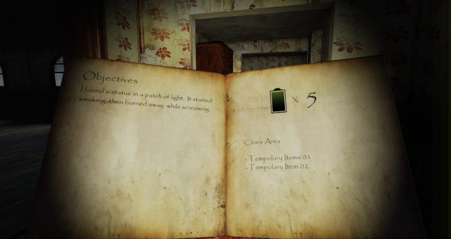
Early version of the player's Journal
The Proof of Concept Technology was a success internally. In fact, the team had accomplished their semi-random experience design goal. The art team created highly functional modular assets. This allowed the level design team to quickly create an astounding amount of content for our first milestone. In two and a half weeks, we had created a concept demo that took around 20 minutes to walk through. However, there wasn't much in the way of content, other than walking around and refilling your flashlight's batteries.
We had been successful in our first milestone. That really pumped up the team and maybe created this false sense of security in our minds. Our goal for the following milestone, Proof of Concept Gameplay, was to expand on the game's mechanics to actually give the player something to do during their leisurely stroll through the manor of Lord Kraven. We started actually crafting the content for our first haunt during this sprint as well--the statue haunt. However, we didn't take any time to polish up the massive amount of content that we had created during Proof of Concept Technology, and that led to bad juju down the road.
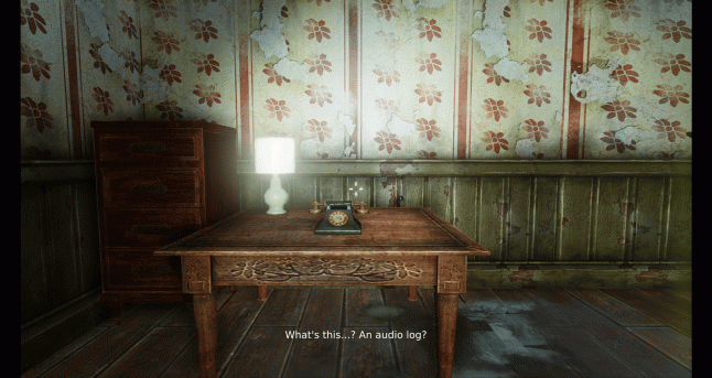
The following is a list of features that got designed, some of which got implemented into the game, and all of which were cut later:
The flashlight needed batteries that were scattered around the manor. This was bad for a number of reasons. We found out that this resource was tedious to manage because the flashlight was absolutely essential to exploring the darkest rooms in the mansion. We had pitch black rooms! It simply didn't make sense to punish the player because they had their flashlight on too long.
The projector screen in the Safe Haven rooms.
Abundant locks and keys. (Think of having to find the Red Key to open the Red Door in Doom 2.)
Voice acting / audio logs. (For an example of audio logs, think Borderlands 2, Doom 3, Bioshock.)
Outdoor areas.
Machine walls. (See the house shifting and changing before your eyes to emphasize that rooms are indeed moving in real space.)
Room shifting puzzles like explained in, The 3D Map, above.
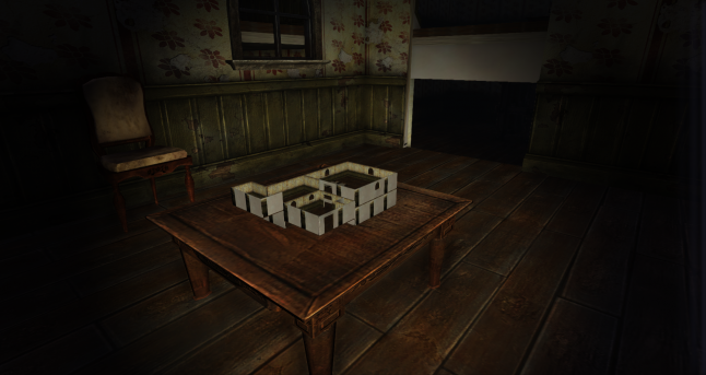
Puzzle Rooms contained 3D Maps: The predecessor to the Room Table
The game was simply too damn big and too ambitious for a student project. Our POCG therefore was a failure. We were moving in a direction that, at the time, we believed was the right direction. But at the end of the day, we couldn’t prove that we could wrap our heads around making that game fun. We needed to redesign and we needed to do it quickly.
As you may have already guessed, we decided to scope down the game incredibly until only the bare essentials were left. Our scoping down meant cutting a bunch of mechanics, pretty much all the ones listed above. We also decided that the design for structured randomness wasn’t working for our game. The reason wasn’t because it wasn’t fun; in fact, I still believe it could be ludicrously entertaining if executed well. The reason was that we had to create a massive amount of content to see any benefit from using that system.
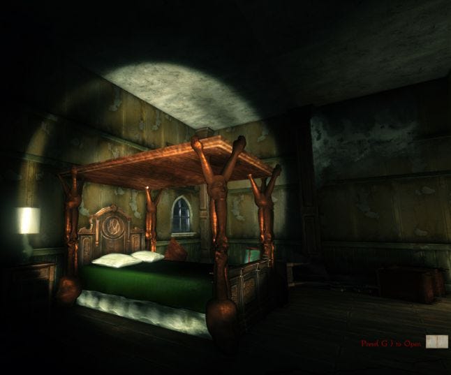
Bedroom: Middle of Vertical Slice
We came to the conclusion that if we stuck to creating only a handful of rooms, we could spend much more time polishing them. It meant we could do something else as well: we could go ahead and make the game linear. For a horror experience, more so than maybe most other genres, having a linear experience allows level designers to set up their scares. Even if you don’t have jump scares, as a designer, a linear experience allows you set up ambiance and mood better, better control the rise and ebb of music and sound effects, better control transition between post-process effects and more. So we knew we had a win there.
The choice to cut Voice Acting: Cutting voice acting was a hard choice for many of us on the team. Ultimately, the reason we did it was because we had all experienced bad voice acting in games. (In fact, one of our inspirations, Resident Evil, contained terrible voice acting.) It is easy to get voice acting into a game very quickly, and extremely hard to make it feel not cheesy, canned, campy, or worse, just plain bad. We knew that putting in voice acting could in fact make our game suck, so we just decided to do without it. That meant, that for Vertical Slice, we cut the narrative of the game altogether. For a brief moment, that lifted a burden off of our game and gave us some clarity.
From the beginning of the Vertical Slice sprint, we created a mantra that stuck with us for the rest of our development: “Keep it scary.” Because at the end of the day, if making our game scary was the only thing we accomplished, we could call our game a success in our own eyes.
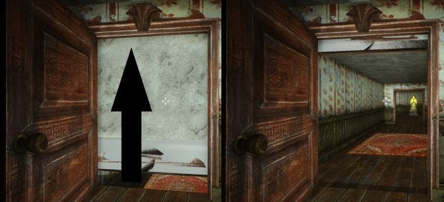
Room Shifting: Kraven Manor's Kernel of Fun
Now that we had a new vision, we needed the gameplay for the scoped down game to be a "kernel of fun". We knew that the technology behind being able to move rooms in real space was cool, and it was fun when the player moved rooms intentionally, like Betrayal and the room shifting puzzles we had concepted out. "Room shifting" was our kernel of fun.
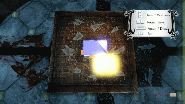
The Room Table from POCG
At this point, we knew exactly how many rooms we were going to create: the Library, the Wine Cellar, the Bedroom, the Entryway, and the Kill Room. That informed us about how we could retool our core mechanic of room shifting into something that still had the same core ideas but would be manageable for our student project. We came up with the Room Table. (See the side story below.)
The Room Table: At its core, the room table allows the player to be the architect of their own game. They can place rooms how they see fit, moving the rooms we created in real space, and travel there to admire their handiwork. The room table is essentially 5 mechanics rolled into one: (1) Find a room model, bring it back to the room table to build an increasingly elaborate manor. (2) Connect a room model to the entryway and travel to that room. (3) Rotate a room from one door connection to another doorway and travel to that new doorway. (4) Connect a room to a previously connected room, and travel through the first room into the second room. (5) Connect a room to bridge the gap between the entryway and a distant and immovable "room island" in order to travel to that immovable room.
After taking the time to carefully scope our game and focus on what was fun, we knew we were on the right track. Again, our game felt a little barebones in the form of minute-to-minute gameplay. We had delivered on the ambiance, the scope of the game, and the kernel of fun, but we were still missing something. The player needed something to do besides look for new room models to connect to the room table.
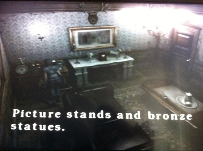
At the same time, I had began looking at games like Silent Hill and Resident Evil for answers on how they conveyed information to the player and how they delivered their story beats. I began to wonder if we could add a mechanic that would accomplish reintroducing our story into the game and giving the player something to do while they were exploring the manor. Then I found it. I brought in my Gamecube one afternoon and played Resident Evil for the team. The game has a mechanic where when you walk into the room, an object shines alerting you to its presence. When you press a button next to the object, the game gives you a blurb of text telling you about the object and often giving you bits of story or clues on how to solve a puzzle. I asked if the team thought it would be a good idea to have this mechanic and they agreed. Thus was born the Examine mechanic (the magnifying glass). Looking back, I really think the Examine mechanic is neat because it allowed the team to inject personality into the game and sell the atmosphere even more.
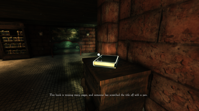
After we figured out our gameplan, there were only a few small trifles left, such as localizing the game into more than just English, and making sure everything was shiny and felt awesome.
I know we all learned a lot from the development of Kraven Manor. While I can't speak specifics about what other people learned, I can talk about what I learned. Obviously, our game turned out very different from what we envisioned it would be in the Proof of Concept Technology sprint. I think some of the things that we did very well were to keep asking questions to never let ourselves become stagnant. Questions like:
What are the bare essentials that make your idea fun?
When communicating with team members, what is it you are really trying to say? If you don't feel your idea is being heard, is there another way to phrase it? And if your idea is being heard and people still don't agree, that's usually a sign that it isn't a good idea ;)
What small facet of your idea makes it fun?
What is the core of the experience you are trying to create?
This isn't new stuff. I'm mostly repeating what great game designers have been saying for years. However, I will say this: humble yourself. I am so much more humble now than when I started at the Guildhall. If you think you have a knack for design, and if you've practiced it, you just might. But everyone needs to practice humility in game development. I've learned that if you want people to respect your ideas, you need to work hard to prove that they are as fun as you say. I learned to be much more open to critique. I learned that your best ideas need to be torn down, flipped over, and improved upon 10-50 times before they will get to the level that they need to be to become viable in a commercial product.

I'm usually a Producer on projects, that's why my logo says so! Check out my other work at www.BenRoye.com.
Read more about:
BlogsYou May Also Like