Trending
Opinion: How will Project 2025 impact game developers?
The Heritage Foundation's manifesto for the possible next administration could do great harm to many, including large portions of the game development community.

Featured Blog | This community-written post highlights the best of what the game industry has to offer. Read more like it on the Game Developer Blogs or learn how to Submit Your Own Blog Post
In this blogpost, we talk about the choices we made while making a more visual prototype for the fighting simulation part in our current game in development.

The following article was written by Isak, the new programmer on our game in development Ludus. You can keep up to date with Ludus at gladiator.training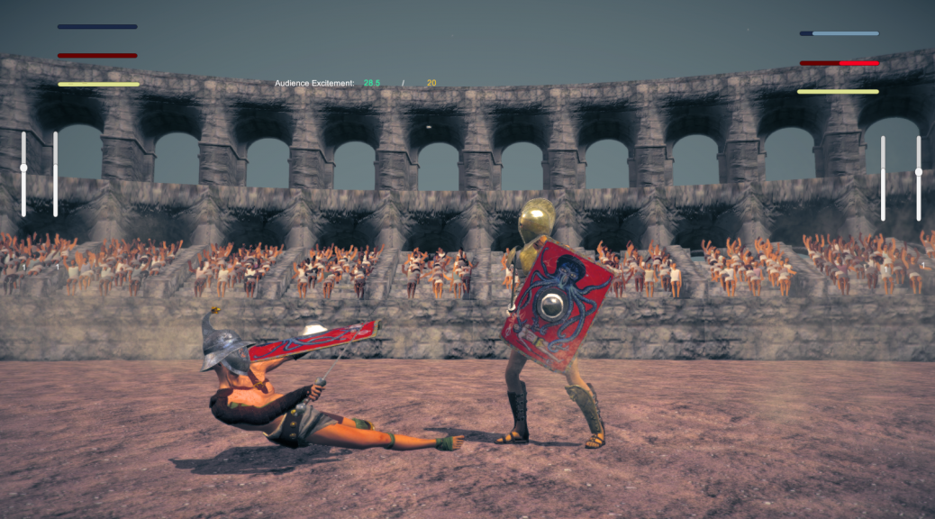
Since I joined the team we have been working hard towards a prototype that we can start showing off to people and iterate on. The plan is to have something usable by early next year. The codebase I was given was mostly made up of concept code written by Vegard that only he could understand and use to describe what should happen in the various, cryptic scenes which showed nothing but numbers on a blue background.
One of the systems I've been reworking is the fighting system. Currently it is only a simple DnD D20 style system with modified rules that changes the way health and critical strikes work by using hitpoints and vitality (or as the original document calls them: vitality and wound points). In short: regular hits consume hitpoints, when all of the hitpoints are depleated you start losing vitality points, when all of the vitality points are gone, you are defeated - if a critical strike happens, damage skips hitpoints and goes directly to vitality.
The fighting system is completely indepent of whatever you display on the screen, this gives us flexibility to try out different ways to present the fights to the player, without having to modify how the underlying system operates. In the beginning, the only visualization I had created for myself looked like this:
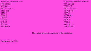
Note the intense effort I put in to change the default background color of Unity. This does not look like much but everything we needed was there, the gladiators were generated randomly and we could observe how different stats provided different advantages in fights.
A quick rundown of the interface: you don't actually control any of the gladiators directly, the game is about managing gladiators after all, not playing as one. In the current state, the only input you have on the fight is the intensity of the fight. Basically, the gladiators go at each other for a few hits, then they stop, giving you an opportunity to shout instructions on how they should fight. If they fight with a high intensity they do more damage and the audience also gets more excited. If they take it easy the audience will find it less interesting but you also don't risk exhausting - or even killing one of your gladiators. The gladiators are not equally good at taking instructions, it is based on both your and the gladiator's stats. In some cases, the gladiator will even do the opposite of what you asked them.
The next step was to build a more stimulating interface for the system. I started by taking the animations that Vegard had been working on and making it possible to trigger them from code. I also grabbed the crowd agents and some colour correction from previous scenes and with a little effort, I had something that was looking like this:
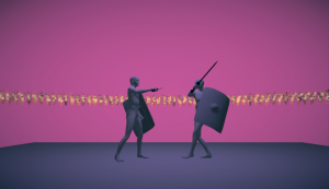
Sometime around this point I had the idea of trying to set a milestone for making a prototype that we could show off on the London Indies Pub Night in December, which was about one and a half week away. The other guys liked the idea so we decided to go for it.
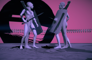
Of course, just standing on a regular boring plane with the crowd just cheering normally isn't fun enough. So I picked a random texture laying around (that had nothing to do with ground) and slapped it on there and made the crowd do a wave. Just for fun!
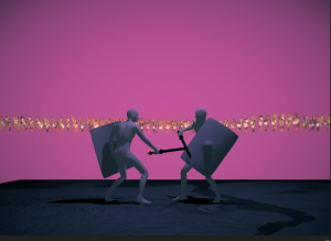
These strange naked manequinn men fighting in pink space was pretty interesting to view but the time had come to put some actual gladiator meshes in there. At this point I had also added the hitpoint and vitality bars instead of showing numbers:
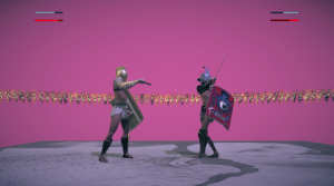
At this point it was also less necessary to display character attributes on the screen since a lot of them show quite well in the generated character mesh. For example if they are stronger and have a higher constitution they will appear larger than weaker gladiators.
After this I added sliders for controlling intensity as well as stamina bars. Following that I put the arena in there with proper ground, changed sky color and some tweaks until we had something that was pretty displayable for the pub night:
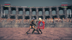
Note that during this entire time, the underlying fight system was always the same as the pink - text on the screen - interface in the first screenshot. This type of software design can be very practical in that it lets you swap the presentation layer without changing the logic of the system it's running underneath.
Now for us, this is far, far from what we want the final product to be. But even this got quite a good reception and got people excited about seeing the game progressing forward. Having a nice milestone like this allowed us to narrow down just the things we needed to meet our "deadline". It helped us avoid unnecessary yak shaving and reveal what yaks needs to be shaven the most after showing off the prototype. We can also move on to other components of the game such as the roleplaying aspects, knowing that we already have a placeholder for fight resolution that we can iterate on later.
What you should take away from this article is just how useful (sluggish?) it is to set up moderately sized, achievable goals, which, as a bonus, can be used as a nice ice breaker to talk about your game and what it will be while still coming off as credible. It will hopefully keep you from over-engineering systems that you don't yet know what they should be and make quick decisions that will do for now.
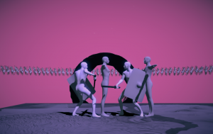
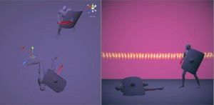
At the very least, you will hopefully experience fun moments where your game displays funny or interesting behaviour. A lot of accidentally artsy screenshots were taken during the development of this prototype . Some of them you can enjoy below.
Read more about:
Featured BlogsYou May Also Like