Trending
Opinion: How will Project 2025 impact game developers?
The Heritage Foundation's manifesto for the possible next administration could do great harm to many, including large portions of the game development community.

| Picture Perfect: Exploring Photography Games | ||
| Every day this week, Game Developer is serving up a gallery of interviews, deep dives, and more digging into the evolution of Photography in video games. | ||
| Browse Latest Articles | Submit your Blog | |
'We started to look at things more from a focus on how you take photos with a real camera. Placement, for instance, is important when taking a photo. So how can we make it important in TOEM?'
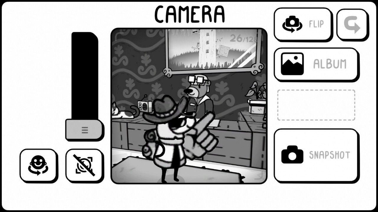
They say a picture is worth a thousand words. If there's any truth to that old adage, then we imagine there's an entire library of stirring novellas hidden inside the charming monochrome vignettes that make up TOEM.
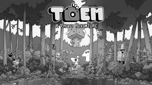
The culmination of years of refinement and sometimes drastic iteration, TOEM is an upcoming wholesome hand-drawn adventure game from Swedish studio Something We Made about taking photos and helping others.
Each of the title's black-and-white landscapes are chock full of quirky characters and artistic flourishes that make it easy to see why the world of TOEM would be a photographer's dream. In a bid to learn more about the design decisions and creative processes that went into bringing each fizzing vignette to life, we went and picked the brains of Something We Made artist Lucas Gullbo.
Gamasutra: How did TOEM spark into being? What were some of the design inspirations and concepts that spurred you on early in development?
Lucas Gullbo: TOEM began as a small experiment between myself and (Something We Made CEO) Niklas Mikkelsen back in 2018. We had recently had a rather "dark" talk session about whether or not game development is a thing to strive for or not, and during this talk I started doodling. I drew a couple of characters, some islands and a beak looking fellow. We both liked the doodles and thought: "Maybe there is something here?".
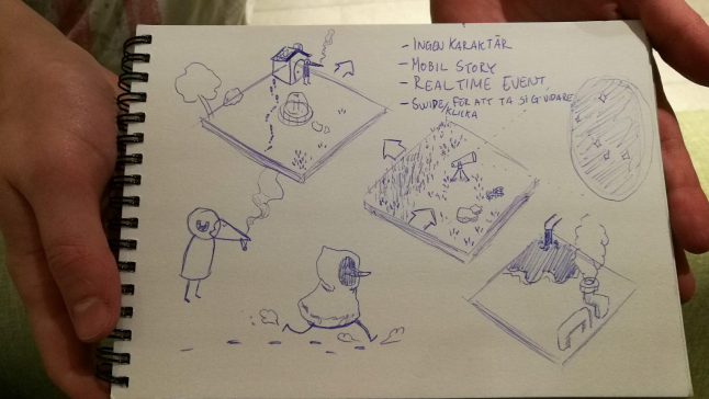
After a couple of weeks we had the first version (there are three more to come) of TOEM. We made a concept trailer for it, sent it in to a local Game Challenge and ended up winning 50,000 SEK. We started our company shortly after, joined an incubator and iterated on the game that we rushed out to meet the deadline of the challenge. We liked what we had going but it was always hard figuring out WHAT to do in it.
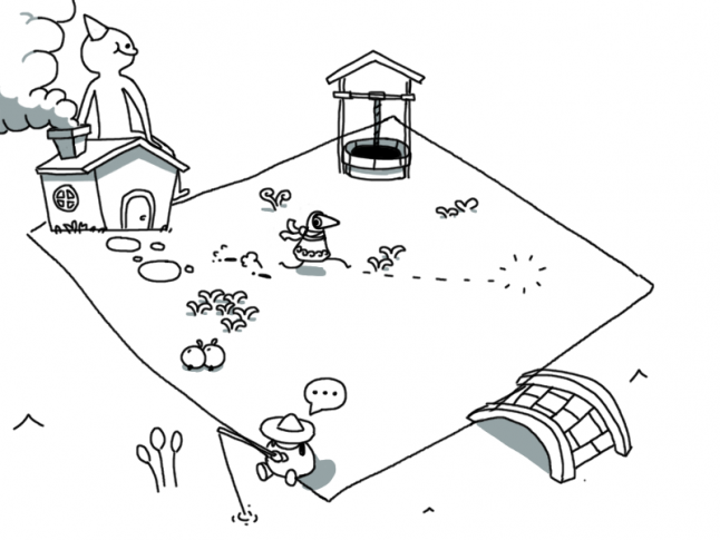
This is where we started our second version of the game, the one with puzzles in it. Neither one of us are puzzle makers, so making a puzzle game was a rather risky decision. This version had the player rotate bridges to make paths and rotate walls to block off other paths.
We got questions about how the game was going to progress since the puzzles are rather easy to solve, we didn't know how to answer the question and this made us rethink yet again.
The third version was the one we experimented with more puzzle solving stuff. This version had the player draw "electricity" lines between two points to activate certain things. Clicking on the world environment now had an effect on it, meaning that the player needed to interact with a lot of things in order to progress. We added in more characters to the game as well and some "puzzles" required you to give advice or words of encouragement to NPC's.
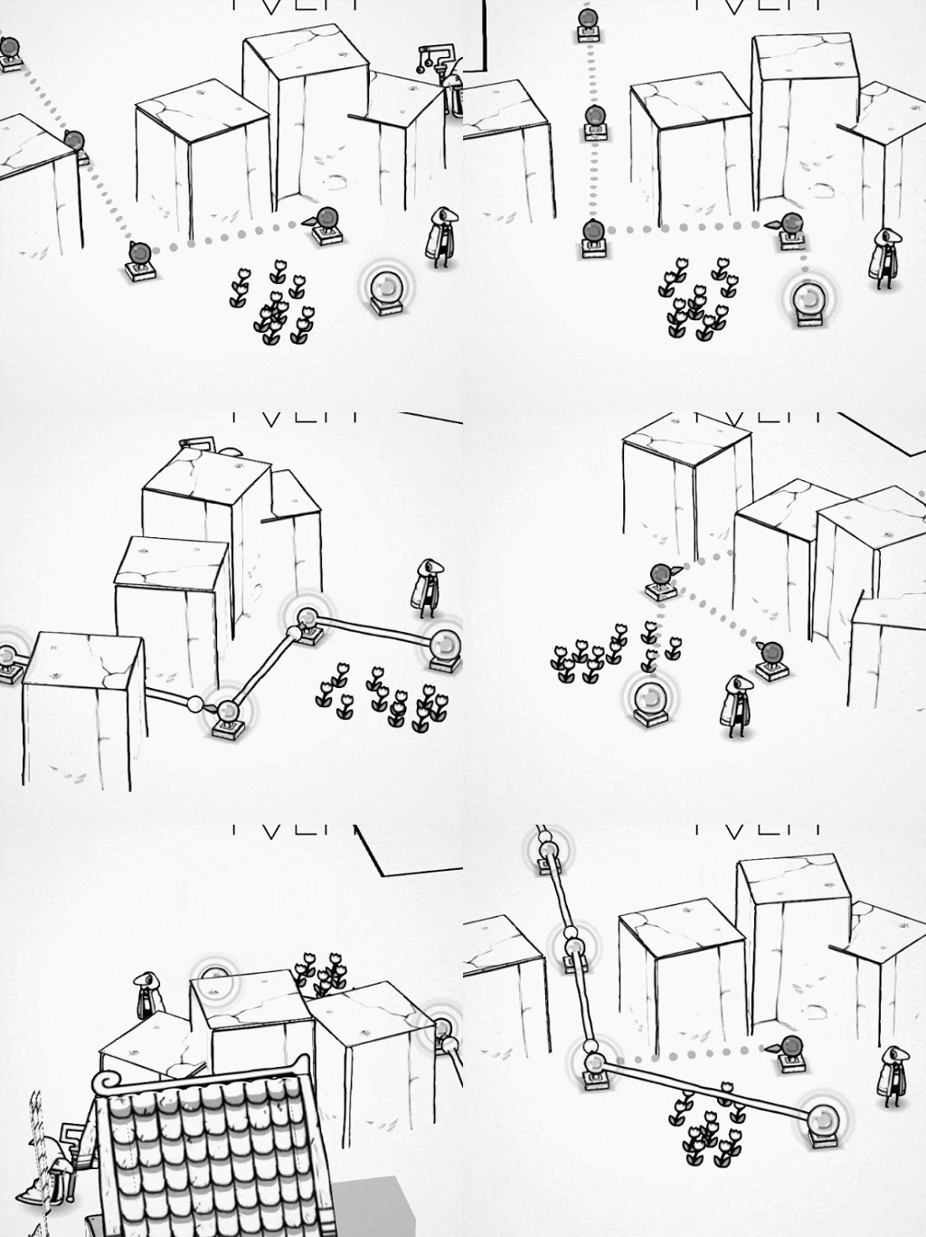
We started to feel rather comfortable with what we had, there was now more content and puzzles to solve and it just so happened that GDC (2019) was just around the corner. This happened to be one of the most critical points in TOEM's development as we quickly learned that we don't have enough “core” for the game. We couldn't really openly explain what the game was or where we wanted to take it. Neither one of us wanted to make puzzles, they are hard to make, we just wanted to make a world to explore. We went on meet-ups, we met cool people and each and every talk just made us realize that we don't know what we are doing.
We had now made three versions of TOEM and decided to give up.
School and jobs took over our time, we did some other things in-between as well, but TOEM was still lurking in the background. We liked the art and the island based scenes, whenever we showed the game we always got positive comments about the look of the game. We took a weekend and just talked about the game, what we had done and what was there.
In the third version there was a telescope and when you interacted with it the player could look at the world from a first person perspective. This was both very interesting and also benefited the art of TOEM.
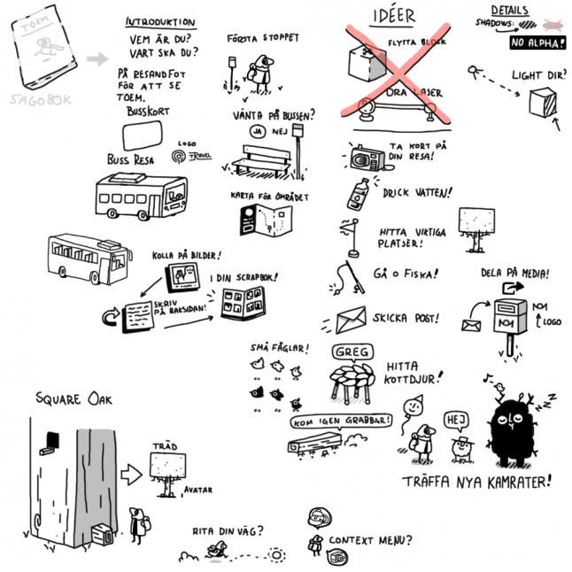
We both thought this was interesting, going from a more top down view of the world to a more intimate view from the player characters eyes. What could we do with this? Ideas about looking at the environment and maybe giving NPC's directions to places to visit. A new sketch was made. One about traveling around with a bus going to places inspired by Scandinavia, talking to some cute and charming characters and saving the journey you made with a camera.
We had new energy again for TOEM. We felt more comfortable than before and since "puzzles" now acted as a more open term for us to play around with, it didn't feel as intimidating as before! We began working on this new idea, making a first person photo mode that the player could take and save pictures in an album. Handing in photos to NPC's and getting their reaction based on what was in the photo.
This was it, the core for TOEM.
Gamasutra: The vignette style levels in TOEM are like miniature puzzle boxes in themselves. How did you design each one to spark intrigue and hook players?
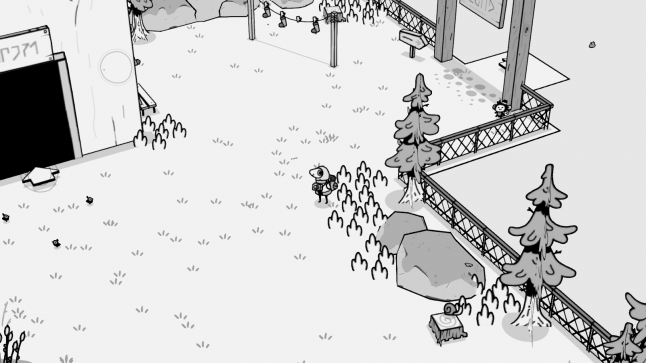
Gullbo: Each level has an intended placement, whether that is to introduce something or create a more meaningful opening it depends on the situation. Since most of the game is about looking with your camera, we wanted to make sure that each level is at least somewhat interesting to look at. Or in other words: There will always be at least one thing in the level that has importance to it.
Other than that, it's more about discovering the region that you explore and trying to figure out where you can find the things you are looking for!
Gamasutra: From a design perspective, why opt for bite-sized puzzle boxes rather than more expansive levels?
Gullbo: Having separate environments comes with a couple of benefits. We can for instance change the environment between two levels quite drastically without it feeling too weird. We can also have players look for something specific or hint about something to be found in the level they are currently in.
We wanted to keep things relatively open from the beginning so most levels are reachable right from the start. Having more hard on cuts between the levels also helped when making certain areas inaccessible for the player.
Gamasutra: Players must use their photographic eye to uncover mysteries and magic in TOEM, but how did you tweak and hone that core photography mechanic to ensure it could be used in a meaningful and impactful way?
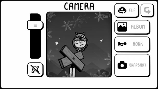
Gullbo: The first thing we implemented for the camera was to register certain objects in the camera viewfinder. This means that when the player takes a photo of something the photo will now contain a tag. ex: Tree, Rock. And then we can have an NPC look at that photo and react based on what tags it has.
We played around a lot with this implementation, tweaking detections etc. to make sure that photos are tagged correctly. From playtesting we noticed that peoples photos always came out incorrectly so we needed to add in more checks for what object is actually being focused on.
Whenever the player opens the camera they are locked in place. We wanted to reduce the controls a bit, and since the game is possible to complete only using a mouse it was hard to implement a fair solution for moving when in first person. But this led to more things we could play around with and look at!
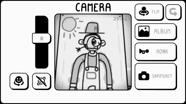
We started to look at things more from a focus on how you take photos with a real camera. Placement, for instance, is important when taking a photo. So how can we make it important in TOEM? Since we have shifts in perspectives we can have things only visible in the camera. Maybe something is visible in the distance or maybe something is hidden behind a corner? These were the ideas that went into the game and led to us having more fun with our puzzles then previously. We also gave the player a much needed selfie mode which resulted in a reason to dress up and look funny! An added bonus that I'm not sure would be in unless we looked at it more technically.
Gamasutra: Why did you choose to make a game that leans heavily on photography? How do you think the mechanic helps players relate to the experience?
Gullbo: It was an interesting take to look at the art in TOEM!
We also wanted to avoid the definition of puzzles as much as possible, since in our head it's more related to brain-teasers rather than funny scenarios that can be solved rather easily. Making a photo adventure felt natural and was beneficial for us in the team to explore and share our ideas.
We really do hope that players will stop and take in the moment from our little photo adventure. To look at the journey they are making and to reflect on the progress they have made. Photos are a nice representation of progress, they act as a time-machine of some sorts, it all ties in quite nicely with the "stop and smell the flowers" approach.
Gamasutra: I'm also interested to hear why you settled on a hand-drawn black and white aesthetic, and what challenges you faced trying to realize that art style?
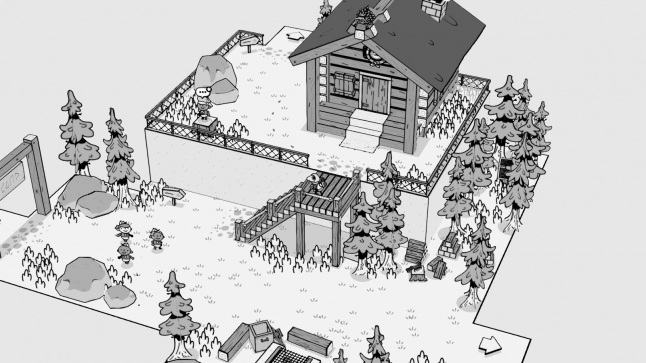
Gullbo: The art style of TOEM always followed along the development, it went back and forth in detail-level but other than that it mostly stayed the same. It all originated from the early sketch which was also in black and white. During the early versions of the game, there were more details inside the textures, I think this made it look more noisy and moving forward the detail levels were kept to a minimum.
So the in-game art has always had its own touch to it, but when we started moving into the UI for the game, things got a bit more complicated. Since everything in the game is black and white, using a colored UI felt out of place. But not using colors for important information prompts complicated things. We ended up dividing the UI more heavily, still keeping it black and white but adding in a fade behind anything related to the UI.
The hand-drawn aesthetics is also just an effect from me making the art. That is how I draw and that is how I could provide my part to the team. Not using colors also made it so I could get my textures done quicker + all the art uses the same saturation meaning that I don't really have to worry too much about color matching!
Gamasutra: TOEM contains a mix of 2D and 3D characters and objects. Why did you include both, and how do you think it impacts how players perceive the world itself?
Gullbo: I think it benefits the art style of the game! It makes it feel a bit like a pop-up book if you may, where more complex/organic shapes are flat while structures with more defined angles are in 3D. It was both an art choice since it benefits the camera angle (2D things always have their best side facing the camera) and a work choice since I'm not great at 3D modeling and wanted to avoid it as much as possible.
Hopefully players will find the style playful!
Gamasutra: Finally, is there a particularly useful design lesson you've picked up working on TOEM that you'd like to share with other developers? Something that'll help them on their own creative journey.
Gullbo: Feeling like giving up on a passion project isn't necessarily a bad thing and in our case was a very important step in the development. We thought the game was over, that it would never get finished. But we are now closing in on release and it's so surreal.
So, take a break once in a while and step back to look at the things you have done rather than the things you want to get done.
Read more about:
Spotlight SeriesYou May Also Like