Trending
Opinion: How will Project 2025 impact game developers?
The Heritage Foundation's manifesto for the possible next administration could do great harm to many, including large portions of the game development community.
How this seemingly unsuitable platform gave birth to a deeply unsettling experience.

Broke: "I can't play this game on my work computer." Bespoke: "I can only play this game on my work computer."
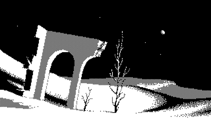
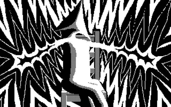
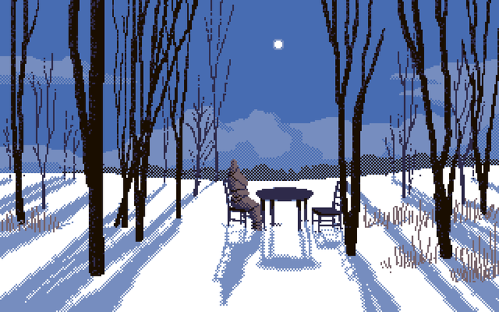
There are many games in the world that are made on unusual platforms or with outdated tools, each a testament to the tenacity and ingenuity of their creator. Joining those impressive ranks of the bizarre and curiously implemented is ROCHE LIMIT, a surrealist pixel art experience delivered in PowerPoint by architect and first-time game developer Jack Strait. This short game is less of a game and more of a series of unsettling encounters and cosmic out-of-body moments that seemingly fixate on a strange house that, the teaser trailer hints, "took everything from you."
Speaking by email, Game Developer caught up with Strait to ask him about his unique choice of platform and how he created an element of interactivity within the extreme limitations of PowerPoint.
What’s your background in game design? Are you self-taught or did you go to school? Have you worked on or produced any other projects?
I'm self-taught! I actually recently graduated with a degree in architecture so I have a considerable background in design, though really a limited amount in this particular field. It was only in high school that I started taking game development more seriously when I created my previous project The EdCo Incident. I think multiple years prior I had lost my copy of the program Game Maker, so I decided to try to put it together in PowerPoint instead.
Those who use PowerPoint for work may be, like me, surprised to hear that PowerPoint can be turned into an interactive experience. What first inspired the idea to make a game in PowerPoint? Was that element of surprise something you wanted to tap into in writing the game’s story? Was it about the technical challenge, or was there a different creative motivation?
In terms of how I designed the story, it actually came together pretty organically. With the previous project, I tried to write it out entirely in advance and found that it was hard to stay motivated that way. The story would just get progressively staler in my mind. So with ROCHE LIMIT, I let myself discover the plotline as I was putting together the art.

What is your background in pixel art? Did any particular projects inspire ROCHE LIMIT or inspire you as a developer?
I also have almost no previous experience in pixel art. It was a few months before I started the game that I saw some fantastic work by the artist Anas Abdin, and I wanted to see if I could capture some of the magic I saw in his best images.
I'm also blown away by [the horror web series] Petscop. For hours on end, you wait for something shocking to happen, but it never does—it just sustains this uncanny atmosphere for hours on end. And then the game gives you so little in terms of meaningful info. You just wait and wait and nothing's ever resolved or explained. It's kind of ascetic in a way, but it's simultaneously so vivid that you can't stop watching.
Another more random influence that I'll probably dive into even further in the future is the Pajama Sam series. Particularly No Need To Hide When It's Dark Outside. Despite being a kid's game, its use of color and form is so unbelievably masterful.
Pardon me for saying so, but I feel most developers, if they didn’t have their primary game design program available, wouldn’t necessarily think of PowerPoint as the next most viable platform. I think many people who use PowerPoint also see it as a very static thing, not something you interact with (whereas in ROCHE LIMIT you can click on the screen and customize a character). Was it difficult bringing interactivity to a program as limited in function as PowerPoint? How did you teach yourself to do that? I can’t imagine there are a lot of “how to make a game in PowerPoint” tutorials online.
I actually had to think about this question for a while. The reason why PowerPoint was my next go-to was probably because of how familiar I already was with it. When I was super young and mildly computer-obsessed, I spent a ton of time playing with the programs that had been pre-installed on my computer. I was also a big fan of making stop-motion animations, and when I got bored of making those with my camera, I started animating things on PowerPoint. So pretty early on, I already knew the fundamentals of what I needed to know to make the game. Then fast forward to 2017 when I started The EdCo Incident, switching to this program felt strangely logical.
What was your approach to learning enough about pixel art to create something compelling of your own?
To be honest, I knew (and still know) very little about formal pixel art technique. I joined the r/PixelArt subreddit to try to surround myself with plenty of inspiration, but otherwise, I just created whatever looked good to my eye. There are definitely some portions of the game that to me look more rudimentary than others since I was really just learning as I went. But overall I wouldn't say it was a terribly hard process. The bigger challenge was making each scene a composition that I actually liked.
.jpg/?width=700&auto=webp&quality=80&disable=upscale)
Going back to the Pajama Sam series and, as you say, its use of color and form, what did you find inspiring about that and how did it make its mark on ROCHE LIMIT? The purples in these screenshots you sent are so intense. And the palette itself seems very limited.
Pajama Sam was one of the first point-and-click games I ever played. And I don't think I ever made it to the end—I just watched my dad play it. When you're young, stuff like that always feels particularly surreal. I can't say for certain if that's why my game turned out as it did, but it's definitely one of the most prominent memories I have of it.
What was surreal about Pajama Sam, if I may ask? I’m not familiar with the series but it must have left quite an impression.
That game had a lot of wacky personified objects and a pretty gloomy atmosphere. A lot of it is also really distant in my mind which gives it a particularly strong dream-like quality to me. Those aspects are probably the main reasons why it felt so surreal to me when I was young.
I love your explanation about why you chose PowerPoint. I assume those stop motion animation skills, brought to PowerPoint, are what give it that small bit of interactivity. Is there any technical insight you can give into that process? Where does one even begin? It must have taken so many frames to achieve this game.
The game would have turned out incredibly static if it weren't for PowerPoint's really great built-in handling of .GIFs. About a year ago I learned that I could make them in Photoshop, so it ended up working out great for my workflow that I could make pixel art and animate all in the same program. The only frustrating aspect was that, like all stop-motion, I had to draw each and every one of my frames. So for example, in the scenes where there are leaves flying in front of the screen, it was a fairly long process of planning and drawing each of their flight paths. It would be really amazing if Adobe could also incorporate a key-frame animation functionality into Photoshop as they've done with Premiere, but I'm not getting my hopes up about that.
It might be worth mentioning for the uninitiated what both those terms mean. Key-frame animation allows you to pick two different object positions, and then the program creates smooth motion between those positions. Stop motion on the other hand removes that very convenient automation. It also tends to leave a lot more room for imperfections. Though in the right context, those imperfections can be charming—like the claymation in Wallace and Gromit.
In terms of how I got started on each scene, I'd normally just do a digital sketch of what I wanted the static image to look like. Then I could start blocking in my colors on a layer above that. And after the static image was done, then I'd make a huge group of layers for each of my animated frames. They're of course all repeating animations, so the longest .GIF I ever had to create was never much more than 80 frames or so. Really I'd say the more grueling aspect was the logistics of assembling my one-thousand-something slide """presentation""" in PowerPoint.

At the beginning of the game, the player chooses their avatar’s appearance through a character creator. How did that affect your process on a technical level?
Yeah, that whole character customization aspect took a ton of work to get right. I felt like it was super worth including though because it puts some distance between the player opening the file and the true beginning of the game. And then I could just use it to take time to establish the atmosphere a little bit.
This might contain a minor spoiler, but since the selections on this menu affect details within the game, I unknowingly made for myself a huge logistical headache. I discovered that when you copy a large portion of the presentation, my hyperlinked arrows always link back to the original slides. So when I needed to make the different gameplay branches to accommodate these varying details, I had to go back and reattach every hyperlink one by one, which in a one-thousand-something slide file was a nightmare. Just to give you a sense of how needlessly complicated this all was, I also figured out an alternative way of dealing with this that I ended up not using. I could have also just made an entirely new PowerPoint file for each gameplay branch because it's actually possible to have an arrow that hyperlinks to a different presentation file. But very strangely, PowerPoint opens this new presentation without closing the previous one. So when the game ends, you'd press exit only to be met with another window from the game you'd have to also close. It would have saved a crazy amount of time, but I ultimately decided that this functionality felt super clunky.
It was fun though getting to ask myself the question not of "what do I want this game to be" but instead "what does PowerPoint want this game to be?" Because with some gameplay elements—like the one mentioned before—I was clearly fighting against what the program wanted me to design. As someone mainly with experience in the field of architecture, this closely relates to the famous concept of "form follows function." Of course, I could go against the program's interests, but it would be much better for my workflow (and maybe even the game's conceptual...purity?) that I try to make something that innately belongs within this unusual format. I actually got a really thoughtful critical comment from a YouTube viewer that touched a bit on this subject. He said that instead of doing pixel art, I should have included a "mix of clip art, '96-'03 aesthetic, [and] blurry images." I imagine that he considered that visual style much more innate to PowerPoint than the look I ended up running with. Though none of this is to say I regret the way the game's turned out. More than anything it's just an interesting topic I plan to think about more in the future.

The page listing on the site where I downloaded your game hints that this may only be a taste of a bigger game. What can you tell me about that? Will that also be a PowerPoint-based project or will you be using something more sophisticated?
As of now, I don't have too many concrete plans on how the game's going to develop. Originally, some alternate endings were going to add ten or twenty percent more content to the game purely in the form of additional PowerPoint slides, but now with the increased attention that the project's gotten (largely due to the amazing promotion from Youtube's Alpha Beta Gamer), I think I'd rather focus on getting ROCHE LIMIT in its current form out to as many people as possible for the time being. I'm planning on sending physical copies of the game out to anybody who wants one. Since CD cases are pretty obsolete now, I'm calling this a "QR case" because it contains a chip with a QR download link printed on it (alongside some really nice sleeve art I designed). My plan is to include my Venmo/Cashapp info with each shipment for anyone that wants to help me cover shipping costs, but otherwise, I'll charge nothing so that the game can reach the widest audience possible. For anybody that's interested, just shoot me a home or business address by email and I'll send a copy your way. For now, though, I'll only be sending copies to people within the US.
You mention the logistics of organizing the myriad PowerPoint slides that make up the game—were there any tools or methods you used to streamline the process or did you just have to kinda freestyle it?
There were essentially no external tools I used to streamline my process, though I was consistently impressed by all the functionalities of PowerPoint. After multiple decades of Microsoft's development on the program, I guess I shouldn't be shocked that it runs so well. I was mainly just surprised by the nearly non-existent lag on my one-thousand-slide file.
It sounds like you had some pretty key images in your mind as you set about creating the game’s visuals. Their sequencing definitely has that dreamlike quality that so appealed to you as a child. Do you consider this a surrealist horror work? What drove you to tell this story in particular? Is there a story to speak of, or rather, a series of unsettling inexplicable events and imagery?
Throughout my entire process of making ROCHE LIMIT, I really had no idea how to label it. For the sake of marketing, calling it a horror game works well. Though if I'm trying to be more precise, I'd possibly just call it an alarming surrealist game. Kinda in the same way that Inland Empire by David Lynch isn't really a horror movie. Parts of it are pretty frightening, but it really evades categorization. I love art that does that. In terms of what informed the story, I knew from the beginning that I wanted this to be a game designed around a house. It was actually the very first aspect of the project that I worked on. I was studying abroad in Rome for architecture, and it was at this amazing park Villa Borghese that I drew my first sketch of the house. It was then during that same semester that I started imagining some of the most important scenes of the game. Only later on did I start planning the story that would string these images together.
I attached one of those early sketches I did of the house! The first one was pretty ugly, but this second one turned out nice.
.png/?width=700&auto=webp&quality=80&disable=upscale)
Original sketches of the house.
I love a good creepy house story. When I was younger and just starting to learn photography, my friends and I would break into abandoned houses and tell stories about the stuff we found there. I think I was fascinated by the idea of what happens to homes or belongings once they are forgotten and no longer loved. As an architect, do you have any thoughts on what makes such seemingly benign spaces seem so frightening?
Oh, great question. Definitely also a tough one to answer. I feel like it probably has something to do with the passing of time, which could be why I've always particularly loved examples of extreme abandonment. Like a structure that hasn't been empty for decades, but instead for centuries like the Temple of Hatshepsut in Egypt. Another place like this is the Cahokia mounds near St. Louis. The site was essentially North America's Washington D.C. before there was ever a Washington D.C., and now the only major feature that's left of it is the huge man-made hill their ceremonial capital building was placed on. While neither of these sites is particularly mundane, it's always super uncanny to be somewhere completely empty where there was once lots of life.
The author would like to note this project was made possible in part by the Iowa State University Foundation and ISU Teaching Professor Andrew Gleeson.
Read more about:
Horror GamesYou May Also Like