Trending
Opinion: How will Project 2025 impact game developers?
The Heritage Foundation's manifesto for the possible next administration could do great harm to many, including large portions of the game development community.
Developer Anders Lauridsen talks about balancing contemporary expectations with the look and feel of a retro genre.

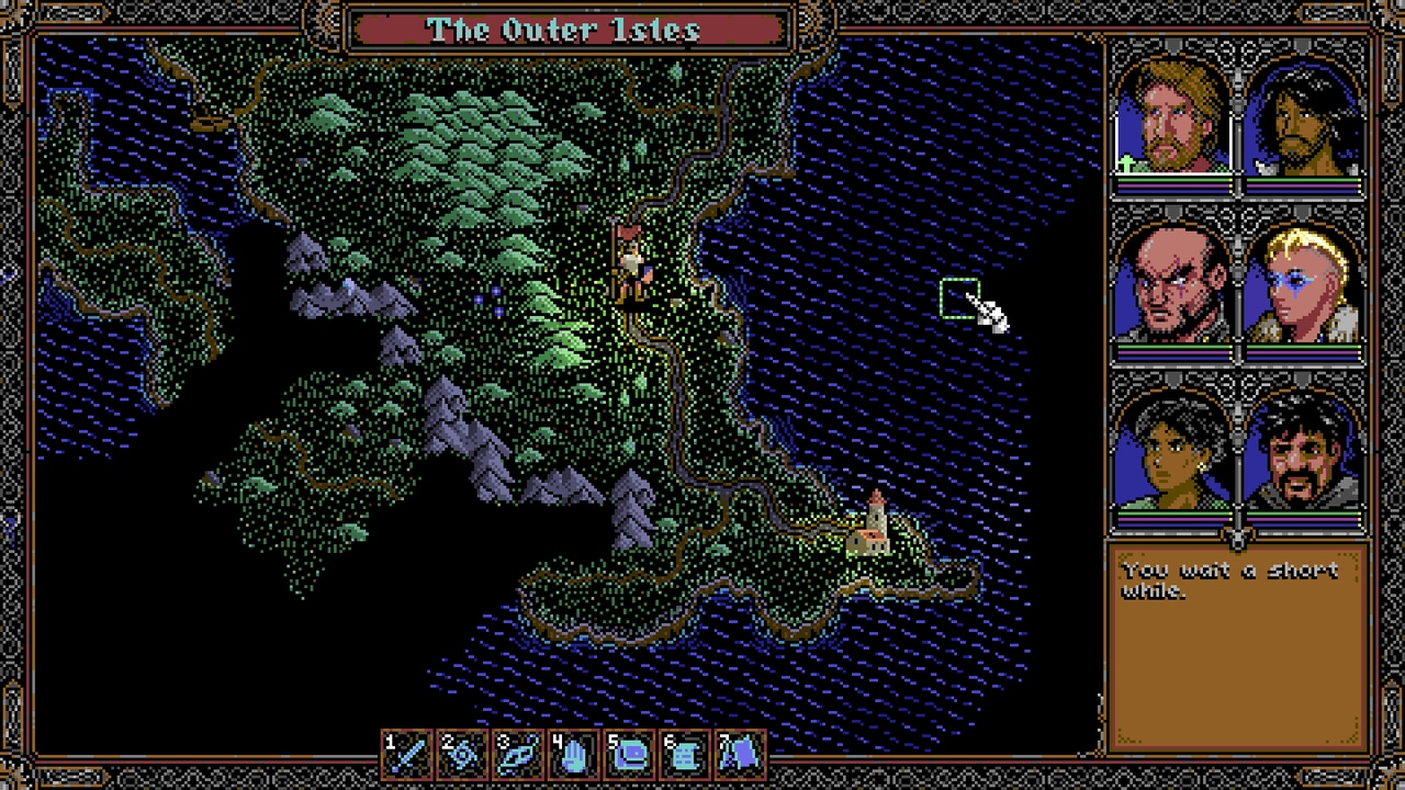
SKALD: Against the Black Priory is a retro CRPG filled with unsettling stories and monstrosities, capturing the dark, eerie feel of the genre while making many of its elements more accessible to modern players.
Game Developer caught up with Anders Lauridsen, the game's developer, to talk about capturing the look and feel of retro CRPGs without some of the issues that came with the classics of the genre, the design challenges that come from creating a world filled with quests and things to do as a single developer, and how they worked to weave a sense of horror into a genre that is normally focused on power fantasies.
Game Developer: SKALD: Against the Black Priory is a celebration of retro party-based RPGs from years ago. What appealed to you about returning to this style of game and creating something of your own in this genre?
Lauridsen: First of all, the games that inspired SKALD (RPGs from the early '90s) have a lot going for them that appeal to me: Turn-based combat, lots of exploration, wonderful pixel art, etc. I genuinely think they had qualities that hold appeal to this day and that have become a bit less prevalent in modern RPGs. As RPGs developed as a genre, there were some features that were "thrown out with the bathwater."
The downside with these classic games is that they tend to be less than accessible these days. For me, I had the experience of coming back to a lot of older titles that I liked the idea of playing more than actually playing them. So, this was a big driver for me: Scratching my own itch for old-school CRPGs! That being said, if you look past the retro graphics, SKALD really is a lot more modern in how it actually plays than you would think.
The elevator pitch is "to make a game that plays like our nostalgia-tinged memories of the CRPGs of yore but not how retro CRPGs ACTUALLY played."
These retro RPGs could be incredibly ruthless and difficult to figure out during their era. What elements did you want to keep from retro party-based RPGs, and which did you wish to change or update to make this game a little less overwhelming for a modern audience?
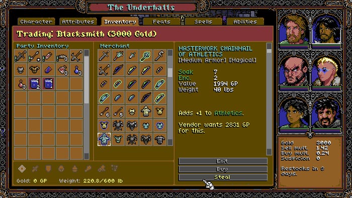
I've been pretty strict about maintaining a certain graphical expression for the game, which imposes some limits on things like UI design due to the small screen real estate, etc. I also wanted a game with a lot of mechanical complexity. So, in other words, a game where you, the player, actually find it more fun to play the more you learn the "rules" of the system.
But all that being said, it's always been important to me to make a game that is as accessible as possible within those constraints. It's been really important not to come across as a gatekeeper for this genre, and this certainly isn't always easy: there's a balancing act between having a game that's fair and welcoming but also challenging and complex. You never get there 100%, but I've done what I can with tutorials, quality-of-life features, a lot of settings, and a customizable difficulty. There are even hundreds of console commands, so you can cheat as much as you like. It's important to me that players get to play the game on their terms.
Beyond that, there are very few (if any) old-school features that I've added just to make life hard for the player. Modern audiences are sensitive to games wasting their time, and though it may not always seem like it, I have tried to make the experience as smooth as possible for players (within the limits of my core design pillars).
Yes, the game is old-school on the surface, but if you can get past that initial layer, you'll find a pretty modern CRPG underneath.
Can you tell us a bit about some of the games that inspired SKALD: Against the Black Priory? What about them that helped inspire elements of your game?
Games like the Gold Box series and the early Ultima games were a large inspiration for the retro aspect of the game. And then the games I REALLY mainlined in my formative years were the Infinity Engine games like Baldur's Gate 1 and 2, Planescape Torment, Icewind Dale, etc. and games like Fallout 1 and 2. I think the narrative experience for SKALD is much closer to those games than Ultima 5, for instance.
Finally, there's been a lot of great CRPGs coming out lately with games like Baldur's Gate 3, Pillars of Eternity 1 and 2, the Pathfinder games, Rogue Trader, and so forth. I've stolen copiously from these, especially in terms of features and secondary systems.

There are many different characters players can enlist with various personalities, skills, and goals that can really shake up how they play through the game. Can you tell us the ideas that went into creating interesting party members that can add many unique elements to a playthrough?
Honestly, I'm a "discovery writer," and NPCs tend to spring forth from who knows where and then assert themselves in the narrative. I genuinely have little influence on what they say and do.
I planned to have a lot more of them, but there is an issue where balancing their screen time and interactions takes a lot of work for a solo developer, and it also makes testing very complex. Simply put, the tools I had today meant a lot of manual testing would be needed for a larger stable of NPCs, and there simply wasn't time for it. So, for this game I opted to reduce the number of pre-made characters to ensure the ones that were there had a minimum amount of meaningful interactions. And even then, I left a lot of intra-party lying on the cutting room floor.
What challenges come from creating a whole vast world filled with different, disturbing places to explore and sidequests to follow up on, as well as an array of classes and abilities, when you're a single developer working on the game? How do you create vast swaths of things to see and do without working yourself to death?
A lot of challenges come from this and I did (almost) work myself to death. Making roleplaying games like SKALD is beyond complex. The game has a near-infinite number of potential worldstates that each create new and unforeseen interactions and it's very challenging to keep this relatively bug-free. And if you then choose to do this whilst trying to add an interesting narrative on top of it, that increases the challenge substantially. There is a reason so many RPGs feature a lot of fetch quests.
The only way to solve this (as far as I am concerned) is to develop high-quality, purpose-built tools and to continually seek to evolve workflows. In other words, it's at least partially an engineering challenge.
Part of the challenge with this project was that I made the tool set while making content. That meant that portions of the game were made using tools that varied wildly in quality. Not only that, but since the tools were continually developing, it also took time for me to "learn" them well. Let's just say I learned a lot as a designer as well during development, and as a result, a lot of my best work came at the late stage of the project.
It's inevitable to wistfully think, " Oh, if I could only go back and redo the game starting with the tools I have now."
You have to communicate a lot of visual information about a character with only a handful of pixels in the game's top-down viewpoint. Can you tell us about how you design a character or place with a minimum of pixels? How do you still convey mood and character when you only have a tiny amount of room, pixels, and visual details to work with?
That's the question, right?
First of all, I had excellent freelancers do most of the non-human models and complex environments. So that's a bit of a cheat, but at the same time, since everything is so minimal, there is a large degree of technical design that goes into making every component work well together. The key here is to first do a lot of work on my end in finding some core principles for the graphic design and then managing to convey that to the artists in a way that ensures I get what I need in terms of technical specs whilst still allowing them to infuse it with as much of their artistry as possible.
Among other things, this requires good communication. It begins with a good, written asset order. Then, a first draft from the artist and then iterating over feedback until we're there. The secret to this workflow (because it can be time-consuming) is that if you have good chemistry, you end up at a spot where you become very well-attuned, and the back-and-forth becomes a lot faster. In the end, it was enough for me to ask one of my illustrators to "Giger it up," and they would know exactly what I was referring to. That's when magic really begins to happen.
Beyond that, when it comes to stuff like "How do we make combat readable?" it's honestly just trial and error. Just iterating over feedback until it feels good. Removing friction and adding "juice".

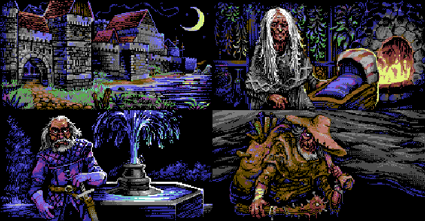
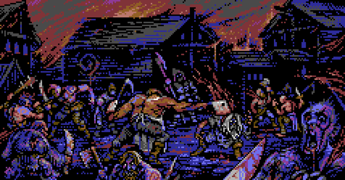
That said, the game goes into great detail with many of the characters and monsters in cutscenes and specific moments and often excels at capturing gruesome, discomforting, or bizarre things. What thoughts went into really going into detail with this visual style and into creating a sense of unease and fear from these detailed visuals?
Once again, this is, first and foremost, the skill of my artists. Secondly, it comes down to the workflow I outlined below. Lastly, I also had a strong core concept of what I wanted the world to look and feel like and how these concepts should feed each other in a way that "permeates" the world with a sense of wrongness. There are a lot of hidden details and subtle stuff that might not register on a surface level, but that come together to form a whole.
Another important aspect is that I, very early on, had an idea that I wanted to challenge a bit of the tired "ren-faire" aesthetics that are so common in a lot of fantasy RPGs. I think that it subtly pushes the game towards a more believable look for the mundane aspects while pushing the horrific aspect more in a direction that is closer to the body horror of a lot of sci-fi horror classics. The mix is something that might strike closer to home than a lot of stock standard fantasy horror tropes.
What additional challenges or benefits came from taking inspiration from the Commodore 64 palette for making the visuals?
This goes beyond just pure aesthetic preference: I started the project by asking myself, "What is the most simplistic graphical expression I can choose that still allows me to tell the kinds of stories I want to tell?". The reason for this is that I always knew I would be working alone or, at the most, with a handful of freelancers, and I really wanted to keep down asset production logistics whilst still having something expressive. That, in turn, also influenced the game design by driving it closer to a style of game-play that was also more common in the low-fidelity graphics era.

It's not pure visuals but also the writing that creates that unsettling feeling. Can you tell us about how you created the game's particular tone with the writing? How did you use words to weave the mood?
How to write cosmic horror, especially for games, is an entire interview unto itself. I'm not saying I'm an expert, but I think I did something right.
The big issue with doing it for a roleplaying game, in particular, is that CPRGs tend to be power fantasies. There are, of course, things you can do to lean into the grim darkness and horror aspects of the game, but it was outside the scope of SKALD to create a game where your character is going slowly insane while losing limbs. There's also something about this being a very mechanistic approach and that's not particularly conducive to horror.
Instead, my approach for SKALD was to adopt a concept of "subtle wrongness." You may be vanquishing your foes fight after fight, but the deeper you progress into the maze of the narrative, the more clear it becomes that something you can't quite put your finger on is terribly wrong and by the end… Well, let's just leave it at that for now.
And this is part of the trick: I tend to try to free myself from explaining too much to the player. I try to have a strong canon in my own head but then only drip-feed it to the players. I think this is a large part of successfully pulling off this increasing feeling of subtle wrongness. At the risk of sounding morbid, I kinda want to replicate that terrifying feeling of growing unease you get if you've ever begun to suspect that you might be suffering from some slowly-evolving, but horrific, disease. That anxious looking for symptoms, trying to Google it, and then instantly realizing you would do anything to go back to being ignorant—that is true cosmic horror.
How do you feel about some of your old favorite games now that you've created your own party-based RPG? How has this affected your opinion of the classics of this genre now that you've lived through everything it takes to create one?
As I said above, I think RPGs are some of the most complex projects you can take on and I have an incredible amount of respect for anyone who does it successfully. What's also abundantly clear is how incredibly passion-driven you need to be in order to make a good RPG. It takes pain and suffering and brutal honesty to make a game like this and that's just as true for a game like SKALD as it is for a game like Baldur's Gate 3.
You May Also Like