Trending
Opinion: How will Project 2025 impact game developers?
The Heritage Foundation's manifesto for the possible next administration could do great harm to many, including large portions of the game development community.

Featured Blog | This community-written post highlights the best of what the game industry has to offer. Read more like it on the Game Developer Blogs or learn how to Submit Your Own Blog Post
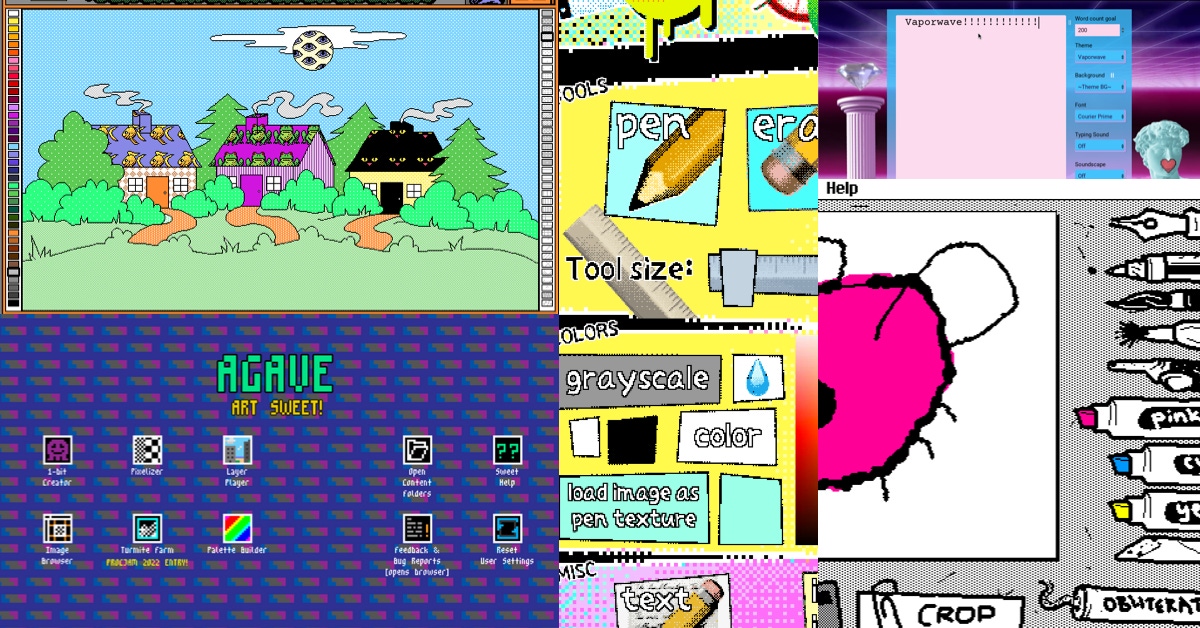
Tools outside of the mainstream, made by just one person, a group of friends, or a small team… all asking 'what if,' and then exploring how their tool can empower creation in an idealistically creative way.
A while ago I posted on social media that I would love an event that celebrates work specifically from solo-developers, so that projects made by “just one person” don’t have to constantly compete with work created by teams. Making work on your own is difficult when you’re held to such high standards.
The conversation kind of took off with other solo-devs voicing that they would appreciate that. Another interesting aspect of posting that thought was hearing the resulting conversation about what exactly is solo-dev?
Does it count if other people are involved (work is outsourced)?
Does it have to be made entirely by just one person?
…And then there were questions if that “entirely just one person making everything” even exists… I would argue yes, because I am just one person working on everything when it comes to my own projects. Such a thing does exist!
Interesting observation is that “solo-dev” seems to be the new indie. With the term “indie” having been (in a way) hijacked by the mainstream so that now work done by AAA is considered “indie”, as long as it looks indie (indie is an aesthetic)… Ok, sorry. My head is full of indiegames discourse lol.
In this case, I think it’s great when things get brought back to the basics… Work by just one person counts as something. It brings value to the table in ways that work by large teams never will because it’s the unique voice, perspective, and intention of just one person that you are experiencing when you are playing their game. Experimentation can thrive here.
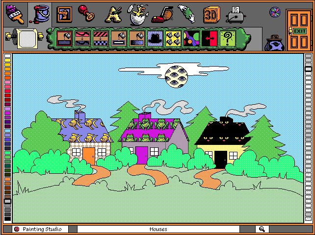
Microsoft Fine Artist, via Discontinued Microsoft Creative Software: “What follows is a list of all deprecated Microsoft software with a creative slant — meaning, software that allows you to create or consume media. Admittedly it’s a broad definition, but it’s an interesting space to explore in Microsoft’s product history.”
It is particularly interesting when you look at the tool space. Tools outside of the mainstream, made by just one person, a group of friends, or a small team… all asking “what if”, and then exploring how their tool can empower creation in an idealistically creative way.
I think tools used to be more interesting (experimental, liberating, weird, wild…) for that reason. In the retro golden era of tools that we often look to as inspiration (see Bryce, Kid Pix, Fine Artist, even Nintendo with Mario Paint …) it was common to have tools that just rolled with how weird being creative on a machine can be. Computers are a wild possibility space. Anything can happen on a computer if you are creative enough. Let’s see how that translates to creating on them!
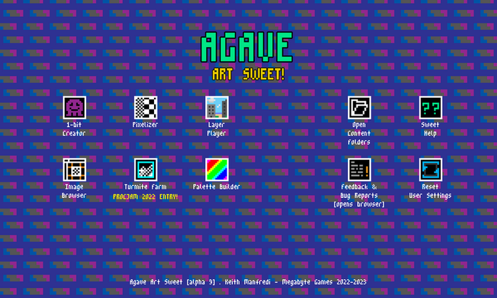
– Agave Art Sweet: “A suite of fun & functional tools designed for pixel art”
This post happened because I’m putting together a curation for a live-performance-talk-thing and I’m inspired again by how wonderfully weird some of these art tools are.
There’s something indescribably liberating about seeing a drawing tool where lines are moving as you draw, things are animating, and you feel like you have no or little control over the art that is happening right now.
For example, I talked about LIPSU in a previous post. I need to mention it again because it’s such a beautiful piece of software. I get put into this type of trance and watch lines jitter and move as I try to draw in it. I have to learn its own language to make things in it… Explore what weird drawing tool does what, and then get empowered to make something truly wildly different.
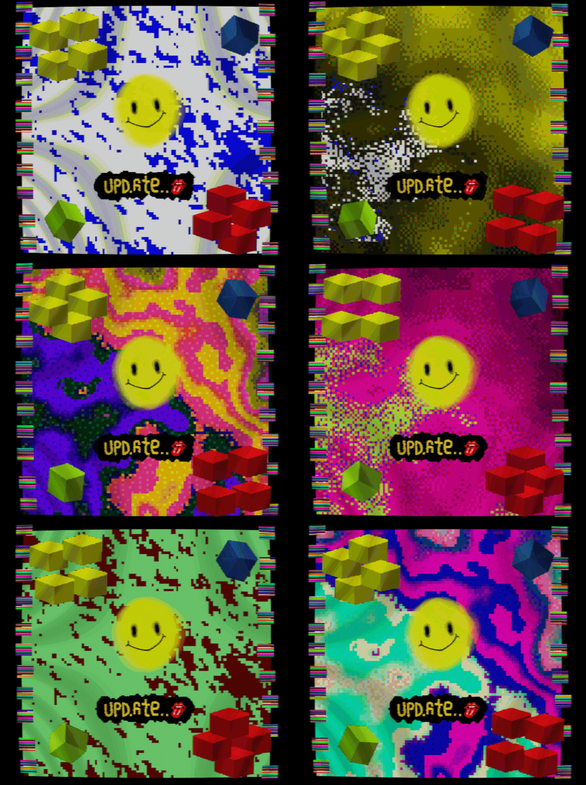
I collected a number of drawing tools for the talk where each of them seems to rebel against the user and has a mind of its own. When I use these, it’s like I’m collaborating with a software that has opinions about how the art should turn out.
Sketchmachine is an interesting case where I can create the brush I’m using and it will animate each stroke. You end up with this wild pulsating canvas of lines traveling across the space, each stroke creating another animation… and you get to export all that as an animated gif!
I used Sketchmachine once in a talk as an example of tools that you can collect, to make your own repository of unique ways to create art, and incorporate those with more traditional art tools.
For example, the Electric Zine Maker has an animated .gif brush tool. You can import animated gifs made in (let’s say) Sketchmachine and use those animations as a brush for making art. So this entire creative process becomes really meta. It’s such a unique way to make art. Wobble Paint, made in Pico-8, and Wiggly Paint, made in DECKER, both are similar drawing apps that let you create art with animated lines. Everything wobbling, and wibbling, and just living on an electric canvas in a way that drawings in the real world never possibly could.
You can export all your wildest wobbles and wibbles as an animated gif too!
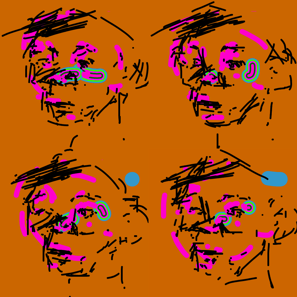
– Giffy user submitted art made in Sketchmachine
I look at these tools more as toys than tools by conventional definition, because there’s that quality of play always hovering behind them. You can come in, absolutely uninspired to make anything, not even really in the mood to make art, and end up playing around. The end result is always something you can export.
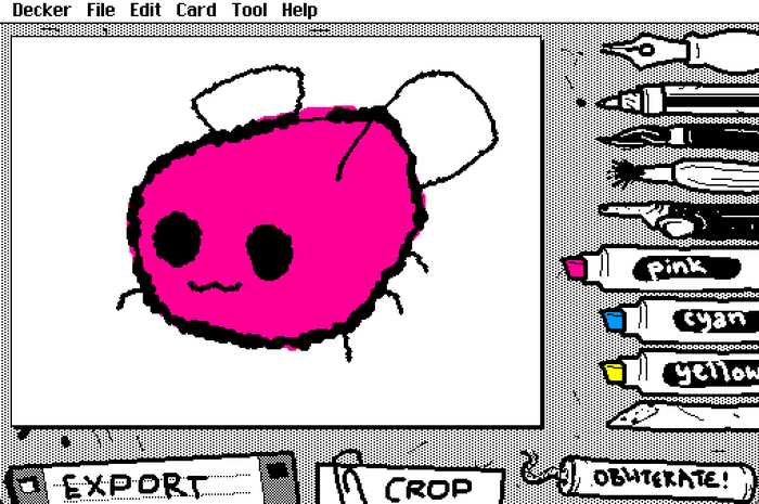
“Wigglypaint is a juicy, jiggly drawing program built with Decker, with notable similarities to Shake Art and KidPix.
One must scroll through the comments on the WigglyPaint itch.io page to really see how much people enjoy the cute things they make in these toy-like tools. It speaks to how meaningful these things are.
When developers turn their little tech experiments into tools is where beautiful things happen. I wish more people knew about projects like Agave Art Sweet which is an art suite of strange yet useful tools that let you output uniquely glitchy colorful art, or older projects like Paintbug which lets you create art in a fantasy realm where little animated characters in a landscape can be used as brushes to paint something strange and unique to the space you are creating in… Each of these are such interesting bite size examples of how tools can be more than imitations of classic art mediums in real life.
Digital toys let us explore a possibility space where art can pulsate, move, degrade, and do strange things with each brush stroke.
I often talk about what a missed opportunity it is that mainstream digital art tools are so caught up in making the perfect pencil line, or imitating exactly how chalk or water colors work, when there’s other types of lines we can invent that would never be able to exist in the real world.
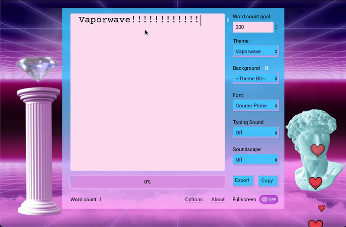
– The Vaporwave Theme for the creative writing app StimuWrite 2
I was talking with someone not too long ago and they described how they had sent something of mine to a friend who immediately brushed it off because it wasn’t in accordance with usability standards (too colorful and weird). This got me thinking about that topic again…
It happens a lot with my work, and I think it captures a really interesting dynamic when we talk about how usability has become a moral high ground issue.
I often get told that I’m ableist because my work is too colorful, with too much animation, too much happening… and it’s not “toned down” to be usable for the widest range of people.
It’s usually arguments about disability from people who are not disabled themselves. This I think is interesting because I create out of my own perspectives often informed by my own disabilities, my own life experiences, and the things important to me… all the things that make me who I am.
I have very bad dyslexia, and struggle intensely with focusing on UI. Believe it or not, but UI is often overwhelming and hard to look at for me. In a way where I just can’t. It takes forever! This happens in any software. Navigating youtube, and being able to read everything, is an uphill battle. That said, I wouldn’t change it for the world. This is how I see things.
So… in my own work, I mimic how overwhelming that feels. In that sense that overwhelming, unreadable, nearly unnavigatable, way-too-colorful UI is my own comfort zone. The loss of control is a safe space to me because I can finally feel at home in how overwhelming it is. It’s not making me feel like an idiot for not understanding this perfectly polished user experience, because it’s made to be the complete contradiction of that.
Most of my work is like this.
I like feeling like I’m failing when navigating a UI. Falling into a sea of overwhelming dizzying colors. The weirdly chaotic UI of the Electric Zine Maker is made for someone like me.
In that sense it also lets you explore what it means to make art in something so unusual and chaotic. Just like retro software once let you when art software was still viewed as an unexplored horizon.
I’ll also point to something like StimuWrite 2 which is a chaotic and stimulating writing app made for people who need more stimulation. Finally an excuse not to check social media every few seconds! StimuWrite has your back.
All that said, I think it’s interesting how software made for or by neurodivergent people is a spectrum of self expression.
It would be unfair to chide StimuWrite for being ableist and exercising poor usability for its stimulation.
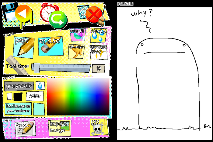
– The Electric Zine Maker’s drawing UI
I think usability advocacy needs to evolve to be inclusive of the expression from the people it advocates for. Someone with ADHD will create software informed by their ADHD. Work by people with autism will be radically unique to them. Everything is going to be beautifully wildly different from how we think software needs to act or look in order to be inclusive.
Usability should be a means of empowering each of these cases, adding to, and not something that takes away from that diversity and color.
I think that often gets missed when people don’t listen to each other. Turning usability into a moral argument has caused it a lot of harm… or “alienation” for lack of a better term.
Then again, there’s also an aspect to this type of software where, when a user doesn’t like something, they will turn it into a moral argument because software is still viewed as a service that owes anyone using it a certain performance. It’s an extremely commercial and capitalist mentality that informs how we view software.
When I created the Electric Zine Maker it was intended to be an art tool just for myself. I wanted something that makes me feel comfortable and welcome in ways that mainstream software can’t and never will. I’m too different to fit into that mold.
Then the Electric Zine Maker took off (I think largely because it’s so different), it reached an audience that has the same needs.
If I were to take away from that by making it more mainstream, remove the experimental and silly tools and give it more mainstream tools, it would lose what it’s about. It would be another Photoshop, which I fail to see the point of since Photoshop tools are a dime in a dozen. It would also alienate me.
Somehow I feel like there needs to be a common ground in our understanding that such work is different for a reason, and that good usablity empowers diversity rather than uniformity.
Exploring experimental digital work will always be very new by principle that this is an ever growing possibility space where anyone’s wildest dreams can be made true, and I don’t think conformity is the answer.
My own rule has always been to start with something absolutely bizarre and work your way back to make it as inclusive to as many people as possible. Sure there are flaws, but then again all software is flawed. I don’t think anyone has it all figured out yet. Digital art is a constantly evolving journey.
There have been many exciting things happening in the tool space lately.
Downpour was recently released. It’s a tool for making games on your phone, in which you can collage together media unique to phones (like photos you took). It’s already enjoying a strong reception.
I think it’s inspiring to see how a community grows around such unique tools, and starts to inform the direction the tool takes. It will be interesting to watch what Downpour turns into.
Another recent find is the brilliant Pupets.app
A tool, toy, browser invention, that lets you play with puppets using hand gestures recorded from the web cam. You can record the resulting performance and share that. It’s a sweet and interesting story telling outlet.
I’m inspired by tools where the use of them seems so esoteric and strange, but people tend to find uses for them anyway. It turns into this really unique type of space that forms around the tool. I think Bitsy is a wonderful example of this.
It’s why I keep saying that the most important thing you can do as an artist is to become something of your own archivist and curator by saving such tools and finding uses for them in your own work. It’s a way of getting away from mainstream tools, such as Photoshop, and forming a type of unique independence from corporations that are driving these discussions.
Monopolies can’t be the only ones dictating how we create art on the computer, otherwise we are all stuck with tools that force trends on us… like how the current AI image generation trend is in pretty much every mainstream thing right now. I’m looking at you, Adobe!
If artist empower small creators to make tools, and artists even invent ways to use such tools in their creative process, then we create a community that is independent from the tech bro nightmare. It’s more sustainable because the space that’s created from that is based on sharing rather than controlling output.
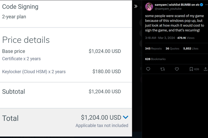
“some people were scared of my game because of this windows pop up, but just look at how much it would cost to sign the game, and that’s recurring!” –Source
The Electric Zine Maker often gets false flagged as a virus by some scanners.
Recently someone brought that to my attention again. False flags do happen. For someone like me, with my very limited budget, getting the app signed properly is phenomenally out of financial reach.
Between facing a reality where I would have to pay Apple to code sign, and then also Microsoft, with both these usually being reoccurring payments… making software is now a privilege afforded to people with financial power. Tech bros and corporations need not worry, but what about the weirdos that just want to make their art? Sometimes I think I’m looking at a reality where experimentation on computers (software, games, etc…) will all be a thing of the past, because the decisions driving tech are made by millionaires and wealthy CEO’s who will nickle and dime tech to death with cloud subscriptions and forcing devs into expensive storefronts.
I often wish there was just as much awareness about that dynamic as there is a distrust of AI art, because AI art came out of that same environment.
We need these seemingly silly tools to keep existing. It’s what they stand for that makes the difference… But maybe I’m foolish to speak for everyone. I just know that I need tools that are bright, colorful, silly, crazy, experimental, and I need them to thrive because these tools hold space for someone like me.
Computers were always meant to be for everyone. For the tinkerers, the nerds, the weird people trying out weird ideas. I feel like that is taken for granted sometimes when you look at how that freedom is so precarious and easily lost.
I have a better example:
Garbage’s Shirley Manson: “We’re losing bands from working class beginnings and risk-takers”
“We’re talking about a capitalist system and all they care about is profit. Not only do they care about profit, but they want more profit. Nothing works like that in the long-term. You can’t make infinite wealth. Things reach their apex and they can’t go beyond that."
The above is a good article, with salient points made that apply to more than just music. I feel the same about software and games, when the only people that get to thrive here are tech bros, trust fund babies, and those that run their own companies… I have to wonder where the future is headed for artists like me?
While I’m here once again musing over how capitalism sucks… I think a major issue with creative tools like the Electric Zine Maker, or any that I mention in my roundups, is that the “end user” often doesn’t see these tools as art. What I mean by that is: I view the Electric Zine Maker as art. It’s a very creative program that’s artistically made to make art in. It’s more than just a productivity oriented tool to me. It’s a creative expression in itself.
Things get harry when people get upset by that, and expect it to be purely about “work”, creative output, and maximizing output. That’s where the complaints about ableism and poor usability come into play, because there’s an expectation of it that the tool is not meeting. It can’t ever meet that because it’s meant, at the very foundation, to be different. Its value lies in being different… Like I said, Photoshop and Photoshop alternatives are a dime in a dozen.
The same rings true for any tool that’s designed to be outrageously different. There’s value in that, and I wish these tools were embraced for being different rather than viewed as a threat. They are a solution to a tech space that is increasingly growing hostile to things that are creative and different.
Embrace software that is about personal expression, because that’s at the heart of what art is all about!
I’ll end this with one last curation roundup of things that I’m going to include in that talk I’m preparing…
*https://internet-janitor.itch.io/decker
“Decker is a multimedia platform for creating and sharing interactive documents, with sound, images, hypertext, and scripted behavior.”
Decker is a singular piece of software that I’ve been getting a lot of use out of while making BlueSuburbia. It’s something you can make more than just stories in. See Wiggly Paint as an example. Since everything you do in it can be output as an .html file it makes it a very versatile tool that you can make games and other art in.
"a little engine for little games, worlds, and stories"
I feel like Bitsy needs to be included in every one of my roundups because it represents so much of the positive things about creative small tools.
*https://the-l0bster.itch.io/pocket-platformer
“A code free tool for creating small platformer games.”
Pocket Platformer is definitely one of the hidden gems in the realm of tiny game engines. It’s similar to Bitsy but for making platformer games. I’ve been using it a lot in combination with my Unreal project, BlueSuburbia. I love it for how hackable it is. You can extend it yourself because everything takes place in a single outputted .html file which is very easy to read. It’s entirely javascript based.
and by the way… the Tiny Tools bundle which is comprised of PicoCad and PicoSynth is still on sale.
*https://zeromatrix.itch.io/rpginabox
“RPG in a Box lets you easily turn your stories and ideas into games and other interactive experiences! As its name suggests, it contains everything necessary for doing so, all packaged together “in a box”. The software is designed with a fun, beginner-friendly approach in mind as to not require any programming or modelling knowledge, while still providing a wide range of customization and openness.”
I talk about this one a lot. It’s one of my favorite examples because it’s both unique in how you make a game as well as “all in one”.
*https://bitsy3d.xyz/
The 3D rendition of Bitsy. I’ve been using it quite a bit in BlueSuburbia as well.
*https://www.flickgame.org/
A very simple little interface for stringing together comic-book-like stories. You can output as an html file, which is very hackable.
*https://chrismaltby.itch.io/gb-studio
“GB Studio is a visual game builder with no programming knowledge required allowing you to make real Game Boy ROMs in minutes. You can run the games on any emulator or you can run them on your Game Boy if you’ve got a flash cart!”
Games made in GB Studio are timeless. They literally cannot die. They are Game Boy games. There are so many emulators for them… that dynamic between preservation, piracy, and emulation deserves a blog post in itself.
Now go make some art in tiny tools made by solo-dev artists!
You May Also Like