Trending
Opinion: How will Project 2025 impact game developers?
The Heritage Foundation's manifesto for the possible next administration could do great harm to many, including large portions of the game development community.

Featured Blog | This community-written post highlights the best of what the game industry has to offer. Read more like it on the Game Developer Blogs or learn how to Submit Your Own Blog Post
There is a part of game feel that is really amusing to work on, and that helps to improve your core gameplay's feedback: Juicing. In this article, I want to share a collection of efficient juicing techniques.

This tutorial was originally published on the GameAnalytics blog

There is a part of game feel that is really amusing to work on, and that yields great results as soon as your game’s core gameplay is rock solid. This is what, since the rise of casual gaming, we call game juice.
Juicing is a pretty wide, yet specific concept. But an interesting one! As the term suggests, juicing is about taking a game that works and adding layers of satisfying bits of animation and audio to improve its feel. It is every visual and auditory improvement you can add to your core game to make it more believable. As if you squeezed the juice out of an already appetizing fruit. You can probably sense that beneath that catchy word lies a powerful game design concept. It is a specific lens we designers can use to push our games’ feel further.
Where UX design follows objective principles and rules, game juice is more personal, and emotion based. The types of feel improvements you could add to your game may vary a lot. Each developer should have his own signature juicing techniques (and successful developers do have theirs). For example, Vlambeer is considered to be the master of screen shake. They even made a talk called “The Art of Screenshake”!
Juicing, from a game developer’s standpoint, relies mainly on 2 domains: animation and audio.
Inbetweening, or tweening, is the process of interpolating values between two extreme values using the computer. The linear interpolation, or lerp, is the most basic tweening method we have at our disposal. And the one we tend to use the most (for starters, a lerp function returns the weighted average of 2 values). When it comes to animating movements, linear interpolations produce tasteless results. This is normal, considering that pretty much nothing in the real world moves in a linear way.
Good tweening boils down to a good application of the 12 principles of animation. Having a good understanding of animation’s basics is key, which requires some practice. However, there are a few common tools we can use to make our tweens feel good easily: easings.
As I said, in the real world, nothing moves in a linear way. It takes a certain force to move anything, to build up speed or inertia. Thus in general, it takes a certain time for objects to accelerate to their maximum speed, or to decelerate to come to a full stop.
In our games, we want to re-create that feeling of inertia for every single animated object. This is also our best way to convey a sense of weight for any item in our game world.
So what are easing? They are a collection of functions used to gradually interpolate between 2 values. Easings offer us a convenient way to represent inertia. Easing equations interpolate between two values with all sorts of accelerations and/or decelerations curves. There are many easing types at our disposal, and some fancy functions can produce very interesting results. I.e. the bounce/elastic formula. You can find many common equations on the easings.net website.
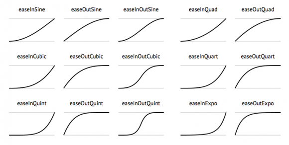
A few samples of common easing equations
You can see that each equation has three variations. It can:
Ease in, accelerate at the start.
Ease out, or decelerate at the end.
Do both.
You will generally want an appearing animation to ease out. In particular for UI elements. When it falls into the screen, you want your game’s logo to gently decelerate towards its final position. You can treat a moving UI element like a character: it accelerates at the start of its moving state (fades in), moves at a constant pace and slides a bit before he stops (eases out).
When should you use a given type of easing? Well, it’s up to you. Easings have to be picked visually, using your sense of spacing and timing. It depends on the precise needs of your project. If you want to get abrupt movements, you will want to lean towards exponential easings. If you need softer movements on the other hand, you can focus on the simpler, quadratic easing.
The best way you can push your understanding and mastery of tweening is observing how other developers do it. As with any type design related discipline, the fastest way to learn is to thoroughly study references.
Game juicing is often presented as a collection of tricks you can use to better the sensations of your player. It is not a matter of using prebuilt formulas though. Your game’s juice should always echo your core gameplay. We cannot improve our game’s feel randomly. Screen shake, squash and stretch, bounciness and other fast-paced animations are only relevant in specific situations! They make sense in dynamic games.
In a story-driven game, or in a horror game for example, you want your animations to be subtle to convey a sense of mystery. You cannot always used that funny elastic equation for instance. Both the amplitude and the rhythm of your tweens will hugely vary depending on your project’s requirements.
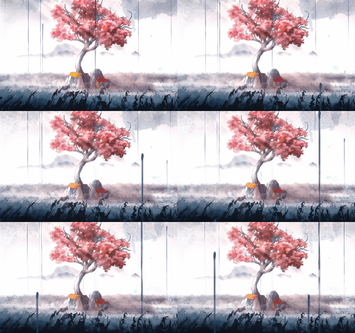

Child of Light offers many examples of subtle uses of secondary animations
I insist: the concept of juice is meant to reinforce your existing gameplay. Juicing up shooting games has already been thoroughly documented by Vlambeer in the talk I linked to above. In such a game, juicing is pretty straightforward: it boils down to making the player feel powerful. You can do so by increasing the size of your bullets, make them move faster, add some recoil when shooting, etc.
What about other types of games? Well, each genre and story is like a different fruit altogether: it deserves its own trademark juice. I will provide you with a quick rundown of the few games’ juice. But before that, we have to talk about the other domain we want to pay attention to, as for is juicing is concerned.
Audio is often overlooked as far as improving your game’s feel is concerned. At least among indies with low budgets. Yet, it offers an affordable way to improve your game’s feedback rapidly. Good sounds reinforce the presence and credibility of any interaction happening in your game. At least as much as your character design or your animation. Bad sound design can break your game.
You should put a strong emphasis on gameplay related sounds. All interactions the player can make should have a clear audio feedback. And those sound should feel full. In other words, you want to push the bass and mediums of most gameplay sound effects to give them some presence or impact. You also want them to be louder than other sounds in the game. You want them to be delicately compressed. You want them to pop out.
As those sounds are gameplay related, they are the most important elements of our sound design. They are our core sound design in a sense. But a game’s main sound effects alone don’t make up for a compelling auditory experience. We still have to think about our soundtrack.
Soundtracks are probably the most efficient tool we have at our disposal to create emotion. Although we all bathe into music, its language is foreign to a fair part of us. Music is somewhat mysterious and magical. It can alter our mood. Music alone can cheer us up or make us feel nostalgic.
In last week’s article about creating immersive game intros, I linked to the powerful title screen of Xenoblade. It really feels beautiful. If you keep staring at it and let the scene sink in, it will touch your very heart. Well, I invite you to take a quick look at the video with the sound muted. Does it still feel the same? The image alone looks pretty… but quite boring, doesn’t it?
As in sound design and animation, a good understanding of the characteristics of powerful soundtracks comes with experience. The only advice I can give you in the case of music is not to neglect it. There are many competent composers and music producers out there waiting to help you push that game to the next level. If you are serious about making great games, don’t hesitate to hire one!
Having solid gameplay sound effects and music are a basic requirement for pretty much all games. There is a type of sound that is used less often - in particular if you have a low budget: soundscapes. Soundscapes are audio tracks that are meant to ground the player a bit more into the game world.
To immerse the player even more into your game’s world, it is interesting to add sound loops corresponding to your environments’ ambiences. Even if you have music playing on top of it! Those soundscapes should be relatively quiet. They are meant to be a subtle background element. Soundscapes are not meant to be consciously listened to. They are barely meant to be heard: they are meant to be felt.
Is the player crossing a stream of water? The sound of its flow should gently mix with the game’s soundtrack. Is the player passing by a chimney? You can make that fire feel warmer with some soft crackling, bass-y sound. You get it. Background audio can help you to improve the player’s experience.
Although your approach to juicing will depend on your game, here are a few common visual effects that will work for most projects. Those mostly rely on particle systems.
The first idea is to use an animated effect whenever a collision happens between two sprites in your game. This could be:
Dust when a character lands or runs. This is an efficient way to make your character feel like it belongs a bit more in his world and give his steps some impact.
Sparkles, or stars. This one is a cheap trick that once again gives a sense of impact whenever two objects are colliding.
Pausing the game for a split second is also a very efficient way to reinforce a collision. You can lengthen that pause or delay to make a hit or a death feel powerful. This is actually a common animation technique that we call a hold. Character animators can hold their key poses for a few frames to reinforce them. This leaves some time for the viewer’s brain to process the most important moments of an animation.
Trails are another kind of common effect. Trails are useful whenever we want to put an emphasis on an object’s arc of movement. This is particularly useful for fast moving objects. For instance, we often see trails:
In a sword or weapon slash animation. A little tip: the trail should instantly disappear on hit.
Behind a fast moving character.
It is important to note though that trails slow down movements. This may not be intuitive for non-animators, but trails can hinder the impact of an animation. They are a specific application of what animators call smears. If we think about it, trails or smears blend the current pose of an object with its position a few frames before (you can go to the animation smears tumblr to see some examples of how animators use those). So be careful with trails!


Your game’s juice also can be squeezed out by adding depth and subtle variations to the animations you implement.
In a 2d sprite engine, we are limited as far as the types of movement we can create. We can play with the position, rotation, and scale of our assets. Luckily, we don’t need more! Using sine or cosine functions, we can make wonders happen!
If you animate the rotation of plants using a periodic function, you will make them feel like they are being pushed by wind. A little tip: to create a believable wind effect, layer multiple sinuses of varying amplitudes and phase! That is how it’s done even in big games.
Animate the scale and opacity of a transparent circular sprite to add warmth to a bonfire or a lamp!
Animate the scale of a circle in a bouncy way and make it move in a loop to get a believable fly!
In the case of 3d engine like Unity, you can easily add a lot of variation and complex movements to your assets using shaders and Vertex colors. Vertex colors are lightweight, easy to paint, and can be used for any kind of masking you could imagine. We are provided with 3 channels we can mask our meshes with, giving us more masking flexibility than we need most of the time.
Vertex colors make it easy to mask part of a foliage mesh and simulate a wind animation on that masked portion for instance. Here is an example of this technique in practice. Try to look at the parts of the patches of leaves that are touching the branches: they do not move. In Unity’s case though, Speedtree handles the masking and animation for you. But you can achieve the same result with plain code.
It gives us the power to animate specific parts of our objects using code! Using the world position of our objects, we can automatically offset the phase of our wind animation for each bit of foliage in our level. At [almost] no cost! And this is true for both 2d and 3d games.
Analyzing examples is the best way for us to see what works. If it works for others, chances are it will work for our games. At least we can pick relevant titles to use as references or as sources of inspiration.
The first example I will take is one of a minimalistic, pretty popular free app published by Ketchapp: Jelly Jump (Apple Store link).
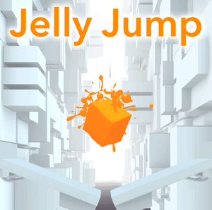
In that game, all the juicing revolves around the jumping jelly. Let us first analyze the game’s basic visual setup.
First of all, the background is immaculate to emphasize the character. The jelly is placed at the center of the screen and its color is saturated to contrast with its environment. You can also note that the jelly is not shaded like the rest of the level. It feels cartoony. It creates a solid foundation for juicing. Keep in mind that we can’t get a good juice without a good fruit.
Then comes the juice in itself. As I said above, it revolves around the jelly, which does 3 things:
It wobbles.
It splashes.
And it leaves a mark on the ground upon landing.
Here, we find 3 principles of visual juicing used in synergy. The character is animated using tweens (wobbles), its movement is enriched with particles, and it leaves a permanent mark on the ground. This combination of visual cues result in a believable jelly.
Watching a quick gameplay session, you can clearly see that the jelly’s wobbles are dependent on the thrust of its jump and the force with which it lands. This reinforces the core jumping mechanic. And that is it for the heart of this game’s juicing!
Although Jelly Jump is not the deepest game you could study around the app store, I think that taking a look at minimalistic games offers us a great opportunity to learn. One touch games with lean visual designs are great references to study from. Their central mechanics and visuals are generally very polished, albeit simple. Ketchapp published a few good examples of such applications.
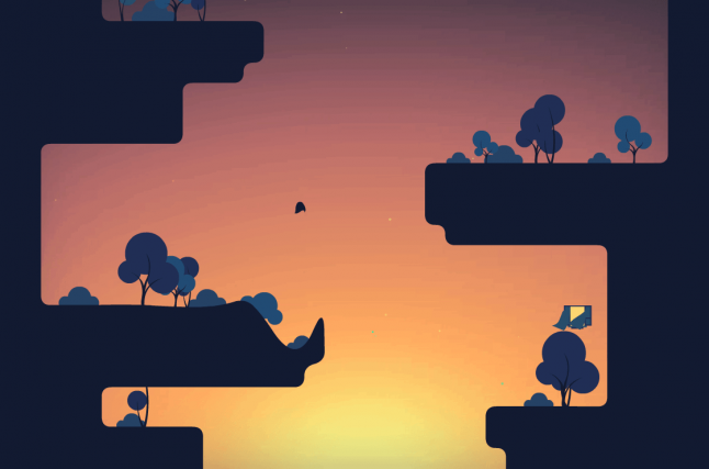
I would like to keep moving on our way to jelly-ness by pointing out an exceptionally juicy game about jelly: The Floor Is Jelly. This is another exceptional game to study from. It possesses a particularly polished feel thanks to the exceptional synergy of the wavy ground and the beautiful soundtrack from Disasterpiece.
Just look at it: everything moves.
The ground itself is alive: it ripples every time the character lands on it. It responds to the player’s movements. Every bush or tree squashes and stretches with each shockwave. Leaves are falling. Birds are flying. The world breathes.
I can’t provide you with an exhaustive analysis of this title’s juicing techniques. I invite you to play it instead and see for yourself how well it works. It is really a matter of synergy in that case: every choice is reinforces the game’s main mechanics and story (yes, there is some sort of a story in The Floor Is Jelly).
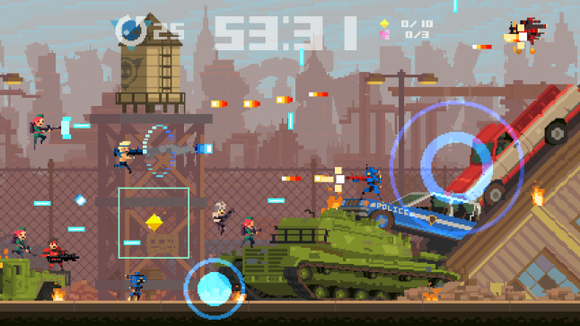
I would like to add another great example that was pointed out in Mark Brown’s short video about game feel: Super Time Force, by Capy Games.
Super Time Force’s strength lies in the abundance of visual effects used in the game. And the abundance of particles used in each system. A single screenshot from the game is enough to tell the tale: every gameplay related element moves. Any important element is animated. Any collision is an occasion to play satisfying visual effects.
Hopefully, this first overview of the concept of juicing gave you a sweet taste of it. It is now up to you to come up with your own way to extract it out of your own creations.
A last few note before we part ways: for one, you should always focus on your game’s foundations first and foremost. You won’t get good juice out of a tasteless fruit. But you should also know when to quit! Used in excess, juicing techniques will both waste your time and annoy your users.
I will leave you with my recipe of a good game’s smoothie:
Animate everything that matters.
Study from the juicing Masters.
And don’t neglect your audio.
This recipe should you follow, your game won’t feel hollow.
This tutorial was originally published on the GameAnalytics blog
Read more about:
Featured BlogsYou May Also Like