Trending
Opinion: How will Project 2025 impact game developers?
The Heritage Foundation's manifesto for the possible next administration could do great harm to many, including large portions of the game development community.

Featured Blog | This community-written post highlights the best of what the game industry has to offer. Read more like it on the Game Developer Blogs or learn how to Submit Your Own Blog Post
It feels like a miracle that in-between organizing a game jam and answering Unity questions for VR Hackathon participants, we were able to make an experimental and decently popular puzzle platformer. Here is the Hidden in Plain Sight post-mortem!

[Cross-posted from Omiya Games]
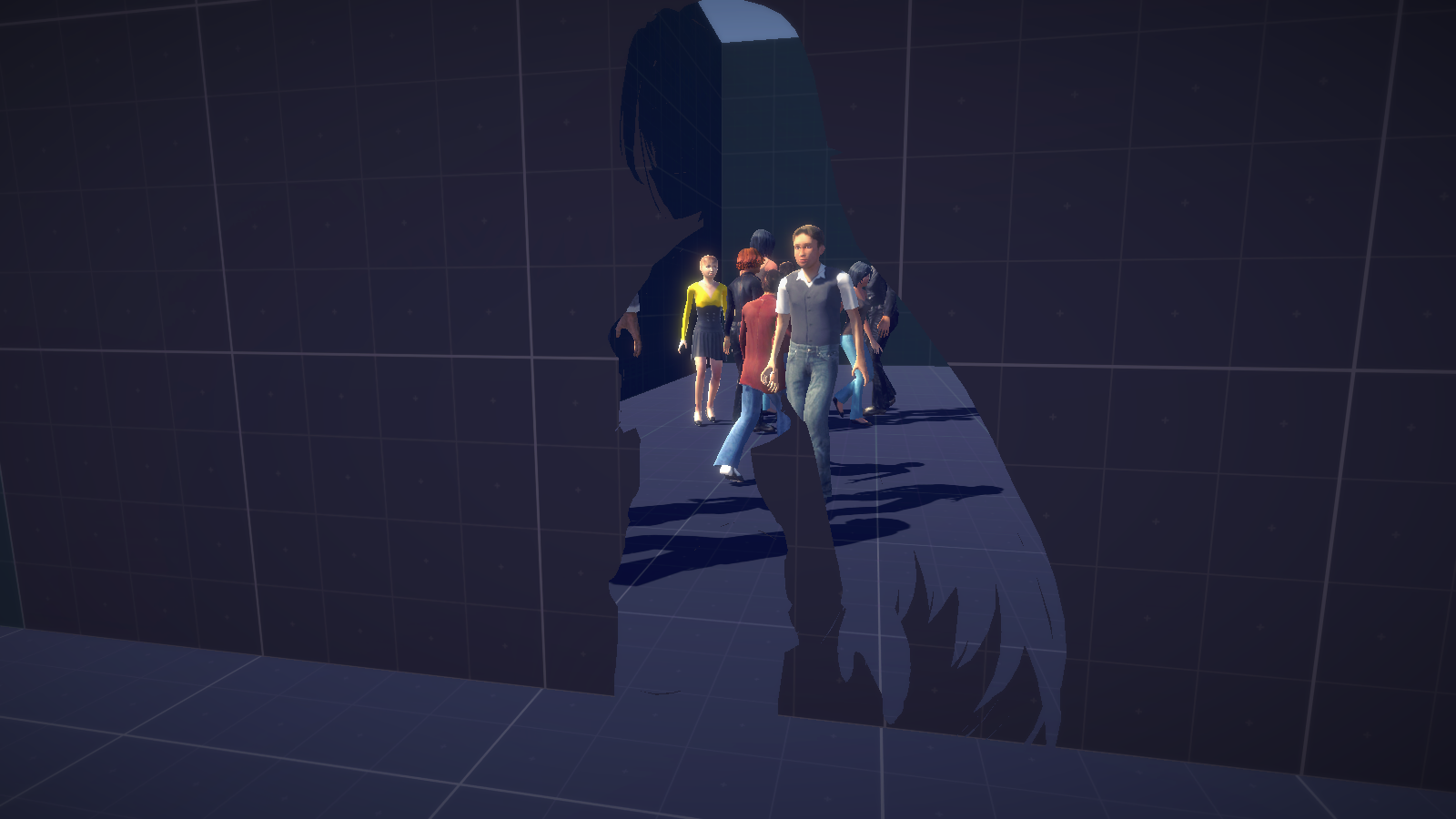
In-between making a game for Ludum Dare game jam, we were also responsible for organizing the Tech Valley Game Space Ludum Dare real-world meeting, and acting as a tutor for the Unity application in a VR Hackathon at Tech Valley Center of Gravity. While we have dealt with being an organizer and making a game at the same time in the past, it turns out being also a tutor for this jam proved to be a difficult task to juggle. Looking back, it feels like a miracle that a decently popular puzzle would come out of this hectic and stressful schedule. Here is the Hidden in Plain Sight post-mortem!
Hidden in Plain Sight is a 3D puzzle-platformer where the player character is, by default, invisible. Her silhouette, however, reveals an invisible dimension (similar to the Lens of Truth from the Legend of Zelda: Ocarina of Time) that she can interact with. Most puzzles rely on using the proper camera angles and character placement to simultaneously reveal the character, and navigate and/or use invisible elements in the game.
Perhaps unsurprisingly, Hidden in Plain Sight‘s visuals are strongly inspired by René Magritte’s paintings, such as La Grande Famille:

While the visuals themselves may be well-trodden ground for the art world, putting them into a game form created an innovative experience for many players, such as the Let’s Play posted above.
More surprisingly, putting together this “cut-out” visual effect was actually quite easy. The result is from a clever combination of using multiple cameras, render textures, and UI mask element, as revealed in this Twitch video: twitch.tv/japtar10101/v/63371555.
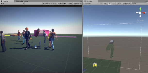
We did try to create a set of shaders for better performance, but quickly abandoned it when realizing we were neither knowledgeable nor quick enough to put it together in a short time frame.
During the second of the four-day development, we spent an ample amount of time experimenting with this visual effect. Those following our Twitter account may recall this animated GIF below:
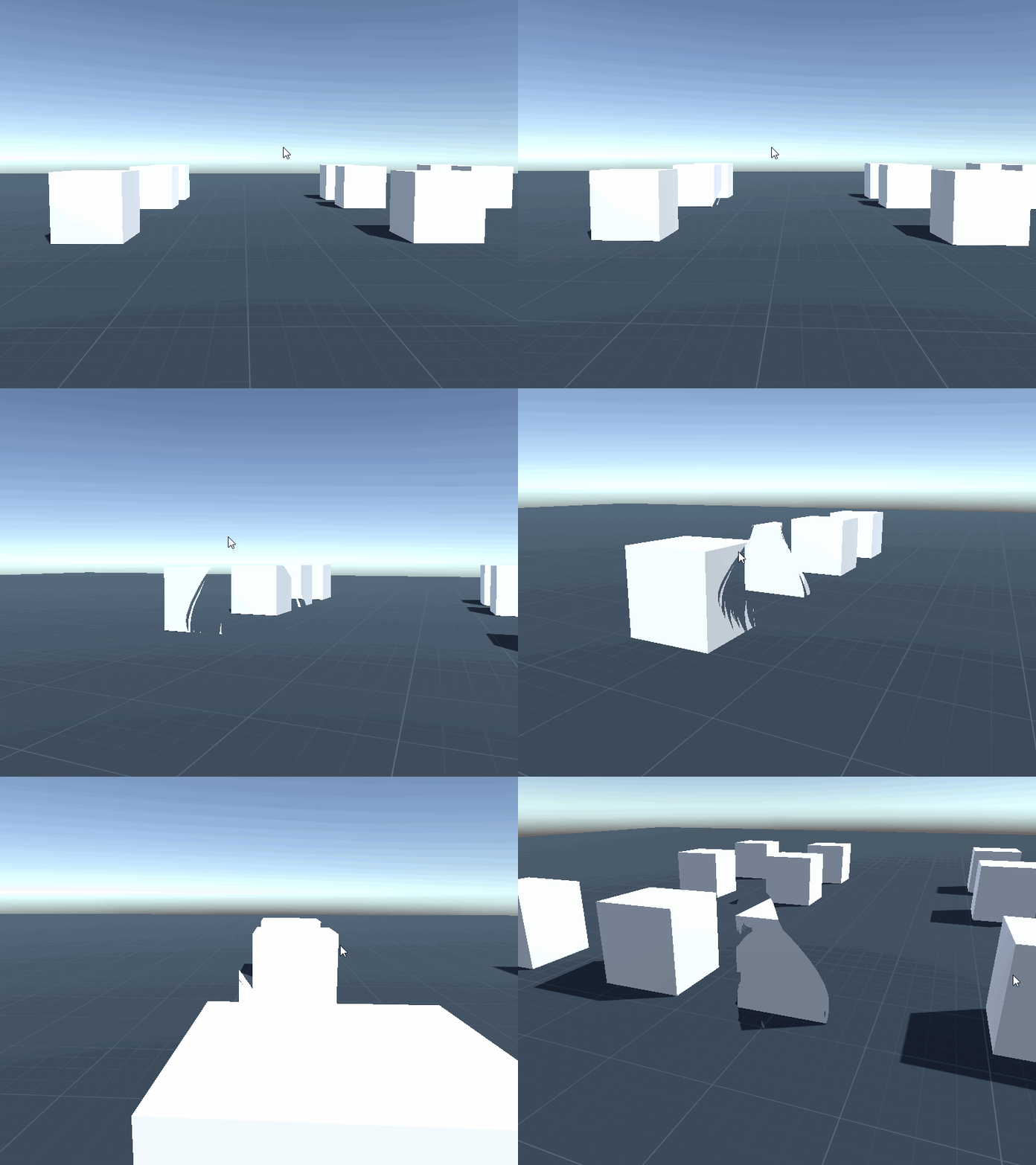
At this time, we discovered a number of important attributes with our game:
The most basic rule in the game, “only objects you see through your character can be interacted,” was actually not finalized until the third day of development. Originally, any object regardless of how it was made visible could be material…or not. After a lot of experimentation, we realized that we ourselves couldn’t figure out what was interactive, and what wasn’t. To fix this, we implemented the rule above to create a more consistent visual-to-interaction language.
We also experimented with creating other methods of figuring out where your character was, such as creating a small cloud wherever she stood. We removed those details, however, when one of our play-testers pointed out that not being able to know where your character is all the time felt like a vital aspect of the game’s experience. Instead, we made interactive objects large and obvious from a distance, especially if they’re invisible.
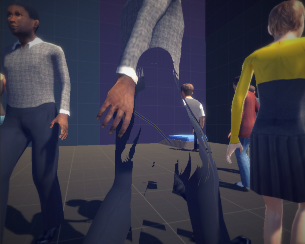
We wanted to make sure the effort of finding that one switch was as fair as possible, so on top of making them large, we added a line that connects them to the door they activate, allowing the player to trace back the switch’s place.
Having an invisible character poses a number of challenges that we had to work within. For example, we kept the platforming easy and to a minimum. Since your character is invisible in most locations, it’s difficult to gauge her position, and thus making the platforming difficult. Even with easy platforming, we went an extra mile to add mid-air controls that were missing in Unity’s Standard Asset 3rd-person controller script, so jumping would feel more natural.
Those who saw our time-lapse video may have found the introduction to it really strange: instead of showing our brainstorming or development process, it shows a bunch of slides on how to create Unity VR applications.
In fact, we had volunteered to teach how to make VR applications to a hackathon occurring at the same place and time as our game jam. Fortunately for everyone involved in both events, the organizers were able to manage ourselves to different rooms, minimizing any possible annoyances. Unfortunately for volunteers such as ourselves, some of our time were taken helping both events, even if we were also working on a submission for either events. In our case, this manifested in answering any Unity VR questions, including giving a presentation at the beginning of the second day of Ludum Dare. The time loss wouldn’t have been such a big issue if we’ve allocated our time and efforts accordingly. Sadly we did not. Instead we were hit with the dreaded…
By the third day of development, we started adding multiple different invisible characters.
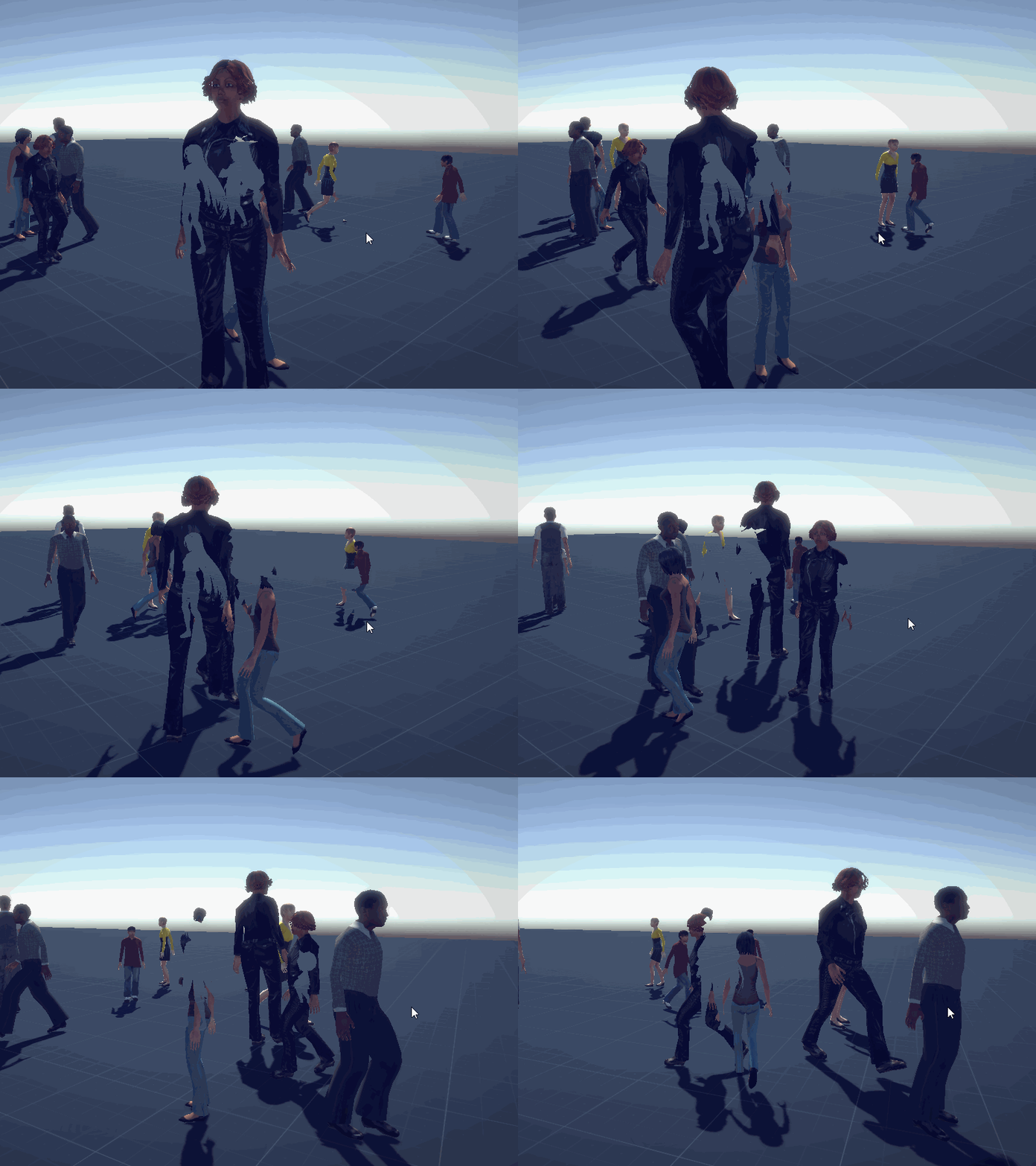
Originally, the game was meant to be about making human connections. In that sense, the non-interactive NPCs in the final game was a deliberate mechanic to emphasize how lonely your character is. To counteract this rather depressing fact, we tried to create Pikmin-like helpers that followed your character around. This feature, as with many other ideas such as switches that requires more than one person to hold down and an actual storyline had to be scrapped, despite a ton of time being spent on each of those features. This was easily the biggest time loss, and one we’re guilty of not-quite-learning.
Notice the weird off-color floor in the screenshot below? That’s the area the movable block can be moved around.
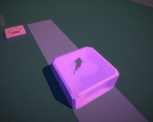
Practically no one understood that’s what the off-color floor stood for. For all the effort we’ve put into polishing the presentation and readability of the game, there are many places where we failed to portray what the visuals meant effectively. And that’s before we get into the (very few) platforming sections in the game. While the screenshot above provides a near-perfect solution to make it clear your character is walking on top of the block, we don’t use the same solution for the platforms themselves. Instead, the platforms in the final game looks exactly the same regardless of whether you’re looking through the character or not, resulting in this monstrosity:
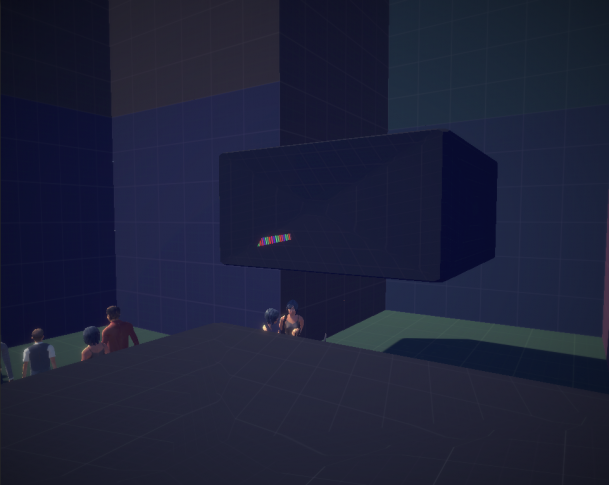
Due to all the feature creep, we’ve left level construction and audio polish to the very last day of development. This lead to a very short and unpolished game, such as blocks being pushed not necessarily playing the push sound effect, or the gap in the last level that makes the world beyond the walls in plain sight. Given how rushed the level design was, it sometimes surprises us when someone compliments how they liked the game.
As many people have notified us, there is already another game named Hidden in Plain Sight by Adam Spragg (note: it plays nothing like our game). Obviously, we should have researched the title properly before posting it on various web portals.
Like most game jammers, time wasted in things that does not show up in the final product has been our biggest stumble block. We definitely need to divide our volunteering time more smartly so it would not conflict with a game jam, or else we’ll leave more than one person disgruntled. We should also be quicker at abandoning time-consuming tasks, and design around the lack of that feature.
While our experimentation time is serving us well in identifying some issues early, it failed to find other problems that became more obvious once the levels were laid out. As such, we should allocate more play-testing sessions to find them more easily, especially after some of the levels are constructed.
Read more about:
Featured BlogsYou May Also Like