Trending
Opinion: How will Project 2025 impact game developers?
The Heritage Foundation's manifesto for the possible next administration could do great harm to many, including large portions of the game development community.

Featured Blog | This community-written post highlights the best of what the game industry has to offer. Read more like it on the Game Developer Blogs or learn how to Submit Your Own Blog Post
How the bunker building in Bunker Punks was changed dramatically and streamlined through regular playtesting and (brutally honest) feedback.

One of the biggest challenges in making Bunker Punks has been getting the bunker building aspect of the game working in a way that clicks with players. Something that they understand immediately, ideally without any tutorial.
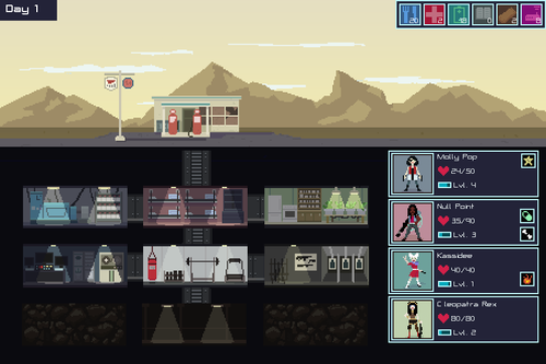
The initial version, was very much a simulation. Punks would heal in the bunker between battles, they would eat food and consume electricity. Other minor events could also trigger, causing illness and other effects.
Some bunker rooms affected the sim, while others affected the shooter side of the games. There was also an overwhelming SIX different resource types that needed to be collected while you were attacking the corporations.
It was complicated, very complicated, with systems overlapping with systems. The goal was to add depth and replayability to the FPS side of the game and this system was DEEP.
This is the version I took down to E3 earlier in the year. Needless to say, it was VERY overwhelming. Players loved the FPS part of Bunker Punks, but the bunker building wasn’t resonating with players.

It was simply too much. (Seriously, SIX resource types - what was I thinking?)
Version 2:
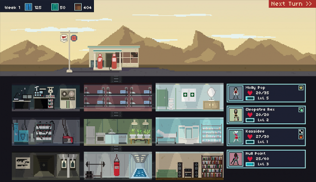
In the second version, punks would still heal, eat and level up in the bunker, but I had streamlined the economy down to only three resource types.
I didn't want to lose the depth and non-linear progression that the bunker building provided. I was also still in love with the idea of the bunker being a sim.
But it just didn't click.
Again, in playtesting, people were overwhelmed by the bunker building and many would simply click ‘next turn’ until a raid came up and they could play the FPS again.

It was like the bunker was this annoying pit stop on their way to the FPS party. The last thing I wanted the bunker to be was annoying.
Version 3:
This was probably the worst of all of the iterations. It was one of those ‘One step forward, two steps back.’ situations.
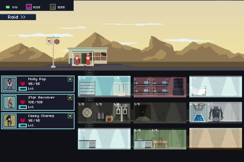
In this version, you would choose a team of punks to go on a raid, and between each level, you could choose a different punk to run. So if one was injured, another could take their place.
I wanted the player to choose different punks with intention, deciding which one would be best for each level of the corporate bunker they were attacking. Choosing your punks needs to be important and I thought that giving the player to choose a new punk between each level would drive that decision making.
I like to playtest at local indie meetups - drunk strangers can give brutally honest feedback simply through what they do and don’t do. Even if they don't say anything, you can read their actions and body language to tell when they are engaged and when they want to walk away and drink a beer.
When I took Version 3 out for playtesting it fell FLAT. Very flat.
It was the first time in the past year of playtesting that people were stopping before they died. Sometimes they'd stop between levels, when it was time to pick a new punk.
When players did make it to the bunker, they would look at the screen, look at me, smile awkwardly and say “Thanks, that was fun." It was painfully obvious that they weren't having fun.

Needless to say, the drive home that night was depressing. I had spent the last 6 months building, rebuilding and rebuilding again and I was making the game worse, instead of better.
It was time for an intervention.
I took the game to a friend of mine. One who works in the industry and who I know I can count on for honest and brutal feedback. She is also an experienced developer who knows a thing or two about UI design.
When she sat down with the game, she tore me a new one.
“Cut this!”
“Cut THAT!”
“What were you thinking?”
“Where am I supposed to look? What am I supposed to do?”
“It’s too much! WAY TOO MUCH!”
After I had received my lashes, I went home and stared at the ceiling for a bit (and by a bit, I mean ‘long into the night, with tears welling up in my eyes.’)
And out came the axe.
No more punks levelling up individually. The Bunker is now their tech tree. Keep the depth, remove the complication.
Two resources: One (Creds) used to build any and all rooms in your bunker and the other (Tech) used to unlock new things after your game is over.
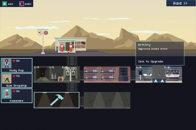
Less total bunker rooms, but they have more impact. Cutting down from nine rooms to five (the quarters in the middle of the top is permanent and can’t be modified), but each time you build a room or upgrade it, the effect is more noticeable.
Simplified punk profiles. They take up less screen real-estate and don’t distract the player from building the bunkers. Only show the player what they need to know.
More logical progression. Instead of starting off with four punks and nine rooms, you start a new campaign with ONE punk and ONE room to build. This lets players wrap their head around the new systems on their first game before the depth starts to appear.
Cleaner, bolder UI. The dark, dank empty bunkers were anything but inviting. Of course the players weren't going to click on them. Unbuilt bunkers now that a bright blue hammer screaming "BUILD ME!!" and when it's time to build an upgrade two bright blue arrows say "MAKE ME BETTER!"
I put all of these changes in (and more) and the bunker now looks like this:

I took this version to a party last week and it tested great. Nobody skipped the bunker. Most people didn’t even pause to wrap their head around it, the just clicked on the big blue hammer and built a room. Then they upgraded the room. Then they raided and built until they died.
And they died happy.
There was a fundamental shift in how people were playing the game: Players were looking forward to getting back to the bunker to level up their punks instead of skipping the bunker to get back to shooting.
The design of the bunker in Bunker Punks has been one of the biggest challenges I’ve faced. But I know now that I am on the right path.
There’s still a bunch of polish and work ahead of me, but the first coat of paint on the bunker building is finally down and it’s good.
Read more about:
Featured BlogsYou May Also Like