Trending
Opinion: How will Project 2025 impact game developers?
The Heritage Foundation's manifesto for the possible next administration could do great harm to many, including large portions of the game development community.

Featured Blog | This community-written post highlights the best of what the game industry has to offer. Read more like it on the Game Developer Blogs or learn how to Submit Your Own Blog Post
There is a pretty big jump between creating work for a 2D composition for a once-off design brief & creating work for virtual reality. This time your audience can literally engage with your work on a previously inconceivable level.

Hello! My name is Lucy, I’m a designer and resident coffee addict at Ultimerse. In this Dev blog I’ll be discussing the primary differences and similarities I’ve found, between designing and creating art for a 3D Virtual Reality gaming space versus my experiences designing and creating art in a 2D space. But first, some background info on me…
Prior to working in my role at Ultimerse and on Paperville Panic, I completed a diploma and then a degree at two respective art schools (RMIT and Melbourne Polytechnic) and then launched into a year-and-a-bit long venture into the big, wide world of freelance graphic design and illustration. During this time I drank a disgusting amount of instant coffee and produced work for some pretty cool clients.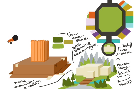 Needless to say there is a pretty big jump between creating work for a 2D composition for a once-off design brief and creating work for an on-going 3D product, let alone one for virtual reality. Everything from team structure, to workflow, to the actual skillset you apply to your work changes. You’re still creating art for a brief, but this time your audience can literally engage with your work on a previously inconceivable level. Which leads us nicely into our first point…
The Cube Has Six Sides
When designing for 2D space, you create your composition thumbnails based on the subconscious idea that your viewer will only engage with your work from one angle, that angle being what the viewer sees in front of them. Sure, as 2D designers you can play with this concept to create some truly interesting viewpoints that distort your audience’s perception of what they are seeing, but ultimately your viewer engages with what is directly in front of them. In VR this completely changes - whatever you design will be viewed from all angles, both flattering and otherwise.
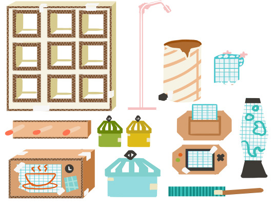
To address this, when concepting you must think of all the different ways the object/building/etc. you’re designing will be viewed and how it will look to someone engaging with it. Will the object look ugly from one side? Will the object have a hidden meaning/joke/reference/etc. on one angle, but not another? How will viewing this object from one angle affect your player’s gameplay experience? The cube has six sides now… well, it always did, but now all six of those sides are visible.
Art Team ASSEMBLE!
Freelance workers are an odd breed, you go from working in your home office in isolation, wearing PJ pants and not having brushed your hair for a day (or maybe that was just me?) to working at a desk in a large, multi-storey building with board meetings, working along a team of professionals wearing the best of Target’s office workwear range. During this time as a freelancer bouncing from job to job, while you do bond with the art teams to an extent, it’s often done through email, Skype, and random in-person meetings with 10 other strangers.
When it’s time to hand over your work it’s emailed or drop-boxed to someone you may not have ever really talked to in-person, and before you know it, you’re on your way to the next job. While feedback is given on your work and you implement it, if your work is hand-passed onto another creative after you have completed it, you rarely get to engage with them. It’s a very cut and dry process.
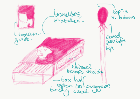
It goes without saying that this completely went out the window once I began designing for Ultimerse. Previously, in my experience as a freelance creative, designing and creating - while sitting next to the person who would put their spin on the work I’d concepted - just didn’t exist.
When designing 2D work, in most cases, you see it through from conception to the very end product. As my skills are 2D based and I’m privileged enough to work closely with a great 3D team (Justine @jdinutella and Angie @ilpickle), the work is concepted in the 2D space and then has to be sent to the 3D team to create in a 3D space.
This means that the concepted work must be able to communicate to a second creative person, working in a different art dimension: what it’s role is, how it works, and what it looks like. In theory this is very simple, in practice it can be difficult. A 3D artist needs to know these three pieces of design communication in order to not only realise the design, but also so they can inject their own artistry into the design. The design will take on a life of it’s own birthed out of the creativity of the art team, so it is vital when working in the 2D space with the initial concept design that it is clear in its intended purpose. Things will change person-to-person, but the core of the design must remain strong from beginning to end.
Colouring Book: Hard Mode, Textures.
In illustration, frequent discussion is had about process. Thumbnails are drafted and pitched, pencilled work is produced and approved, the work is inked by either traditional or digital means, and finally, the work is coloured to completion. This process changes when working in a 3D space. Individual objects/etc. are concepted and this conception can happen in a variety of ways from sketchbook scribbles to rendered art to rough 3D sculptures. Once this concept is approved, the 3D team steps in, creates a final model all the while putting their own spin on the design, and finally, the work often travels back to myself for texturing.
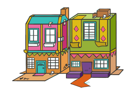
Personally, I like to liken the texturing phase of creating for 3D to the ‘colouring’ 2D design phase. And as any colourist will tell you, it’s about more than just colouring in-between the lines. Unlike colouring in a 2D space your final texture design has to look equally good up-close as it does far away. Your audience (if our playtests are anything to go by) will attempt to engage with the final product in almost every way imaginable, so consistency in the texturing is vital. Texturing is also what ties your design all together - it’s what determines how an object is constructed and how the player perceives it to be. A model of a truck can dream big and become a moving van or a top-secret FBI mobile spy facility or anything else you want it to be, simply with a new texture.
Much like designing objects for a 3D perspective, while textures are created in a 2D space, the designer must think of how each texture will be viewed from each angle of the object and how that viewpoint communicates the object’s purpose to an audience. Are the textures dirtier on one side because of wear and tear? Does this texture have to have a vital, semi-hidden piece of information/a joke/reference/etc. for the player on one side of it? What does this object’s texture communicate to our player about the world it inhabits? Textures, when added to their respective 3D models communicate so much about the world they live in to the player.
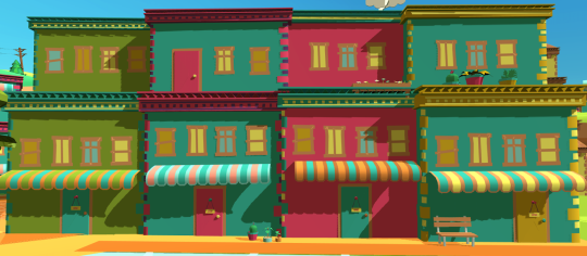
In Paperville Panic textures play an especially important role, our world is arts, crafts, and paper, and a good paper texture is what communicates this to our player. Paper, surprisingly, isn’t flat colour, and when treated as such doesn’t fit the brief, so by using repeat patterns, certain colours, and photoshop effects we can create a paper texture that communicates effectively to our player that they are engaging with a crafty paper world.
2D and 3D design have as many similarities as they do differences. My experiences as a 2D freelancer informed how I shapeshifted into my role as a game designer at Ultimerse, and I’m hoping that for any artists, designers or illustrators this was helpful!
Remember in times of creative doubt, put the kettle on and try again in five minutes and ask yourself what your work is communicating, you’ll feel re-focused. Plus you’ll have a delicious hot beverage in your favourite mug!
I’ll be updating here from time-to-time with the rest of the Ultimerse team so be on the lookout for more of our blogs! But if you’d like to see what I’m up to in-between blog posts, please follow me on twitter @LucyCrimefightr.
I look forward to chatting to you all more, but in the meantime, happy creating!
Read more about:
Featured BlogsYou May Also Like