Trending
Opinion: How will Project 2025 impact game developers?
The Heritage Foundation's manifesto for the possible next administration could do great harm to many, including large portions of the game development community.

Featured Blog | This community-written post highlights the best of what the game industry has to offer. Read more like it on the Game Developer Blogs or learn how to Submit Your Own Blog Post
We spent three years making a ten-hour-long game, but we learned that the first 30 seconds is the most crucial part.

(This blog was originally written by our animator, Ian Gibson, on our website at www.skytyrannosaur.com.)

It took an absurd amount of time that we kept grossly and habitually underestimating, but last February Blowfish Meets Meteor finally hit the App Store to much rejoicing. Almost three years' worth of work finally came to fruition, though in our defence for the vast majority of that time we were only working part-time on it. Still, though, considering the average game on the App Store takes no longer than a few months, we clearly couldn't only blame our part-time work schedule nor our lack of experience. We could, however, blame something else: by mobile game standards, Blowfish Meets Meteor was enormous. Maybe too enormous in hindsight (see our postmortem article on Gamasutra where we look back and reflects on what we did wrong and what we did right).
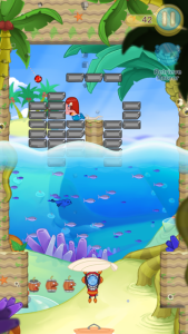 Stage 1 of BMM. Objective: Destroy blocks to save your mermaid daughter.
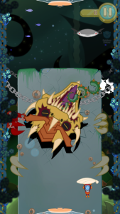 Stage 57 of BMM. Objective: Destroy a giant dragon's head that spins around regurgitating projectiles in all directions while simultaneously having to control a robotic stingray at the top of the screen.
Most mobile games are churned out at such astonishingly fast rates because they have this tendency to have very little unique content and are just an ephemeral experience put on loop. In essence, the rule of thumb is that after playing a game for 30 seconds you've actually played the game in its entirety -- there will be nothing new to it after that. The only motivation is to grind to achieve higher scores. But what we thought was something that would help Blowfish Meets Meteor stand out proved to be a curse in a way -- many people played only the rather simplistic, tutorial-based first level and put it down because they assumed this was a reflection of the entire game. What this means is that 95% of the work we put into it was being hidden behind a false wall, built on preconceptions that (perhaps justifiably) are now inextricable from the mobile game market. It didn't matter that after many levels into this ostensibly basic block-breaker you'd be solving complex puzzles, firing torpedoes at whales, rushing to destroy a crystalline shield encasing a giant heart, playing a classic game of Pong with a robotic stingray, and destroying a massive creature at the depths of the ocean that assaults you in various incarnations. In the end, what most players saw was one or two of the earliest levels where all you do is hit the ball around to break a few bricks. And that was all the time we were afforded to either get a player hooked or turn them away. 30 seconds. BMM has over 10 hours' worth of unique content, but what we discovered is that it's the first 30 seconds that are the most crucial.
 Early concept sketch for Blowfish Burst.
That became our most pressing concern as a game developer -- how could we banish these preconceptions that our game was more than just a small experience on repeat? It continues to be something we wrestle with, and our second game, Blowfish Burst, started out as a reaction to that, taking the lessons we learnt with BMM about the mobile game market.
We had been wanting to do a platformer for a while, but interestingly in its earlier stages Blowfish Burst was quite a different beast from what it is now. It was originally in part an endless runner in the vein of titles like Jetpack Joyride, yet somewhat hybridised between that and a standard platformer. It had three distinct worlds (whereas endless runners tend to only have one) and even boss fights. How that worked is that after having achieved a high enough score to unlock the next world, players were given a choice in the midst of gameplay to either remain in their current world to achieve higher scores, or advance to the next world.
 Blowfish in a gumball machine. An idea for the character select screen that we ended up scrapping, though it's delightfully random (and looks tasty).
We were pretty far along with it, but the more we played through it the more we realised we were making a game that wasn't our cup of tea. As an endless runner it was quite good, but we couldn't escape the fact that we were going through so much painstaking effort to justify making one by throwing in all these elements of a more traditional platformer with a distinctive beginning and end. We were basically hinting to ourselves all along that a classic platformer was precisely what we should do next. Fortunately, so much of the art and even a fair amount of the level design could be repurposed for it, so we were hardly in a position where we had to start from scratch, though it did mean ultimately we were in it for a longer haul than we had initially anticipated (not that that's an outcome we're altogether unfamiliar with). But at the very least we have been extremely satisfied with the result, and I'm not sure we would have been able to say the same had we stuck with the hybrid endless runner route.
The title might have already clued you in, but Blowfish Burst is indeed set in the same universe as Blowfish Meets Meteor. The reasoning behind making a spiritual sequel is that we wanted to use it to further promote BMM and establish a bit of a flagship identity as a developer before moving on to completely different ideas (as tempting as that has been for the both of us -- a certain combat-oriented platformer featuring a katana-wielding mongoose immediately comes to mind). Also, though as a published title Blowfish Burst is a sequel, it technically predates BMM as a basic Flash game that was titled Blowfish Relay. Despite its admittedly crude pixellated graphics, many of the obstacles and gameplay mechanics would make their way into its final form.
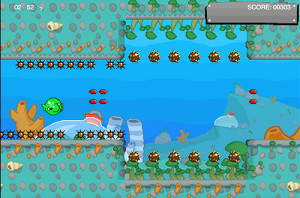 A screenshot from the Flash game Blowfish Relay. Despite its 8-bit graphics the similarities to its new and improved version, Blowfish Burst, are obvious.
For those who have played BMM, you'll undoubtedly come across many familiar things in Blowfish Burst, but I'd say that the setting, characters, and general penchant for bizarreness are the only things they have in common. The former was an adventure block-breaker where you played as a deep sea diver rescuing your (rather extensive) family from a malevolent presence lurking at the bottom of the ocean. In it the titular blowfish only played a minor albeit highly symbolic role -- the player would intentionally pop them with a bouncing meteorite to collect the power-up eggs they would drop. But the second instalment is a side-scrolling platformer where the perspective has turned topsy-turvy, and now the world is seen through the eyes of the blowfish who want only to protect their roe from the divers who steal them for power-ups.
Even putting aside whatever implications of moral relativism this may have, I found this to be an interesting approach because it meant that even though we'd be revisiting familiar characters they would be reinterpreted through a new light. Suddenly the heroic divers were cast as more dastardly. The cute mermaid daughters were now angsty and wielded large pins to pop the poor, unsuspecting blowfish. In a more general sense, the characters were departing from their soft, unimposing rounded shapes and becoming a tad more angular. All in all this made the character design stage considerably more fun.
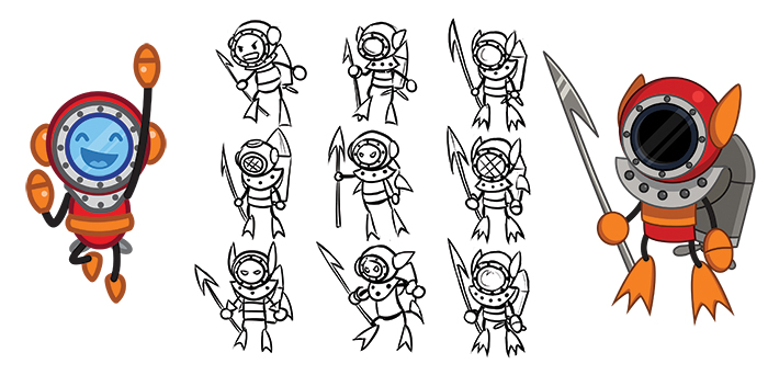 The re-design of the Diver.
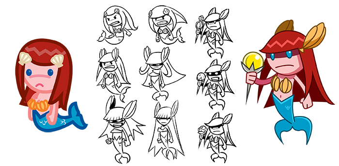 The re-design of the Mermaid.
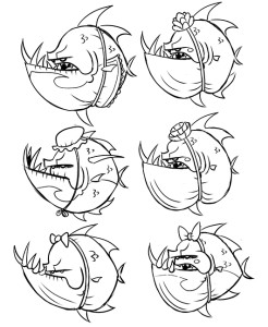 Sketches for the Mama Piranha.
Next up was the environment. I mentioned in the previous post that in contrast to the previous game where I handled all of the art, for Blowfish Burst we recruited another artist, Gene Lange, to create the backgrounds. It was a good move, not only because it took a burden off my shoulders so I could concentrate on the other graphics, but also because his backgrounds were rich and vibrant with scrupulous attention to detail, and I think he does a much better job at conveying its underwater setting. But before we recruited him, I was charged with the backgrounds and whipped up a few conceptual thumbnails which I thought might be worth sharing, especially so you can see how they differ from the final designs despite us having worked with the same descriptions and themes.
 Concept art for World 1.
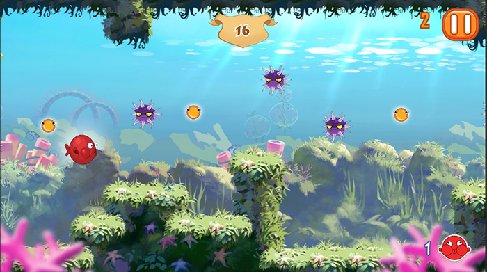 In-game screenshot of World 1.
 Concept art for World 2.
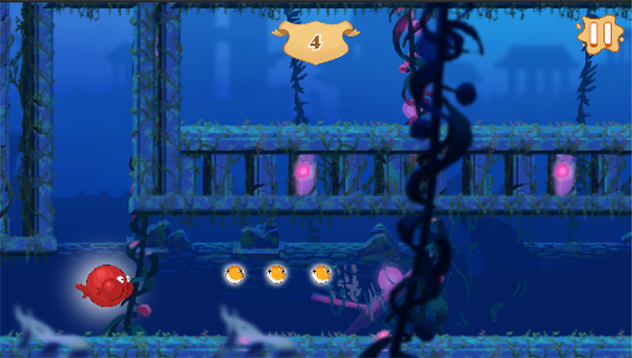 In-game screenshot of World 2.
 Concept art for World 3.
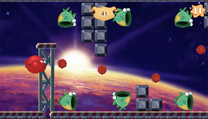 In-game screenshot of World 3.
It's interesting to look back on these and wonder how different Blowfish Burst would have felt had we stuck with the initial backgrounds, and it lends further credence to the fact that a game's art remains an essential aspect that many developers sadly overlook.
...But I'm glad some don't. Because that's where I come in!

Pop goes the penguin.
- Ian
(If you want to be kept abreast of our shenanigans be sure to follow us on Facebook and Twitter!)
Read more about:
Featured BlogsYou May Also Like