Trending
Opinion: How will Project 2025 impact game developers?
The Heritage Foundation's manifesto for the possible next administration could do great harm to many, including large portions of the game development community.

Featured Blog | This community-written post highlights the best of what the game industry has to offer. Read more like it on the Game Developer Blogs or learn how to Submit Your Own Blog Post
With the graphical arms race in games it is worth asking why you might not want more detail and higher res graphics.

I feel like there is this assumption that more detailed/high fidelity visuals are better for video games. That high res, rich with detail, is the gold standard that games should strive for and that low res visuals (blocky, pixally...) are just making the best out of limited resources. I don't just mean in a visual sense, but also in a gameplay mechanics sense, I get the feeling that people think game mechanics would, by and large, be better served by more concrete and high resolution visuals.
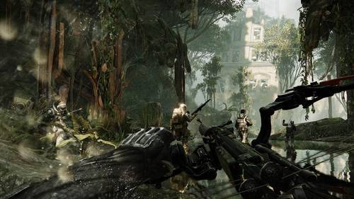
These visuals are amazing, I won't deny that. The question that needs to be asked though is how these visuals, and the game's level of graphical detail, effect the game as a whole.
This is a position reinforced by the constant drum beat of press releases touting better graphics and more polygons, all of which is amazing, but is losing sight of the fact that these are all tools and not the goal. So, lets talk about what the advantages of not using these amazing tools are, because more is something that is restrictive and costly in it's own way.
Resident Evil 6 is a game with a lot of graphics, it has them all over the place.
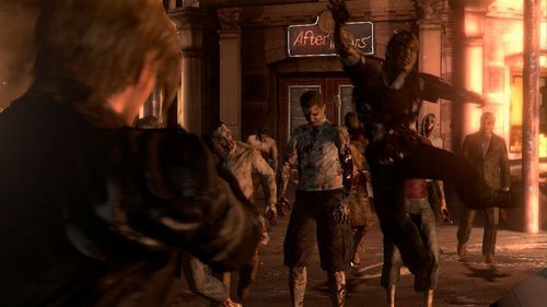
Look at all those graphics, filling up the ENTIRE screen with detail (and brown).
It is also a game that suffers from what I'm going to start calling the Chair Problem. When wandering around in the real world (as some people are want to do) you can interact with a chair in lots of ways; you can sit in them, move them, lean on them, throw them, all sorts of things. The Chair Problem is that in RE6 you can't interact with chairs in these ways in spite of how well rendered they are. They act like tiny annoying walls, ones that you feel like you should be able to move around easily enough except Leon treats them as though they were bolted to the ground. The realism with which the object is rendered contrasts harshly with how you can actually interact with the object in game. It looks like a really realistic and detailed chair, but it doesn't act like it.
This goes for a whole mess of other things: small mounds of rubble that any normal person would be able to walk over block Leon's path forcing him into more zombies, easily scalable walls need to be gone around, locked doors with great big holes next to them still need keys. This discrepancy between what the player can do and what they expect to be able to do given the realism and detail with which these objects are rendered only draws attention to the gamic nature of these elements. Paradoxically, the fact that these things are made more realistic/detailed ends up making the game less immersive due to this contrast.
The burden of realistic visuals is that people expect to be able to interact with the game's realistic world in a realistic sense. They expect to be able to push that chair out of the way, they expect to be able to open every drawer, they expect to be able to go interact with objects as though they actually were that object. Even if the game has fantastical elements like super strength the realism of the visuals means that they expect to be able to use those fantastical elements in realistic ways, to be able to destroy walls in their way and be able to throw everything they see really far because that sounds fun.
All these games can't really let players do things like that though, not just because of how hard it would be to program but because how much that would screw with the game's progression. As such realistic games have to come up with a reason for every window they include (because it would be normal for a window to be there) why the player can't jump through that window. The character is afraid of heights, the character can't swim, the character really doesn't want to leave the city limits because they love this city so much. A large discrepancy between how realistic a game's mechanics are and how realistic the game's visuals are can be immersion breaking, rendering mute the effort the graphics team put forth making such a visually realistic world.
Now look at a game like VVVVVV which has barely any graphics.
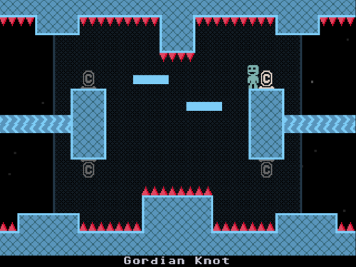
RE6 probably has more detail in a single texture then exists in this entire game yet it, not RE6, is the essay's positive example.
Unlike RE6 you have no idea what real world version of the objects in this game would look like, everything is a block and the player doesn't even get running animations. Also unlike RE6 it is amazingly easy to understand how the player can interact with anything on the screen. In RE6 you would walk up to something and sometimes it would let you interact with the object but you wouldn't know until you got within punching distance, but in VVVVVV when you see something you instantly know the kinds of interactions you can have with it.
Every Frame a Painting is about film (and I love it), in one of its episodes it talks about Satoshi Kon's editing techniques. One time he was asked if he wanted to direct live action films and he said he wouldn't want to because his editing technique is to fast for live action. In animation he could include less information in shot which meant that the viewer could understand what is going on in it faster and so he could have quicker shots and cut much faster then he would be able to in live action. By making it so that there is less information for the viewer to parse, by cutting out extraneous or unhelpful information, he could speed up how quickly people could process what he wanted to show them.
I've been critical of games that want to be movies but this is a perfect example of something we should take from movies. In games how quickly the player can process information is incredibly important because they don't just have to be able to understand what is going on but be able to react to what is going on. Having a lot of incredibly detailed textures and high poly models may look nice but every detail is another bit of information the player has to parse before reacting.
The more information you throw in front of that player the longer it will take them to be able to react just because you are giving them more information to parse through. VVVVVV can ask more of its players faster because it visually strips away all distractions and focuses solely on information the player will need to be able to solve its puzzles. This is not the only way to increase clarity, but it is a powerful one. Game's often can't add enough explosions but we need to ask ourselves, with every explosion we are adding or yet another number that flashes on the screen for a moment or two, "Will the player be able to understand what is going on?"
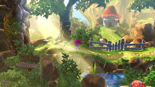
This is Giana Sisters: Twisted Dreams which is a good 2D platformer set in a 3D world. 2D/3D games like this typically have a problem where it is hard to tell which objects are in your way and which ones are in the background/foreground. This is a problem that exists solely because of the addition of visual clutter.
Minecraft was a game that was originally made by 1 person on a shoe string budget, and its visual style is certainly reminiscent of this past. It is a game that uses and relies on many real world concepts in order to skip a great deal of tutorials: gravity, movement, even crafting feels intuitive because you make things out of roughly what they are made out of (or at least what you feel like they would be made out of) in the real world. But the game's mechanics can't support a great deal of detailed realism because the specifics of how you do these things in our world don't translate well into the specifics of how you do these things in the Minecraft world. For example: you punch trees to get wood, when you break an object is becomes a compact version of itself, you can carry around a mountain in your pocket...
Minecraft visuals are just detailed/realistic enough that people can visualize what is going on and get that they can use some amount of their real world knowledge in order to understand how things work in this game's world, but just abstract enough in order to let people gloss over the strange specifics of how everything works. So long as it is vague (via low levels of detail, blocky characters and animations) we can get on board with punching trees for wood, but if the game gets to specific about it, visually, then the game loses us. The level of visual abstraction in Minecraft roughly matches the abstraction of the game's mechanics and adding a greater level of detail or graphical fidelity might make the gamic elements of the game more obvious and immersion breaking.
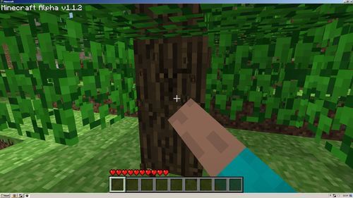
While the game's visuals are abstract we can say to our selves "I'm not literally punching a tree for wood or digging a hole by punching, this is representative" but when the game's visuals are rendering that punching of the tree with perfect models, textures, and animations it becomes harder for the mind to accept that what is going on is representative and not literal.
I could write another essay talking about all the benefits of super detailed/realistic/high res graphics, but I probably won't because I feel like that point has been implicitly made by every game with a hundred million dollar graphics budget. What I'm trying to say is that a game's visuals and its mechanics aren't completely separate spheres that don't overlap. hey need to compliment each other in order to get the player in the right mood and mind set, and to be able to convey all the information the player needs in a form they can process in the amount of time the game expects them to do so, so that they can enjoy the game. Higher res and more detailed models/textures are useful tools to that end, but they come with their own price and sometimes that price isn't what is the best interest of the game/player.
Making a good game isn't just about adding on as much as you can without breaking the game's back, having more can be in its own way just as limiting as having less. When thinking about game design be sure to ask not just how much you can get away with, but how little do you actually need? You don't necessarily want as little as you can get away with, but you should understand at what point you are adding clutter to the game.
When we talk about the various aspects of a game we tend to talk about them in isolation of each other: how does this game's mechanics work, how visually appealing are the graphics, how nice is the sound design, how well written is the dialog? But what this fails to address is that a game isn't the mechanics or the story or the graphics, it is all of these things combined. Roast beef might be tasty and so is ice cream, that doesn't mean a meal that is just roast beef and ice cream is a good meal. It isn't just about having really good parts, but about how those parts complement each other and add to the whole.
Does that make sense?
Read more about:
Featured BlogsYou May Also Like