Trending
Opinion: How will Project 2025 impact game developers?
The Heritage Foundation's manifesto for the possible next administration could do great harm to many, including large portions of the game development community.
Silent Hill character designer and CG artist Takayoshi Sato examines the art of creating believable computer-generated characters in this in-depth feature, originally created for Game Developer magazine.

[Silent Hill character designer, Fatale contributor and CG artist Takayoshi Sato, currently art director at Virtual Heroes, examines the art of creating emotionally involving computer-generated characters in this in-depth feature, originally published in Game Developer magazine.]
Technology has greatly improved since the first 3D consoles appeared. Back then, as the more veteran artists may recall, one building was less than 50 triangles, and a character was less than 500. The standard for a texture was 16 colors at 128 X 128 resolution. It was extremely challenging to render anything organic. We needed to work within severe limitations, and players had to accept pixelated textures all over the place.
Now we've got higher console and PC specs, and the luxury of technologies such as normal, height, and specular maps, ambient occlusion, sub surface scattering, and lots of real-time rendering features that can compete with software rendering.
I recall around 2005, close to the release of the Xbox 360, we started hearing about the Uncanny Valley, and the term has only gained traction since then. This means despite the fact that rendering quality has improved tremendously and characters are rendered with high detail, they still lack emotion, and our extremely detailed models are acting like marionettes. The better rendered the model is, the weirder it tends to look.
3D scanning and motion capture cannot be completely trusted either. Motion capture has its own odd look, and 3D scanned heads often don't look anything like the original person.
Partially this is because some sort of distortion occurs in the process, but more than that, we don't get the feeling of a person from that frozen still head, like we do not get that feeling of humanity by looking at decapitated head separate from its body.
Once I was involved with a very complex experimental scanning process, scanning a 3D shape at 60 frames per second, while recording texture and voice at the same time. It should have captured all human essence in one shot. It should have looked very lively. But it did not.
These soulless models playing out actions before us leave us with an empty feeling. Characters need to be emotionally engaging, touching, and must dominate the scenes they're in with their presence.
This cannot be done with any type of recording. Character creation spans several areas outside of the character department (in a typical game production) -- in other words, a solid character cannot be established without many disciplines working together as a team, managed by a strong vision. It needs to be elaborately planned, because creating attractive characters is essentially the same as creating good scenes or stories.
In this article I will try to break down the most important elements involved in the creation of an emotionally involving character.
A good story consists of several key moments connected together, and characters exist as a vehicle with which to navigate these key moments. So the first thing to do is create and understand your key moments.
There are two prominent shots that we need to pay extra attention to in regard to character. The first is the introduction shot. This is literally an introduction to the character, and provides a first impression for players.
Second is the reaction shot, focusing on a character after a given important event happens. It shows the character's face, telling the audience what kind of incident it was for the character, which helps to define their position within the story. Usually in linear media the scene ends with this reaction shot, and it remains in the audience's mind as a major story impression, whether they are conscious of it or not.
You cannot really do anything without understanding and determining the mood. A simple character description is just not good enough. A figure could look totally different depending on the mood surrounding it.
For instance, a smile that looks like a horrifying grin in Rembrandt lighting might appear innocent with a Renoir lighting scheme. Or if the subject is a monster, with a Brueghel-like background it may look like a legendary story, but would appear to be more of a surreal fantasy in Odilon Redon's style.
Core elements such as story, theme, and philosophical message determine the mood of the target scene. On a more subliminal, but no less important level, lighting and composition are main contributors that define this mood visually. Characters can look totally different under different a lighting scheme, lens, or scene composition.
Important shots need to be designed with those elements in mind, especially in cut scenes or establishing/reaction shots. Ultimately we are aiming for that perfect shot, and character development ideally starts with the scene test bed with the lighting and camera prepared.
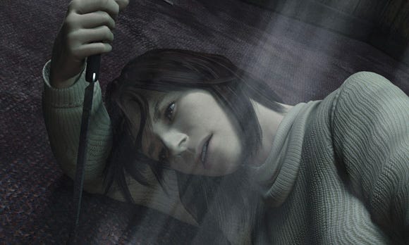
Figure 1: Angela from Silent Hill 2.
In the image of Angela from Silent Hill 2 (see Figure 1) there is not much obvious facial expression or any emotional depiction on the character, but you can tell by the subtle things like lighting and the camera setting that there is enough room behind her for somebody to attack, and there is someone (the player in this case) in the scene -- and she knows, but does not care much.
There is very stable screen construction following her bodylines, yet the banked camera conveys a somewhat unstable moment. She seems to be indulging in her own moment defenselessly. Her eyes tell us there is nothing important in the direction she is looking other than the knife, but her eyes don't focus on it. This image is giving us a lot of information without using the typically overt emotional tools seen in games.
In early game development, pre-production art tends to start with various designs for vehicles, space ships, battle suits, and things of that nature. People tend not to be satisfied or confident with those early designs, and pre-production often gets excessive.
In regard to character, combat suits and the like are the industry's favorite theme, and they're put through hundreds of designs as though product sales depended entirely on that. But how much of that pre-production time is spent on what's inside?
In approved concept art, usually we see fantastic costumes, accessories, and cool tattoos. But the drawing of the human itself often remains a stereotypical archetype. This is understandable because first, the characters' actual roles in games tend to be stereotypical, and second, it's not usually the concept artist's job to delineate the nuance of the human inside the combat armor.
Unless you have live casting, nobody really knows who the character is until a production artist starts modeling. With this kind of setup, there isn't much of a chance to find out the bare attraction of these characters.
Only a character with soul is capable of telling a good story, or delivering a message. Without real characters, the whole product winds up being an empty killing experience (although that is often all the game calls for). Establishing the character inside the suit is essential if you want to create products that have a lasting effect on players, and on history.
Concept art is full of visual language -- not only costume designs like helmets, mantles, jet-packs, artificial muscles and jewelry, but also scars, tattoos, pimples, and even a five o'clock shadow. This is all common language to provoke familiar ideas.
But organic objects are very complex, and especially when looking at human beings, our minds are capable of differentiating a lot more than simple visual language. The pointy ears and hairstyle of Dr. Spock from Star Trek are visual language tropes. That's very good costume design, and everybody remembers it. But that does not mean anybody can play his role as long as the body type is similar.
Leonard Nimoy (from the original TV series) and Zachary Quinto (from the new Star Trek movie) are human beings, and our brains are capable of reading more information than just those visual language identifiers. On the surface, it's easy to tell them apart with a few words. But it's very challenging to describe the specific face shape or nuance that makes up Leonard Nimoy or Zachary Quinto's Dr. Spock (see Figure 2). It would probably require a great author to describe it in words.

Figure 2: Here are photos in which all obvious visual language has been hidden. Makeup is another example of visual language. For instance, almost every one of Marilyn Monroe's facial features has become iconic.
Likewise, it requires a great artist to describe in art. What makes a human character human is those non-visual language elements. Typical game productions don't pay much attention to that.
If a particular game requires that players slaughter a bunch of enemies, there needs to be a reason. For example, the main character hates aliens because he saw them kill his parents. That is enough motivation to inspire the player to kill. In order to make it a proper story though, it needs one more step.
For example, the player killed countless aliens in order to take revenge for his parents. However, he discovered the aliens have a good side, through a relationship with a particular alien that changed his views. The alien became his close friend. Regular video games have this level of story at best.
In order for the audience/players to really feel emotionally involved with the story, we need to go one step deeper. For example, the main character wants to say he hates aliens, because it helps him stand out among those who favor them. In truth, he's not really sure whether he hates them.
One thing he is certain of is that it cheers him up when he gets attention from everybody after killing aliens, and he can play the big outlaw. He likes it. It makes it easier for him to get girls. He gets excited when he tells people his parents' sad story. That extreme delight comes to the surface, and a subtle smirk crosses his cheek.
And because he tries to prevent the expression from surfacing, an odd strain appears on his face, making a nice agonizing effect. He is not always happy. He is worried that he may have to continue being this way for the rest of his life. He is tired from pretending to be someone that he is not. Deep inside, he's actually scared when he looks down the sights at an alien.
Then, a strange alien appears in front of him. It acts differently, getting attention with a divine messiah-like quality. Our hero realizes it's a good time to change his character back to who he really is. This way he can return to being a regular person without having to expose his doubts. He has saved his pride and lived happily after. This is character development. We need to understand the inner character beneath his surface persona.
Finding flaws in your characters can bring them away from a false perfection, and creates great intimacy. Asymmetry is the typical method. The human face is not symmetrical -- making the eyebrows unbalanced, or making one cheek sag compared to the other side, or even adding a distortion of the entire skull -- these little things bring surprising intimacy.
Little pores opening on the tip of a pretty woman's nose, a belt of fat that appears under the jaw line when a person looks down, or a belt of fat over her pants line when she leans over, these things add some idea of who the character is.
Yellow stained teeth? One tooth missing? One cauliflowered boxer's ear? That's the typical method of adding imperfections in games, but really it's just simplistic visual language. Certainly it helps describe the role, but it does nothing to add real character depth.
These sorts of tropes come from just lazily adding random details on characters, such as pores, or wrinkles on the lips without reason. This only serves to divert the audience's eyes from the character itself to unimportant details -- unimportant because those details aren't there to convey any particular piece of the story.
For example, if you add realistic wrinkles on a character's lips, and it could communicate the idea that the place is pretty dry or the character is tired. This represents a failure if that is not the message that you wanted to convey. Every tiny element should be part of the final message.
After understanding everything about your characters, the next step is determining how to reflect this character in computer graphics. Like the little smirk in the story above, you should find signs that can reflect the inner emotion.

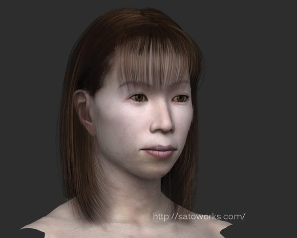
Figure 3: The woman below has been given a stretched mouth to reflect her deeper character.
See Figure 3 for an example of these subtleties. The image on top is a typical mouth shape to be used in production -- easy to rig and weight.
The image on the bottom has some good subtlety that shows her personality and history. She was not happy with her small lips, and always tried to make them wider. It became natural after years of trying.
As another example (Figure 4), eyes change when a person focuses intently on an object.
Probably the muscles around the eyes tighten so they can adjust the focus -- there is a huge change of impression when the eyes focus, even though there's not much change in shape.

Figure 4 shows the difference in expression when the eye focuses intently on an object.
It's now the era of ZBrush. Especially in the game industry, details of 3D models are increasingly crafted in ZBrush, so the flow and edges of a surface can be modeled like clay, using a polygon structure. (I would not like to call this an edge loop, because the concept for edge loops deals with subdivision and tessellation, whereas polygon structure is meant for flows like this.)
An edge needs to go along a contour, and since one polygon can only share four edges, it's a challenge like a puzzle. Ultimately you need to pick some edges and throw some away to maintain the quad polygons.
I would say this is the most painful process and takes the most time when creating a 3D model, but this is how good models are made. Lots of time is spent on these areas that are seldom seen by non-professional eyes. ZBrush or Mudbox will release you from some of this pain, and four-sided quad polygon limitations (see Figures 5a and 5b).
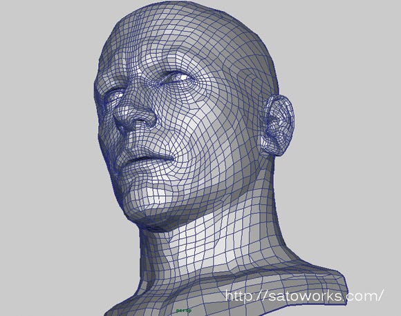
Figure 5a: Detecting flow makes objects easier to carve. 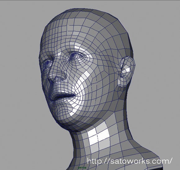
Figure 5b: Flow changes depending on the person, and even changes when muscles are flexed.
With these software packages, the polygon structure does not have as large a role as it used to, but still cannot be ignored. Outside of games or in some situations like softbody simulation, you can't get away from it.
Normally we may think that we are designing 3D models, but actually I think we are not. Even though we're building a three-dimensional polygonal object, the final output is always 2D.
There is ultimately not much difference between painting and 3D modeling, because at the heart of it you're designing a picture, or sequence of pictures.
The only difference is whether it's created with two-dimensional methods or three-dimensional ones. So how realistically do you feel you are designing that 2D output when modeling in 3D?
Shadows are the biggest factor here. We are designing more for shadows than we are for the shape. The right shadow falls on the right place if the model is right, within a proper lighting scheme.
If the resulting composition does not seem strong enough, and if the character does not appear strong enough, it's very possible that the shadow shape is wrong. You have an incredible amount of control at the modeling stage, and it's here that you can generate shadow shapes quite flexibly (see Figures 6a and 6b).
If you can't hit the right shadow after hundreds of iterations, maybe the target impression that you are trying to accomplish differs fundamentally from your lighting.
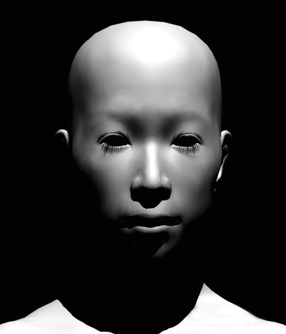
Figure 6a: At the modeling stage you have the most control over shadow shape. 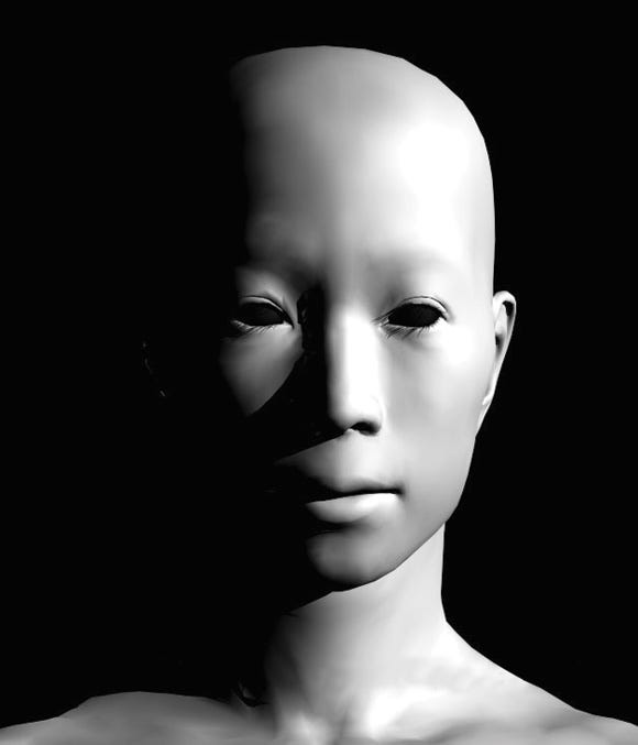
Figure 6b
As a good example of this, film director Kon Ichikawa often utilizes light coming from the side, so the faces get a clear shadow cast from their nose even with less rugged faces of Asians. Half of the face would be in shadow if he tried this trick with Caucasian actors (see Figure 7).
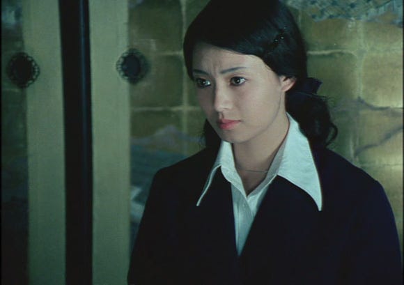
Figure 7: Director Kon Ichikawa often lit his actors with strong cross lighting.
It would help to check the costume design of your character to see how a busy shadow runs across it, and you might also want to compare it with the complexity of the background. This will help you to establish and control the balance of shadow.
People have an amazing ability to recognize other people. You will be surprised if you try using a 3D scanner to recreate a head -- the result will be different from what you expect. If you try to capture the entirety of a head with your naked eyes, even though our eyes are only three inches apart, it's difficult to do accurately.
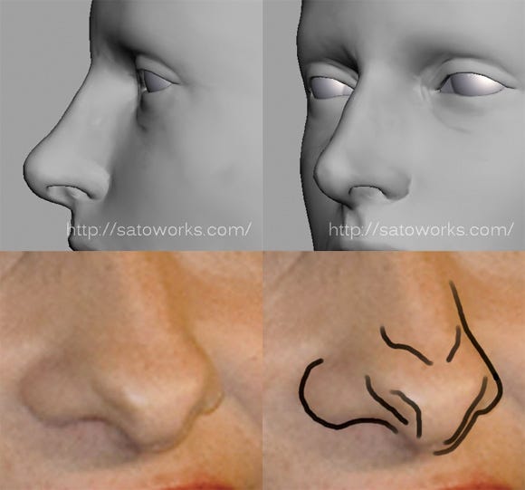
Figure 8: A nose that appears straight actually has a lot of complexity.
So with a scanned head, you can be sure there's going to be some mass and volume you didn't expect, which will result in an unexpected silhouette when you move your in-game camera. A straight nose when viewed from the side may be slightly hooked (see Figure 8).
A cheek may actually be puffier when you see it from certain angles. Great sculpture changes its silhouette elegantly as you physically move around it, and every moment is a surprise. The concept applies to CG and you should be prepared for it. The illusion should betray your sense of volume every time the angle changes.
A good character should have a good signature pose. It's easy to recognize Spider-Man by his gymnastic flying silhouette, for instance. But again, that is visual language, which belongs in the realm of concept design.
What I mean here is the posing that defines the character's personality. Good film actors change their body mannerisms for the roles they play. The neck angle and spine curve are typical targets. Simply pulling the spine in and out for default poses gives the character a really different personality.
You also rarely see a profile shot in movies, because actors rarely turn on the axis that's perpendicular to the camera. Good animation doesn't do this either, though it still happens if the director isn't good.

See the image above for an example. The story behind this image, created for a serious game, is that this girl has HIV, and she prostitutes knowingly. A guy (we do not know who is -- this could be a customer, could be police) is approaching her. I needed complex emotion on her face to indicate guilt and ignorance, but since I did not have time to add real facial expression, I solved it with simple posing. The girl successfully conveys some of the complex emotion I was looking for.
It's a fun process to decipher how your favorite actor creates his role through poses and movement, setting aside typical acting aspects like voice tone or eye movement.
Human beings live from moment to moment -- we are not really conscious of what we do between describable actions. For example, when you wash your hands, your focus is on your hands. Next, you want to wipe your hands, so your focus jumps to the towel.
People are not exactly aware of what they're doing while moving between these focus objects. In these in-between moments you can redirect focus to create good acting. The same idea applies to the face. A smile, a frown, anger, or even lip syncing, all are examples of visual language.
Between these states, that's where you can create real character. If you step-pause a movie at home, you'll find actors making funny poses and faces between the conscious points. That's a good subject to study. Boring acting like simple smiling or frowning may turn into some attractive expression by injecting this type of essence.
There is no guarantee that you can find a perfect cast. Even if you do, there are often many legal reasons that we cannot use the particular actors we want for our animation. That's when you have to design a human, and the result needs to be more attractive than a regular human. It must be as attractive as an actor.
I think this is one of the most difficult things to accomplish. It's easier to take a specific human target and try to model it, but if you can't use the actors, you can't use them! Figure 9 shows an attempt at using a real actor (Gary Oldman) to evoke a certain mood.
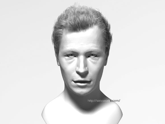
Figure 9: An early test for the GoldenEye: Rogue Agent game (recreated for this article) using Gary Oldman to create a more complex character.
The typical way to design a human is to pick stamps of features from many people and combine them like a police composite drawing. It usually takes a hell of an effort to blend them so that all parts and skull shapes work in harmony, and even then there is no guarantee that your results will look strong.
You might need to go back and start choosing feature stamps again if the result isn't strong enough. Designing a human is a repeating sequence of this trial and error process. When I do this, I need to be ready to get completely exhausted, and still there is no guarantee of getting a good result.
Sometimes character descriptions are difficult to visualize. For instance, consider this one: "35 years old, but still looks somewhere in middle her 20s, a mix of Arabian and North African. Her eyes are solemn yet very determined. Although she is not a classic beauty her beguiling serenity makes everybody mesmerized."
It is cruel if this complex requirement only falls on a character artist. As CG and game fidelity goes up, more actual references are required. I think it's worth having auditions or working with domestic and oversea casting agencies to help artists when modeling.
Various elements need to be considered before entering full production. As the technology improves and budgets go up, It's becoming very challenging to tie each component into a single direction. But great impact cannot be achieved without all elements working in harmony. Masterpieces are borne when everything works in sync.
[All images created by Takayoshi Sato with the exception of Figures 2 and 7.]
Read more about:
FeaturesYou May Also Like