Trending
Opinion: How will Project 2025 impact game developers?
The Heritage Foundation's manifesto for the possible next administration could do great harm to many, including large portions of the game development community.
On the road to smartphone success, there significant are challenges -- game design, business model, and look and feel. How did one developer navigate those waters? This candid look back examines all of these crucial elements of building a mobile game.

On the road to smartphone success, there significant are challenges -- game design, business model, and look and feel. How did one developer navigate those waters? This candid look back examines all of these crucial elements of building a mobile game.
Puzzle Craft is a cross-genre puzzle/town building game developed by Ars Thanea Games and published by Chillingo. The game got great reviews, and a great response form the public, who loved the addictive gameplay, and the unobtrusive in-app purchase model.
In this article we would like to look back at the production of the game and share with you some insights and anecdotes.
Ars Thanea Games is a small, independent game developer, and a part of an advertising agency and production studio Ars Thanea.
The game was published on the 16th of August, 2012. The development of Puzzle Craft started in July 2011 and took almost one year, with a core team of four people, along with some outsourcing.
Our production philosophy was to start with simple prototypes and iterate, working on the ideas, expanding them and adding new elements. Later in the text we will analyze the process on several interesting examples.
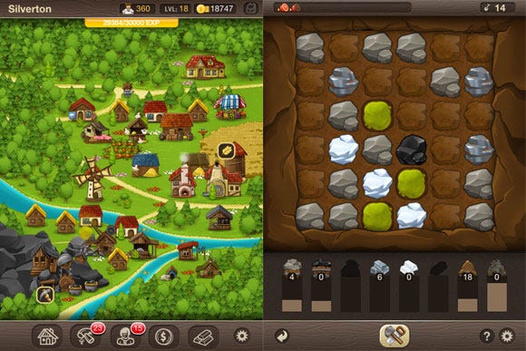
The final version of Puzzle Craft.
The game was coded using Cocos2d. We also created a toolset for defining the gameplay and editing the village screen, as in such a small team we found it critical to separate the programmer’s work from the designer’s tasks. With the toolset we could test the gameplay and balance over and over, while the programmer focused on new features optimization etc. In the gameplay editor we defined all prices, puzzle parameters, and upgrades describing them with a set of actions defined in the code. The data was saved to an XML file, which we could download to the game and test the new parameters without the need to rebuild the code.
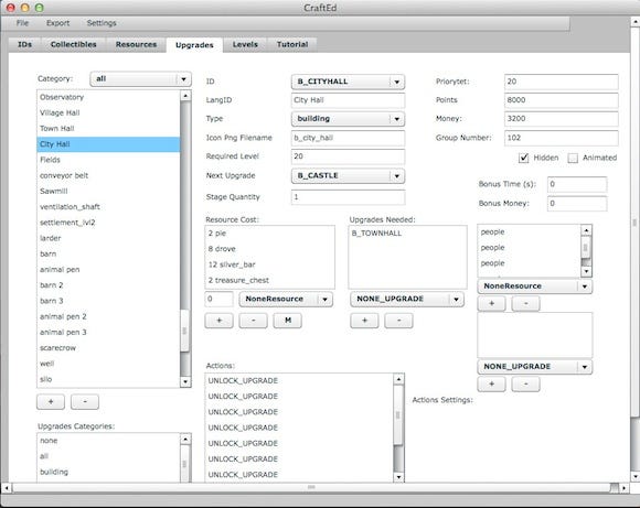
Click for larger version
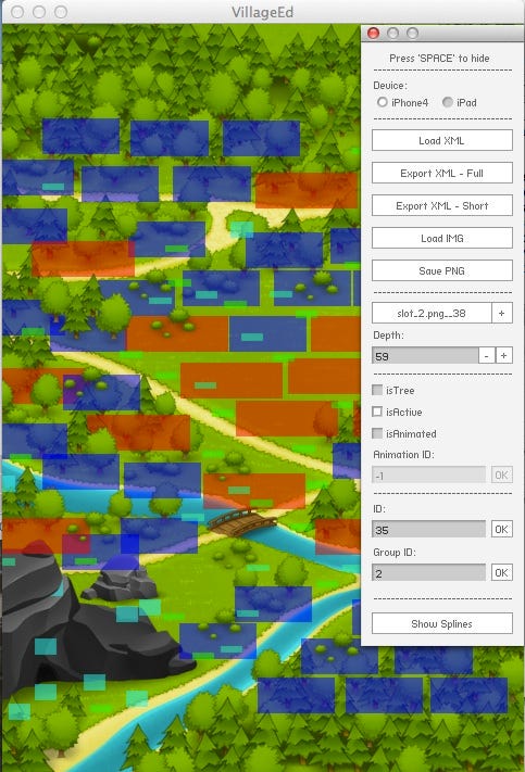
The other custom-made tool was the village editor. We used it to define all the visual aspects of our village screen -- the placement of trees, the placement and parameters of building slots, the roads the villagers used etc. Both editors were made in Flash.
We started with two base ideas: we wanted to make a game about building, creating, and caring about stuff, rather than a game about destroying; we also wanted to make a game with some actual gameplay.
Going after the building/creating core idea, we decided to make a town-building simulation, and the engaging gameplay core idea solidified in the puzzle element. We wanted to stand out form the other town-building games, and wanted the players to actually do something constructive, rather that just click and wait. Collecting resources by solving puzzles seemed constructive enough, and fun enough. So the basic gameplay cycle was born -- you want a new building, so solve puzzles until you have the resources you need; then you build the building, feel satisfied, and want to build another new building. At the beginning there was a simple prototype, with doodle graphics and duct-taped code. And it played so well that we decided to go for it.
Step by step, we started adding depth and new elements to the gameplay. The first challenge was to define the difference between the farm and the mine -- the goal was that the farm felt organic and peaceful, while the mine challenging and industrial. That is why every visit on the farm lasts for one year, and as you play the seasons change, while to go enter the mine, you have to use some of the food you gathered and the supplies are the only limit, you dig as deep as you can.
The first feedback from test players showed that there was a need for some kind of instant bonuses, that would allow them to change the situation on puzzle boards. There were also some disagreements on how many collected tiles should add you a new resource and how long a chain should add a bonus tile. Letting the players decide seemed like a good idea.
Thus the three cornerstones of Puzzle Craft gameplay were defined:
1. Tools acting as one-time bonuses giving more control over the board;
2. Workers, changing the tile-to-resource and chain-length-to-bonus-tile ratios;
3. Buildings, introducing lasting changes to the gameplay.
With the buildings, we have actually made a huge spreadsheet listing every changeable element of our game and basing on that list we started thinking on possible buildings.
At the same time we were playing and polishing the puzzle mechanisms. Distractions like the explosive gas, rats, and wolves were balanced and all mechanisms unified: at first long chains of dirt, grass and trees gave you no bonus tiles -- then we changed that, strengthening in the process the core themes of the mine puzzle screen (gathering dirt without tools heightens the risk).
Basing on a small number of mechanisms, we started building up the game, and after several months of constant testing and re-iterating of all the upgrades and prices ended with a quite deep and addictive gameplay.
The first idea was to publish Puzzle Craft as a typical pay-for-download game, at a price of about $2 or 3. When first prototype was finished and we showed it to our publisher, Chillingo, they put forward an idea: the game would do nicely as a free-to-play title.
Testing the idea took us over a month and resulted in some interesting changes in the game:
In the prototype every building increased your "population score", and to unlock more powerful buildings you had to reach a high enough population. This has nothing to do with the workers you employed, and so was confusing for some players.
We changed that mechanism into a wide recognized experience points/level system. That added more depth to the game, as you are awarded EXP not only for the new buildings, but also for using tools, gathering resources, and making long chains. Suddenly, your skill started to matter.
We added a time barrier to the visits on the farm. You had a number of "bags of seeds" that you used to enter the farm, and after you used them the only option was to wait, or pay for more bags.
We increased the number of resources needed for buildings and tools, and decided that the prices of hiring workers go up with every worker of a given type. The changes were business-driven at first, but then we noticed that our fun from the game significantly increased. There was a challenge at last, and we could spend much more time with the game.
Time bonuses were added: tools and resources from buildings, and money from the taxes.
We came up with some ways to bend the game rules that you could buy for in-game coins, such as: additional moves in the mine, saving the farm, buying buildings for coins, etc.
Then we realized, that to develop a moneymaking F2P game, we would have to add waiting for new buildings to be constructed (skippable with coins) and a second currency (available only in IAPs). Frankly speaking, that idea sucked. At this point the game would become just too frustrating to play. So we decided to drop the F2P idea, and make a low entry game (priced at $0.99) with some IAPs.
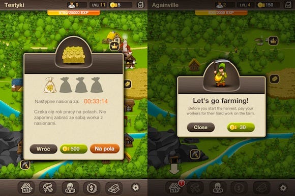
Click for larger version, with all three steps in the evolution
As you can see above, we started tests with some abstract tokens, then changed them into bags of seeds, and then dropped the idea. You still have to pay the workers, but the price is set in such a way, that you will probably never have to wait. Frankly speaking, the real goal of paying for entering the farm is to make your coins valuable -- when you have to constantly spend them, you feel they are useful, and you are happy when you earn them.
We removed all time barriers and frustration points, because they were not fun. However, we decided to leave the time bonuses -- because they were fun. Then we rebalanced the whole game to make sure that you can finish it without spending money on IAPs.
Looking back, that was a good move. The game improved from our short affair with F2P, and in the end we made the game we wanted to -- relaxing and focused not on waiting but on the actual gameplay.
At least as interesting and the changes in Puzzle Craft design are the iterations of its visual side. Let’s have a look at the evolution of some key elements of the game.
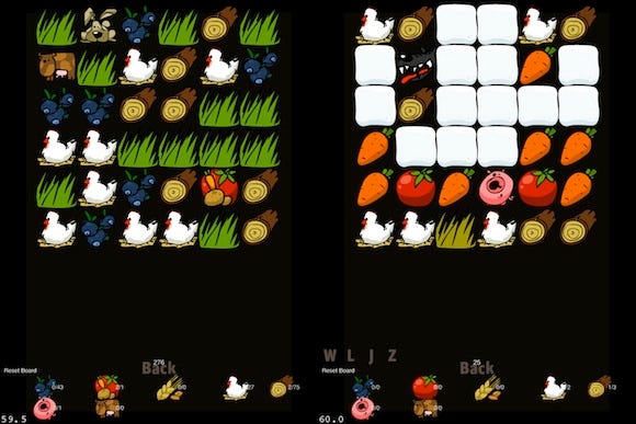
Click for larger version
At the beginning there was a prototype with berries but no carrots, deep snow in winter, and cute rabbits instead of rats. You changed the seasons by hand, and we were still looking for a perfect tomato -- not knowing that what we needed was an apple.
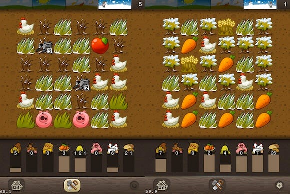
Click for larger version, with all three steps in the evolution
The new look was great, and the final animals and plants were chosen, but it still took a few iterations to polish every element: the resources, the tiles (with or without the black contour?), the winter trees, the calendar, and the time progress bar.
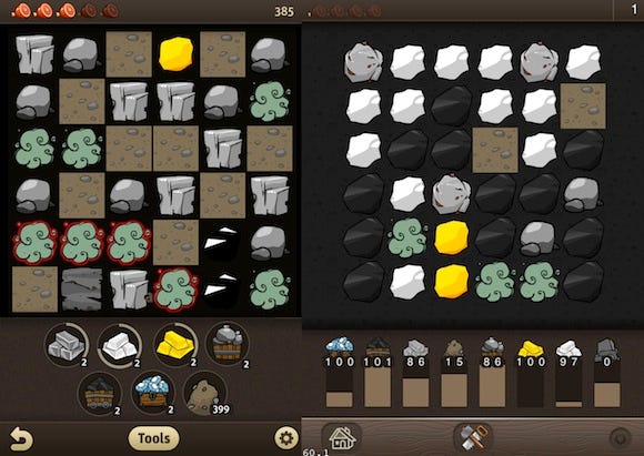
Click for larger version, with all three steps in the evolution
We started in the dark -- with fancy-but-not-functional resources indicators, coal invisible against the black background, and no idea how to draw the iron ore (try to spot it on every of the three pictures above).
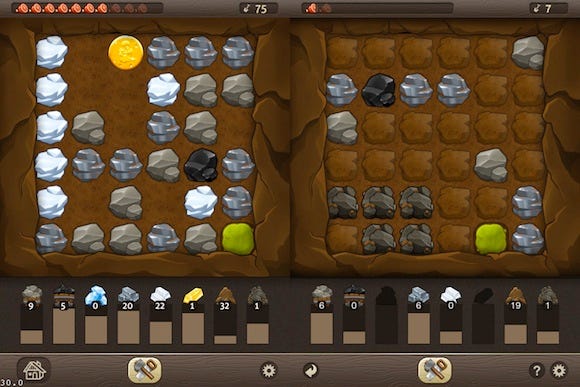
Click for larger version, with all three steps in the evolution
It took some time before the look matched the deep-mine-expedition theme we had in our minds. The last change was to add separate lumps of dirt, because the nice looking wall of earth we liked so much proved to be totally counterintuitive for the players.
In our first prototypes the village was static -- new buildings appeared in predefined spots and all you could do was to decide which building you want to build, and then observe how your village changed. We started with simple sketches, having hard time to fit it all into one screen (it worked like this: visit the mine, swipe, check the village, swipe, go to the farm).
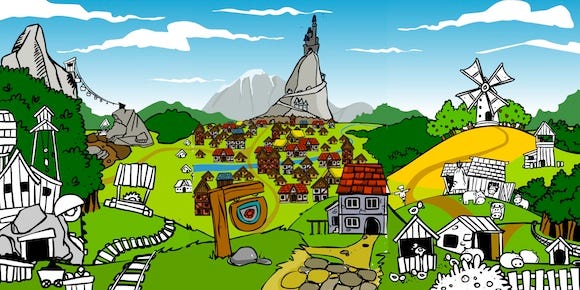
Click for larger version
The effect was awkward to use and the houses were too tiny, so we went for a pseudo-isomeric view instead, and then added some depth to the flat-looking buildings. We were quite pleased with the outcome and started to upgrade the graphics to their final quality.
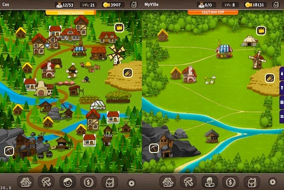
Click for larger version, with all three steps in the evolution
Then, of course, it become clear that players want to decide where to place their buildings, so we added the placement mechanism. It took some time and a number of paper-cut prototypes to find the right way of adding some degree of freedom to a map and buildings designed as a static picture. The key was to forget about the standard grid approach, and opt for hand-placed slots. The last challenge was to fit the castle -- and the solution was not to fit it at all. Only when the castle crossed the boundaries of the screen did it become epic enough for players to feel satisfied.
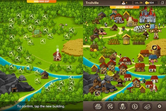
Click for larger version, with all three steps in the evolution
Designing a game is one thing, and communicating the design to the players is another cup of tea altogether. In Puzzle Craft players need to be able to collect tiles, buy new buildings, tools, and workers, check their resources and trade them, buy IAPs, and prepare supplies for the mine. They also need to understand all mechanisms of the game.
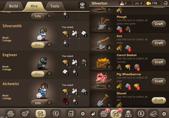
Click for larger version, with all three steps in the evolution
The final interface is pretty simple, but the first approach was far more complicated.
Starting with all types of upgrades stuffed under one button and then divided among several not-so-intuitive tabs, we finished with every type of upgrade (buildings, workers, tools) under a separate button and accessible with just one tap.
Dropping the tabs allowed us to design a universal upper bar with all the most vital information.
At first we perceived preparing supplies as a vital part of the gameplay cycle, and there a whole separate screen dedicated to that process.
However the screen did not feel fun enough, so we started adding more and more graphics.
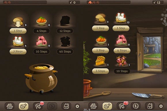
Click for larger version, with all three steps in the evolution
Until we realized that the best option was to drop the screen altogether and just use a popup --it improved the players’ experience, and give us some space on the bottom bar (which we needed to change the aforementioned tabs into separate buttons).
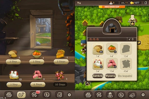
Click for larger version, with all three steps in the evolution
We also moved the resources summary from a separate screen to an easy-accessible side tab (BTW take a look on how the iron-, silver-, and gold bar icons changed).
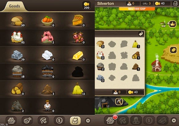
Click for larger version, with all three steps in the evolution
But the hardest part was to inform the player how the game rules actually work.
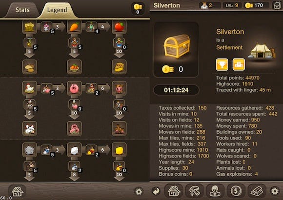
Click for larger version, with all three steps in the evolution
The first idea was this elaborate and totally incomprehensible stats / relations screen. Sensing that something is wrong we split it into the town hall screen (which survived to the release) and a beautiful, elaborate and still totally incomprehensible relations screen.
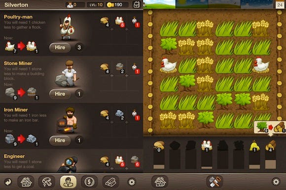
Click for larger version, with all three steps in the evolution
After many days of debates and brainstorming, we threw the screen away and presented the same information in the places and at the moments, it was actually needed. And it worked.
The game was almost ready when we realized that we had no idea how to explain all the mechanisms to new players. We obviously could not afford to send one of the game developers to every customer!
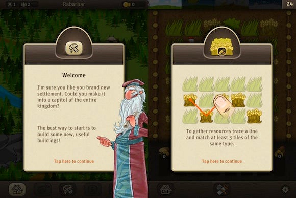
We started with great big popups with lots of text. This, of course, didn’t work at all. Nobody reads the text, and everybody skips popups. Animated images were sort of okay, but we had no time or free space to animate all tutorials.
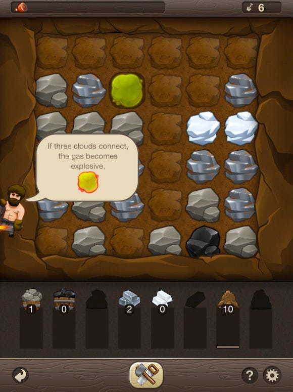
The midpoint in the evolution. Click for larger version, with all three steps in the evolution
We kept some animated tutorials, but decreased the size of the popups. All the other info is delivered in smallest chunks possible, with pictures, and by your villagers.
This increases the chances that anybody reads the text (and deepens your relationship with the imaginary villagers you have to care about). However, the most effective tutorial tool is the nice bouncing arrow pointing to the next element you have to interact with.
At some point while working on the tutorial, we realized how many things we have to explain to the players: that tiles sum up to resources, that you are rewarded for long chains, how exactly workers change the game, what do rats do, etc.
The solution we went for was to start with the gameplay at its minimum (no long chains, no workers, no tools, no free moves, no market) and create buildings that introduce new gameplay elements. This was a real breakthrough -- we gave the players the power to change the rules of the game, and the players loved it.
There are a few mechanisms or relations in the game that are not clearly explained. They give you the opportunity to explore and analyze the game and find out some combos or strategies by yourself. Many players like the thrill of discovery as much as we do.
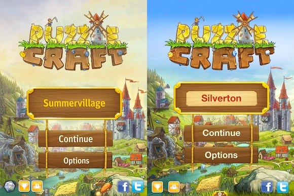
We started with quite a boring main menu, and only later created a really nice loading screen, so we decided to merge them, and after some color correction we got a new, beautiful main menu.
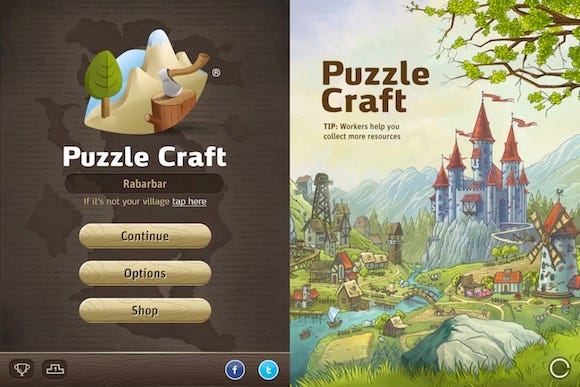
Working on the Puzzle Craft logo, we decided to focus the two main aspects of the game: farming and mining. We started exploring this idea in our first designs.
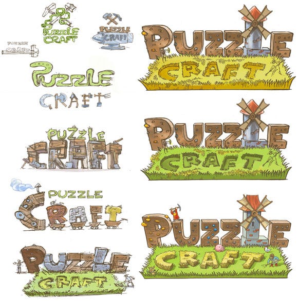
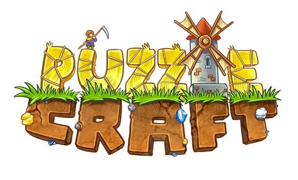
We really liked this 3D version of our logo, but in the end we decided to simplify it show the letters in 2D. Effect bellow:
At the beginning there was a simple, placeholder icon.
![]()
Then we prepared several sketches to discuss with Chillingo, our publisher.
![]()
Then we refined them…
![]()
...and prepared several more, this time focused on showing the gameplay.
![]()
Then Chillingo prepared their proposition...
![]()
...and then we tried a totally different approach.
![]()
Finally, over a month later, Puzzle Craft's icon was ready.
![]()
Overall the whole development process took us about 12 months, with a team of four people plus outsourcing. The core team:
Bartlomiej Rozbicki - Project Lead/Art Direction
Artur Ganszyniec - Design/Gameplay
Mariusz Macieja - Programming
and Marcin Gibowski - Illustration and Animation
Read more about:
FeaturesYou May Also Like