Trending
Opinion: How will Project 2025 impact game developers?
The Heritage Foundation's manifesto for the possible next administration could do great harm to many, including large portions of the game development community.

Featured Blog | This community-written post highlights the best of what the game industry has to offer. Read more like it on the Game Developer Blogs or learn how to Submit Your Own Blog Post
Long, moody treks across a large map in a visually stunning environment can only get you so far...

When you think back at your best gaming experiences, what do these have usually in common?
Is it the marvelous graphical fidelity?
The high quality audio?
Or is it, like it is for me, the "flow" of the game? The precise and perfect spacing of "things" that you do or experience during gameplay.
This space in-between experiences is, at least for me, the most important thing to nail down in game design.
It is almost like a rythm or a musical composition.
When I "design" new adventures or campaigns for my tabletop games, I usually follow a certain narrative structure than can be called "classical".
The Three Act Structure

I found out early on in my design experiments that i can use this structure for more than narrative, or conversely, to apply narrative to something that is normally seen as narrative.
For example, combat-encounters and map-design could be plotted in the three-act structure, as well as the plot/story itself.
If we apply this structure to free-roam games, and adjust it a little for a visual interpretation, we can see how discovery of new content and its spacing correspond with a satisfying experience.
Example: Skyrim

Skyrim is ~37 km² (14 sq. miles)
Content in Skyrim is plotted so you are about at maximum ~60 seconds away from meaningful interaction.
If you think about it, how do you approach exploration in open-world games like TES and Fallout 3?
Lets assume you have no quests active and just set out in a particular direction.
Since the games are first person perspective (or 3rd person if you really want to), the first thing that happens is you start walking in a direction of interest. This is the introduction-period of our graph.
The first "plot-point" happens if you notice something of interest (content), be it a dragon fighting a bear, a temple or an unexplored dungeon.
Your "rising action" section of the graph corresponds your approach of the content, you grow tense at the exploration, the discovery.
The second "plot-point" corresponds with you reaching the content.
The crysis happens when you resolve what the conent means (to you, the game), be it fighting a cult of vampires, reading a stone tablet or just appreciating the vista.
And then the cycle starts again.

The contrast with other games like Fallout 1, which didn't have a first person perspective, this delivery was handled in a different way, but with the same structure.
In the case for Fallout 1 the exploration mechanic relied on the overworld-map and its random-encounter system (which is still the best random encounter system ever created).
The travel itself generated rising action the furter you traveled, as the probability went up to have a random encounter. And then of course there was the random encounter itself, which could be completely non-combat.
In Skyrim this extends as well to the dungeon "design".

Skyrim dungeons are, while often being complex, essentially linear in their level-design.
That doesn't mean they don't have multiple ways of approaching objectives, but the structure and the emotions they invoke are carefully engineered.
All dungeons have an introductory area near the entrance, the enemy-density and strength is low. The deeper you go the higher the enemy density and their level, usually culminating in some sort of "boss-fight" and a very quick exit without any enemy-encounters.
Counter Example #1 LA Noire

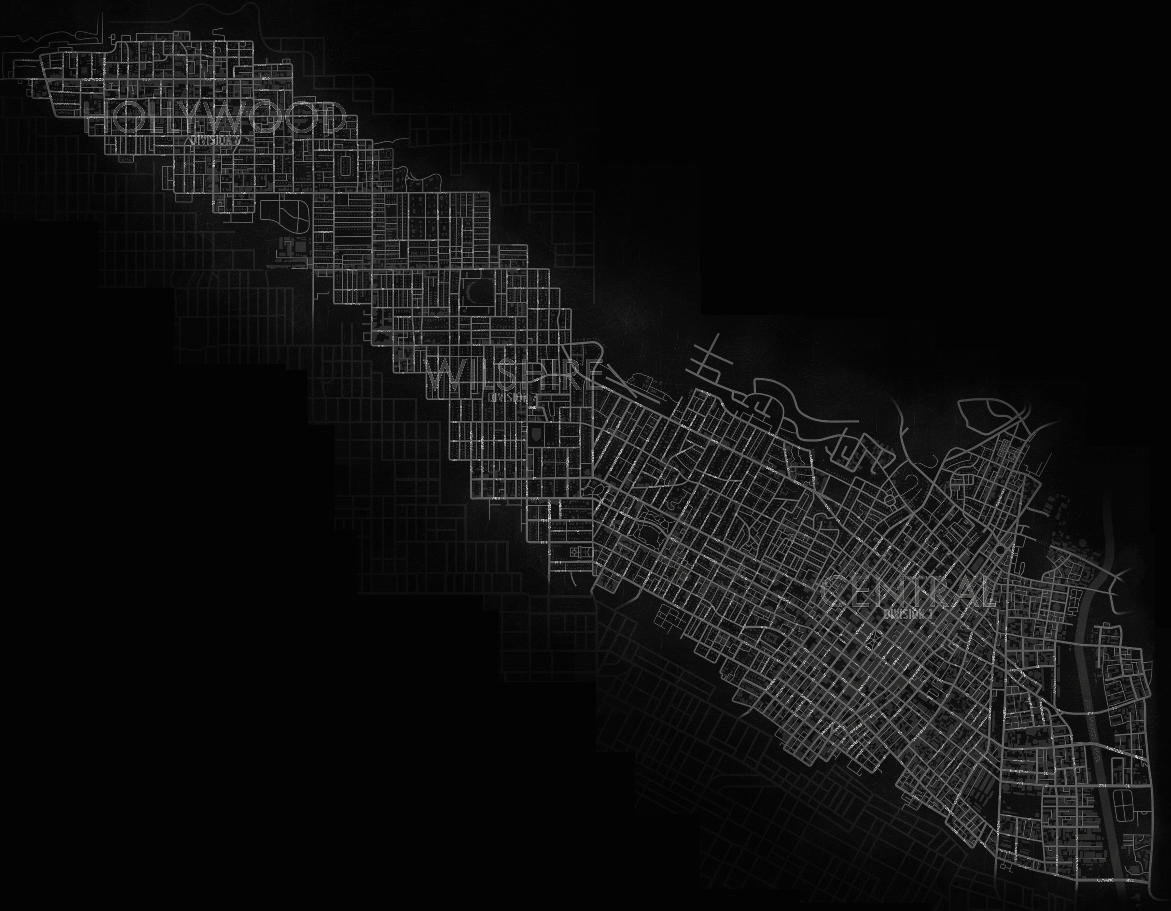
LA Noire is 13 km² (8 sq. miles)
LA Noire is 13 km² (8 sq. miles)While LA Noire is smaller in size than Skyrim, it feels larger and traversing it is a lot more tedious than Skyrim.
First, there are no easily discernable landmarks when the player looks around from any given position of the map. This is due to being in an urban environment, most of your view is blocked by buildings, generic buildings no less.
There is little to no visual pointers to where you are exactly in relatation to the game-map, there are only subtle visual differences between districts. When you compare this to Skyrim, due to the varied environments the player always knows where he is.

Second, content is not distinct from non-content.
In skyrim points of interest are distinguishable, some are hidden, yes, and need a large deal of exploration and dedication to find, but they are upon reaching recognizable as content.
LA Noires city is mostly generic filler, non-conent. Outside of missions there is no interesting things to explore or do, beyond collecting collectibles of course.
Thirdly, traversing the city is restricted to streets, a problem games like Assassins Creed for example do not have, even though they are also set in an urban setting.
Furthermore, the traversal is even restricted to "proper" and "realistic" traversal. Driving fast, aggressive, crashing is not possible.

Instead of making the large and open world interesting, the game makes it an obstacle that needs to be overcometo get to the things you want to -do- as a player.
LA Noire nails the 50s America visuals, the mood, the noire perfectly, yet it shows us that this is not enough, the level-design and content-spacing works against the toolset presented to the player.
Its one thing to see a map-marker and drive towards it looking at the map, and another thing entirely to actually see the actual content and approach it.
Counter Example #2 Fallen Earth
I don't want to discuss the merrits and/or flaws of FE per-se but rather show the difference between the map-design of Fallout 3 and FE, and why Fallout 3 is an engaging open world and Fallen Earth is not.

Fallen Eeart is a game that looks and plays reminiscent of Fallout. The game is set in the post-apocalypse of earth and starrs mutants, zombies and destroyed cities as well as a first-person perspective if you so desire.

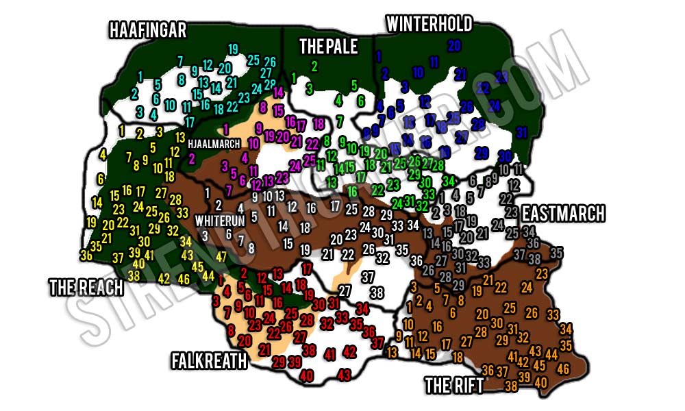
This is the map for Sector 1 of Fallen Earth (there are 3 sectors). Fallen Earths size is 83 km².
Your first longer journey as a new player will be from Terrance to Embry Crossroads after finishing the "extended tutorial" in the starter area (Terrance).
The time that it takes you to travel from Terrance to Embry Crossroads is about 3-5 minutes on horseback (roads give you increased speed).
In between Terrance and Embry, there is nothing of interest, beyond quickly respawning mob-packs, mining-nodes and non-accessible quest objectives aquired from.
In contrast Fallout 3, like most Bethesa free-roam games, keeps in line with having content closely spaced and concentrated. No content is further away than one minute of travel on foot.

The first flaw in the map-design is that Fallen Earth features a classical quest-hub system where you pick up quests "in town" and then "run out" to complete them in the vicinity or travel to another quest hub.
There is no incentive to just set out into this huge, interesting open world and just discover things.
This is a trap that game-designers often fall into. Creating large worlds, realistically large, but with no incentive to -do- anything in it.
A large world by and off itself does not suffice to make it interesting for the player to partake in it, there must be -content- in it to make it worth-while for the player to invest the travel-time.
Especially in MMOs designers often think that with enough people playing the empty spaces will "fix themselves" because players are a part of content.
Unfortunately this is not true unless the players do something that is meaningful to the -other- player.
Set-dressing isn't content by itself, it needs to be relevant to the gameplay. Not necessarily interactive, but meaningful and engaging (lore, for example). In the way that Fallen Earth visually presents Points of Interest in the distance they lack distinction from non-content (like LA Noire), they lack resolution for the rising action (battling through mobs blocking your way) when you reach them.
Games are best when you experience things, and even better when you -do- things to experience said things.
Content needs to be carefully spaced, it needs to be meaningful and varied.
Repetition can not provide a crisis.
Designers not only need to think of -what- to put in their game, but also -where-.
Read more about:
Featured BlogsYou May Also Like