Trending
Opinion: How will Project 2025 impact game developers?
The Heritage Foundation's manifesto for the possible next administration could do great harm to many, including large portions of the game development community.

Featured Blog | This community-written post highlights the best of what the game industry has to offer. Read more like it on the Game Developer Blogs or learn how to Submit Your Own Blog Post
The challenges of developing our first VR game. Theseus is a third person experience, so how did we approach cameras and UI?

This post was written together with: Andrea De Siena, Alberto Barbati and Mattia Frigerio
Forge Reply is a game development studio based in Milan, Italy. Our first most important project so far has been the gamebook/JRPG hybrid Joe Dever's Lone Wolf. The game was released on mobile devices in 4 acts, between 2013 and 2014; since then, it has also been ported to other platforms (PC, PlayStation 4 and Xbox One).
Joe Dever's Lone Wolf had been conceived in the wake of high-quality mobile games, but upon its launch the industry was facing a new major shift. VR gaming was beginning to take shape, and we wanted to be part of it.
Theseus is our first VR game, and it has led us to face a completely new scenario. In this blog post, we will speak about the challenges we have faced in terms of Game Design and UI.
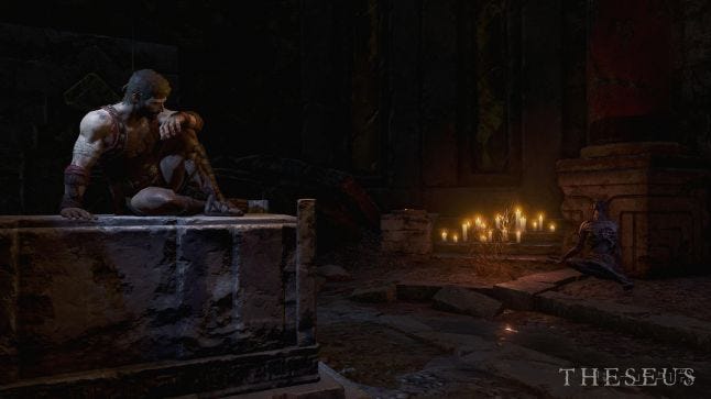
How we approached VR – Why in 3rd person?
When we envisioned Theseus as a Virtual Reality game, a first-person approach came naturally to our minds. However, as we produced the first prototypes we realized that in order to create the alchemy we envisioned, the first-person perspective would not have been the best choice.
Therefore, we considered our options and we decided to switch to a third-person game. We thought about it almost like an out-of-body experience (or the experience of the camera-wielding Lakitu in Super Mario 64). Our main references were old survival horror masterpieces like Resident Evil and Alone in the Dark; in those games the camera is fixed and its position changes depending on the Player’s movement (usually when there’s a room/zone change).
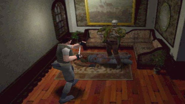
But Theseus needed to be both an emotional and a cinematic experience. How could we convey these feelings using only fixed cameras? It would not be possible, therefore we decided to add another camera system that follows the character, derived from more modern games (like The Last of Us), but also adapted to VR needs.
That is how we developed our Mixed-Camera System, which allows us to transition from fixed to follow cameras and vice versa, depending on the gameplay flow. Moreover, the switch takes place without causing any motion sickness problems. If we look for examples among recent VR games, we can describe the system as an alternation between the cameras of Chronos and those of Edge of Nowhere.
How we moved on to develop our camera system
The Mixed-Camera System has given us great versatility, allowing level designers to choose the best camera solution depending on any given gameplay situation.
Follow cameras, for example, proved to be the best choice for all those situations where we wanted to increase the player’s sense of immersion, and increase the tension. Fixed cameras, on the other hand, were the most suitable choice during combat sessions, or to address certain situations that otherwise could have caused the Player to feel VR sickness.
FIXED CAMERAS
In combat sessions, the widened shot of a fixed camera allows better understanding of the battlefield, helping the Player to locate Theseus properly in the 3D environment. As a result, it becomes easier to predict and avoid enemy attacks. On the other hand, a fixed camera increases the perception of architectural grandeur, so that we manage to offer impressive and distinctive views of the labyrinth.
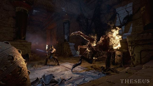
While our level designers were blocking out the levels, we realized that the placement of these fixed cameras had to meet much more strict requirements than a traditional game where the camera always follows the player (such as Resident Evil). In Virtual Reality games, the player controls the camera by moving the head, so it is not possible to “force” drastic camera shifts between a room and the following one. On the contrary, it was necessary to create a “flow” of rooms, structured using reverse shots, and always taking into account the rotations of the Player’s head (see example).
Correct Design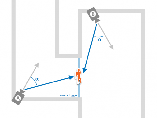
Correct camera positioning. Camera takes into account the position of the player’s head when switching from A to B and from B to A.
Result in Game
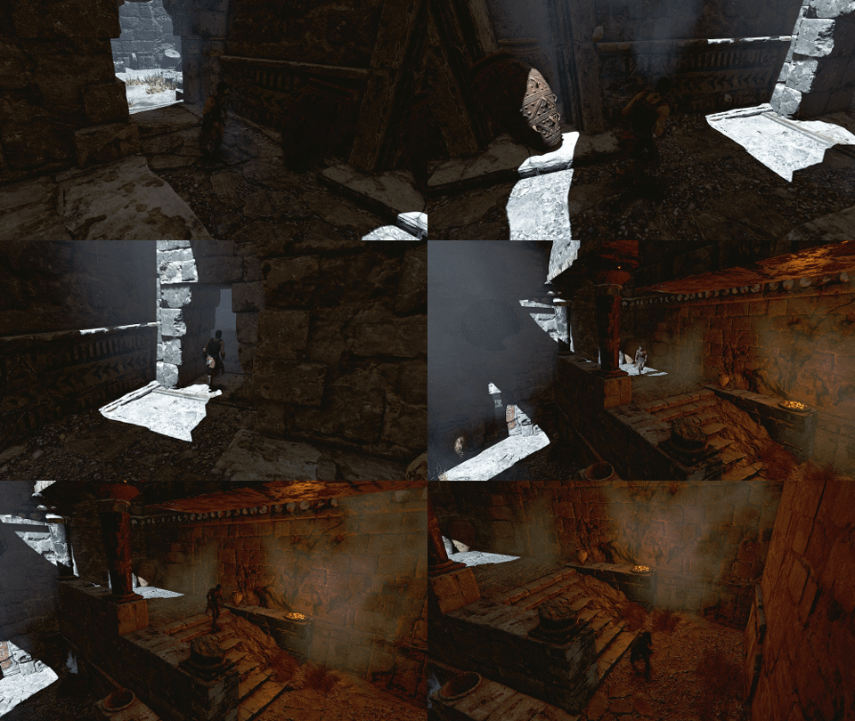
Wrong Design
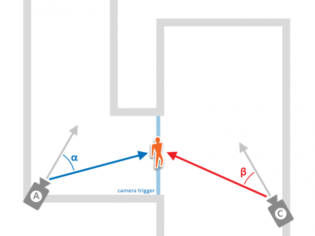
Wrong camera positioning. When switching from A to C the player can't see the character.
FOLLOW CAMERAS
The immersion sense given by a follow camera can be compared to a ride on a theme park attraction, where the user moves on rails and looks around. These cameras are less suitable for gameplay situations, and more suitable for narrative moments. Compared to the fixed cameras, the follow cameras led us to implement dedicated mechanics:
The risk of motion sickness increases when a camera follows the character’s movements and the character moves too fast. For this reason, we tried to limit the speed of the player while in follow camera mode.
To reduce the amount of lateral movements, that can cause motion sickness, we implemented motion splines for some “narrative moments” where the character moves in very large spaces. In these situations the character is linked to the spline and can only follow it with the analog stick.
As a further measure, we decided to limit or block the character’s movement when the player is looking elsewhere. We made this decision because the game is packed with moments of great impact, which lead the user to look around the scenery.
CAMERA TRANSITIONS
Our level designer also took care of the switch between fixed and follow cameras. This type of transition is, in fact, quite critical and we had to define a set of rules:
We tried to associate any transition to an architectural element, such as a door or the entrance of an immense corridor, so that the user would “expect” a camera switch.
Again, we reduced the character’s speed when a transition takes place, in order to prevent the character from moving fast while in follow camera.
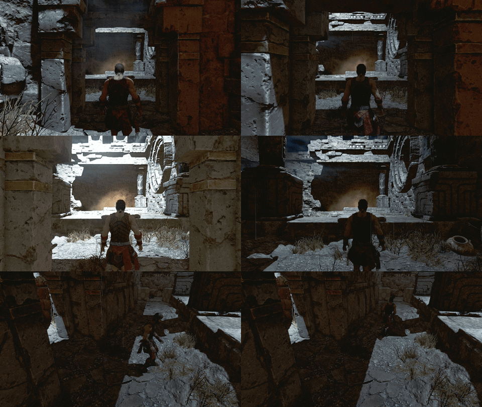
Before switching to a follow camera, we laid out the level design so that the Player was encouraged to move their head and go back to a neutral, non-rotated position (see example).
Correct Design
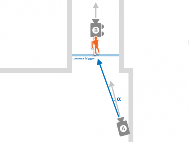
A is a fixed camera and B is a follow camera. A is in a correct position.
Result in Game (from Fixed to Follow)
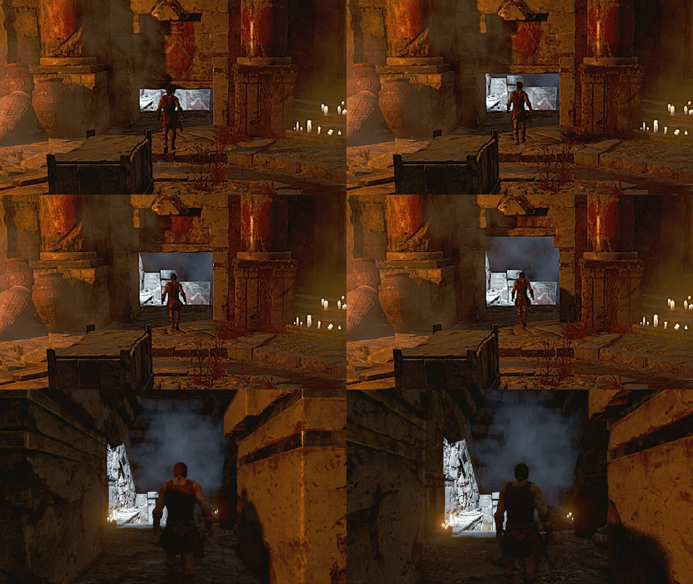
Result in Game (from Follow to Fixed)
Wrong Design
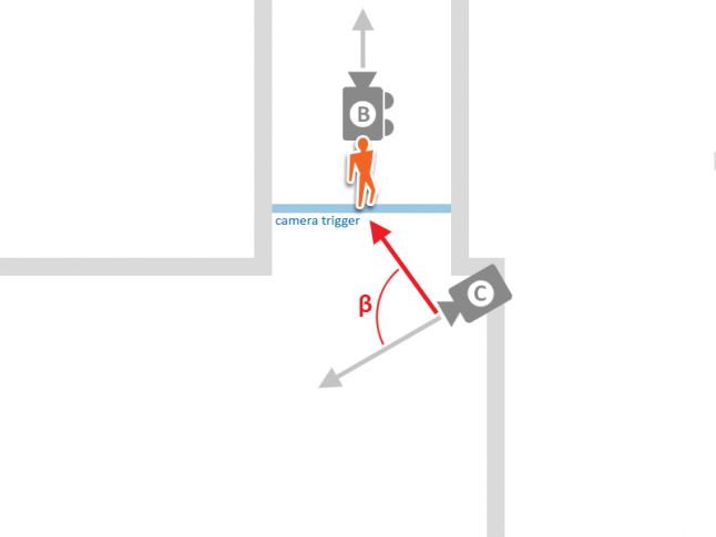
C is a fixed camera and B is a follow camera. C is in a wrong position.
A constraint turning into an opportunity
Since the beginning of the development of Theseus, we decided that the “narrator” would speak the ancient Greek language, and that only the subtitles would be localized. We counted on the atmosphere of the game to benefit from it, but there were also considerable budget-saving collateral effects. In addition to these story dialogue lines, we also wanted to use text to give some usability “hints” where contextual icons were not clear enough.
We had to decide how to present these texts, since VR there offers two possible options, each with pros and cons:
In “head space” —the text is always in front of the player, even if they turn their head;
In “world space” —the text is actually placed in the 3D environment.
In the early stages of development, we mainly worked on “head space” UI. We did not want to block the Player’s view, so that we tried not to put anything right in the middle of the screen; as a result, the only reasonable place seemed to be just below the eyesight. But as the Player looked down to read the subtitles the headset would move as well, triggering a sort of “usability loop”. After assessing the situation, we came to four key conclusions:
You should not display too much text at once;
Reading two lines (one below the other) can be uncomfortable;
The need look at the text distracts the Player from whatever else is happening, which can break immersion;
On the other hand, the Player can easily miss the subtitles if their attention is fixed elsewhere.
“World-space” text has proved to be definitely better: it feels consistent with the environment, it is less distracting and it turns out to more comfortable to read, even when it is longer than a few sentences.
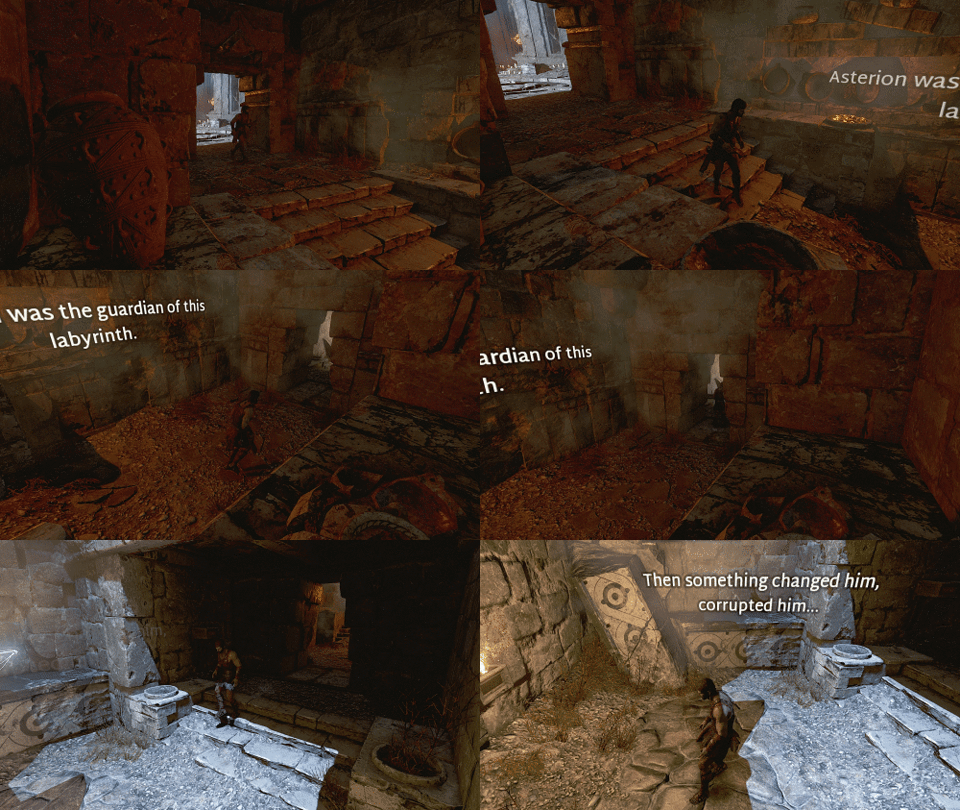
There are some caveats as well, though: each line has to be placed individually and manually in a meaningful position, which can be a time-consuming operation when you have a lot of text. Moreover, the font size has to be big enough to limit the appearance of aliasing artifacts. Last but not least, you have to be extra careful during localization, since English is quit “concise” as a language and sentences written in other idioms usually take up more space.
In the end, we decided to use a mix of both approaches: “world-space” text would be used to tell the story, while head-space would be limited to the display of “Player hints”. This setup also poses a usability advantage, because the Player learns to recognize quickly what kind of text they are about to read; there is no need to resort to other elements, like changes in the font or the color of the words.
In conclusion, the creation of Theseus as a VR game has proved to be very demanding, but rewarding. The main reason were the challenges we had never encountered before, such as motion sickness or the readability of in-game texts. Virtual Reality definitely encouraged us to think outside of the box.
We hope that this post can be of help or inspiration to you as well, as you carve your own way through VR development. Thank you for reading!
If you're interested in seeing a preview of our work, watch our teaser trailer below!
Read more about:
Featured BlogsYou May Also Like