Trending
Opinion: How will Project 2025 impact game developers?
The Heritage Foundation's manifesto for the possible next administration could do great harm to many, including large portions of the game development community.
What makes good level design? PhD and educator McMillan -- who's worked with Ubisoft to create a curriculum for game design -- examines how point of view effects players, showcasing a variety of gameplay scenarios which show different tactical choices players may be confronted with.

What makes good level design? PhD and educator McMillan -- who's worked with Ubisoft to create a curriculum for game design -- examines how point of view effects players, showcasing a variety of gameplay scenarios which show different tactical choices players may be confronted with.
There are various means of understanding how the perception of 3D spaces in games changes the player's emotional state.
One methodology used in level design is that of architectural perspective -- the relationship of the player and the spaces that they occupy at any given time. Many implementations of this approach do not consider more dynamic relationships involving the player, other agents and the environment.
This article looks at dynamic relationships within 3D space in order to understand how we can use dynamic objects in conjunction with level geometry to adjust game difficulty and the player's emotional state. To achieve this goal, this article will take the novel approach of evaluating the tactics of players in the context of modern, 3D FPS games.
An understanding of how we can tailor the difficulty level of virtual spaces in games through a better understanding of what makes 3D FPS levels more or less difficult.
A look at how difficulty ramping can be achieved using a number of different approaches.
In order to take a rational approach to the design of 3D game spaces, we need to identify a number of metrics. The primary metric that alters difficulty is player line of sight. The greater a player's line of sight, the more able they are to plan ahead and think strategically about the game world.
Greater line of sight also allows the possibilities for a larger amount of tactical options, as the player will have more time to plan and also a greater situational awareness. On the other hand, reducing the player's line of sight will result in disadvantaging the player, as they will have less situational awareness and less time to act to certain problems.
I must point out that this observation is in relation primarily to the FPS genre. If we were to phrase this in broader terms, we could make the same conclusions by citing a player's "situational awareness"; however, as this article is level design-centric, I will instead dissect this notion of line of sight.
We can measure line of sight using two key principles: the angle created by geometric field of view (GFOV) as well as the fidelity of graphical resolution, which will tell us how far the player can accurately see. (Figure 1)
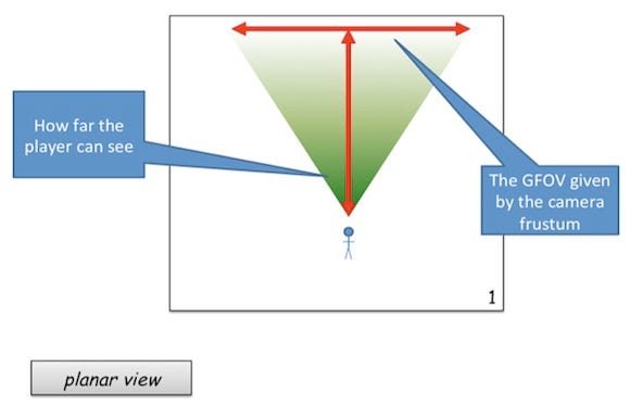
Figure 1
When dealing with the rendering of 3D spaces, we are primarily concerned with the geometric field of view (Figure 2). The GFO is the most commonly discussed type of field of view metric, as this field of view is that of the player's camera. The width is represented as an angle that measures the horizontal span of the frustum. The far clipping plane is the point at which the game engine stops rendering. We sometime hear this referred to as "draw distance". Complex rendering systems will express this element of visual acuity in "arc minutes."
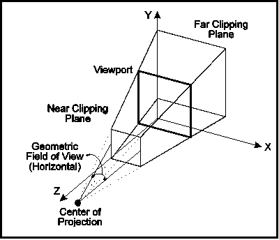
Figure 2
Less discussed is the concept of display field of view, or DFOV (Figure 3). This is the field of view dictated by the player's distance to display and the size of the display that they are playing the game with. Interestingly, the DFOV plays an exceedingly important role in the navigation and subsequent difficulty of 3D space, but only for female gamers. Research conducted by Tan, Czerwinski, and Robertson (2006) suggests that female players have the most to gain when the DFOV and GFOV angle is a 1:1 relationship. Interestingly, males seem to be far less affected in their navigation of 3D spaces when this relationship is changed, even dramatically.
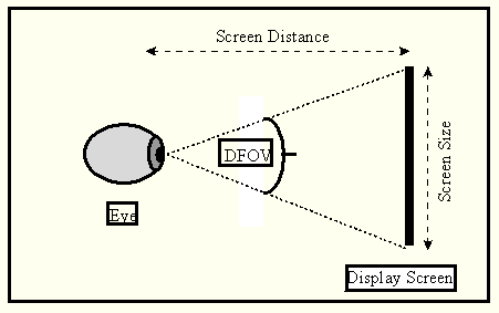
Figure 3
A portal is any game device that allows for greater-than-usual line of sight. We could consider a gantry that surrounds an upper level of a factory level as a type of portal, as the player is able to use the open floor plan to gain a view of the floor beneath them (Figure 4). This is why we often see players taking the "high ground" in a tactical scenario, as the height elevation allows for a greater situational awareness as opposed to if the player remained on the lower parts of the map. Windows and doorways also constitute portals within game levels.
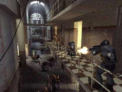
Figure 4
Any type of weapon of game object that allows the player to have greater control over their view of the virtual world is extremely powerful. Weapons like the sniper rifle, which its ability to increase line of sight, are extremely powerful as a consequence. These powerful abilities, however, are usually compromised in some way. The sniper rifle, although giving the player greater line of sight, will always reduce the player's GFOV (Figure 5). Or the homing rocket used in Unreal Tournament will leave the player exposed to attack whilst in use.
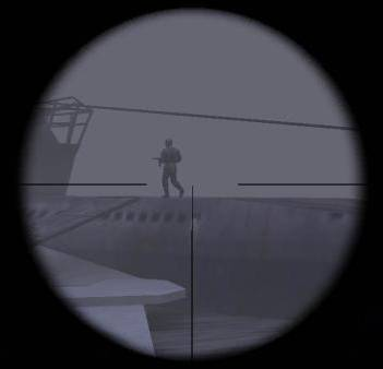
Figure 5
Occluders can also modify graphical fidelity, and subsequently limit peripheral vision, or the player's view distance. The flashlight used in Doom 3 is one of the best examples of an occluding device that does both of these things (Figure 6).
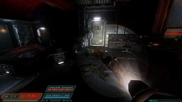
Figure 6
The flashlight technique is also interesting from a spatial perspective, as it makes small spaces seem artificially larger, and encourages the player to explore parts of a room or level that they wouldn't otherwise do if it were fully lit. On face value, Doom 3's levels have an extremely linear design when compared to the franchise's earlier titles; however, the player is kept in the smaller spaces longer, as the use of occlusion means that they need to spend longer gaining a situational awareness of each room.
The "noise" effect used in Silent Hill 2 (Figure 7) is also another alternative occluding device, used to reduce the player's line of sight and subsequently make them feel more cautious. It is also important to note that effects like this often serve an important technical purpose, as they reduce the draw distance required in large, open environments whilst also giving the illusion that the environment is larger than what it seems. We often see simulated weather effects such rain, fog and simulated snow used to achieve a similar goal.
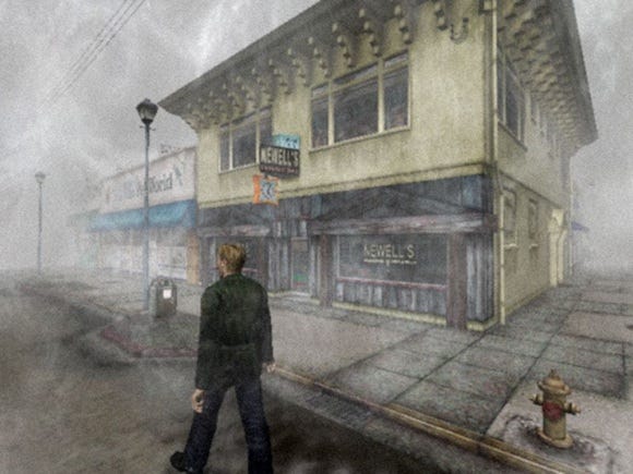
Figure 7
In the context of games, level designers can use the principle of portals and occluders to adjust the difficulty of a game's virtual space. Figure 8 demonstrate the difference in difficulty associated with using occlusion. In the example of the left, the player has a significantly heightened sense of situational awareness, as they can see through the walls. This will mean that they will be on the "front foot" when it comes to engaging any enemies.
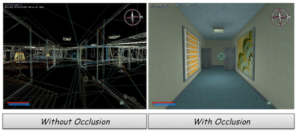
Figure 8
In the example on the right, occlusion is used to limit the player's situational awareness. By doing so, the player will undergo moments of anxiety when exploring new spaces, as they will need to quickly familiarize themselves with the layout of the space so that they can plan strategically for a number of possibilities. Although there are many psychological outcomes from these mechanisms, in the context of this article, we are dealing primarily with occluders and portals as a function of difficulty ramping using 3D spaces.
When dealing with the rational design of 3D spaces, the designer needs to be aware of how control interfaces can make movement in a 3D space more or less difficult.
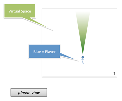
Figure 9
When the player has a greater amount of space to operate in, they have increased opportunities for either enemy engagement or enemy evasion. Space also forms the basis of essential emotions of game play. Size variations in level geometry should be used in a way in which the player can observe contrasts in their environment.
The use of space needs to be analyzed with the addition of the primary metric, line of sight.
Even though a large space may offer the player greater amounts of opportunity, a limited line of sight will override any advantage that the space brings with it, and this is similar to the use of the flashlight in Doom 3. (Figure 9)
Alternatively, when the player's view frustum is sufficiently large enough in comparison to the virtual space, they will be the most empowered (Figure 10). A simple way of thinking about the combination of these two elements is to consider that the size of a game space is always filtered through the player's view frustum; hence, in terms of a hierarchy of difficulty metrics, virtual space will always be secondary, as the world is ultimately communicated to the player via the camera system.
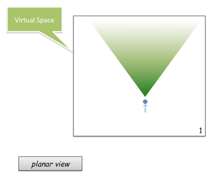
Figure 10
Virtual space is a trade-off for the player between possibility for movement and possibility for ambush. The easiest way to understand this trade-off is by considering the relationship of line of sight, virtual space, and enemy approach vectors.
There are three ways of understanding how approach vectors affect the game's difficulty. Difficulty of approach vectors is dictated by whether an enemy occupies the players existing view frustum, whether they have to move view frustum, or if they have to move view frustum and change world position to engage.
Easiest Approach Vectors: Those which the player can see in their immediate view frustum without the need to adjust their position or view. (Figure 11)
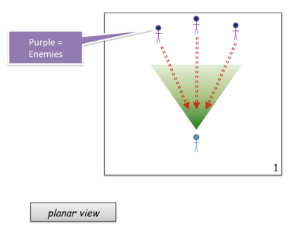
Figure 11
Intermediate Approach Vectors are those where the player must change their view position of the 3D world, but not necessarily their world position. (Figure 12)
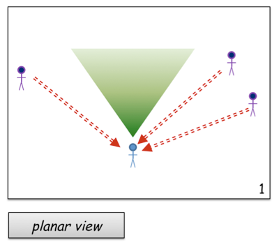
Figure 12
Most Difficult: Any approach vector that requires the player to shift their view the most from its current position.
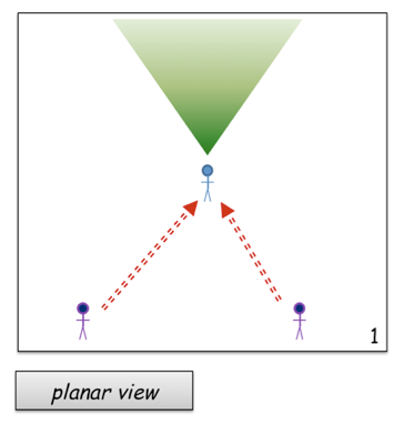
Figure 13
When an enemy approach vector requires the player to change their view frustum and world position, we are creating the potential for the player to make mistakes. This added possibility for mistakes is what ramps our difficulty. However, in order to understand this metric further, we need to know a little more about player psychology.
Humans are excellent "guesstimaters." We tend to iteratively guesstimate our way to the solution of problem by continually guessing, observing, and correcting. Imagine you are reaching out for your cup of coffee. You will move your hand, observe its new position, and then update the amount of movement required to meet with the target. This will happen many times per second until you reach your goal. (Figure 14) (This is akin to Steve Swink's "delicious cupcake" example in Game Feel.)
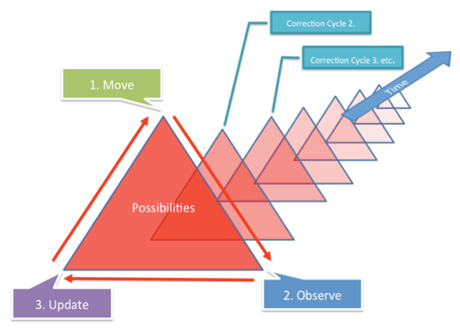
Figure 14
Basically, the more we expect the player to change their position or line of sight, the more correction cycles we are forcing them to undertake. The lower the number of correction cycles, the easier it is for the player to hone in on their target.
Figure 14 is an example of our guesstimation process when honing in on a static target. The large red triangles represent the margin for error in any guesstimation phase; the larger the triangle, the more room for error in that guesstimation step.
As we hone in on our target via movement, observation, and correction (update), we gradually reduce our margin of error. However, if an object continues to move, then the amount of possibilities will not reduce in a linear fashion, like Figure 14 suggests.
To give another example, let's assume that the player is undertaking the same process of move, observe, update for a static object -- say they are trying to adjust their crosshair so it is over a target. They will gradually move the crosshair until the margin of error becomes lower and lower via this process of refinement.
Now, imagine of the target suddenly reacts to the player and attempts to evade them via strafing away (Figure 15). The player will now need to significantly update their process of guesstimation, bringing more possibilities, and hence a greater margin for error, until they eventually hone in on the enemy again.
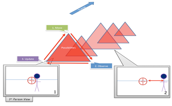
Figure 15
Although open spaces open up the possibility for the player to be flanked or approached from many more approach vectors by enemies, more open spaces also allow the opportunity for evasive maneuvers by the player.
In Figure 16, the player has the advantage, as there are more evasion vectors than enemy approach vectors. In a previous article where I dealt with the notion of compression and funnelling, I refer to these vectors as "expansion vectors" -- an element which can alleviate the tension caused by compression via enemy encroachment on the player.
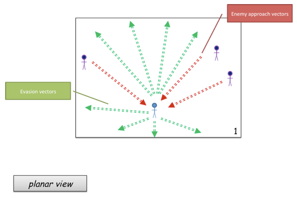
Figure 16
In the majority of cases, players in first person perspective games will choose to firstly adjust their world position so that as many enemies as possible can be kept in the current view perspective -- watch someone play Serious Sam and they will usually prefer to backpedal away from enemies so they can keep their view frustum on them. World movement change is preferred above excessive view frustum changes. In most cases, a player will choose to backpedal first with minimal changes to view position. (Figure 17)
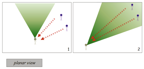
Figure 17
In a tactical scenario, strafing around an enemy will always be advantageous, as enemies require more correction cycles to attack a strafing target as opposed to one that is simply moving away or towards them. You can think of this in terms of the movement of a crosshair in game. If a player backpedals away from their enemy, then although they are becoming a smaller target, the amount of correct cycles required to adjust the cross-hair is significantly less. (Figure 18)
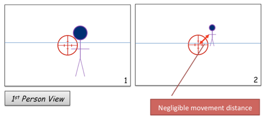
Figure 18
When an enemy moves in such a way that it causes the player to frequently update their view frustum, the scenario is much more difficult due to the margin of error which is being introduced into the scenario. (Figure 19)
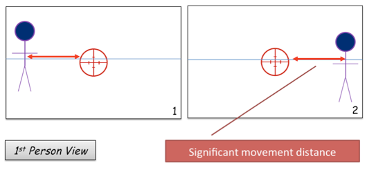
Figure 19
Now that we have an understanding of the essential metrics and player psychology, we can now look at how level geometry begins to modify these relationships from both a difficulty perspective as well as an emotional perspective.
Figure 20 is a simple depiction of how level geometry begins to modify the player's the emotional state and strategy by affecting the view frustum. Frame 1 of Figure 20 shows an artificial representation of the player's view frustum, whilst frame 2 depicts the actual view frustum after occlusion.
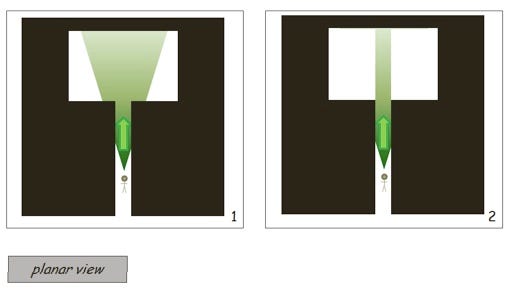
Figure 20
By introducing an enemy into the example used in Figure 20, we can begin to evaluate how the level geometries modify line of sight, view angle and evasion / approach vectors. Figure 21 is an example of the player moving forward along a tight corridor into an open space.
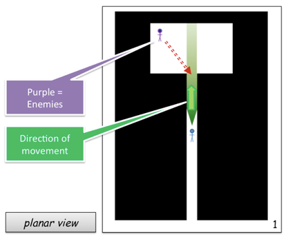
Figure 21
As the camera frustum has been occluded by the level geometry, the player is unaware of the patrolling enemy ahead. In this example, the player is the most disadvantaged. The level geometry is reducing their possible evasion vectors. By removing the player's possibility to strafe, the enemy has the advantage of requiring fewer correction cycles to target the player.
In this example, the player will need to rush into unknown space in order to engage the enemy. They will be hesitant to do this, as it will require changes to GFOV and world position in order to engage. Further to this, as the room has been occluded, they will have not situational awareness in this environment -- they may even believe that they are moving into another tight hallway.
There is, however, an upside; confined spaces are sometimes beneficial for the player, as it reduces the possible amount of approach vectors that an enemy can use against them. The trade-off, though, will always be a reduction in the possible evasive movement vectors, so evaluating this particular scenario requires more knowledge of the enemies' behaviors.
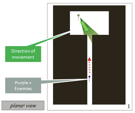
Figure 22
If we change the player's position with the enemy's position, we have a significantly different type of encounter -- one that favors the player for all of the same reasons that the enemy was favored in the previous encounter (Figure 22). This is another extension of the notion of compression and funneling that I have discussed previously.
Corridors like those depicted in Figure 22 are choke points which cause compression on the player -- when compressed, the player will feel extremely anxious, and move quickly to get out of this environment, especially in deathmatch type scenarios where human players will exploit these choke points.
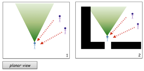
Figure 23
Figure 23 is a demonstration of how we can modify the player's tactical abilities and subsequent emotional state by introducing certain level geometries. In frame 1 of Figure 23, the player is moving forward through the frame, and has two enemies approaching them from a diagonal vector, just outside of their line of sight. This example is similar to that of Figure 21; however, when the player goes to engage enemies by changing their view frustum (and/or their world position) they have reoriented themselves into a corner, hence compromising the available space that they have for evasive maneuvers. (Figure 24)
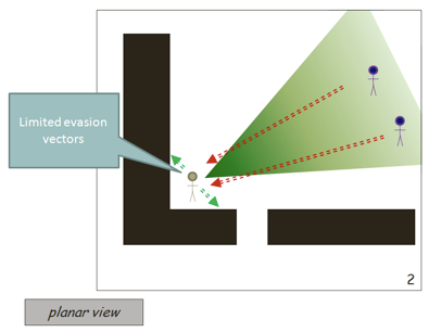
Figure 24
Forcing enemies through choke points will always be advantageous for the player. Figure 25 modifies the scenarios depicted in Figure 24 to turn the tactical advantage towards the player. Frame 2 of Figure 25 demonstrates how an occluding device can be beneficial for the player from a strategic perspective. In this example, the player has two approach vectors to monitor. As there is only one enemy, they can use the either one of the two approach vectors as an evasion vector to force to the enemy into another choke point if they need to.
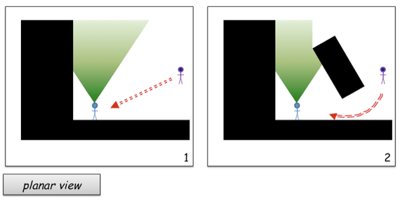
Figure 25
Figure 25 can be further modified with level geometry to add additional choke points (Figure 26). However, this will start to work against the player, as they have far too many possible approach vectors. We can think of this scenario in terms of "closing off space" -- a tactic that players use as a type of checklist to ensure that that they systematically closed off possible ambush vectors before moving onto the next game space.
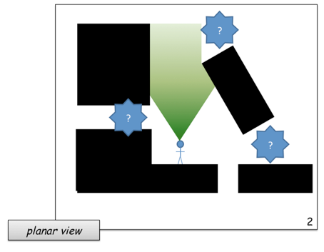
Figure 26
In Figure 27, we have the same amount of choke points as in Figure 26; however, the player is able to systematically close each one of these off as they move through. In Figure 26, the player needs to manage three different potential approach vectors at any one time, whilst in the linear space of Figure 27, they only every have to manage two at a time. Further to this, they can incrementally close off these spaces to reduce this number further.
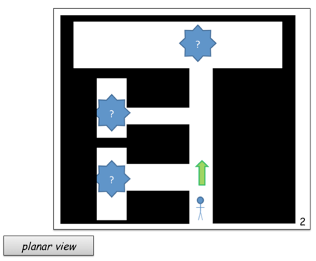
Figure 27
As the player moves through the environment as depicted in Figure 27, they begin to close off space, preventing possible ambush (under normal circumstances at least). Games such as Dead Space purposely break this rule in order to keep the player in a constant stage of anxiety:
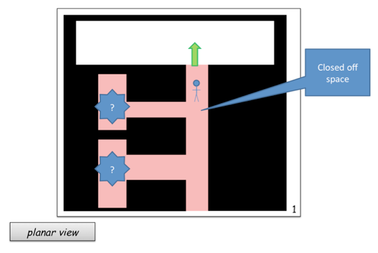
Figure 28
Multiplayer maps are also a notable exception to this rule. Figure 29 is an example of a deathmatch type space that purposely prevents the player from being able to close off spaces. This type of spatial design is intended to be strictly non-linear, and force confrontation as much as possible.
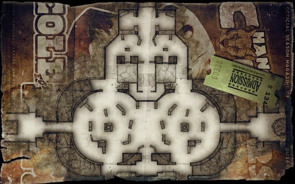
Figure 29
Just as planar objects affect the metrics of space, so to do height elements. Earlier in the article, we considered how gantries could be used as an advanced type of occluder, allowing the player to gain an advantage as they have greater situational awareness.
It is also important to once again demonstrate how line of sight takes priority over virtual space in terms of metrics that determine difficulty.
Although the player will have limited evasion vectors, a gantry like the one depicted in Figure 30 will give the player strafing abilities whilst they are targeting enemies on the lower floor. The combination of these two elements combined give the player the most advantageous position in this scenario.
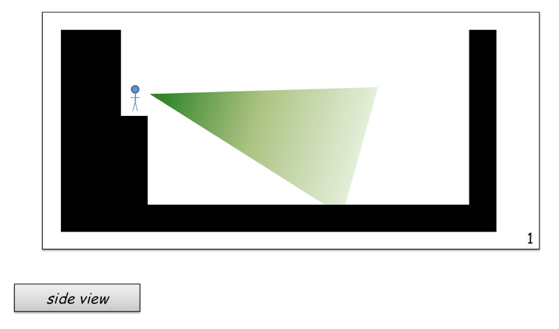
Figure 30
To demonstrate this point even further, let us consider the player in the inverse position. Whilst close to the gantry ledge, the player will have a significantly occluded view of the position above them. Further to this, the only way they have of removing this occlusion is to backpedal. As demonstrated in earlier examples, if the player is backpedaling away from the gantry, any enemy attempting to target them will require fewer correct cycles to gain an accurate hit.
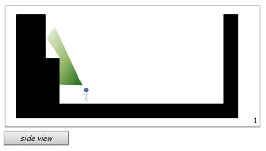
Figure 31
To demonstrate this point even further, let us consider the player in the inverse position (Figure 31). Whilst close to the gantry ledge, the player will have a significantly occluded view of the position above them. Further to this, the only way they have of removing this occlusion to backpedal. As demonstrated in earlier examples, if the player is backpedaling away from the gantry, any enemy attempting to target them will require fewer correct cycles to gain an accurate hit.
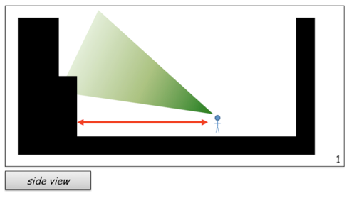
Figure 32
The player in this scenario takes a risk by undertaking a backpedaling action to engage a potential enemy that is higher than them (Figure 32). Although the eventual outcome will mean that an enemy occupying the ledge gantry will be contained within their view frustum, the player is also making himself or herself an easier target. Ideally, advanced players will begin to learn that any backpedaling in this type of scenario should also be accompanied by large amounts of random strafing movements.
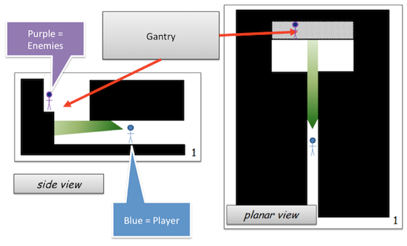
Figure 33
The most difficult iteration of this scenario can be seen in Figure 33. If we remove the player's ability to strafe and also add an overhanging ledge over the player's path, then this represents the most difficult iteration of the space. The player has reduced line of sight, hence they are less able to gain situational awareness and plan their actions and possible alternatives. Further to this, the player has had their evasion options compromised in the worst possible way -- they only have the possibility for backpedaling rather than the more effective strafing type movements.
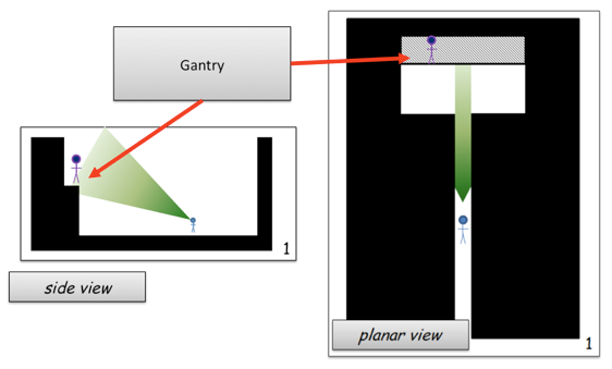
Figure 34
If we find that the example given in Figure 33 is too difficult for the player, we can use rational approach to start modifying the level geometry in such a way that we incrementally reduce difficulty. For example, Figure 34 makes the height of the corridor much higher, so that the player can see that there is a gantry ahead of them. This, then, at least lets them know of a potential hazard on this approach vector and they can then adjust their view frustum to accommodate this portion of the environment as they approach, instead of being forced to add multiple correction cycles.
The term "conclusion" is misleading; in terms of understanding the impacts of space on difficulty and player psychology, what is presented here is merely the tip of the iceberg. The next step in understanding virtual space is to consider that within game geometries, we have a number of attractive and repulsive forces. I have previously discussed the theoretical components of this in another article, which deals with the notion of compression and funneling, and I have hinted at its benefits throughout this article.
Understanding dynamic relationships is the next piece of the puzzle. We need to understand the dynamic forces that compel the player to move and engage with the level geometries. For now, though, this rational approach to difficulty ramping in 3D FPS games can be easily applied to your own design concepts. If spaces are designed with the player's situational awareness in mind, then we can begin to incorporate other design tools, such as Jesse Schell's interest curves, to further improve our designs.
Tan, D. S., Czerwinski, M. P., Robertson, G. G. (2006). Large Displays Enhance Optical Flow Cues and Narrow the Gender Gap in 3-D Virtual Navigation. Human Factors: The Journal of the Human Factors and Ergonomics Society Summer 2006 vol. 48 no. 2 318-333
Read more about:
FeaturesYou May Also Like